Updated June 13, 2023
Excel Box Plot (Table of Contents)
Introduction to Box Plot in Excel
If you are a statistic geek, you often might come up with a situation where you need to represent all 5 important descriptive statistics that can help get an idea about the spread of the data (namely minimum value, first quartile, median, third quartile, and maximum) in a single pictorial representation or in a single chart which is called as Box and Whisker Plot. For example, the first, median, and third quartile will be represented under a box, and whiskers give you minimum and maximum values for the given data set. Box and Whisker Plot is an added graph option in Excel 2016 and above. However, previous versions of Excel do not have it built-in. This article will show how a Box-Whisker plot can be formatted under Excel 2016.
What is a Box Plot?
In statistics, a five-number summary of Minimum Value, First Quartile, Median, Last Quartile, and Maximum value is something we want to know to have a better idea about the spread of the data given. This five-value summary is visually plotted to make the data spread more visible to the users. The graph on which statisticians plot these values is called a Box and Whisker plot. The box consists of First, Median, and Third Quartile values, whereas the Whiskers are for Minimum and Maximum values on both sides. John Tuckey invented this Chart in the 1970s, and it has recently been included in all the Excel versions of 2016 and above.
We will see how a box plot can be configured under Excel.
How to Create Box Plot in Excel?
Box Plot in Excel is very simple and easy. With some examples, let’s understand how to create the Box Plot in Excel.
Example #1 – Box Plot in Excel
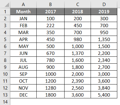
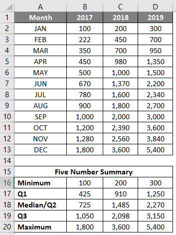
Suppose we have data as shown below, which specifies the number of units we sold of a product month-wise for the years 2017, 2018, and 2019, respectively.
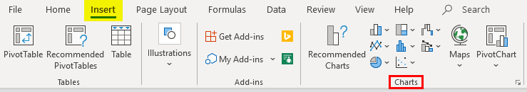
Step 1: Select the data and navigate to the Insert option in the Excel ribbon. You will have several graphical options under the Charts section.
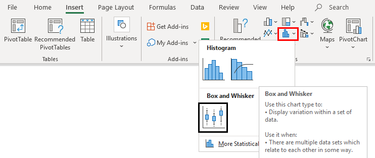
Step 2: Select the Box and Whisker option, which specifies the Box and Whisker plot.
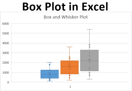
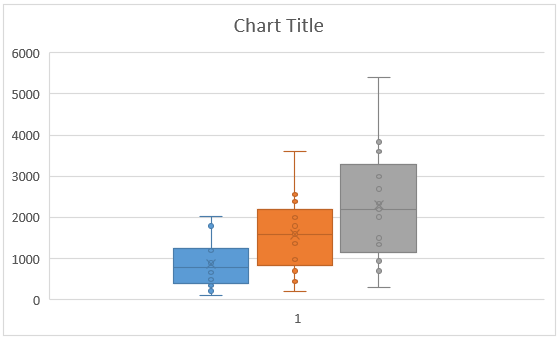
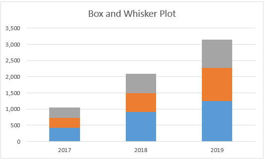
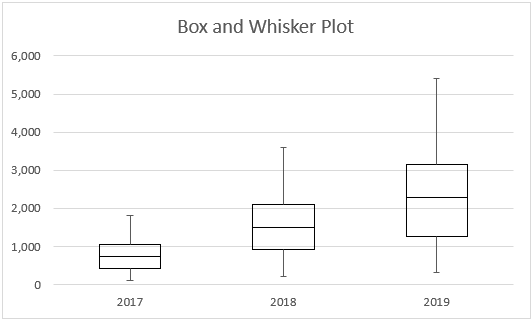
Right-click on the chart, select the Format Data Series option, then select the Show inner points option. You can see a Box and Whisker plot as shown below.
Example #2 – Box and Whisker Plot in Excel
In this example, we will plot the Box and Whisker plot using the five-number summary we discussed earlier.
Step 1: Compute the Minimum, Maximum, and Quarter values. MIN function allows you to give your Minimum value; MEDIAN will provide you with the median Quarter.INC allows us to compute the quarter values, and MAX calculates the maximum value for the given data. See the screenshot below for five-number summary statistics.
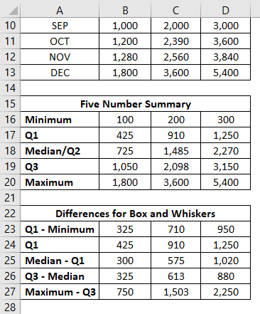
Step 2: Now, since we are about to use the stack chart and modify it into a box and whisker plot, we need each statistic as a difference from its subsequent statistic. Therefore, we use the differences between Q1 – Minimum and Maximum – Q3 as Whiskers. Q1, Q2-Q1, Q3-Q2 (Interquartile ranges) as Box. And combined together, it will form a Box-Whisker Plot.
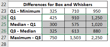
Step 3: Now, we are about to add the boxes as the first part of this plot. Select the data from B24:D26 for boxes (remember Q1 – Minimum and Maximum – Q3 is for the Whiskers?)
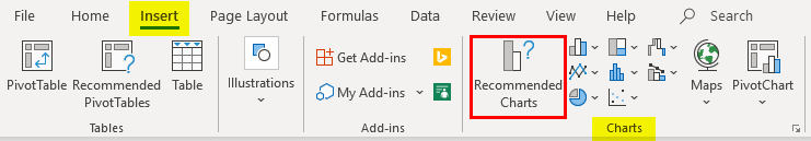
Step 4: Go to the Insert tab on the Excel ribbon and navigate to Recommended Charts under the Charts section.
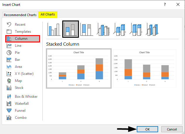
Step 5: Inside Insert Chart window > All Charts > navigate to Column Charts and select the second option, which specifies the Stack Column Chart, and click OK.
This is how it looks.
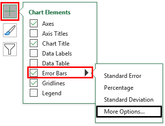
Step 6: Now, we need to add whiskers. I will start with the lower whisker first. Select the stack chart portion, which represents the Q1 (Blue bar) > Click on Plus Sign > Select Error Bars > Navigate to More Options… dropdown under Error Bars.
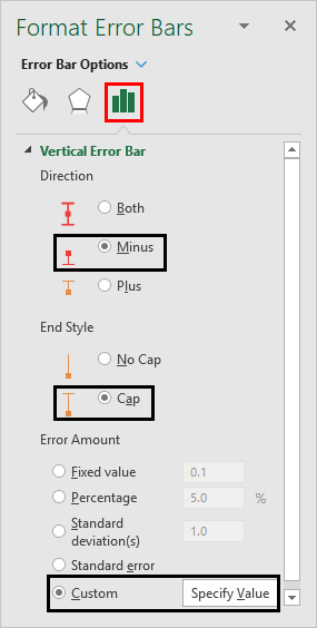
Step 7: As soon as you click on More Options… Format Error Bars menu will appear > Error Bar Options > Direction: Minus Radio Button (since we are adding the lower whisker) > End Style: Cap radio button > Error Amount: Custom > Select Specify Value.
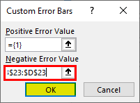
It opens a window specifying the lower whisker values (Q1 – Minimum B23:D23) under Negative Error Value and Click OK.
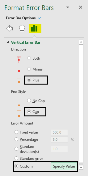
Step 8: Do the same for the upper Whiskers. Select the gray bar (Q3-Median bar); instead of selecting Direction as Minus, use Plus and add the values of Maximum – Q3, i.e., B27:D27, under the Positive Error Values box.
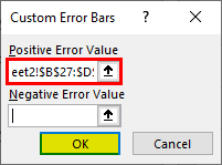
It opens a window specifying the lower whisker values (Q3 – Maximum B27:D27) under Positive Error Value and Click OK.
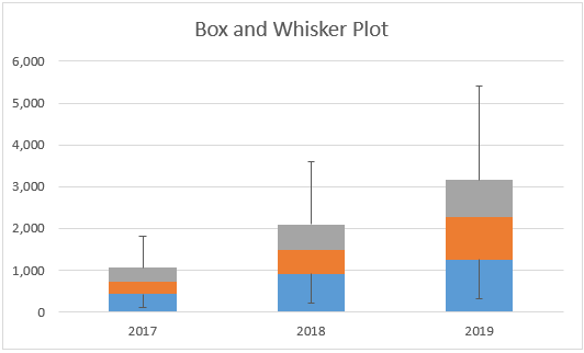
The Graph now should look like the screenshot below:
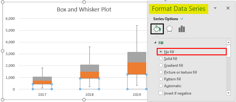
Step 9: Remove the bars associated with Q1 – Minimum. Select the Bars > Format Data Series > Fill & Line > No Fill. This will remove the lower part as it is not useful in the Box-Whisker plot and was just added initially because we want to plot the stack bar chart as a first step.
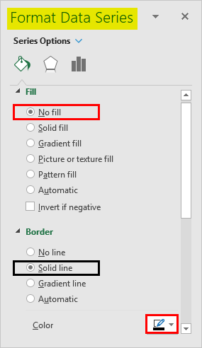
Step 10: Select the Orange bar (Median – Q1) > Format Data Series > Fill & Line > No fill under Fill section > Solid line under Border section > Color > Black. This will remove the colors from the bars and represent them just as outline boxes.
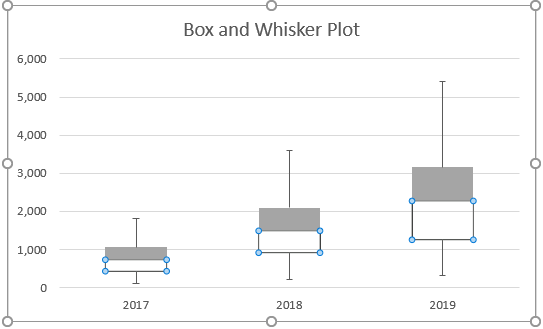
Follow the same procedure for the gray bar (Maximum – Q3) to remove the color from it and represent it as a solid line bar. The plot should look like the one in the screenshot below:
This is how we can create Box-Whisker Plot under any version of Excel. If you have Excel 2016 and above, you have the direct chart option for the Box-Whisker plot. Let’s end this article with some points to be remembered.
Things to Remember
- Box plot gives an idea about the spread/distribution of the dataset with the help of a five-number statistical summary which consists of Minimum, First Quarter, Median/Second Quarter, Third Quarter, and Maximum.
- Whiskers are nothing but the boundaries, which are minimum and maximum distances from the first and third quarters, respectively.
- Whiskers are useful for detecting outliers. Anything that lies outside the whiskers considers an outlier.
Recommended Articles
This is a guide to Box Plot in Excel. Here we discuss how to create a Box Plot in Excel, practical examples, and a downloadable Excel template. You can also go through our other suggested articles –
