Updated August 24, 2023
Box and Whisker Plot in Excel (Table of Contents)
Introduction to Box and Whisker Plot in Excel
Just looking at the numbers will not tell the story better, so we rely on visualizations. We have sophisticated software in this modern world to create beautiful visualizations. However, amidst all the sophisticated software, most people still use Excel for their visualization.
When discussing visualization, we have one of the important charts, i.e., “Box and Whisker Plot in Excel”. This is not the most popular chart in nature but the most effective one. So in today’s article, we will show you about Box and Whisker Plot in Excel.
What is Meant by Box and Whisker Plot in Excel?
Box and Whisker Plot is used to show the numbers trend of the data set. Box and Whisker plot is an exploratory chart used to show the data distribution. This chart shows a statistical five-set number summary of the data.
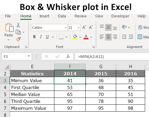
These five statistical numbers summary are “Minimum Value, First Quartile Value, Median Value, Third Quartile Value, and Maximum Value”. These five numbers are essential to creating “Box and Whisker Plot in Excel”. Below is the explanation of each five numbers
- Minimum Value: What is the minimum or smallest value from the dataset?
- First Quartile Value: What is the number between the minimum value and Median Value?
- Median Value: What is the middle value or median of the dataset?
- Third Quartile Value: What is the value between the median value and maximum value?
- Maximum Value: What is the highest or largest value from the dataset?
How to Create Box and Whisker Plot in Excel?
Let us see the examples of creating Box and Whisker Plot in Excel.
Example of Box and Whisker Plot
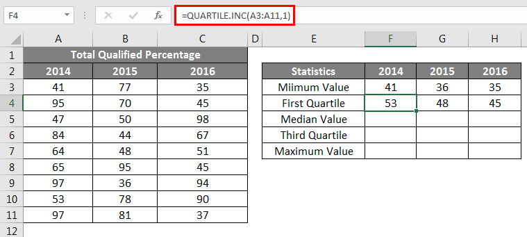
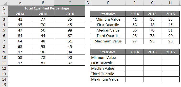
Below is the data I have prepared to show the “Box and Whisker Plot” in Excel.
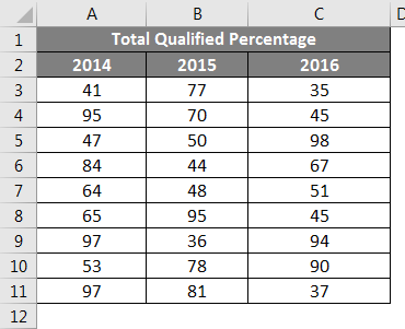
This is the data of educational examinations of the past three years, which says the pass percentage of students who appeared for the examination.
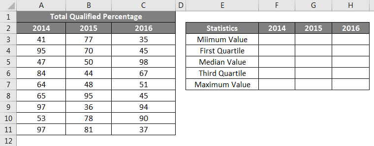
To create “Box and Whisker Plot in Excel”, first, we need to calculate the five statistical numbers from the available data set. Five numbers of statistics are “Minimum Value, First Quartile Value, Median Value, Third Quartile Value, and Maximum Value”. For this, create a table like the one shown below.
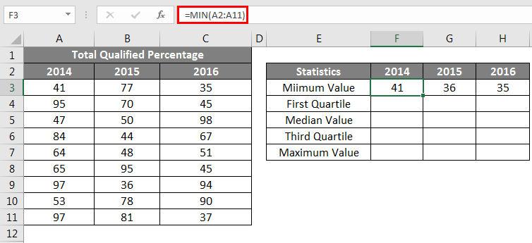
First, we need to calculate the smallest or minimum value for each year. So apply Excel’s built-in “MIN” function for all the years, as shown below.
The second calculation is to calculate what the First Quartile Value is. For this, we need another built-in function, QUARTILE.INC. To find the first Quartile value, below is the formula.
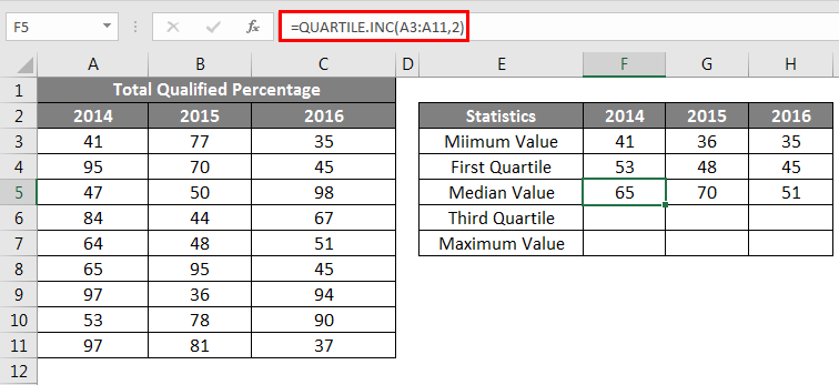
The third Statistical Calculation is Median Value; below is the formula.
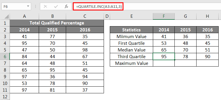
The 4th statistical calculation is the third quartile value; for this change, the last parameter of the QUARTILE.INC function to 3.
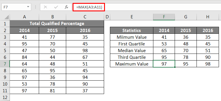
The last statistic is the calculation of the Maximum or Largest value from the available data set.
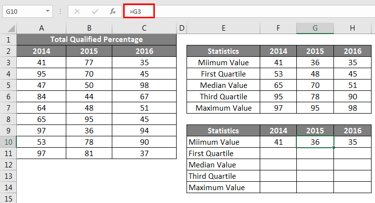
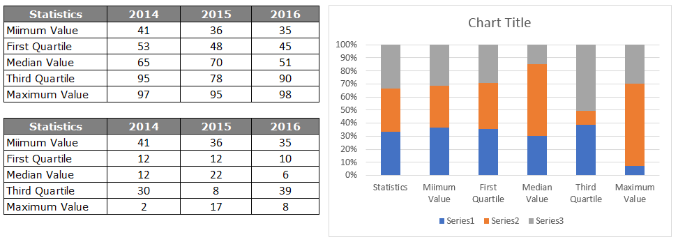
Once all the five number statistics calculation is done, create a replica of the calculation table but delete the numbers.
For Minimum Value cells, give a link from the above table only.
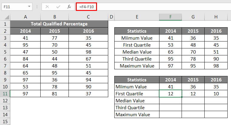
Next, we need to find the First Quartile Value, for this formula is below
First Quartile – Minimum Value.
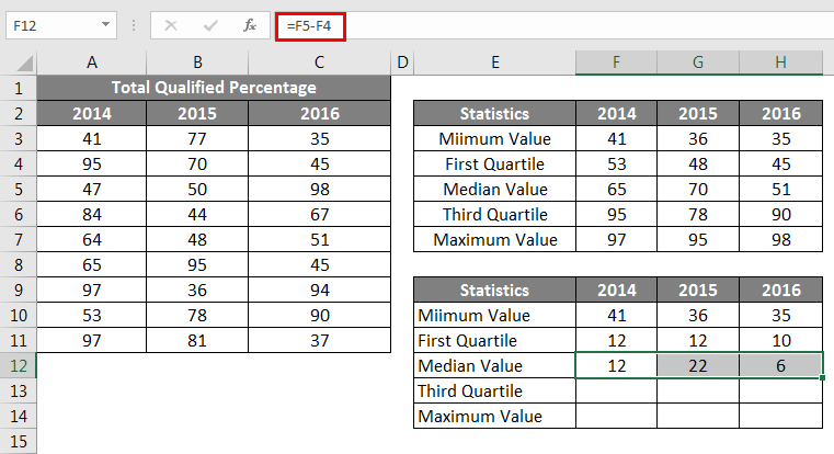
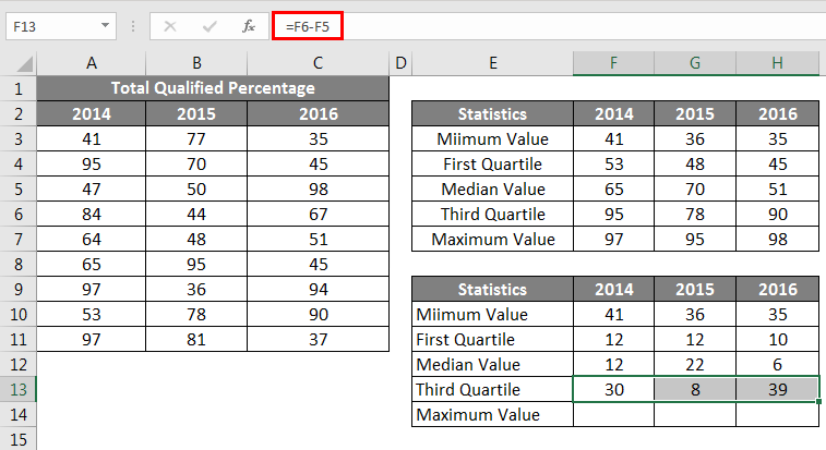
Next, we need to find the Median Value, for this formula is below
Median Value – First Quartile.
Next, we need to find the Third Quartile Value, for this formula is below
Third Quartile – Median Value.
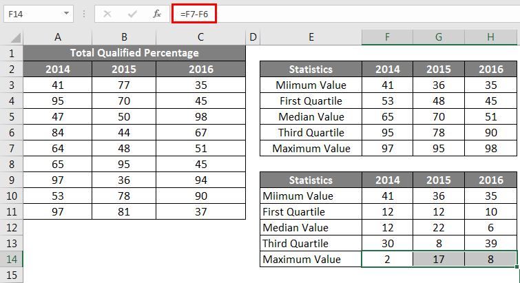
Next, we need to find the Maximum Value, for this formula is below
Maximum Value – Third Quartile.
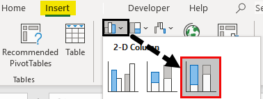
So, now all the calculations are ready to insert a chart. Now select the data to insert the Stacked Column Chart.
Now our chart will look like the below.
Select the chart; now, chart tools appear on the ribbon. Under the DESIGN ribbon, select “Switch Row / Column”.
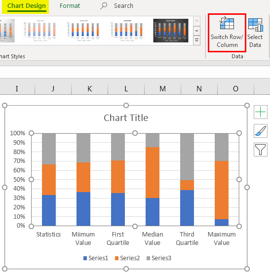
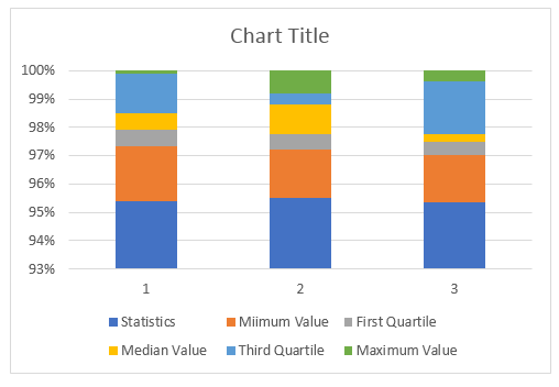
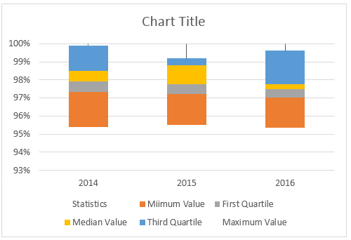
This will interchange rows & column data in the chart is switched, so our new chart looks like the below one.
Now we need to format the chart; follow the below steps to format the chart.
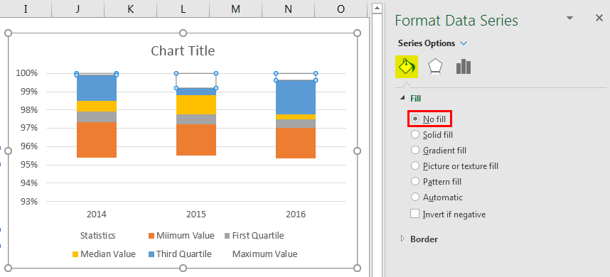
Select the bottom-placed bar, i.e., blue-colored bar, and make the fill as No Fill.
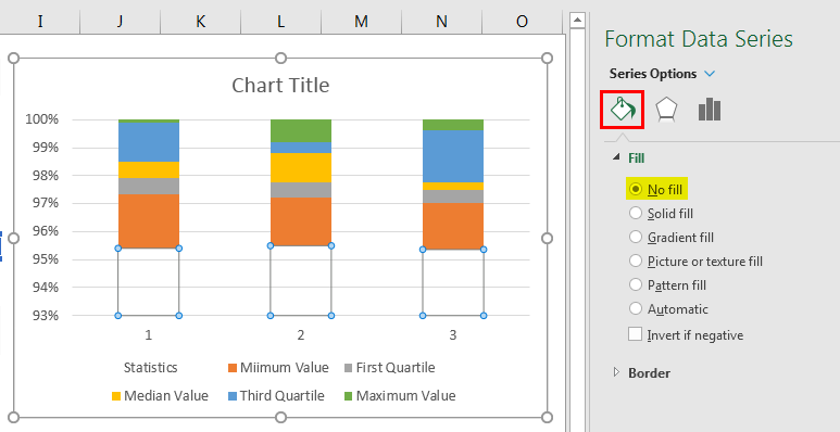
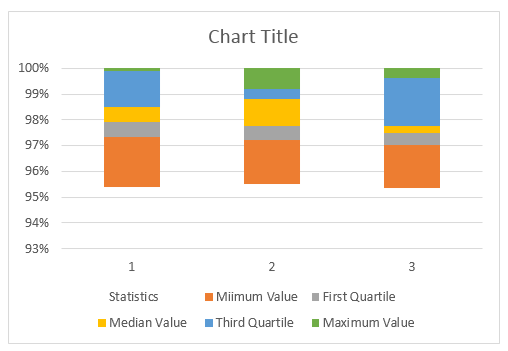
So now the bottom bar disappears from the chart.
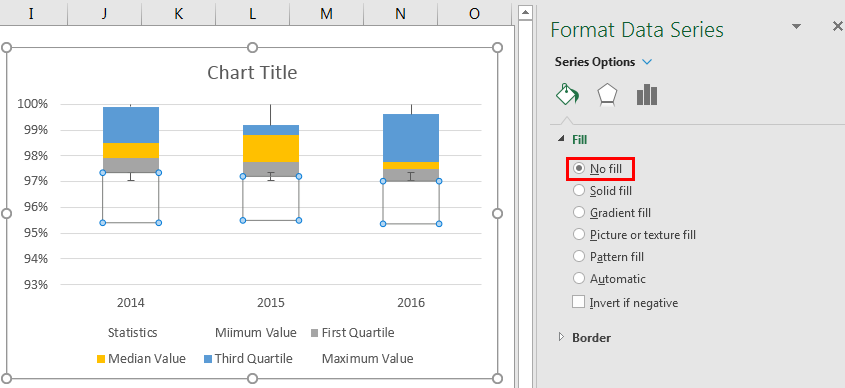
Right-click on the chart and choose “Select Data”.
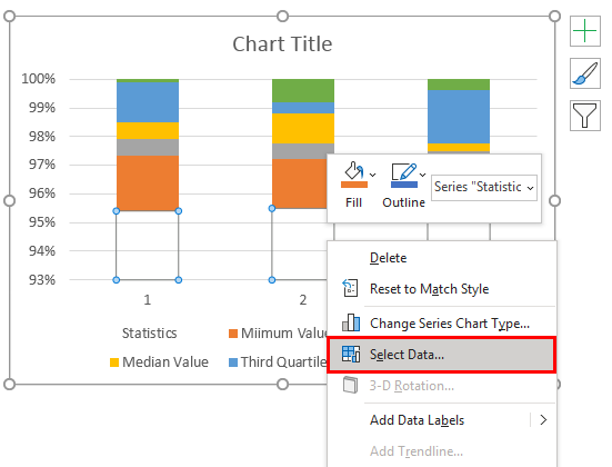
In the window below, click the EDIT button on the right side.
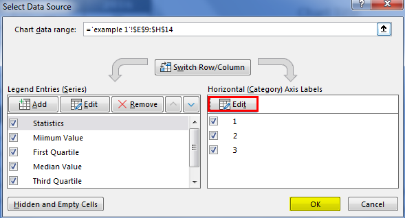
Now select Axis Label as year headers.
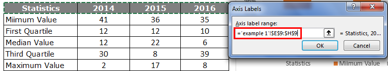
Now horizontal axis bars look like this.
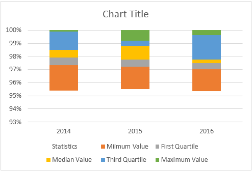
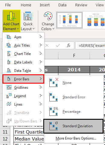
The BOX chart is ready to use in Box And Whisker Plot in Excel, but we need to insert WHISKER into the chart. To insert WHISKER, follow the below steps.
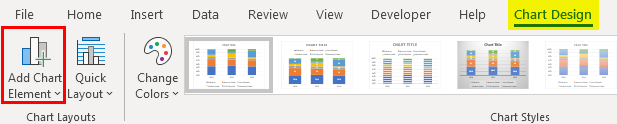
Now select the top bar of the chart that makes NO FILL.
Now by selecting the same bar, go to the Design tab and Add Chart Elements.

Under Add Chart Elements, click on “Error Bars > Standard Deviation”.
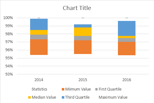
Now we got Whisker lines on top of the bars.
Select Whisker lines and press Ctrl + 1 to open the format data series option.
Under “Forma Error Bars”, make the following changes.
>>> Direction “Minus.”
>>> End Style “No Cap”.
>> Error Amount > Percentage > 100%.
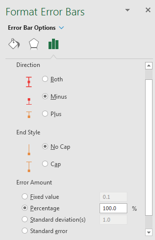
Under Format Error Bars, it will somewhat look like this-
Similarly, we need to insert a whisker into the bottom as well. For this selection, the bottom-placed bar and make the FILL as NO FILL.
Also, by selecting the same bar, go to the Design tab and Add Chart Elements.
Under Add Chart Elements, click on “Error Bars > Standard Deviation”.

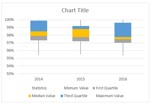
Repeat the same steps as we did for the top bar whiskers. Now, we will have our Box and Whisker plot chart ready.
Things to Remember
- There is no built-in Box and Whisker plot chart in Excel 2013 and earlier versions.
- We need to calculate five-number summary items like “Minimum Value”, “First Quartile Value”, “Median Value”, “Third Quartile Value”, and “Maximum Value”.
- All these calculations can be done using Excel’s built-in “Quartile.INC” formula.
Recommended Articles
This is a guide to Box and Whisker Plot in Excel. Here we discuss the meaning and how to create Box and Whisker plots in Excel with examples. You can also go through our other suggested articles to learn more –
