Updated August 24, 2023
Waterfall Chart in Excel
Waterfall Chart in Excel is quite a useful tool to show the up and down in the data where each tower or column starts from the top of the lowest point of previous data. For example, if the first iteration counts as 100 and the second as 110, then the second column will start after the previous column end at 100, and it will be shown by a +10 figure or with several how much the next iteration goes up.
The waterfall chart helps to explain the cumulative effect of how the growth or reduction happens over a period of time. Let’s see an example of a waterfall chart to understand better.
How to Create Waterfall Chart in Excel?
Waterfall Chart in Excel is very simple and easy to create. Let us understand the working of the Waterfall Chart in Excel by some examples.
Example #1
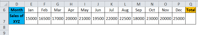
Let’s take the example that “XYZ” company wants to know how the sales accumulate month by month from the initiation of business for one year and want to analyze how sales fluctuate each month.
The below table shows the sales generated each month for a particular year.
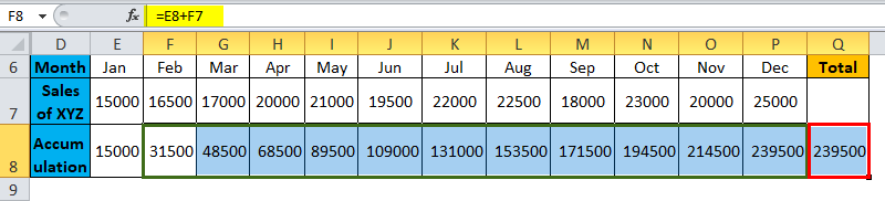
We need to add accumulated sales to the current month’s sales to know the current month’s accumulation. For example, 15000(Jan)+16500(Feb)=31500 is the total sales by the end of February; similarly, you can add the 31500(Sales up to Feb)+17000(March sales)=48500 is the total sales by the end of March.
Performing accumulation in Excel
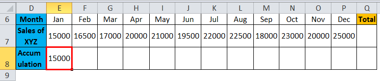
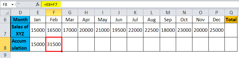
First, copy the Jan sales in the first cell of accumulation as shown below.
Later insert the formula for adding January sales to February sales in the accumulation row under the February column, as shown in the screenshot below.
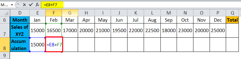
The Formula gives the result as:
Now copy the formula to all other months as shown in the below screenshot so that we will get the accumulated sales of each month.
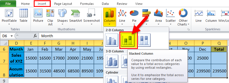
Creating the chart
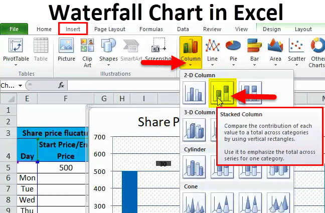
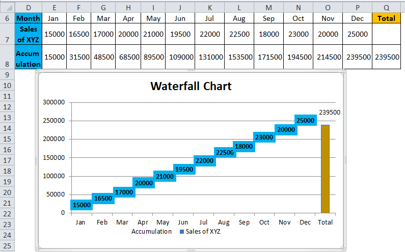
Now select the entire data range and go to insert >charts >column >under column chart > select Stacked column as shown in the below screenshot.
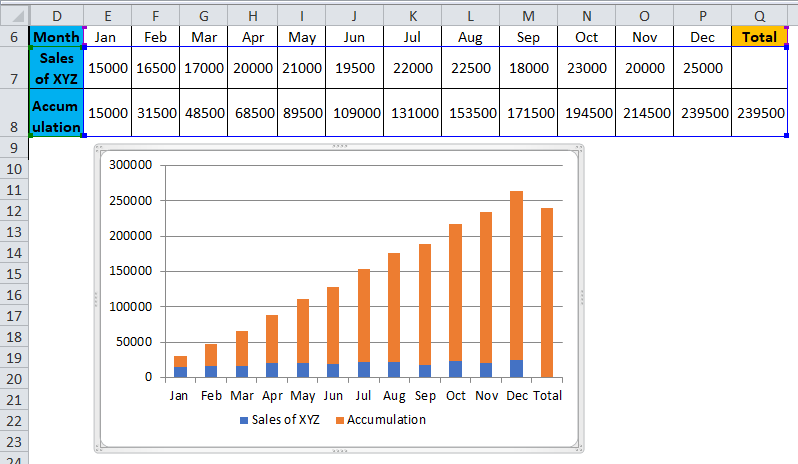
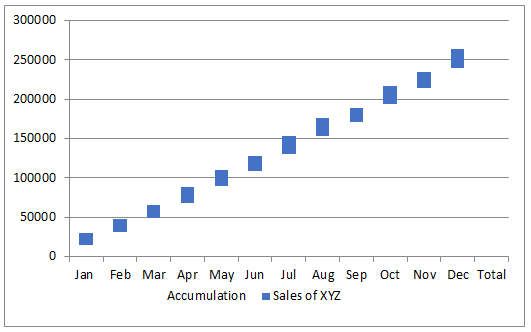
You will get the chart as below.
Now we need to convert this stack chart to a waterfall chart with the below steps.
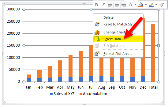
Select the chart or bars and right-click; you will get the pop-up menu; from that menu, select the “Select data” option.
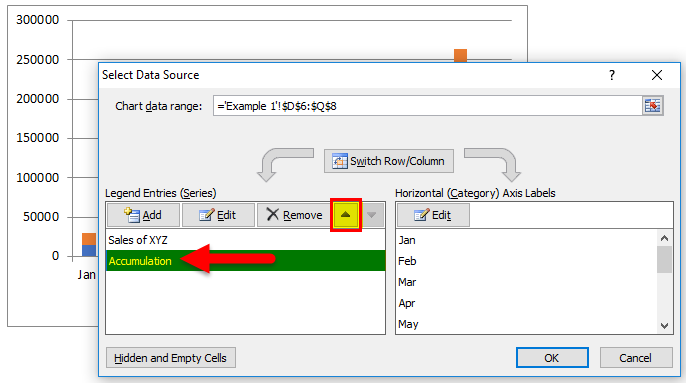
When you click the “Select Data”, one menu will pop up as below. Click on “Accumulation” and then click on “up arrow” as marked with red color.
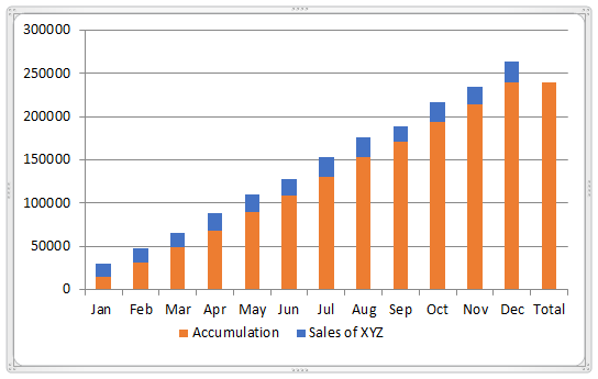
Then the chart will convert as below. The blue color appears on the up, and orange appears at the bottom.
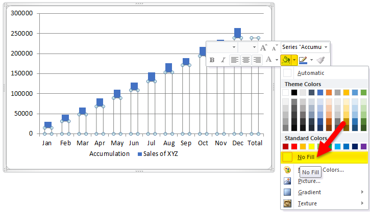
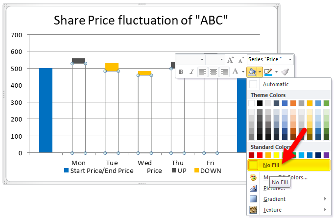
Now select the orange bars and do a right-click; click on the “fill” option available, select “No fill”. So that orange bars will change to white color (colorless).
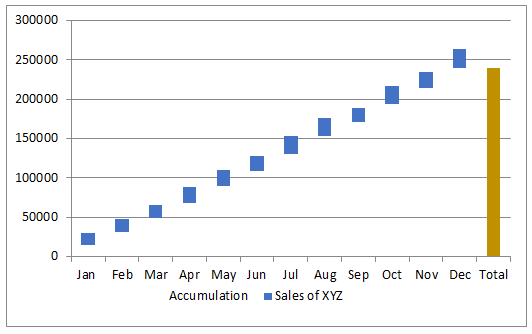
Now the chart will look like the below picture.
Select the total bar alone and fill in some colors as your wish, then it looks like below.
If you observe the chart, it looks like water falling from up to down or “flying bricks,” which is why it is called a waterfall or flying bricks chart.
If you want to see each month’s sales in the chart, you can add the values to the bricks. Select the blue bricks and right-click and select the option” Add Data Labels”.
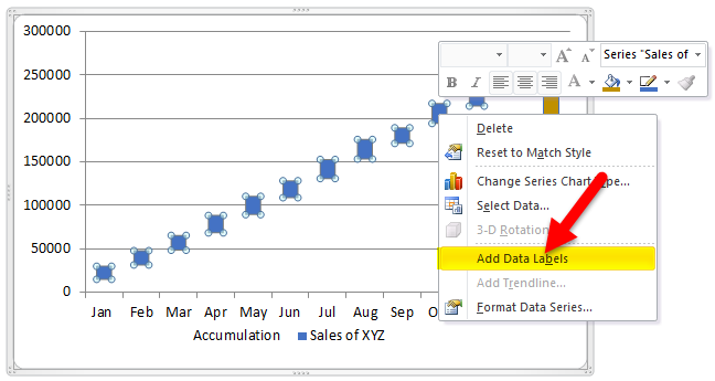
Then you will get the values on the bricks; for better visibility, change the brick color to light blue.
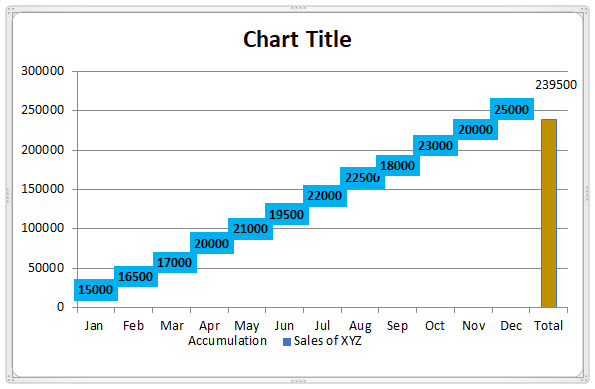
Double click the “chart title” and change to the waterfall chart.
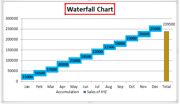
If you observe, we can see both monthly sales and accumulated sales in the singles chart. The values in each brick represent the monthly sales, and the brick’s position with respective values on the left axis represents the accumulated sales.
Example #2
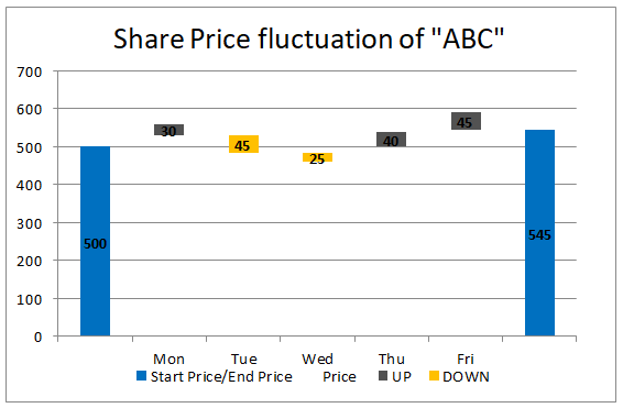
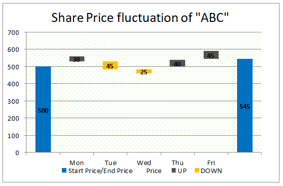
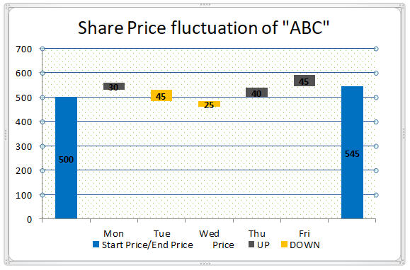
Let’s take the example of the fluctuation of the share price of “ABC Ltd” for a week.
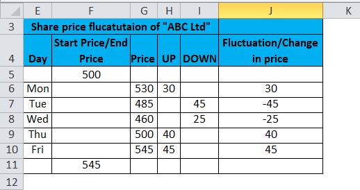
Column “Start price/End price” represents the starting and ending price of the share for the week. 500 is the beginning price, and 545 is the ending price.
The column “Price” represents the share price by the end of the day (If the share price increases, the change will add to the last date price and vice versa). Column “UP” represents the growth in share price. The column “DOWN” represents the fall in the share price. The column” Fluctuation” represents the increase or decrease of the share price on a particular day.
Now select the data excluding the last column, “Fluctuation”, and create a chart as described in the previous process; then, the chart will look like the below chart.
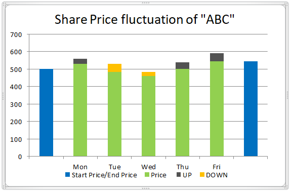
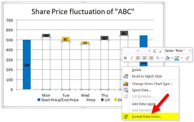
You can consider the green color bar as “Base”; hence, you can make the color “No fill”; then, you will get the waterfall chart with a combination of colors.
As described previously, add the values to the chart.
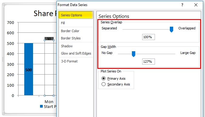
If you want to decrease or increase the gap between two bars or want to perform any other changes as per your project requirements, then you can do that by selecting the bars and right click then selecting “format data series”.
You will get the menu on the right side; change the gap width as per your requirements.
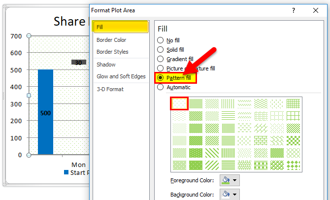
You can also select the pattern in the background by selecting “Format Plot Area”.
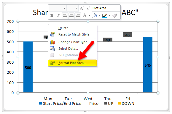
Under Format Plot Area, go to fill. Select “Pattern fill” and the first pattern, as shown in the screenshot below.
Then your chart will look like the below screenshot.
We can also change the thickness of gridlines by selecting the gridlines option, as shown below.
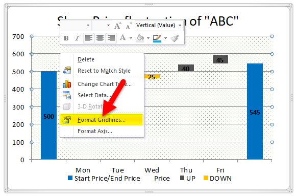
By clicking on Format Gridlines, a pop-up menu will appear under that; go to “Line Color,” Select “Solid Line,” and select the fill color shown in the screenshot below.
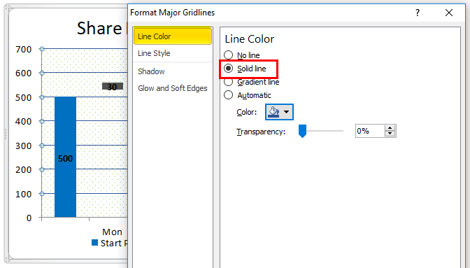
You can observe the thickness of the lines has changed from the previous screenshot to the current screenshot.
Like this, you can do a little makeover to look your waterfall chart more attractive.
Pros of Waterfall Chart in Excel
- It is easy to create with little knowledge of Excel.
- One can view the monthly and accumulated results in a single chart.
- The chart will help to visualize both negative and positive values.
Cons of Waterfall Chart in Excel
- When we send to users who have Excel versions apart from 2016, they may be unable to view the chart.
Things to Remember
- Gather the required data without errors.
- Apply formulas to get the accumulated balance in any one column as it should have accumulated a balance.
- One column should have start and end values.
- Select the data and apply a stacked bar chart.
- Apply “No Color” to the base.
- Add required formats as you wish to look chart better
Recommended Articles
This has been a guide to a waterfall chart in Excel. Here we discuss its uses and how to create Waterfall Chart in Excel with Excel examples and downloadable Excel templates. You may also look at these useful functions in Excel –
