Updated August 24, 2023
Marimekko Chart Excel (Table of Contents)
Definition of Marimekko Chart Excel
A two-dimensional stacked chart is most commonly used by a business analyst in consulting & finance companies. It is also referred to as Mekko or mosaic, or matrix chart; this name is given to it because of the similar patterns in Marimekko fabric. Marimekko chart is frequently used to visualize categorical data for a pair of variables. Data is displayed or reflected as “Blocks”, which vary in height & width.
Marimekko chart helps to check out the companies’ relative positioning in different segments & Market segmentation analysis for any sector companies. In the Marimekko chart, we can represent or showcase two variables’ data, i.e., one variable through the vertical axis’s height and the other through the width of bars or columns.
Marimekko combines data from multiple charts (stacked column & bar chart) into a single two-dimensional stacked column chart, where the bar width reflects an additional variable, and each column represents company percentages for those specific segments.
There is no inbuilt Marimekko chart Option available in Excel; it will take a lot of time to create it; in most cases, we have to create it with slight data manipulation variables.
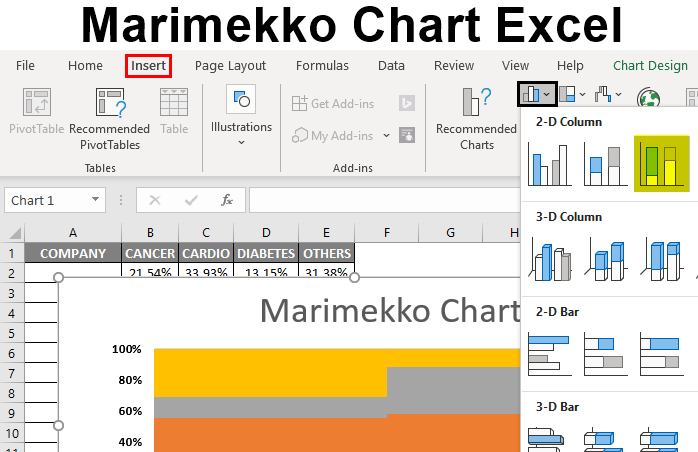
How to Create a Marimekko Chart in Excel?
Let’s take an example to create a Marimekko chart in Excel for two variables.
Marimekko Chart – Segmentation Analysis for Different Companies and Their Relative Positions (without any Add-In Tool)
I have 4 different pharma companies with their sales data for four drug class segments in the table below. Now I have to create a Marimekko chart for these sales data showcasing the sales percentage across the different segments.
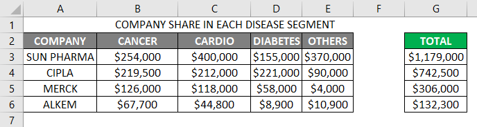
Here I have to showcase market share & distribution through the mekko chart; the first step is, to sum up the total sales of each segment (in column G) & each company in a separate row (Row number – 8)
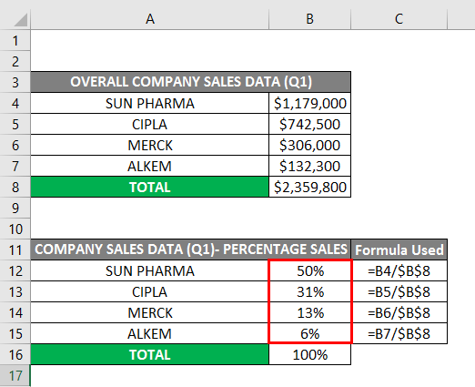
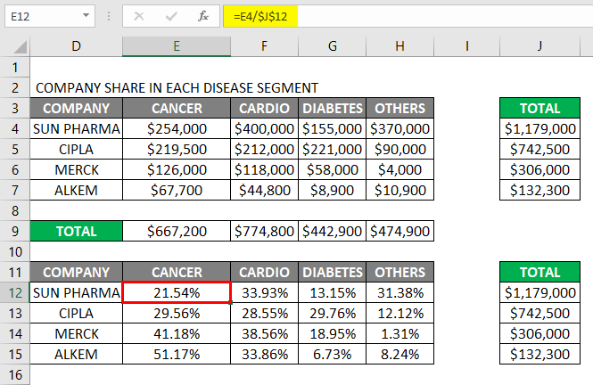
I need to convert each company’s total sales data across different segments to the percentage, which can be calculated by individual company sales divided by total sales (Percentage calculation is carried out from cells B12 to B15). You can observe here the sales data is in ascending order (Highest sales to lowest sales)
A similar procedure is followed for each drug class segment sales data for different companies, i.e., sales data to percentage conversion.
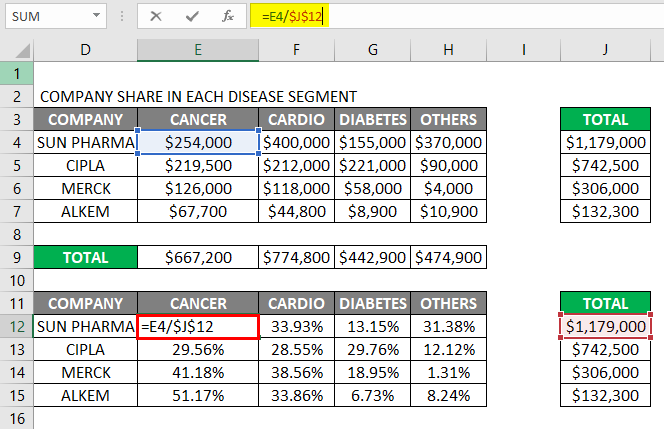
The result is shown below.
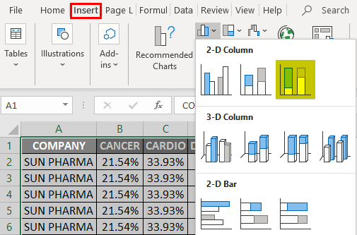
Once we get the percentage sales of sales data for each company, to create a mekko chart, we need to create that many rows for each company, i.e., For the company sun pharma, I have created 50 rows because the percentage share is 50, a similar number of rows is created based on the percentage sales of each company so, the total hundred rows created, after this, I have to add the respective company distribution share for each company across different rows.
So, the total rows will be 100 rows of data; now, for this set of 100 rows, we have to create a 100% stacked bar chart under the 2d column chart option in the chart tab.
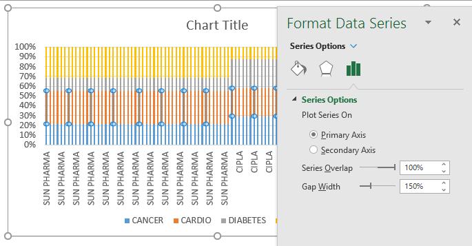
Once the 100% stacked bar chart is created, we have to format it.
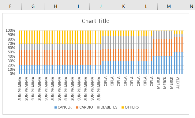
There is a gap between data series in the stacked bar chart; we have to format it where we need to remove the gap width across data bars by clicking anywhere in the data bars and right-click on it, in that select an option format data series, where we need to update the gap width percentage from 150 to 0%
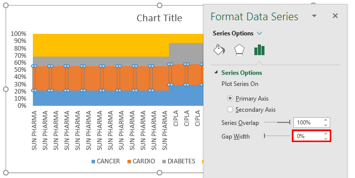
The changes mentioned below could be observed once the gap width is updated to 0%.
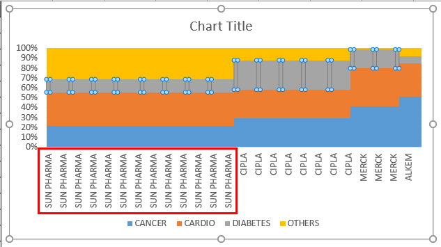
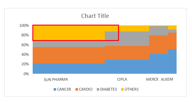
In the X-axis, you can observe the multiple similar names of companies in the chart because the no. of rows appears in the data table, i.e., 50 rows in the case of sun pharma. We can update it to a single company name record by keeping it in the middle portion and deleting the other records in the data table. To perform this, we must delete the company’s multiple similar names and restrict them to a single entity in the data table.
Once the X-axis parameters are resolved, the data bars must be formatted. You can observe the sales data for each segment of one company overlapping each other (Below screenshot). We need to eliminate this by creating separate boundaries across each company’s sales segment.
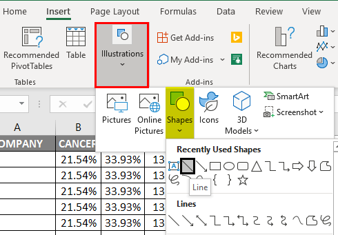
Boundaries across each company’s sales segment can be created to insert lines across each company’s borders.
Under the illustration, you need to select a shape; under that, click on a Line. That line appears in the chart area, where you must format and place it across each company border in the data bars.
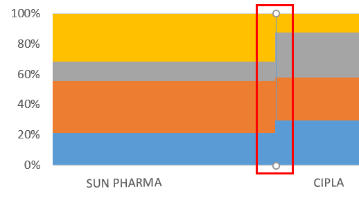
I need to draw the line across the data bar’s border for a sun pharma company and format it.
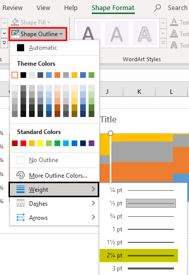
The line background color must be updated or formatted from black to white under the shape outline option.
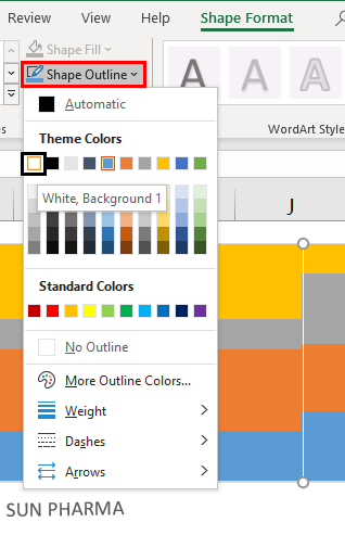
For a better appearance of the line across the border, we need to increase its weightage to 21/4 points under the shape outline options.
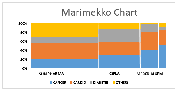
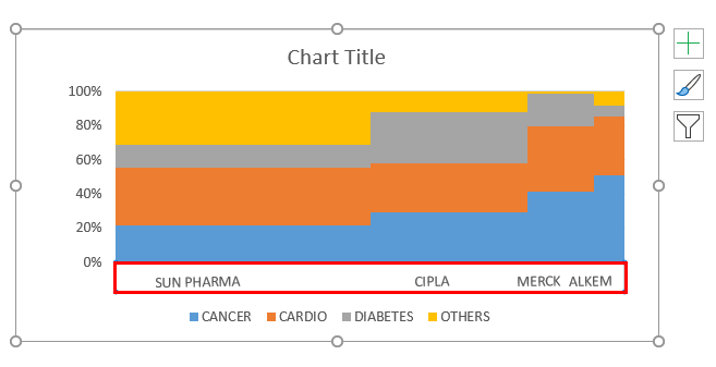
Once the line is formatted, we can copy and paste it across each company data bar borders. I have removed the default Chart Title and changed it to the relevant title.
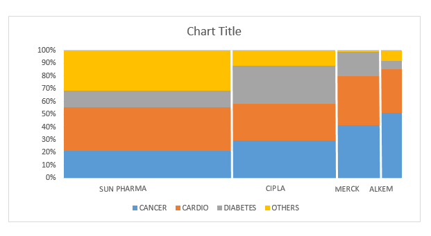
Now, the Marimekko chart is ready, where the bar width indicates and reflects the sales performance of each company compared to other competitors in a given drug class segment. The column height represents the sales for individual companies in that particular drug class segment.
Things to Remember About Marimekko Chart Excel
- Marimekko chart is primarily used for market analysis, i.e. market segmentation, % share of competitor companies in a market segment & individual share of companies in a market segment.
- There are various third-party utilities or add-in tools & Power-user available in the market to automatically create a Marimekko chart by just inputting the raw data or variables most commonly used is Peltier Tech Charts for Excel 3.0
- Marimekko chart provides valuable input with a single chart, which helps the client with clear insight for future planning and executing it to improve company sales performance.
Recommended Articles
This is a guide to Marimekko Chart Excel. Here we discuss How to Create Marimekko Chart in Excel, practical examples, and a downloadable Excel template. You can also go through our other suggested articles –
