Updated March 17, 2023
Introduction to Seaborn Pairplot
Seaborn pairplot is used to plot the pairwise relationship into a dataset. This function creates an axis of the grid such that the numeric variable in that data is shared across by using the axis of y in a single row and the x-axis in a single column. Plots that were diagonal have been treated differently. We can draw a univariate plot to show marginal data distribution for every column.

Key Takeaways
- The seaborn pairplot method enables the user to visualize an axis matrix. Every element in the dataset is distributed into the y and x axes using a column.
- Using it, we can make different graphs showing the pairwise connection and distribution.
What is Seaborn Pairplot?
Using it, we can show variable subsets or plot different variables on columns and rows. It is the high-level interface for the pairing grid, which was intended to make it easy to draw the styles, which was common, and we need to use the pairing grid directly if we need more flexibility. For plotting the pairwise distributions of the bivariate dataset, we use the function of pairplot. It shows the relationship for (n, 2) data frame variables as the diagonal plots and matrix plots is the type of univariate plot. At the time of creation, it uses multiple arguments as input.
The below syntax shows how we can use the seaborn pairplot as follows. It uses the below argument as follows.
Syntax:
seaborn.pairplot (args)The pair plot method will enable the users to visualize the matrix. Each numerical element in the data set is distributed through the y and x axes. We can make multiple graphs to show the pairwise distribution and connection of the graph.
How to Create Seaborn Pairplot?
We can utilize the method of pair plot in seaborn.
The below steps show how we can create a seaborn pairplot as follows. In the following step, we first install the seaborn in our system.
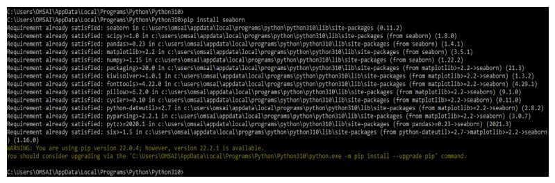
1. While creating the seaborn pair plot, first, we need to install the library package of seaborn by using the pip command. The below example shows to install the package of seaborn as follows.
Code:
pip install seabornOutput:
2. After installing the library package of seaborn, we import the numpy, pandas, and seaborn packages. We are importing the packages by using the import keyword as follows.
Code:
import numpy as np
import pandas as pd
import seaborn as sns
import matplotlib.pyplot as plt
Output:
3. After importing the library in this step, we need to load the data set. Below we are loading the data set name as tips as follows.
Code:
df = seaborn.load_dataset ('tips')Output:

4. After loading the dataset in this step, we check the data from the data set as follows.
Code:
df.head (6)Output:

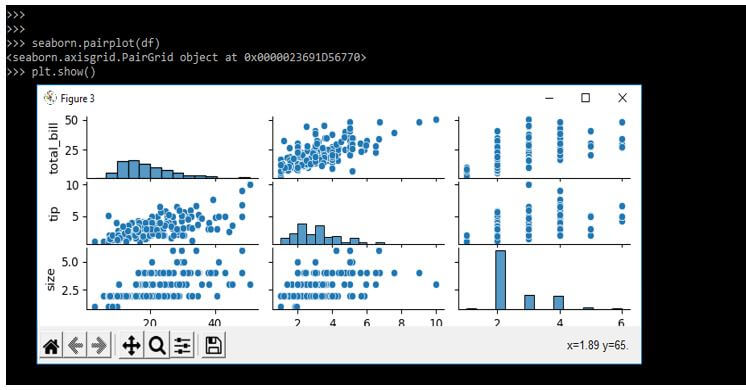
5. Now, in this step, we plot the seaborn pairplot using the loaded dataset.
Code:
seaborn.pairplot(df)
plt.show()
Output:
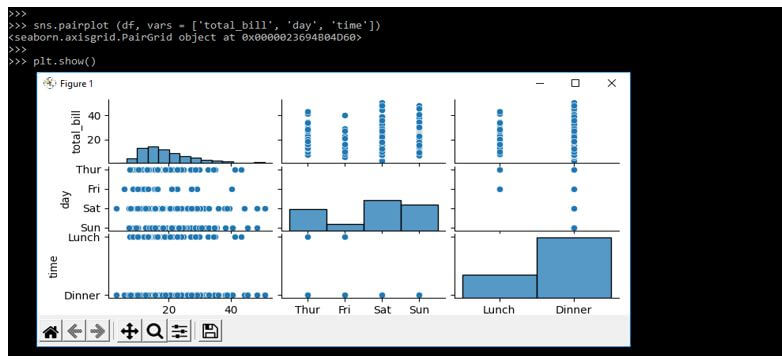
6. In the example below, we are providing data per column name as follows.
Code:
import numpy as np
import pandas as pd
import seaborn as sns
import matplotlib.pyplot as plt
df = seaborn.load_dataset ('tips')
sns.pairplot (df, vars = ['total_bill', 'day', 'time'])
plt.show()
Output:
7. In the below example, we are using the hue parameter as follows.
Code:
import numpy as np
import pandas as pd
import seaborn as sns
import matplotlib.pyplot as plt
df = seaborn.load_dataset ('tips')
sns.pairplot(df, hue ='sex')
plt.show ()
Output:

Seaborn Pairplot Visualization
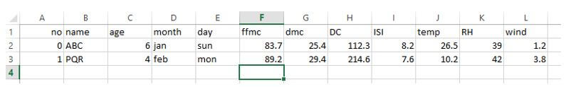
Visualization of data is the data representation in a graphical format. It is essential for data analysis, and it was fantastic because of the data-centric packages of python. Pairplot visualization is used to understand the data to summarize a vast amount of data in a simple format. For plotting the multiple bivariate data set distributions, we are using the pairplot visualization function. To plot the pairplot visualization, we are creating the csv file.
After creating the CSV file below, we are importing the library of seaborn and matplotlib as follows:
Code:
import seaborn as sns
import matplotlib.pyplot as plt
Output:

After importing the library, we load the data set using the CSV file name as a plot.
Code:
data = pandas.read_csv("plot.csv")Output:
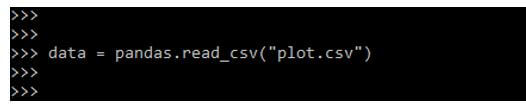
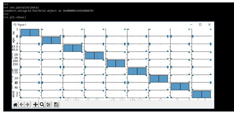
After loading the data set using the CSV file in this step, we plot the seaborn pairplot.
Code:
sns.pairplot(data)
plt.show()
Output:
Examples of Seaborn Pairplot
Different examples are mentioned below:
Example #1
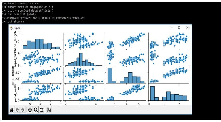
In the below example, we are loading the data set name as the iris. Therefore, we are not using any parameter with it.
Code:
import seaborn as sbn
import matplotlib.pyplot as plt
plot = sbn.load_dataset ('iris')
sbn.pairplot (plot)
plt.show ()
Output:
Example #2
In the below example, we are loading the data set name as the iris. We are using the hue parameter with it as follows.
Code:
import seaborn as sbn
import matplotlib.pyplot as plt
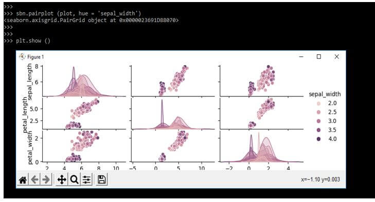
plot = sbn.load_dataset ('iris')
sbn.pairplot (plot, hue = ‘sepal_width’)
plt.show ()Output:
Example #3
In the below example, we are loading the data set name as the iris. We are using the kind parameter with it as follows.
Code:
import seaborn as sbn
import matplotlib.pyplot as plt
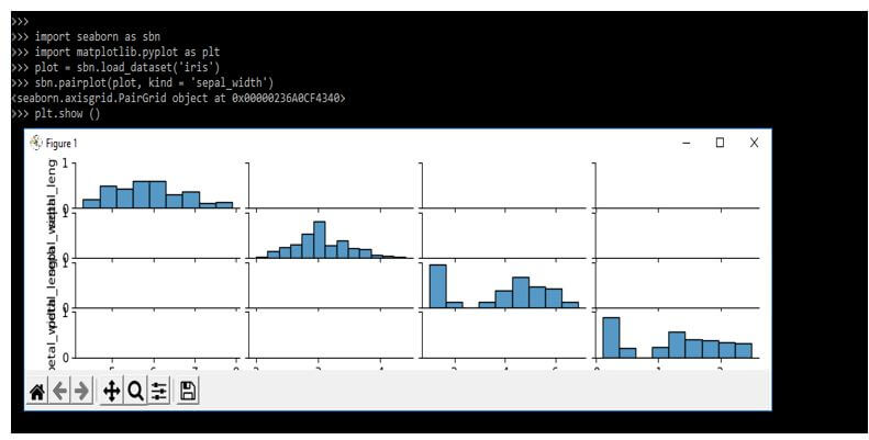
plot = sbn.load_dataset ('iris')
sbn.pairplot (plot, kind = ‘sepal_width’)
plt.show ()Output:
FAQ
Other FAQs are mentioned below:
Q1. What is the use of seaborn pairplot in python?
Answer:
The pair plot method utilizes or highlights multiple parameters or displays attributes in various categories.
Q2. What is seaborn pairplot data visualization?
Answer:
It will visualize the data for finding the relationship between variables and parameters we use when creating the seaborn pairplot.
Q3. How can we initialize the seaborn pairplot library?
Answer:
First, we need to install the package of seaborn. After installing the seaborn package, we initialize the same in our code using the import keyword.
Conclusion
When creating the seaborn pairplot, it uses multiple arguments as input. This function creates an axis of the grid such that the numeric variable in that data is shared across by using the axis of y in a single row and the x-axis in a single column.
Recommended Articles
This is a guide to Seaborn Pairplot. Here we discuss the introduction, visualization, examples, and how to create a seaborn pairplot withFAQ. You may also have a look at the following articles to learn more –
