Updated May 31, 2023
Introduction to Seaborn heatmap
A Heat map is a two-dimensional visualization method that shows the variation in the magnitude of a particular phenomenon in terms of different colors represented. The heat map is a data visualization technique that shows the shape and direction of different heat values at different temperature levels for a set of data points. In this topic, we are going to learn about the Seaborn heatmap.
Creating Seaborn Histogram
A heat map is a data visualization technique that can give you a sense of whether the network or a feature has changed over time. For example, heat maps can illustrate the relationship between a number of different attributes or a data set and a characteristic such as the degrees of freedom (or number of degrees of freedom), accuracy, and so on. The number of heat maps generated for a given set of data points tends to be small when compared with the number of data points in the set, which could indicate that the number of data points is less correlated to each other than previously thought. The number of data points in the data set might not be normally distributed like in the case of data in a medical dataset. In order to evaluate the correlation between all the individual points in a data set, we need to use a data mining technique, known as statistical learning.
Seaborn is built on top of Python’s core visualization library Matplotlib. It allows developers to plot a graphical visualization using Python’s plotting language, and the code includes a tool to load it into R or Matplotlib. You can also use the data to understand how data is used, to understand your analytics project’s business or to gain a deep understanding of the different ways customers generate data. You can start by exploring the data using Pandas.
We have created multiple Heatmaps with seaborn library from different data sets.
Syntax:
import seaborn as sns
import numpy as np
data_ = np.random.randn(8,12)
ax = sns.heatmap(data_)
Output:
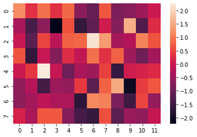
In the above example we have plotted a simple heat map with the random numbers using the Numpy random function and the heat map is plotted using seaborn.heatmap() function. In the first step we have imported seaborn library and named it as sns and called Numpy library as np. In the next step we have created the dataset using random generation of a 8×12 matrix. In the final step we have plotted the heatmap using heatmap function by passing the required parameters to the function.
Since the values in the matrix is between 2 to -2 we have values ranging from -2 to 0 to 2. We can see the difference in the color tones where the higher values are pale ranging to the lesser values that are more darker in color.
Syntax:
import seaborn as sns
import numpy as np
np.random.seed(0)
data_ = np.random.randn(8,12)
ax = sns.heatmap(data_, vmin=1, vmax=2)
Output:
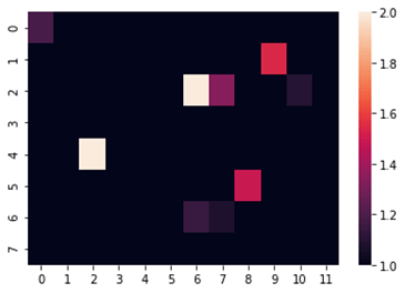
In the above example we have used a feature in seaborn heatmap which allows us to set the limits of the heat map. We can use this feature to filter the values we need. We have used the vmin and vmax attribute in the heat map function which allows us to set the minimum and maximum limit to set inside the heatmap. We have set the heatmap minimum limit as 1 and maximum as 2. So the heat map only displays the values from 1 and 2 and all the other values that do not fall under the min and max limit is displayed darker in the heatmap.
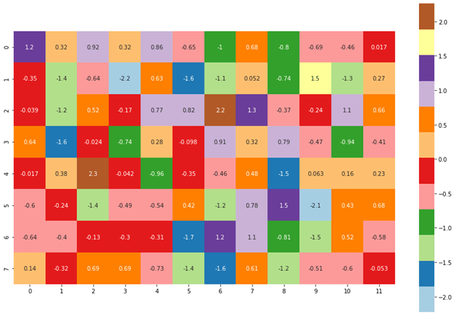
Syntax:
import seaborn as sns
import numpy as np
np.random.seed(0)
data_ = np.random.randn(8,12)
ax = sns.heatmap(data_, cmap = 'Paired' )
Output:
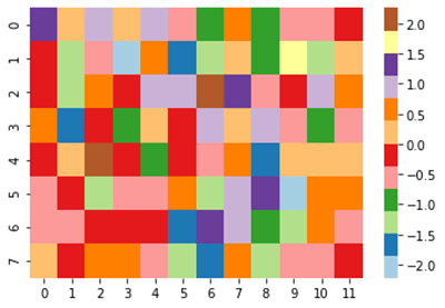
In the above example we have plotted the heatmap with the feature known as cmap where we can use different color palettes from the seaborn library. There is also a feature known as diverging palette where we can set the color range.
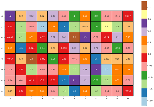
Syntax:
import seaborn as sns
import numpy as np
import matplotlib.pyplot as plt
data_ = np.random.randn(8,12)
plt.subplots(figsize=(15,10))
ax = sns.heatmap(data_, cmap = 'Paired', annot = True, square = True)
Output:
In the above example we have plotted the heatmap with suitable figure size using the matplotlib library. We have set the layout size of (15,10) with which we will plot the heat map for better clarity. We have used a special attribute known as annot in the seaborn library that allows us to visualize the values inside the heatmap.
Syntax:
import seaborn as sns
import numpy as np
import matplotlib.pyplot as plt
data_ = np.random.randn(8,12)
plt.subplots(figsize=(15,10))
ax = sns.heatmap(data_, cmap = 'Paired', annot = True, square = True,
linewidths=1, linecolor = 'k')
Output:
In this example for a better visualization we have used some of the cosmetic attributes such as line width and line color from the seaborn library. It allows us to separate each squares with a specific line with varying with and color so that individual squares are visualized clearly and neatly. We have used the line width as 1 and line color as black (‘k’) so we can see the black line separating individual squares clearly.
Seaborn comes with some very important features. First, the framework offers a very lightweight framework for building and developing distributed applications and infrastructure. Its power comes from the large number of modules, which are easy to maintain and use. Second, the package is very large, mainly based on python modules which are very widely used and widely tested. Finally, the package also supports writing the code in different programming languages (such as c, C#, Java, Python, PHP, and R).
Conclusion – Seaborn heatmap
In this article we have discussed about the seaborn Heatmap with various examples. We have plotted various Heatmaps using seaborn library and Matplotlib library and demonstrated different attributes and parameters to the heatmap function. Seaborn is an open source library used in python programming language. It provides high quality API for data visualization. It consists of modules representing data streams, operations and data manipulation. Seaborn library along with Matplotlib is widely used around the data science community. We hope this article helps. Thank you.
Recommended Articles
This is a guide to Seaborn heatmap. Here we discuss the seaborn Heatmap with various examples along with the plotted various Heatmaps using seaborn library. You may also have a look at the following articles to learn more –
