Updated March 17, 2023
Introduction to Seaborn Line Plot
Seaborn line plot is the data visualization library of python based on the module of matplotlib. The seaborn library provides a high-level interface for drawing the line plot. Using the seaborn, we draw an informative and attractive statistical graph. Moreover, we can draw the line plot with the possibility of several groupings of semantics. For example, the x and y relationship is shown in different subsets.

Key Takeaways
- Seaborn is a library that was used to plot the line. We can object to the relationship between categorical and continuous values in the data format, which was continuous.
- The function of the seaborn line plot is creating the function of line charts in python using the seaborn package.
Overview of Seaborn Line Plot
The visual semantics parameter is used to control and identify the different subsets. Using seaborn, we can show the three dimensions independently by using the types of semantics. Still, we can say that this plot style is hard to interpret and ineffective by using the semantics of redundant. However, it helps make the graphics accessible. In python, seaborn is a visualization library used for graphics plotting. This library provides default color palettes and styles to make the line plot and other types of plots more attractive and valuable.
How does the Seaborn Line Plot work?
The dataset’s visual representation is chosen per the dataset or the type we want from the plot. For example, a scatter plot is preferred for visualizing the relationship, which was statistical. But at the time, coming up with the data, which varies with the time, then scatter plot is not a good choice same time we are using it.
At the time of working with it, we need to follow below steps as follows:
1. While working with the seaborn line plot, we must install the seaborn library in our system.
Code:
pip install seabornOutput:
2. After login into the python shell, we now need to import the package of seaborn, and also we need to import the package of matplotlib. We are importing both packages by using the import keyword as follows.
Code:
import seaborn as sns
import matplotlib.pyplot as plt
Output:
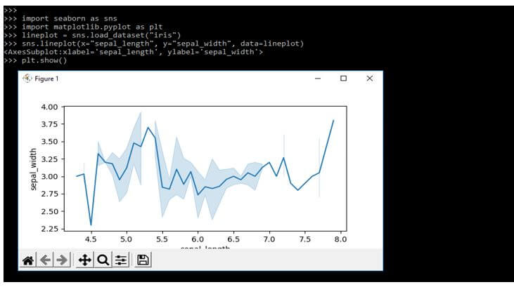
3. After importing the seaborn and matplotlib package in this step, we are loading the data set as follows.
Code:
lineplot = sns.load_dataset("iris")Output:
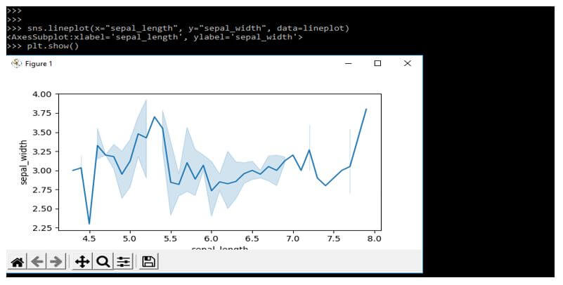
4. After loading the data set in this step, we plot the line plot as follows. We are plotting x and y plots as follows.
Code:
sns.lineplot(x = "sepal_length", y = "sepal_width", data = lineplot)
plt.show()
Output:
Seaborn Line Plot Parameters
Different parameters are available in the seaborn line plot, which we use in the line plot.
Below syntax shows the seaborn line plot as follows:
Syntax:
sns.lineplot(parameters);Below are the different types of parameters that we need to use at the time plotting a line as follows:
- X, y – This is the input data variable which is numeric. Using those variables, we can pass the data directly and reference columns into that specified data.
- Hue – This parameter is used to group the variables producing lines by using different types of color, whether numeric or categorical. So mapping of color behaves directly in other cases.
- Style – Variable grouping in it will produce different dashes and a marker that contains the numeric type, but it will always treat as categorical.
- Data – It is a data frame where every frame variable contains each row in an observation.
- Size – This parameter is nothing but the grouping of values producing the line using different widths.
- Palette – It is a method of choosing colors when mapping is used.
- Hue_order – It specifies the categorical levels and order processing of hue semantics.
- Hue_norm is a pair of values we set in the normalization range.
- Units – It is a vector or key.
- Style_order – It is an accepted order.
- Markers – It’s determining how to draw the markers.
- Estimator – This is the name of the panda’s method.
- Seed – It is a random number.
- Sort – Data is sorted as per order.
- Kwargs – This is a keyword argument.
- Markers – The object will determine how we can draw the markers for the different levels of variable style. This parameter is critical in a seaborn line plot.
- Legend – This parameter is showing that how we can draw the legend. The numeric, hue and size variables are represented using sample or spaced values.
Examples of Seaborn Line Plot
Different examples are mentioned below:
Example #1
Below is an example of the seaborn lineplot as follows. In the below example, we are plotting the x and y line plot as follows.
Code:
import seaborn as sns
import matplotlib.pyplot as plt
lineplot = sns.load_dataset("iris")
sns.lineplot(x="sepal_length", y="sepal_width", data=lineplot)
plt.show()
Output:
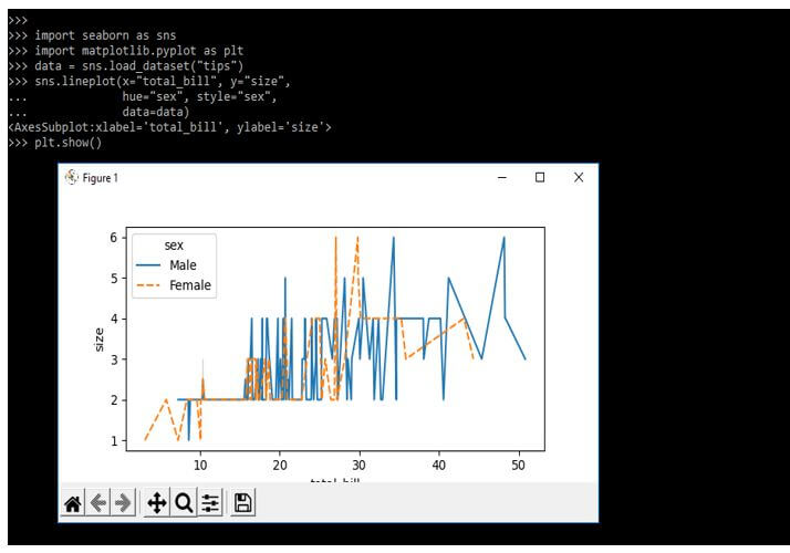
Example #2
In the example below, we are drawing the line plot using hue and style. In addition, we are using the x and y-axis.
Code:
import seaborn as sns
import matplotlib.pyplot as plt
data = sns.load_dataset("tips")
sns.lineplot(x="total_bill", y="size",
hue="sex", style="sex",
data=data)
plt.show()
Output:
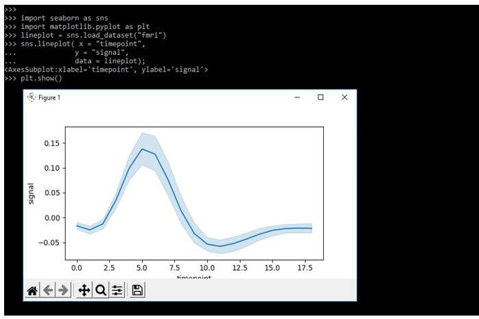
Example #3
In the below example, we are using fmri to plot the line. In addition, we use x, y, and data parameters to plot the line.
Code:
import seaborn as sns
import matplotlib.pyplot as plt
lineplot = sns.load_dataset("fmri")
sns.lineplot( x = "timepoint",
y = "signal",
data = lineplot);
plt.show()
Output:
FAQ
Given below is the FAQ of Seaborn LinePlot:
Q1. What is the use of the seaborn lineplot method?
Answer:
It is a data visualization library that was based on matplotlib. It provides the interface which was drawing statistical graphics.
Q2. How to plot wide-form data in a seaborn lineplot?
Answer:
We can plot the wide form of data using a library of pandas and seaborn. We can also load data by using panda’s library.
Q3. How can we customize line plots by using seaborn?
Answer:
We can use the hue for segregating the data set into individual line plots based on our feature.
Conclusion
The seaborn library provides a high-level interface for drawing the line plot. Using the seaborn, we are drawn to informative and attractive statistical graphs. Furthermore, the Seaborn library provides default color palettes and styles to make the line plot and other types of plots more attractive and valuable.
Recommended Articles
This is a guide to Seaborn Line Plot. Here we discuss the introduction, working, seaborn line plot parameters, examples, and FAQ. You may also have a look at the following articles to learn more –
