Updated March 16, 2023
Definition of Seaborn Graphs
Seaborn graphs is a plot by using seaborn, it is a graphics library of python which was built on top of matplotlib library. Seaborn is allowed to plot graphs in less code. Seaborn is providing the multiple functions to plot the graph as per graph we need to function in seaborn. Analyzing the data by using graphs is making understand better, seaborn graphs will make the understanding of data more easily.
What are Seaborn Graphs?
Data analysis is a very crucial task in any process. It is allowing us to find the trends in our data that we can notice by looking at our data. Seaborn library of python will helps us to visualize the data and draw conclusions. Seaborn is the library that was used underneath matplotlib for plotting the graph. The seaborn graphs are used to visualize the distribution which was random. For plotting the seaborn graph we need to install the seaborn library in our system.
There are multiple types of graphs available in seaborn, by using the same we can draw the graph as per our request. The seaborn graph is an important aspect of machine learning and artificial intelligence applications. We can gain a key insight into our data through graphical representation. To use the various methods we are using python graphics libraries like seaborn.
There are multiple functions that were defined in seaborn to plot the graphs and plots. We are using the pyplot module to plot the graph in seaborn. If suppose we want to plot the particular axis then we are using the plotting function into the axes objects. The operations for manipulating the figure procedure. We are using the show function to display the plotted graphs in seaborn.
Key Takeaways
- The seaborn graphics library is a most useful and important library which was used for statistical visualization in python.
- For using the seaborn graph we need to install the seaborn in our system. To use seaborn we need to install python, it is a prerequisite to use seaborn.
How to Create Seaborn Graphs?
At the time of creating we need to follow the below steps as follows.
- At the time of creating seaborn graphs first, we are installing seaborn. While creating the seaborn graph we are installing the seaborn library in our system. In the below example, we can see that we are installing the seaborn using the pip command.
Code:
pip install seaborn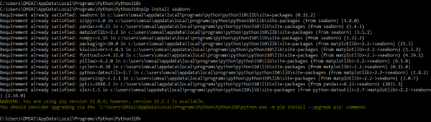
2. At the time of creating the seaborn graph we need to import the library by using the import keyword. In the below example, we are importing the seaborn, matplotlib, and pandas library for creating the seaborn graph as follows.
Code –
import seaborn as sns
import matplotlib.pyplot as plt
import pandas as pd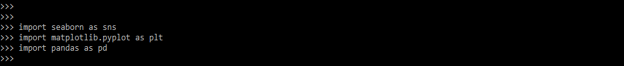
3. In this step we are defining the x and y axis of the graph. In x axis we are defining the student’s name and in y axis we are defining the student’s marks as follows.
Code –
stud_name = ['ABC', 'PQR', 'XYZ', 'MNP', 'CBD', 'BCD']
stud_marks = [65, 73, 49, 86, 52, 91]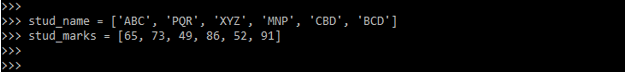
4. After defining the axis of the graph now we are using the stripplot function to draw the seaborn graphs as follows.
Code:
graph = sns.stripplot (stud_name, stud_marks);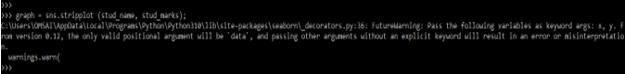
5. After defining the x and y axis of the plot, now in this step we are setting the title of the x and y axis. Also, we are calling the catplot method to plot the seaborn graph as follows. We have defined x label as stud name and y label as stud marks.
Code:
graph.set (xlabel = 'Stud Name', ylabel = 'Stud Marks')
6. After defining the x and y label now in this step we are defining the name of the graph and plotting the graph as follows.
Code:
plt.title('student result');
plt.show ()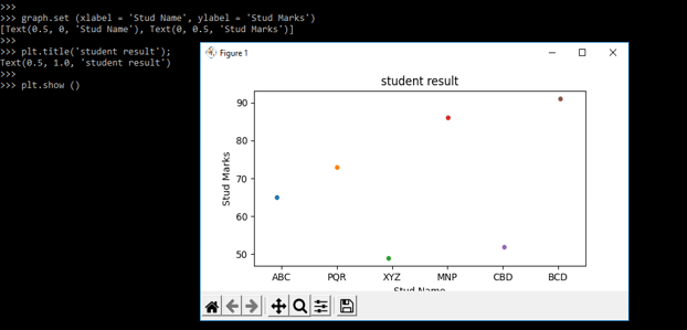
Seaborn Graphic Library
Seaborn graphic library is one of the graphics libraries used for data visualization. Seaborn is providing multiple color palettes and colors to make graphs more attractive. The main aim of seaborn graphics library is to make the visualization more attractive. The seaborn graphics are based on matplotlib. Seaborn graphics library is integrated with the panda’s library.
Seaborn graphics library is categorized into the following categories as follows. Graphs are generally used to visualize the relationship between variables.
- Distribution graphs – These graphs are used to examine the distribution.
- Relational graph – This graph is used to understand the relationship between two variables.
- Categorical graphs – This graph is used to categorize the variables.
- Multi plot grids – This is used to plot multiple instances.
- Matrix graphs – This graph is a type of array for the scatter plots.
We are installing the seaborn graphics library by using the pip command. To install this library we need to install python.
Code:
python –V
pip install seaborn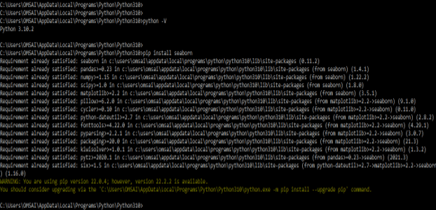
The seaborn line graph is the basic graph that represented the seaborn library as follows.
Code –
import seaborn as sns
import matplotlib.pyplot as plt
sns.set(style="dark")
graph = sns.load_dataset("tips")
sns.lineplot(x = "tip", y = "total_bill", data = graph)
plt.show()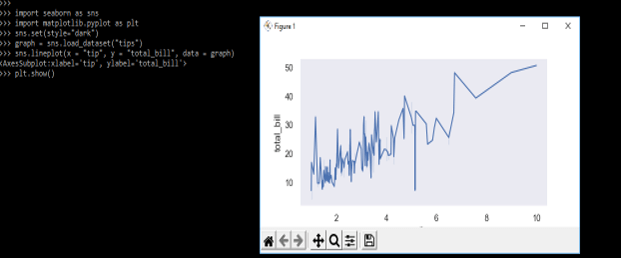
In the below example we are plotting lmplot from the seaborn graphics library as follows.
Code –
import seaborn as sns
import matplotlib.pyplot as plt
sns.set(style="dark")
graph = sns.load_dataset("tips")
sns.lmplot(x = "tip", y = "total_bill", data = graph)
plt.show()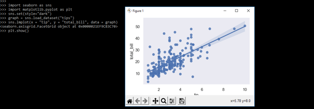
Examples
In the below example we are plotting the stripplot as follows.
Code –
import matplotlib.pyplot as plt
import seaborn as sns
sns.set(style="white")
graph = sns.load_dataset('tips')
ax = sns.stripplot(x = 'tip', y = 'total_bill', data = graph)
plt.title('Seaborn Graph')
plt.show()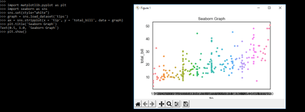
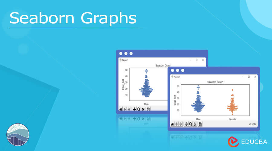
In the below example, we are plotting the swarmplot as follows.
Code –
import matplotlib.pyplot as plt
import seaborn as sns
sns.set(style="white")
graph = sns.load_dataset('tips')
ax = sns.swarmplot (x = 'sex', y = 'total_bill', data = graph)
plt.title('Seaborn Graph')
plt.show()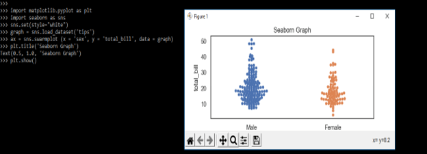
In the below example, we are plotting the barplot as follows.
Code –
import matplotlib.pyplot as plt
import seaborn as sns
sns.set(style="white")
graph = sns.load_dataset('tips')
seaborn = sns.barplot (x = 'sex', y = 'total_bill', data = graph)
plt.title('Seaborn Graph')
plt.show()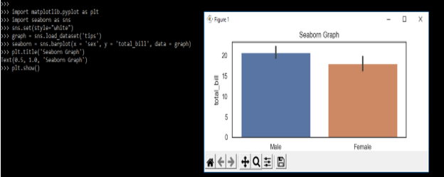
FAQ
1. What is the use of seaborn graphs in python?
Seaborn graphs are very useful and important in python for visualizing the data. We can make multiple types of graphs to visualize the data.
2. Which libraries do we need to use while working with seaborn graphs in python?
We need to use the seaborn, numpy, matplotlib, and pandas library while working with seaborn graphs in python.
3. What is the use of the show method in seaborn graphs?
We are using the show method to display the specified graph which we have created by using specified data.
Conclusion
Data analysis is a very crucial task in any process. It is allowing us to find the trends in our data that we can notice looking at our data. Seaborn is used to plot seaborn graphs., it is a graphics library of python which was built on to the top of matplotlib library.
Recommended Articles
This is a guide to Seaborn Graphs. Here we discuss the Definition, What is seaborn graphs, How to create seaborn graphs, examples, Key Takeaways, and FAQs. You may also have a look at the following articles to learn more –
