Updated March 15, 2023

Introduction to Seaborn jointplot
Seaborn jointplot provides a convenient interface to the class of joint grid by using several types of points. It is intended for a lightweight wrapper; suppose we need more flexibility, we are using a joint grid directly. We draw a plot by using two variables to define the seaborn jointplot. It is very important; also, we are drawing two graphs using univariate and bivariate.
Key Takeaways
- Seaborn jointplot displays the two variable relationships as it will be defining the profile of 1D. The class of seaborn jointplot is convenience which was wrapping the joint grid.
- The tool of multivariate distribution is important for demonstrating this plot; this plot is sampling for multidimensional and natural clustering.
What is Seaborn jointplot?
The seaborn joint plot comprises three plots; out of the three plots, the first plot will display the bivariate graph, showing how the dependent variable will vary with the independent variable. Another joint plot is placed on the top of the bivariate chart, showing the distribution of the dependent variable. The third plot is placed on the right of the bivariate graph. It is very helpful to draw univariate and bivariate together in a single graph. The univariate analysis focuses on one variable, and it will describe summarizations and show patterns.
How to Add Seaborn jointplot?
The seaborn jointplot module is computed from the scatter graph, which contains different histograms on the upper edge of the plot. We are using joint plot method for creating the seaborn jointplot in python. The below example shows how we can add the jointplot method as follows. The example below shows that we have first imported the matplotlib and seaborn library. We need to import the library in our code to add the seaborn joint plot. Before importing the library package, first, we need to install the seaborn package in our system.
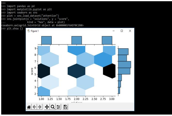
After importing the packages then, we add the dataset to our code. In the below example, we are adding the attention dataset. After loading the dataset, we define the method of jointplot. After defining the method, we are displaying the plot as follows.
Code:
import pandas as pd
import matplotlib.pyplot as plt
import seaborn as sns
plot = sns.load_dataset("attention")
sns.jointplot (x = "solutions", y = "score",
  kind = "hex", data = plot)
plt.show ()
Output:
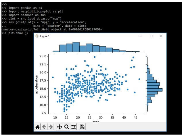
While adding the seaborn jointplot in the below example we are using the jointplot parameter as x, y axis also we are using the kind and data parameter. We are loading the dataset name as mpg as follows. We are importing the package name as matplotlib and seaborn.
Code:
import pandas as pd
import matplotlib.pyplot as plt
import seaborn as sns
plot = sns.load_dataset("mpg")
sns.jointplot(x = "mpg", y = "acceleration",
  kind = "scatter", data = plot)
plt.show ()
Output:
Seaborn jointplot Method
Basically the seaborn is the library that was taking features from the matplotlib. This library is providing a high level of interface to us. Seaborn is helping to solve the problems of matplotlib parameters and the working of data frames.
Below is the syntax of seaborn method as follows:
Syntax:
seaborn.jointplot (parameters)Seaborn method is taking multiple parameters as input. By using seaborn jointplot method in python we need to load the predefined data set or we can create our excel file to load the data.
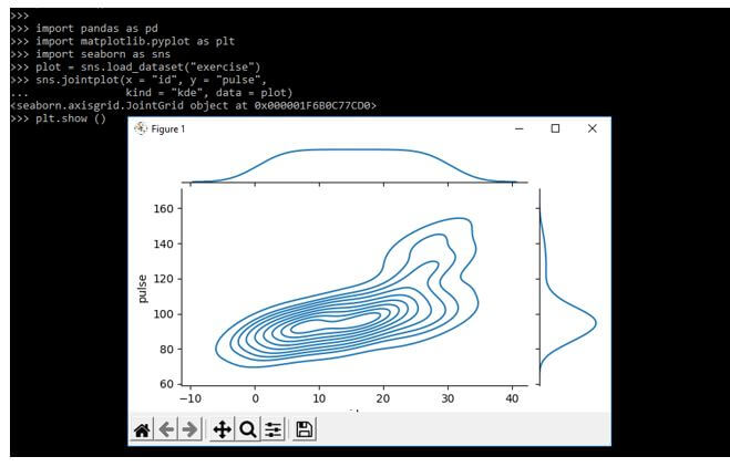
The below example shows the seaborn jointplot method as follows. We are loading the exercise data set to define the jointplot method as follows.
Code:
import pandas as pd
import matplotlib.pyplot as plt
import seaborn as sns
plot = sns.load_dataset("exercise")
sns.jointplot(x = "id", y = "pulse",
  kind = "kde", data = plot)
plt.show ()
Output:
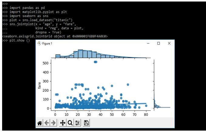
We are loading the titanic data set to define the jointplot method as follows. In the below example we are using x, y, kind, dropna, and data parameters as follows.
Code:
import pandas as pd
import matplotlib.pyplot as plt
import seaborn as sns
plot = sns.load_dataset("titanic")
sns.jointplot(x = "age", y = "fare", kind = "reg", data = plot, dropna = True)
plt.show ()
Output:
Parameters of Seaborn jointplot
As we know that seaborn jointplot is taking multiple parameters as input. Below are the parameters which we are using in seaborn jointplot.
seaborn.jointplot (multiple parameters)- X and y – This is nothing but the variables which was used to specify the position of the x and y axis.
- Data – This parameter is used to take the data frame when x and y contain the variable names.
- Kind – This is an optional parameter. It will take to draw plot kind.
- Color – This is an optional parameter. It will take color to plot the elements.
- Dropna – This parameter will take the value as Boolean. This is an optional parameter.
- Return – It is joint grid object which contains plot on it.
- Height – This parameter is showing the actual size of figure.
- Ration – It will show the ratio of joint axis.
- Space – It will show the space between marginal joint axes.
- Marginal tricks – If suppose this parameter is false then it will suppress ticks on count.
- Hue – It is a semantic variable that was mapped to determine the elements of color plot.
- Palette – This is nothing but the method which was used to choose the colors at the time of mapping the semantic of hue.
- Hue order – This parameter is specifying the order plotting and processing for levels which was categorical.
- Hue norm – This parameter is nothing but the pair values which was used to set the normalization.
- Kwargs – It is additional keyword arguments which were used to pass the function.
Examples of Seaborn jointplot
Given below are the examples mentioned:
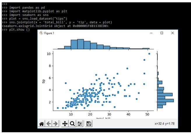
Example #1
In the below example, we are loading the tips data set.
Code:
import pandas as pd
import matplotlib.pyplot as plt
import seaborn as sns
plot = sns.load_dataset("tips")
sns.jointplot(x = 'total_bill', y = 'tip', data = plot)
plt.show ()
Output:
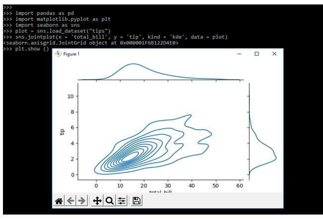
Example #2
In the below example, we are using input parameters as x, y, kind, and data. We are loading the tips data set.
Code:
import pandas as pd
import matplotlib.pyplot as plt
import seaborn as sns
plot = sns.load_dataset("tips")
sns.jointplot(x = 'total_bill', y = 'tip', kind = 'kde', data = plot)
plt.show ()
Output:
FAQ
Given below are the FAQ mentioned:
Q1. What is the use of seaborn jointplot in python?
Answer:
Seaborn jointplot is used to display the relationship of two different variables. It will work with bivariate and univariate functions. Also, we are creating jointplot using this method.
Q2. Which libraries we are using with seaborn jointplot?
Answer:
We are using the seaborn and matplotlib library at the time of using the seaborn jointplot in our project.
Q3. How we can draw jointplot by using a color scheme?
Answer:
We are using the hue parameter at the time of defining the jointplot method to draw the color scheme.
Conclusion
The seaborn joint plot comprises the three plots, out of the three plots the first plot will display the bivariate graph which was showing how the dependent variable will vary with the variable which was independent. It is intended for a lightweight wrapper in the method of joint grid.
Recommended Articles
This is a guide to Seaborn jointplot. Here we discuss the introduction, how to add seaborn jointplot? method, parameters, examples, and FAQ. You may also have a look at the following articles to learn more –
