Updated March 27, 2023
Definition of Python Tkinter Label
A Python Tkinter Label is a Tkinter widget class that is used to display text or image in the parent widget. It is a non-interactive widget whose sole purpose is to display any message to the user. Now let us first look at the Python Tkinter Label’s syntax, and then we will discuss why we use it in the first place.
Syntax:
w = Label (master, option, ...)The following are the parameters of Python Tkinter Label:
- Master: This is the parent widget.
- Options: This represents a list of options that can be used on the parent widget. These are key-value pairs that are separated by a comma.
Options Used in Python Tkinter Label
Python Tkinter Label is used to specify the container box where we place text or images. It is used to provide the user with information about the widgets used in the Python application.
The following are the options that can be used in the Python Tkinter Label:
- anchor: This option helps us control the position of the text when the parent widget has more space than the text needs. The value of the anchor corresponds to the different options available in a compass. The default option being CENTER.
- bg: This signifies the background color that is to be displayed behind the label and the indicator.
- bitmap: This is used to display an image in the label
- bd: This indicates the size of the border around the indicator. The default value is 2 pixels.
- cursor: This is used to denote the type of cursor, i.e. arrow or dot.
- font: This signifies the font in which the label is to be displayed.
- fg: This option helps to set the color of the text when we are displaying text in the label. When we are displaying bitmap, this option helps us to determine the color of the 1-bits in the bitmap.
- height: It determines the vertical dimension of the label.
- image: It helps us to set an image in the label widget.
- justify: It determines how multiple lines of text would be aligned with respect to each other. The possible options are LEFT for left-justified, CENTER for center alignment and RIGHT for right-justified. The default value is CENTER
- padx: This signifies the extra spaces added to the label’s start and end. The default value is 1.
- pady: This signifies the extra spaces added to the top and bottom of the text in the label. The default value is 1.
- relief: It determines the appearance of the border around the label. The default value is FLAT.
- text: This option is used to display one or more lines of text in a label widget.
- textvariable: This option also helps us display text in the label widget; the only difference is the method by which we are showing the text. In the textvariable method, a StringVar class object is created and then using the set option on that object, we can assign the text.
- underline: With this option’s help, we can display underline beneath the text in a label. The underline would start from the 0th element and commence on an nth element. The default value for underline is -1, which means there is no underline.
- width: This signifies the width of the label in characters. The label will be sized to fit its content if this option is not set.
- wraplength: This helps us to limit the number of characters in each line by mentioning the value to the desired value. The default value is 0.
Examples of Python Tkinter Label
The Label widget is a standard Tkinter widget used to display text or images. Below given are the examples of python tkinter label:
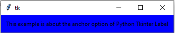
Example #1
Code:
from tkinter import *
root = Tk()
var = StringVar()
label = Label( root, anchor = CENTER , bg = "blue", textvariable = var, bd = 10, cursor = "dot")
var.set("This example is about the anchor option of Python Tkinter Label")
label.pack()
root.mainloop()
Output:
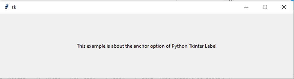
Example #2
Code:
from tkinter import *
root = Tk()
label = Label( root, height = 10, width = 100, padx = 2, pady = 2, text="This example is about the anchor option of Python Tkinter Label")
label.pack()
root.mainloop()
Output:
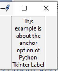
Example #3
Code:
from tkinter import *
root = Tk()
var = StringVar()
label = Label( root, underline = 2, wraplength = 70, textvariable = var, relief = "groove")
var.set("This example is about the anchor option of Python Tkinter Label")
label.pack()
root.mainloop()
Output:
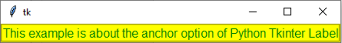
Example #4
Code:
from tkinter import *
root = Tk()
var = StringVar()
label = Label( root, font = "bold", fg = "green", bg = "yellow", textvariable = var, relief = "groove")
var.set("This example is about the anchor option of Python Tkinter Label")
label.pack()
root.mainloop()
Output:
Conclusion
In the following article, we have discussed the basics of the Python Tkinter Label. Primarily we saw the syntax along with the reason why we use the Python Tkinter label. After that, we discussed the options that can be used to tweak the labels. Lastly, we concluded the article by seeing multiple examples of the same. So next time you ponder upon Tkinter, do remember to use the features of Python Tkinter Label.
Recommended Articles
This is a guide to Python Tkinter Label. Here we discuss the definition and various options used in the python Tkinter label along with different examples and its code implementation. You may also have a look at the following articles to learn more –
