Updated March 27, 2023
Introduction to Python Tkinter button
Python Tkinter button is one of the most popularly used graphical user interface in python to design buttons in GUI’s. Here, the button widget in Tkinter is used to build various types of buttons in the GUI interfaces that are being developed.
Syntax:
Button(master,option=value,)
Attributes of Python Tkinter Button
Following are the list of attributes:
| Option | Description |
| active background | color of the background area of the button when it gets clicked. |
| active foreground | Color of the text in the button when it gets clicked. |
| bd | border-width of the button |
| bg | the initial background color of the button. |
| command | the operation which needs to take place on the click of the button. |
| fg | the color of the text label placed on the button. |
| font | font of the text to be used in the label of the button. |
| height | represents the height of the button which is used. |
| highlight color | focus highlight color |
| image | if an image needs to be used instead of a text in the button. |
| justify | how the text needs to be aligned in the button, whether it needs to be left-justified or right-justified else in the center. |
| padx | the padding area between the label and the button corners on the left and right side of the button. |
| pady | the padding area between the label and the button corners in the above and below the area of the button. |
| relief | mentions the variety of the border that needs to be used, some among the usual values are SUNKEN, GROOVE, RAISED and RIDGE. |
| state | the option which needs to be set when the mouse is over it.
|
| underline | used to underline the text of the label in the button, when the value is -1, nothing remains underlined, whereas when the value if nonnegative, then the corresponding character in the text will be underlined. |
| width | mentions the width of the button. |
| wrap length | allows to wrap the text label. |
Examples 0f Python Tkinter Button
Given below are some of the examples of Tkinter:
Example #1
Code:
import tkinter as tk
Object creation for tkinter
parent = tk.Tk()
button = tk.Button(text="QUIT",
                   bd=10,
                   bg="grey",
                   fg="red",
                   command=quit,
                   activeforeground="Orange",
                   activebackground="blue",
                   font="Andalus",
                   height=2,
                   highlightcolor="purple",
                   justify="right",
                   padx=10,
                   pady=10,
                   relief="groove",
                   )
pack geometry manager for organizing a widget before palcing them into the parent widget.
possible options "Fill" [X=HORIZONTAL,Y=VERTICAL,BOTH]
                 "side" [LEFT,RIGHT,TOP,UP]
                 "expand" [YES,NO]
button.pack(fill=tk.BOTH,side=tk.LEFT,expand=tk.YES)
kick the program
parent.mainloop()
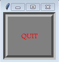
Output:
Explanation:
For implementing the GUI functions using tkinter, the tkinter library needs to be installed. It can be installed using pip or any other standard python install technique. The program starts with the import of the tkinter library with the reference name of tk. an object for the tkinter class is created in the name of the parent. Next, a button variable is declared with the listed attribute values,
- Width of the border: 10
- Background-color: grey
- Foreground color: red,
- Operation Command: quit
- Active Foreground color: Orange
- Active background-color: blue
- Font: Andalus
- Height: 2
- Highlight color: purple
- Justification for Alignment: right
- Padding for x-axis: 10
- Padding for the y-axis: 10
- Relief Value: groove
Initiating the above-given arguments generates a button accordingly; from the generated button being a widget, it is packed into the parent widget using the pack command. Technically, the pack command is in the form of the method pack(). Applying this method to the variable button initiates a widget with the mentioned properties over the base widget. the base widget which is being used here could be a panel or any other graphical user interface. the pack() method is associated with three major arguments when encapsulating the button variable.
They are as below:
- Fill: X=HORIZONTAL, Y=VERTICAL, BOTH
- side: LEFT,RIGHT,TOP,UP
- expand: YES, NO
At last, the mainloop() function of the Tkinter object is triggered for setting up the GUI creation program into execution. We can notice an active button being prompted on the execution of the program being placed on a sophisticated GUI panel.
Example #2
Code:
import tkinter as tk
Object creation for tkinter
parent = tk.Tk()
button = tk.Button(text="QUIT",
                   bd=10,
                   bg="black",
                   fg="white",
                   command=quit,
                   activeforeground="Orange",
                   activebackground="blue",
                   font="calibri",
                   height=2,
                   highlightcolor="purple",
                   justify="left",
                   padx=2,
                   pady=2,
                   relief="ridge",
                   )
pack geometry manager for organizing a widget before palcing them into the parent widget.
button.pack()
kick the program
parent.mainloop()
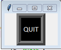
Output:
Explanation:
This program is very much similar to the above one functionally, nut the properties of the widget which has been created are widely modified here. First, let us discuss the various display properties which are nicely associated with this button widget,
- Width of the border: 10
- Background-color: black
- Foreground color: white,
- Operation Command: quit
- Active Foreground color: Orange
- Active background-color: blue
- Font: calibri
- Height: 2
- Highlight color: purple
- Justification for Alignment: left
- Padding for x-axis: 2
- Padding for the y-axis: 2
- Relief Value: ridge
Again here initiating the over mentioned arguments creates a button accordingly like before, And also here the packing of the widget is carried on more precisely to mention the application is considered to be destroyed without the packing operation in its position. Hence, being packed is a default operation to take place, but on different terms here, the packing is achieved by placing zero arguments. Still, on different terms here, the packing is achieved by means of placing zero arguments. This means all the argument value for the packing process is settled with its default association.
At last, the mainloop() function of the Tkinter object is triggered for setting up the GUI creation program into execution. We can notice an active button being prompted on the execution of the program being placed on a sophisticated GUI panel.
Conclusion
Tkinter offers some among the cool options for graphical user interface design, and the predominant form of button design and executions are covered in a detailed manner.
Recommended Articles
This is a guide to Python Tkinter Button. Here we discuss the introduction to the python Tkinter Button along with appropriate syntax, attributes, and respective examples. You can also go through our other suggested articles to learn more –
