Updated March 24, 2023
What is Gantt Chart?
The Gantt chart, often used in project management, is among the most popular and useful ways to view activities (tasks or events) on time.t is a Gantt chart, a handy tool of project management professionals that are heavily used to track projects. Gantt chart essentially converts the project information to visual representation. It is much easier to monitor the progress of a project through a visual representation rather than actually going through the data. Power BI offers a very up-to-date Gantt chart functionality using which an insightful Gantt chart can be built.
Components of Power BI Gantt Chart
A Gantt chart is made of some important components. These are as follows:
1. Task: Tasks are basically activities involved in the project.
2. Duration: It refers to the estimated timeline for the completion of each task.
3. Start: A date on which execution of a task shall begin.
4. %Completion: It essentially shows how much of the task work has been completed.
5. Resource: Technical, domain, or other experts required in the project.
To create Power BI Gantt Chart you need data to work with, so you can download the excel workbook template from the below link which is used for this example.
How to Create Gantt Chart in Power BI?
In the following section, we will go through the detailed step-by-step process to create Gantt Charts in Power BI.
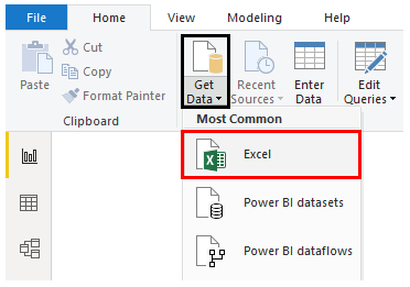
- Step 1: Load the dataset into Power BI. For that click on Get Data Menu under Home Tab. From the drop-down menu of Get Data, select appropriate data source type. In this case, it is Excel, so clicked on Excel as shown by the below screenshot.
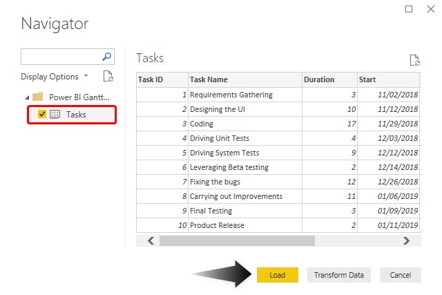
- Step 2: Select the files from the location it is stored. Once the requisite dataset is selected, in the Navigator window, select the appropriate sheet from the Excel workbook, and then click on Load.
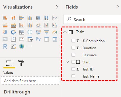
- Step 3: The data gets loaded into Power BI. Requisite dimensions and measures present in the dataset can be seen on the right side of the screen.
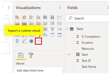
- Step 4: Note, in the above screenshot, in the Visualizations section we cannot find the Gantt chart. This is because, Gantt chart is not available directly, and it needs to be imported as a custom visual. For this, click on “Import a custom visual” symbol as highlighted below.
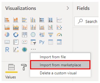
- Step 5: The Gantt chart needs to be imported from the marketplace, and so click on the “Import from marketplace” option.
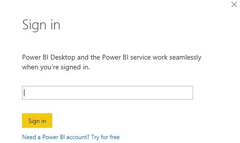
- Step 6: One needs to be registered through the official email id. Sign in to have access to the marketplace.
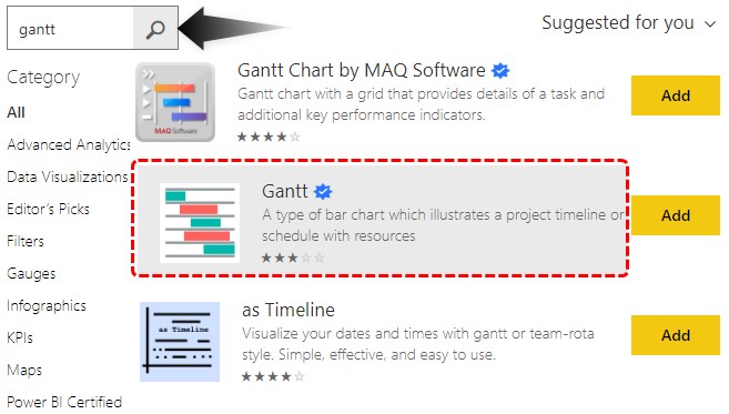
- Step 7: In the marketplace window, in search, type “Gantt” to discover all available Gantt chart options. This is as shown below. We get a list of Gantt charts, Just click on the Add button to add the chart to the Visualizations section.
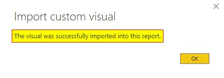
- Step 8: Once the chart is imported into the Power BI environment, we get a success message as shown.
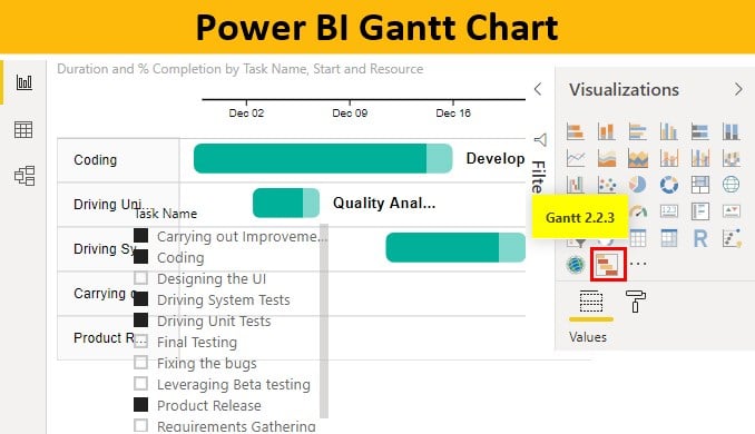
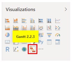
- Step 9: The imported Gantt chart can be found in the Visualizations section. It has been highlighted in the below screenshot.
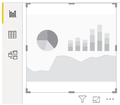
- Step 10: The chart can be brought into the analysis. For this click on the newly brought Gantt chart symbol as shown below.
- Step 11: Gantt chart is made of certain components. As a visualization giving clear details of the project schedule and assisting project managers in monitoring the task, it must make use of each component judiciously. Power BI as a visual analytics tool very well ensures that Gantt chart for a project gives the details in the most effective manner.
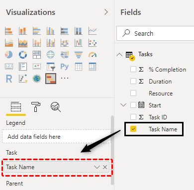
In order to generate an insightful Gantt chart, we must drag dimension or measure over corresponding components in the Fields section. We’ll drag each of them one-by-one sequentially. Let’s first start with Task Name. Drag Task Name dimension over Task in Fields section. Ensure that while dimension or measure is being dragged over the corresponding field, closely observe how the Gantt chart is getting affected.
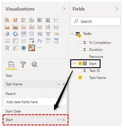
- Step 12: Now, drag Start over Start in Fields.
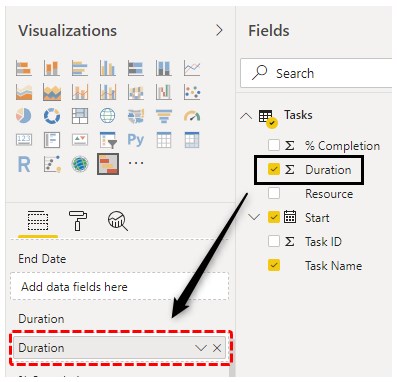
- Step 13: Now, drag measure Duration over Duration in Fields.
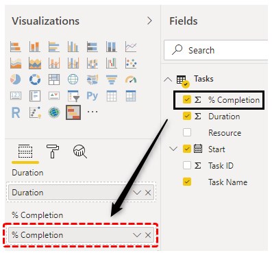
- Step 14: Now, drag %Completion measure over % Completion in the Fields section.
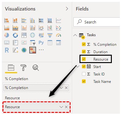
- Step 15: Finally drag Resource over Resource in Fields. Remember Resource is a very crucial component of a project, and a Gantt chart must have it.
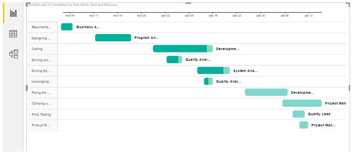
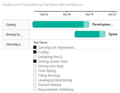
- Step 16: When we perform the above steps properly, we end up getting a Gantt chart as shown by the following screenshot. Here, the Gantt chart has two colors, light green and dark green. The former corresponds to Duration, while the latter corresponds to %Completion. In this way, the Gantt chart in Power BI provides us detailed insights into the project schedule. However, in the below chart, the size of the text is too small. We’ll overcome this issue by following the steps mentioned in the subsequent section.
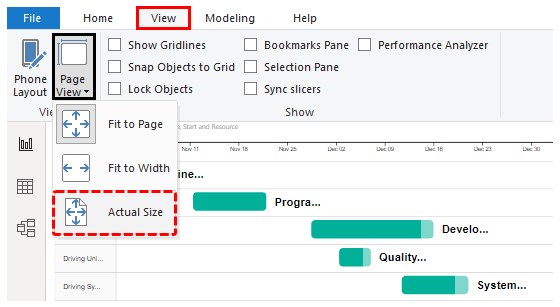
- Step 17: In the View tab, under the “Page View” menu, select “Actual Size”, and click on it. This is illustrated by the below screenshot.
Following the above steps, we get an insightful Gantt chart. Now, we can see that the size of the text has increased considerably. We can view the requisite part of it using scrolls.
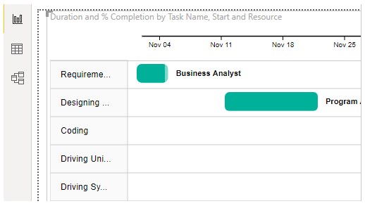
- Step 18: As we can see above, the Task Names have got slightly buried, and we cannot view the names clearly. In order to overcome this, we can use a Slicer, so that the task names can be viewed properly. The following screenshot shows a slicer being added to facilitate easy task selection.
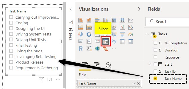
Slicer also allows us to select tasks as per our requirements and analyze the project schedule. This is as shown below.
Note: Power BI dashboard file can also be downloaded from the link below and the final output can be viewed.
Things to Remember
- Gantt chart as functionality is not available directly and needs to be imported from the marketplace.
- Gantt chart has various components, and all these must be taken into consideration. Moreover, they must correspond to the respective fields.
- In the marketplace, various types of Gantt charts are available. It’s always good to explore each of them one-by-one, in order to discover the uniqueness offered by each of them.
Recommended Articles
This is a guide to Power BI Gantt Chart. Here we discuss how to Create Power BI Gantt Chart to essentially convert the project information to visual representation along with a practical example. You may also look at the following articles to learn more –
