Updated June 20, 2023
What is Bullet Chart in Power BI?
The following article provides an outline for Power BI Bullet Chart. A bullet Chart is a visualization chart type that gives excellent insight. Though slightly complex, the chart is an effective tool for measuring the performance of KPI. Power BI provides an elaborate mechanism to build and use bullet charts for decision-making. Bullet charts prove particularly useful when conducting performance measurements across different categories.
How to Create Bullet Chart in Power BI?
We will use the Product Sales dataset to understand the concept of a bullet chart in Power BI. The dataset contains data about six different products. For each product, there are five measures provided: Actual, Target, Poor, Good, and Excellent. Using these measures, we are going to build bullet charts for each of the products. The bullet chart takes into consideration multiple measures. Let’s go through the demonstration as follows. To create a Bullet Chart, we will need data. So you can download the Excel workbook from the below link, which is used for this example.
The following section will go through the detailed step-by-step process to create Bullet Charts in Power BI.
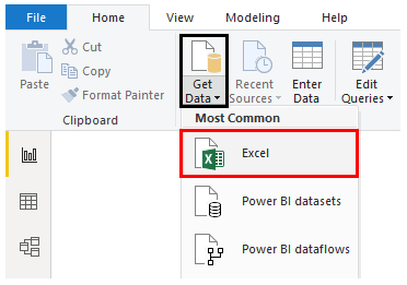
Step 1: Load the dataset into Power BI. For that, click on the Get Data Menu under Home Tab. Select the appropriate data source type from the Get Data drop-down menu. In this case, it is Excel, so click on Excel, as shown by the below screenshot.
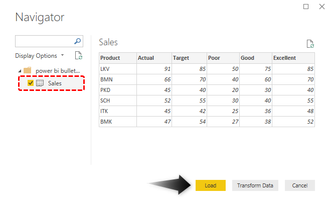
Step 2: In the Navigator pane, select the appropriate sheet from the workbook (Sales in this case). The pane on the right-hand side displays the loaded data from the sheet. Finally, click the Load button highlighted in yellow to load the data into Power BI.
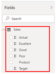
Following the above procedure successfully loads the data into Power BI, and the required dimensions and measures can be seen in the Fields section on the right-hand side of the screenshot.
Step 3: We have loaded the data, as seen below.
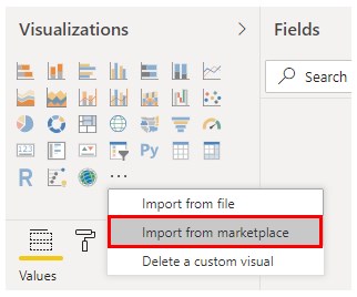
Step 4: The bullet chart is unavailable as an in-built chart option in the Visualizations section and must be imported from the marketplace. Just click on the “Import a custom visual” icon in the Visualizations section, and click “Import from the marketplace” in the pop-up menu.
Step 5: Now, sign in using appropriate credentials, i.e., username and password.
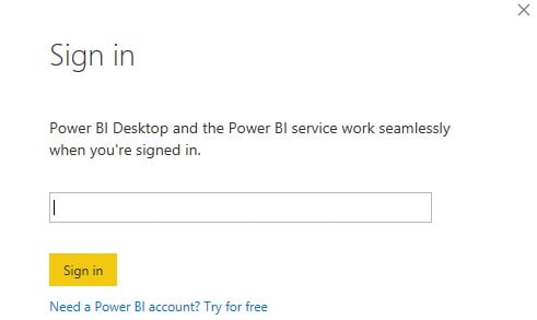
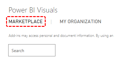
Step 6: We can only use a Corporate or Student ID to access this feature. Successful login takes us to Power BI Visuals Marketplace, as shown in the screenshot. Click on the marketplace, and the available visuals appear. We must select the required visuals from these options. Search the required one in the search box located on the left-hand side.
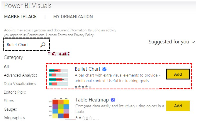
Step 7: When we search ‘bullet’ in the marketplace, various options for visualization appear from which we can select the required one. Read the description for the option to be specified before proceeding ahead. We selected the first Bullet Chart option. Click the Add button on the right-hand side of the chart tool to add the chart to Power BI.
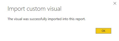
Step 8: After successfully importing the chart into Power BI, a success message will appear, as shown in the screenshot below. Click on Ok to proceed ahead.
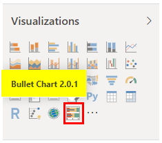
Step 9: The following screenshot shows the newly imported bullet chart visualization being highlighted. Click on the bullet chart symbol in the Visualizations section.
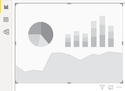
Step 10: We get a bullet chart layout, as can be seen on the left-hand side of the following screenshot. We will bring requisite fields into this layout to obtain the required bullet chart.
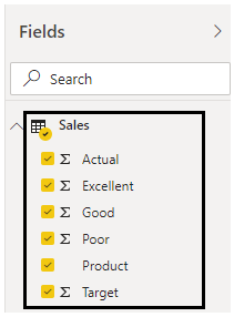
Step 11: Now, select the fields one by one. Select Product, Actual, Target, Poor, Good, and Excellent in this order. The order is significant to generate the right bullet chart.
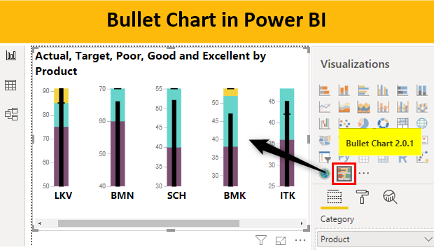
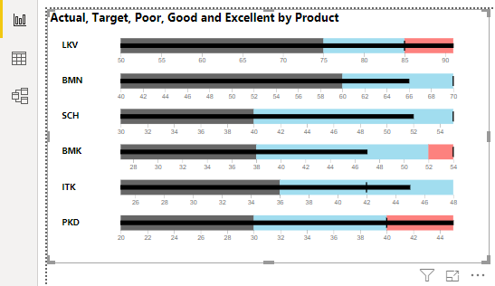
Step 12: When we follow the above step properly, the bullet charts get generated, as seen in the following screenshot. Here the black-colored bar inside represents the Actual measure; the slim vertical line represents Target, and Gray, Sky Blue, and Red colors represent the Poor, Good, and Excellent measures, respectively.
Step 13: We successfully managed to generate a bullet chart visualization. However, we want Poor, Good, and Excellent criteria to be represented by Gray, Sky Blue, and Red colors, respectively. To format the chart, click on the “Format” symbol.
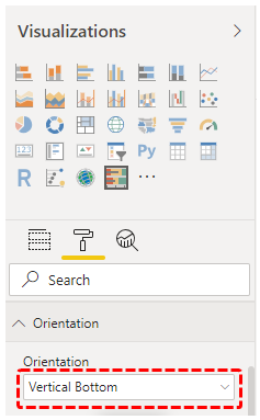
Step 14: First, we will change the orientation of the chart. For that, click on the requisite option in the “Orientation” section in the Format section. From the available options, we selected the “Vertical Bottom” option.
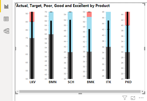
Step 15: When we select the “Vertical Bottom” option by following the above procedure, we get the vertical bullet chart. Observe that the product names appear below the bullet chart.
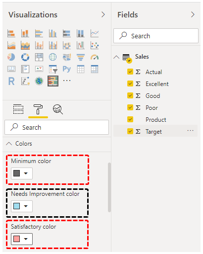
Step 16: Now, we can set the required colors in the Colors section. “In the given representation, ‘Poor’ corresponds to the ‘Minimum’ level, ‘Good’ corresponds to ‘Needs Improvement,’ and ‘Excellent’ corresponds to ‘Satisfactory.'”
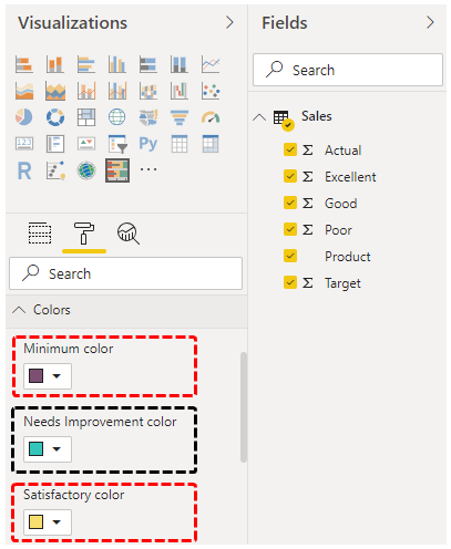
Step 17: Now, we have set Minimum to Purple, Needs Improvement to Green, and Satisfactory to Yellow.
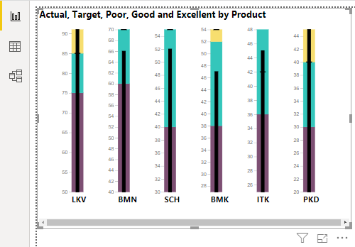
Step 18: Now, as can be seen in the following screenshot, we have got a bullet chart where the red color represents the poor performance category, yellow represents good performance, and the green color represents Excellent. We can see in the screenshot below that the products BMN, SCH, and BMK couldn’t achieve the target, while the rest three exceeded the target.
Things to Remember
- The bullet chart visualization is not available directly as an in-built visualization chart type. It needs to be imported into Power BI from the marketplace.
- Selecting the measures appropriately is crucial in generating an accurate bullet chart. Failure to do so may result in an incorrect visualization.
- The marketplace offers various options for bullet charts, and it is essential to experiment with them to understand the unique features that each option provides.
Recommended Articles
This is a guide to Power BI Bullet Chart. Here we discuss how to create a bullet chart in Power BI, examples, and a downloadable Power BI template. You may also look at the following articles to learn more –
