Updated August 24, 2023
Pivot Chart in Excel ( Table of Contents )
Pivot Chart in Excel
When the data is big, it is often difficult to draw conclusions and tell the stories behind it. A pivot table could well be the tool that can help us in these crunch situations.
A pivot table can cut, slice, summarize and give meaningful results from the data. Usually, after summarizing the data in Excel, we apply graphs or charts to present the data graphically to tell the story visually.
The pivot table does not require your special charting techniques; it can build its chart using its data. Pivot charts work directly with the pivot table and visualize the data most effectively.
In this article, I will explain the process of creating pivot charts in Excel. This will be beneficial for you in your day-to-day work. Download the Excel workbook to practice with me.
How to Create Pivot Chart in Excel?
A pivot table is available in all versions of Excel.
I have sales data for 4 regions across many months. Using an Excel pivot table, I want to know the summary behind this data.
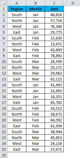
Step 1: Select the data.
Step 2: Go to Insert and apply a pivot table.
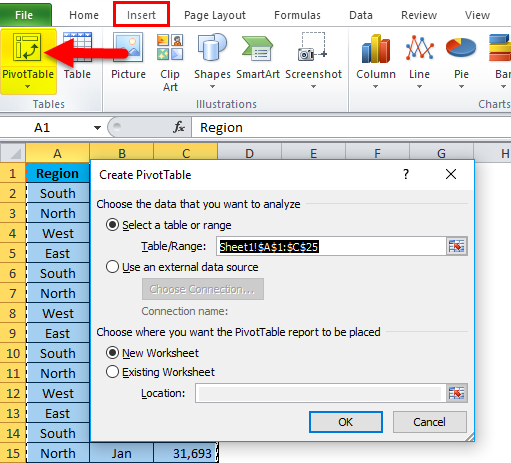
Step 3: Click OK.
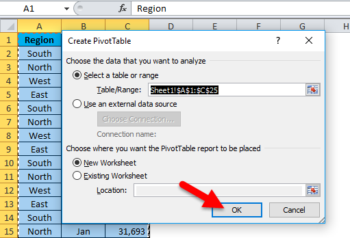
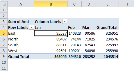
Step 4: Drag and drop Region heading to the ROWS and Sum of Amt heading to the VALUES.
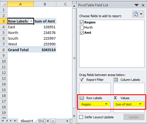
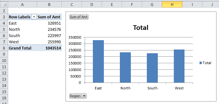
Now we have a summary report region-wise put together of all the months.
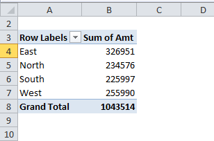
This report only shows a numerical summary; you can insert Pivot Chart if you need a graphical summary.
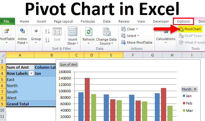
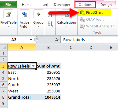
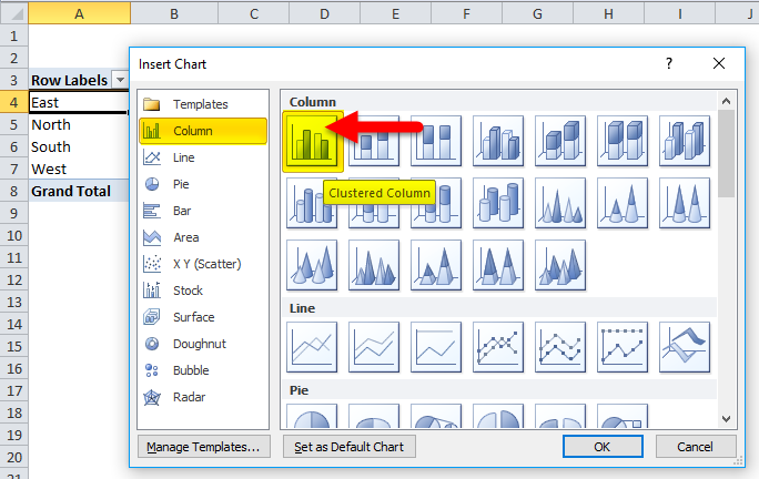
Step 5: Place the cursor inside the pivot table and go to Options. Under this, you will see the Pivot Chart option.
Step 6: Once you click on Pivot Chart, it will show you all the available charts. Please select any one of them as per your wish.
Step 7: Your initial chart looks like this.
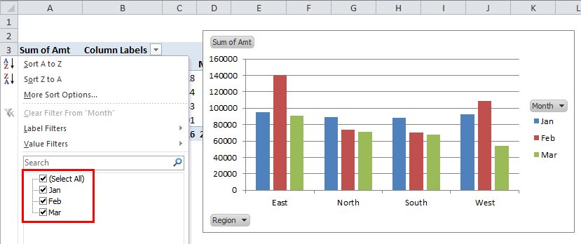
Step 8: Now add the Month heading to the COLUMNS field. It will break up the report region-wise & month-wise.
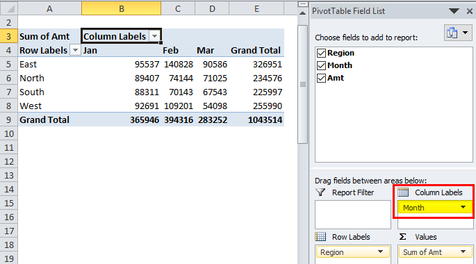
Step 9: Now, look back at the chart. It has automatically updated its charting field. It is also showing the breakup of region-wise & month-wise visuals.
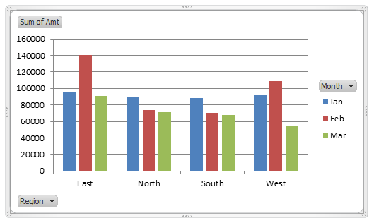
Step 10: If you observe, one drop-down list is available for MONTH & REGION in the chart. These are the controls for the chart.
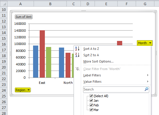
Step 11: If you want to show the result only for Jan, you can select the Jan month from the drop-down list.
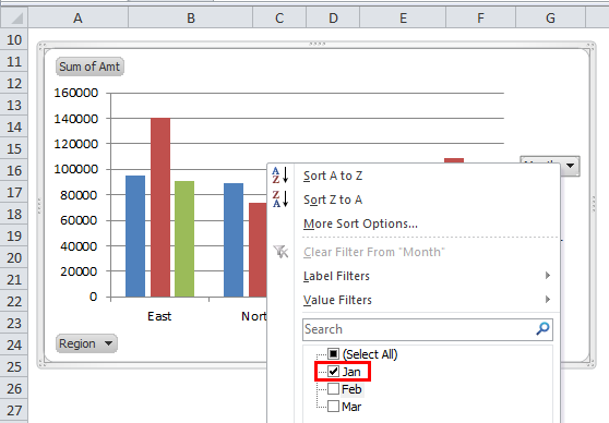
Step 12: It will show the results only for Jan. The important thing is not only in the chart section but also in the pivot region.
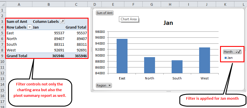
Step 13: A pivot chart controls the pivot, and a pivot table controls the pivot chart. Now the filter is applied in the pivot chart, but I can also release the filter in the pivot table.
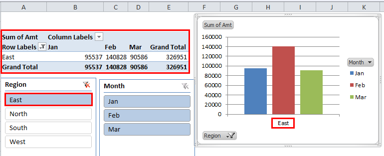
Insert a Slicer Into the Table
All these while you worked with filters in Excel. But we have visual filters in Excel. Slicers are visual filters to filter out any particular category for us.
In our previous section, we selected the Month from the drop-down list either on the pivot chart or on the pivot field, but using SLICERS, we can visually.
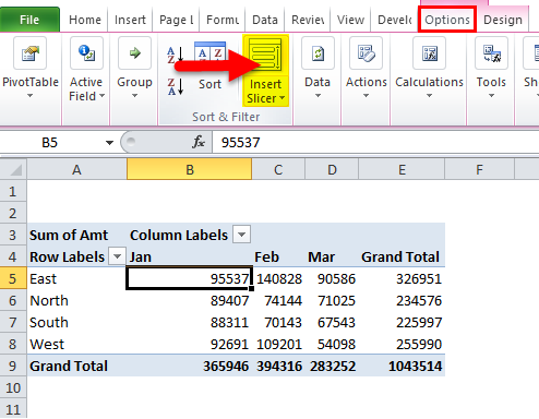
Step 1: Place a cursor inside the pivot table.
Step 2: Go to Option and select Insert Slicer.
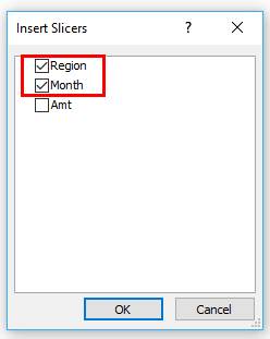
Step 3: It will show you the options dialogue box. Select for which field you need a slicer.
Step 4: After selecting the option, you will see the actual slicer visual in your worksheet.
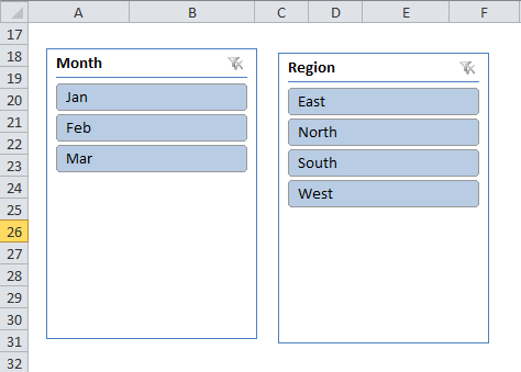
Step 5: Now, you can control the table and chart from the SLICERS. As per your selection in the slicer, the table and chart will show their results accordingly.
Advantages
- Effective and dynamic chart.
- Visualization and numbers are interdependent.
- It shows drops, highs, lows, everything in a single graph.
- Large data into a concise size.
Things to Remember about Excel Pivot Chart
- If the data is increasing, you need to change the range of the pivot table every time the data increases. So I will advise you to use Excel Tables to auto-update the pivot ranges.
- Both PIVOT FIELD & PIVOT CHARTS are interdependent.
- SLICERS can control both of them at a time
- The range becomes dynamic since the chart is directly connected to the changing numbers.
Recommended Articles
This has been a guide to Excel Pivot Chart. Here we discuss creating Pivot Chart in Excel, practical examples, and a downloadable Excel template. You can also go through our other suggested articles –
