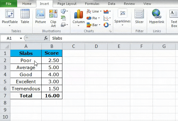
Updated June 12, 2023
Gauge Chart in Excel
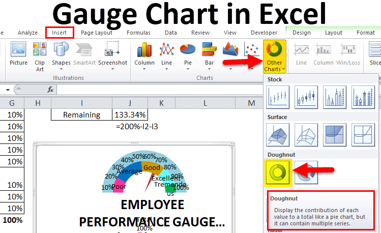
A gauge chart in Excel is a meter type chart of a dial chart, which looks like a speedometer with the pointer toward the numbers mentioned on the arc. The gauge Chart measures and shows the numerical value from zero to its maximum limit. We can use the Gauge chart to show profit, loss, and completion status with percentages. To create a Gauge chart, the first 3 numbers in which some of those 2 numbers give the 3rd value. Then using these numbers, create a Pie Chart, which is there in the Insert menu tab’s Charts section. Once created, delete a portion that came out of the summation of the first 2 numbers. This is what our basic Gauge chart will look like. Now we can choose the data which we want to show on it.
How to Create a Gauge Chart in Excel?
Gauge Chart in Excel is very simple and easy to use. Let’s understand the creation of a Gauge Chart in Excel with some examples.
Example #1 – Create a Simple Gauge Chart in Excel
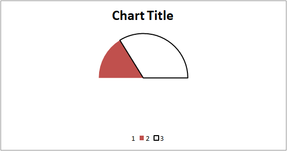
A pie chart can resemble a simple gauge chart in Excel. It does not involve any levels like the speedometer has Poor, Average, Good, or Excellent parameters. It shows only two items: the current achievement and what needs to be achieved.
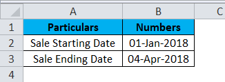
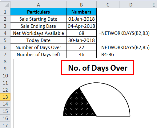
For this example, I have set up data. This data includes the sale starting date and sale ending date.
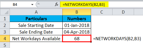
Using the NETWORKDAYS function, I have shown the total days available in the sales cycle. NETWORKDAYS excludes weekends and gives the number of days.
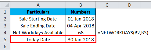
In the next cell, I have entered the current date.
Again using the NETWORKDAYS, I have shown how many days are over from the sales start date.
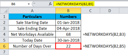
And how many days are left in the sales cycle
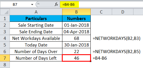
Now we will create a simple gauge chart in Excel that shows the total number of days available, the total number of days over, and the total number of days remaining.
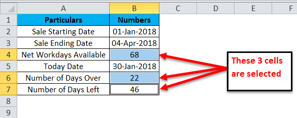
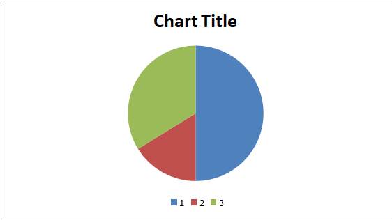
Step 1: Select B4, B6, and B7 cells by holding the Control key.
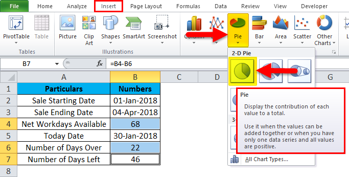
Step 2: Insert a Pie Chart for the selected cells.
Step 3: Now, we have a chart that looks like this.
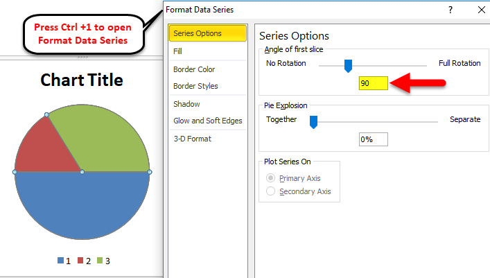
Step 4: Select the chart and press Ctrl + 1, the shortcut key for the format chart. On the right-hand side, you will get format options.
Make the Angle of the first slice 90 degrees.
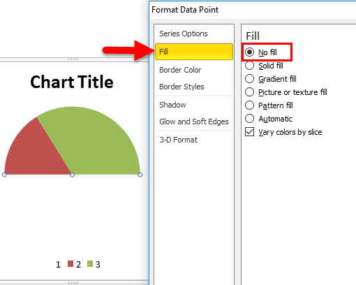
Step 5: Now select the blue colored area, i.e., the highest value, and make the fill as NO FILL.
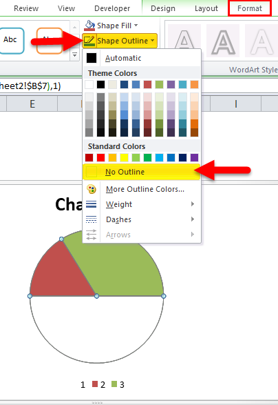
Step 6: Now select the entire chart. Under Format, the tab makes the Shape Outline as No Outline.
Step 7: Now select only the GREEN Colored part to make and the FILL as NO FILL, shape outline as BLACKLINE.
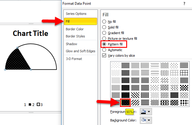
Step 8: Now select only the colored area and make the shape outline like a black line. Go to FILL > Pattern Fill > Select 90% pattern fill.
Step 9: Make the chart title No of Days Over.
Now we have set up a simple Gauge chart. But it does not have any kind of indicators such as Poor, Average, Good, and Excellent parameters; we will see this in the next example.
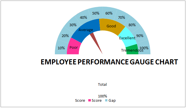
Example #2 – Create a Speedometer Chart with Indicators
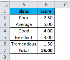
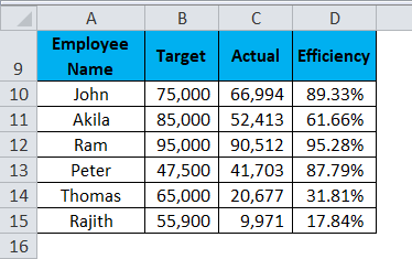
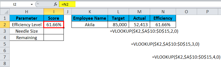
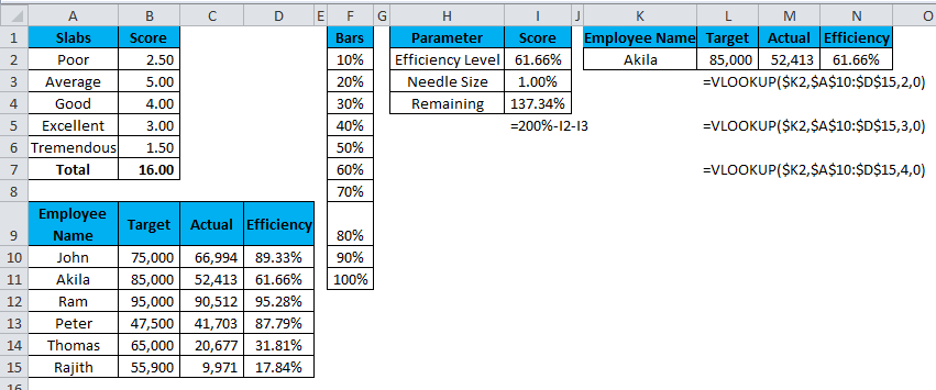
For this example, I am taking sales individual employee’s performance in the last year. To judge them, I have created some slabs for their efficiency level.
Conversely, I have individual sales employee’s performance for the entire year.
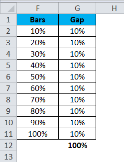
Now create one more data series, as shown in the below image.
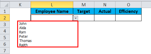
Create a drop-down list of employee names.
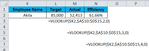
Apply VLOOKUP to get the target, actual, and efficiency level based on the selection from the drop-down.
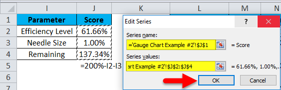
Now create one more table for the Speedometer needle.
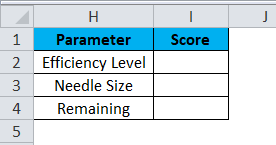
For Efficiency Level, give a link to the VLOOKUP Efficiency cell, i.e., N2.
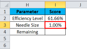
For Needle Size, mention 1%.
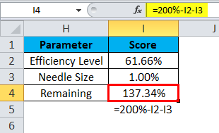
For the Remaining cell, mention the formula as =200%-I2-I3.
We have set up the data required to create a Gauge chart in Excel.
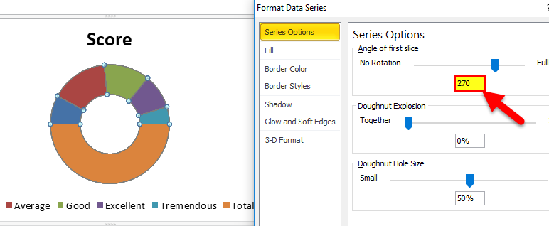
Step 1: Select the first table and insert the donut chart.
Step 2: Your chart should look like this now.

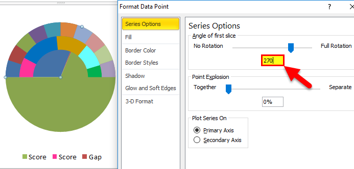
Step 3: Select the chart and make the Angle of the first slice 270 degrees.
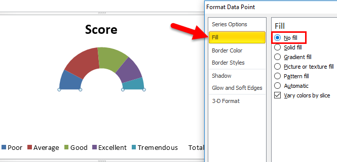
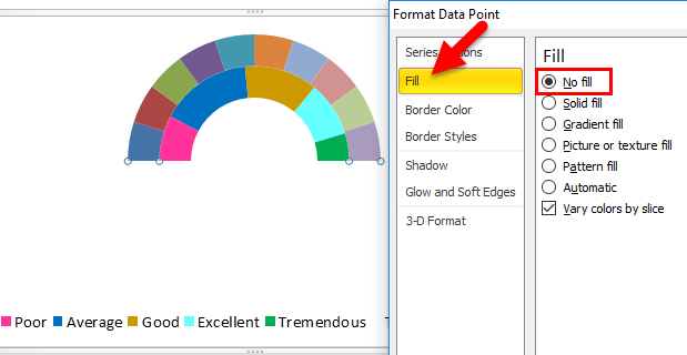
Step 4: Now select the big portion of the donut chart and make the fill as NO FILL.
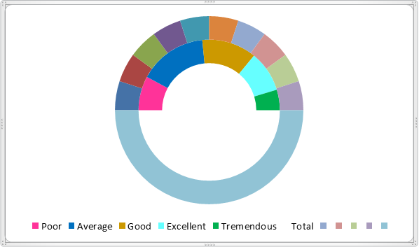
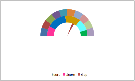
Step 5: For the remaining 5 parts, fill in different colors as shown in the below image.

Step 6: Right-click on the chart and click on Select Data.
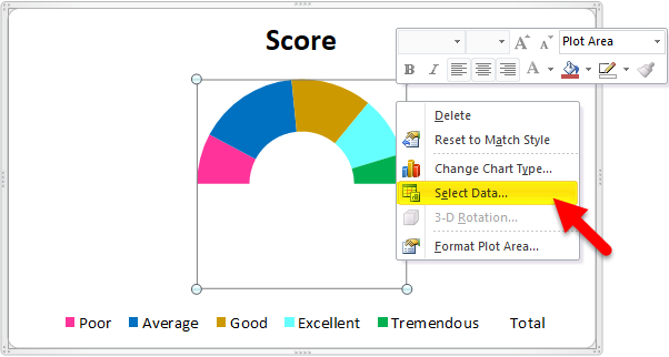
Step 7: Here, select the second table we have created.
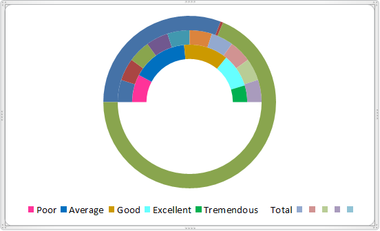
Step 8: Now, our chart looks like this.
Step 9: Again, select the big portion of the newly inserted chart and fill it in as NO FILL.
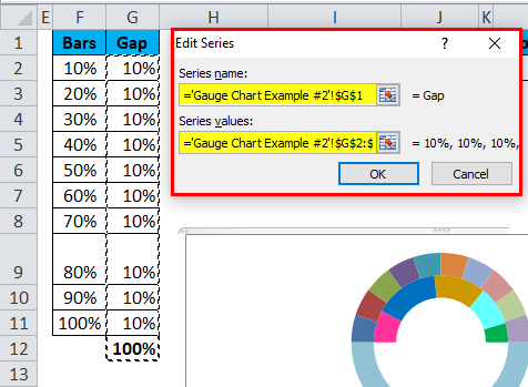
Step 10: Right-click on the chart and select Select Data. Here select the final table we have created.
Step 11: Our chart looks like this now.
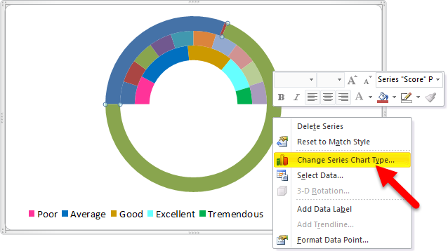
Step 12: Select the newly inserted chart and click Change Series Chart Type.
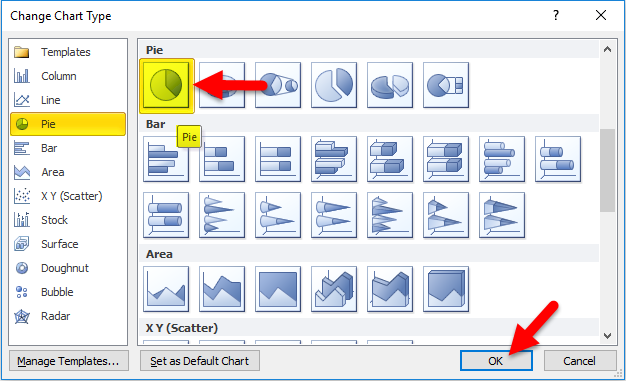
Step 13: Select the PIE chart and then click on OK.
Step 14: Make the Angle 270 degrees.
Step 15: In the PIE chart, fill the two big portions as NO FILL and change the needle size to 5%.
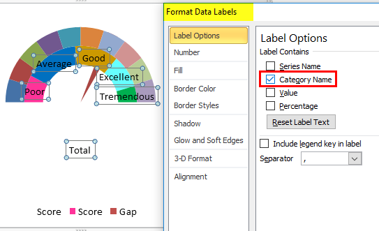
Step 16: Right-click on the first donut chart and select format data labels that select only the category name.
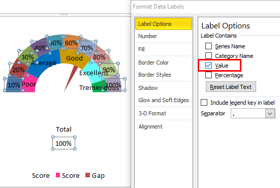
Step 17: Select the second donut chart and add data labels, but this select Value.
Step 18: Make some color adjustments for data labels to look better.
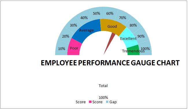
So our Speedometer or gauge chart is ready to use.
As per the change of the employee name, you make it from the drop-down list, and your gauge chart will show the results.
Things to Remember About Gauge Charts in Excel
- Create a drop-down list to make the chart dynamic.
- Even though it looks like a great chart will take a tremendous amount of time to create.
- It is often used in KPI presentations.
- Try different colors to make the chart look great and appealing.
Recommended Articles
This has been a guide to Gauge Chart in Excel. Here we discuss how to create a Gauge Chart in Excel, along with Excel examples and a downloadable Excel template. You may also look at these useful charts in Excel –
