Updated August 24, 2023
Clustered Column Chart in Excel
Clustered Column Charts are the simplest form of vertical column charts in Excel, available under the Insert menu tab’s Column Chart section. It shows the growth of all the selected attributes covering the time period allowed by the chart itself. To create this, we have to select the data which have been available over a different time period, and we will have columns for each parameter. This is quite useful when we want to show growth.
Steps to Make Clustered Column Chart in Excel
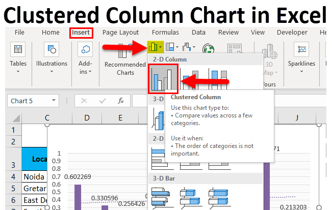
To do that, we must select the entire source Range, including the Headings.
After that, Go to:
Insert tab on the ribbon > Section Charts > > click on More Column Chart> Insert a Clustered Column Chart
Also, we can use the short key; first, we need to select all data and then press the short key (Alt+F1) to create a chart in the same sheet or Press only F11 to create the chart in a separate new sheet.

When we click on more column charts, we get a new window, as mentioned below. We can choose the format and then click on Ok.

How to Make Clustered Column Chart in Excel?
Clustered Column Chart in Excel is straightforward and easy to use. Let us understand the working of Clustered Column Chart with some examples.
Clustered Column Chart in Excel Example #1
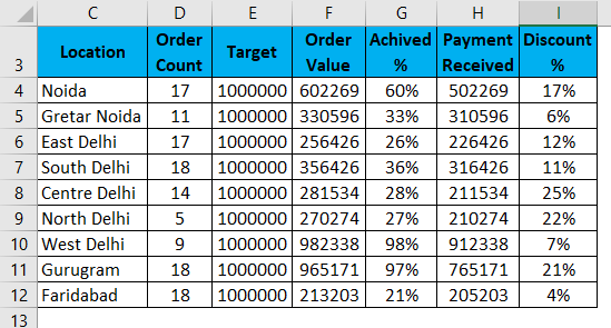
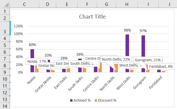
There is a summary of data; this summarization is a company’s performance report, suppose some sales teams in different location zone, and they have a target for the product’s sale. All filed like target, order count, Target, Order Value, Achieved %, Payment received, and Discount % are given in the summary; now we can see them in the table below. So we want to display the report by using a cluster column chart.
First of all, select the Range. Click on Insert Ribbon > Click on Column chart > More column chart.
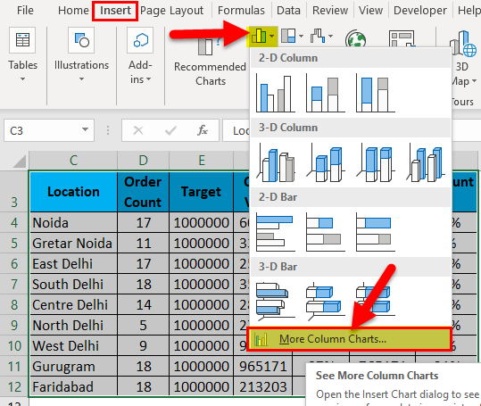
Choose the clustered column chart > Click on Ok.

Also, we can use a shortcut key ( alt+F11).
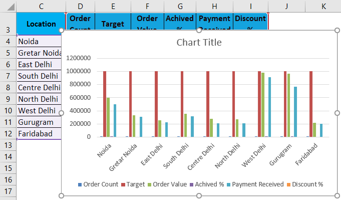
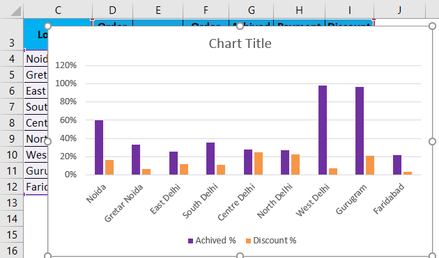
This visualization is defaulted by Excel; if we want to change anything, so excel allows us to change the data and anything we want.
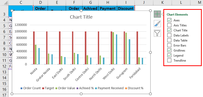
If we see on the right hand, there is an option ‘+’ sign, so with the help of the ‘+ ‘sign, we can display the different chart elements we need.
When we use the chart and select the two tabs, more display. ‘Design ‘and ‘Format ‘as ribbon,
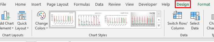
We can format the chart and color themes layout of the chart with the help of the Design ribbon tab.
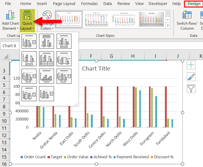
Both ribbons are very useful for a chart. E.g., if we change the layout quickly, click on the Design tab, click on Quick Layout, and change the chart’s layout.
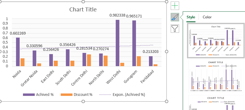
If we want to change the color, we can use a shortcut to change the style and color of the chat; click on the chart, and there is an option highlighted, as shown below.
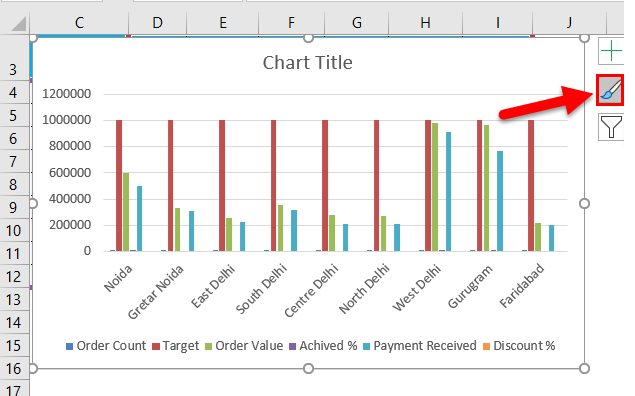
Click on the style you want.
The chart also is given facility to filter the column, which we do not need; similarly, click on the chart; at the right side, we can see the filter sign, as shown below, mentioning the pictures.
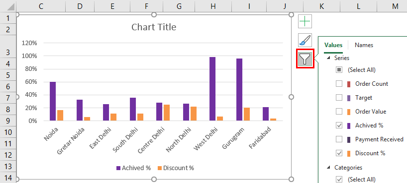
Now we can click on a column we need to show in the chart.
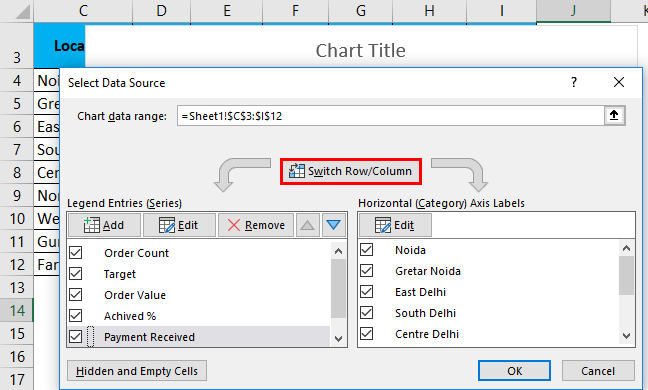
Again we can change the data range also; Right-click on the chart and select the data option; then, we can change the data.
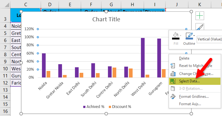
We can change the axis horizontally or vertically by clicking the switch row/column. We can also add or remove and edit a file.
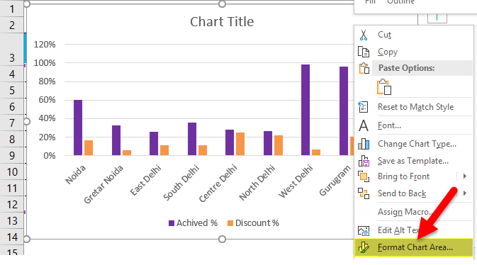
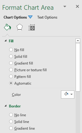
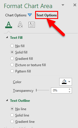
We can also format the chart area by right click on the chart and selecting the format chart area option.
Then we get a new window on the right side, as shown below.
Just click on the chart option, then we can use all options for formatting the chart, like chart title, axis, legend, plot area, series, and vertically.
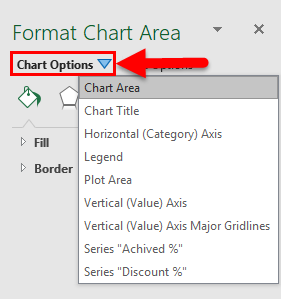
Then click on the option which we want to format.
In the Next Tab, we also format the text.
Some more important things are adding data labels and showing trend lines in chat; we need to know.
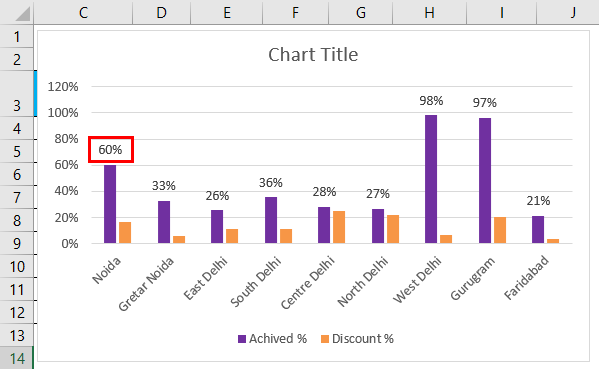
To show data labels as percentages, right-click on a column and click Add data labels.
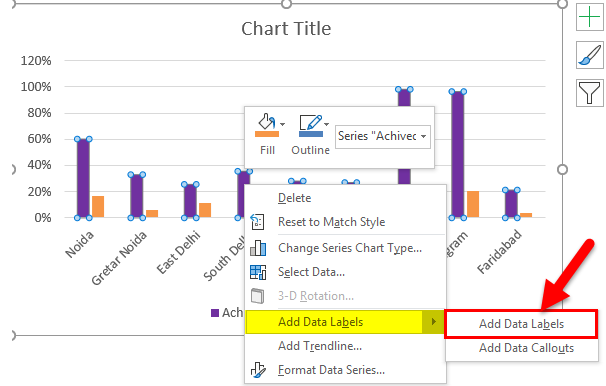
A data Label is added to the chart.
Also, we can show data labels with descriptions. With the help of data callouts. Right-click on column data column labels, click on add data labels and click on add data callouts. The picture is shown below mentioned.
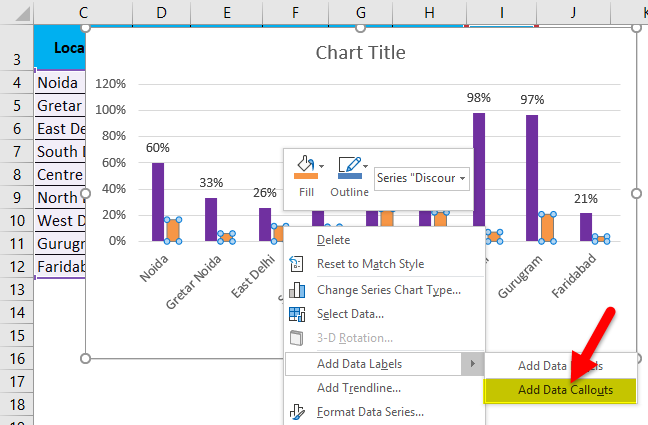
Data Callouts are added to the chart.
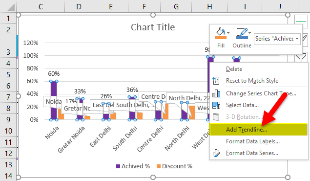
Sometimes we need trend analysis also on a chart. So right-click on data labels and add the trend line.
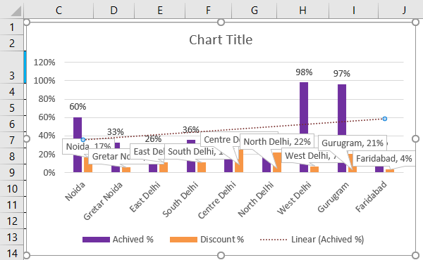
A Trendline is added to the chart.
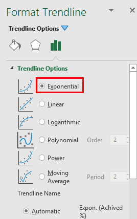
We can also format the trend line.
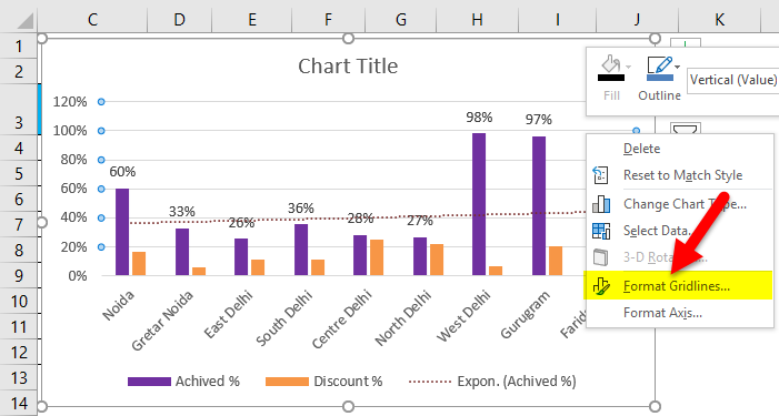
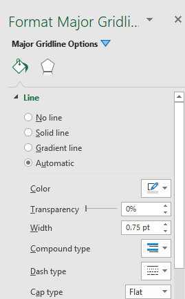
If we want to format the gridlines, right-click on Gridlines and click on format gridlines.
Right Click on Gridlines and click on Add Miner Gridlines.
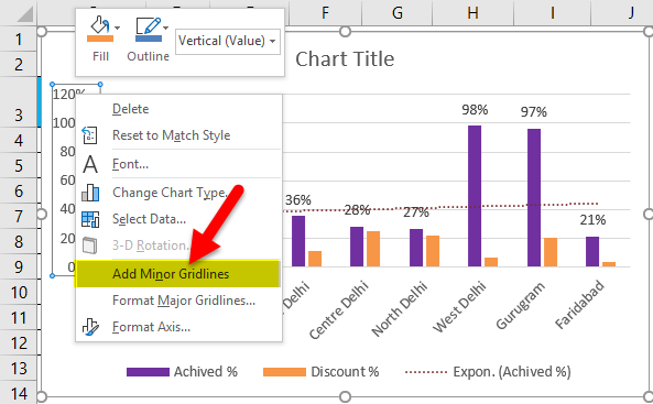
A miner Gridlines is added to it.
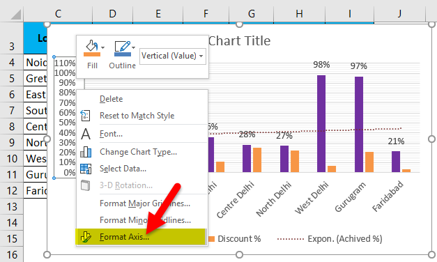
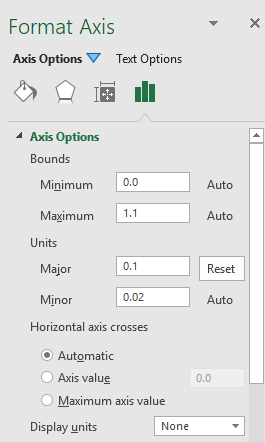
Right Click on Gridlines and click on Format Axis.
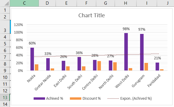
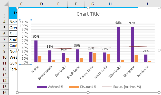
Finally, the Clustered Column Chart looks as given below.
Pros and Cons of a Clustered Column Chart in Excel
Following are the Pros and Cons:
Pros
- Excel defaults to using a Clustered Column chart as the default chart type, but you can change it to another.
- Any person who can understand it and will look presentable who is not much more familiar with the chart.
- It helps us to summarize a vast amount of data in the visualization, so we can easily understand the report.
Cons
- It’s visually complex when we add more categories or series.
- At one time more challenging to compare a single series across categories.
Things to be Remember
- You should fill all columns and labels with different colors to quickly highlight the data in our chart.
- Use self-explanatory chart titles and axes titles. So by the title name, one can understand the report.
- If the data is relevant to this chart, then use this chart; otherwise, if the data is related to different categories, we can choose another representable chart type.
- No need to use extra formatting so that anyone can see and analyze all points.
Recommended Articles
This is a guide to a Clustered Column Chart in Excel. Here we discuss creating the Clustered Column Chart in Excel with Excel examples and downloadable Excel templates. You may also look at these useful functions in Excel –
