Updated August 3, 2023
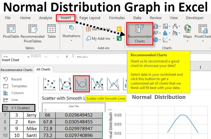
Table of Contents
Normal Distribution Graph in Excel
A normal distribution graph in Excel, plotted as a bell-shaped curve, shows the chances of a specific event or value. It simply helps find the probability of certain events or values. It depends on the average value of the data (mean) and how different or spread out the numbers are (standard deviation).
What is a Normal Distribution Curve? (Bell Curve)
The normal distribution is a bell-shaped curve often appearing in various phenomena around us. For instance, we can find the probability of a person getting a disease due to family history.
Let us understand this with an example.
Imagine if the average sleep of students = 7 hours.
We can plot normal distribution Excel graph to see if each student is getting more, less, or proper sleep compared to the average sleep.
The graph will plot the values in a bell-shaped curve to show each student’s chances of sleeping for exactly 7 hours and the difference between their actual sleep durations and the desired average.
Let us see a few features of an ideal curve and connect them with our example:
| Curve | Example |
| Horizontal axis: Displays the data values, like heights, marks, etc., Vertical axis: Shows the likelihood of those values occurring. |
X-axis: Each student’s sleeping hours
Y-axis: Probability of getting 7-hour sleep. |
| The center is the highest point in the curve.
It represents the average or 49.9% probability. |
Our curve will show the average sleep of 7 hours at the center of the curve (the highest point). |
| The angle gradually decreases on both sides, meaning the values at these points significantly differ from the average.
Simply put: |
All the other sleep hours different from 7 hours will be on either side of the curve.
Simply put: |
Normal Distribution Formula
1. Mathematical Formula
In mathematics, we find the normal distribution using the probability density function (PDF), which is:
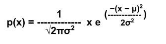
The above formula uses the following parameters:
Mean (μ): It represents the entire data’s middle or average value and determines the curve’s center. The graph compares all the other values with the mean value to find the difference between expectations and reality (probability).
Standard Deviation (σ): It measures how close or far are the other values from the center point (mean) on the graph. It gives us the curve’s width by telling us how spread out the data is.
Exponential Function (e): A special number represents the slope’s increase or decrease. It helps to determine where the probability falls on the curve (left side with decreasing performance or right side with increasing performance).
We can write the above formula in Excel terms in the following way:
2. NORMDIST Excel Function
The above mathematical formula for the normal distribution graph may look complex, so Excel has added this in-built Excel function to simplify it. The normal distribution excel function, NORMDIST, is a statistical function that helps to get a probability of values according to a mean value.
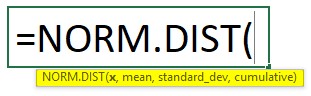
The Excel function uses the following Parameters:
- “Mean” and “standard deviation” are explained above, and “X” is the value you want to find the distribution for.
- “Cumulative” is a logical value where “true” or “false” decides how to calculate the normal distribution. “True” will calculate the normal distribution for all values less than or equal to your selected x-value. In contrast, “False” calculates the probability only for the selected x-value.
How to Calculate Normal Distribution in Excel?
Let us now learn how to calculate a normal distribution for any data in Excel. We will use both the mathematical as well as the NORMDIST function.
We have added an Excel example template for you to follow through with the calculations easily.
Example #1: NORM.DIST Function
A school teacher, William, wants to find the normal distribution graph for his students’ marks. Let us find the normal distribution using Excel’s mean and standard deviation.
Step 1: Add Data
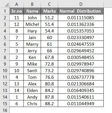
Enter the data with students’ names and marks in the Excel sheet.
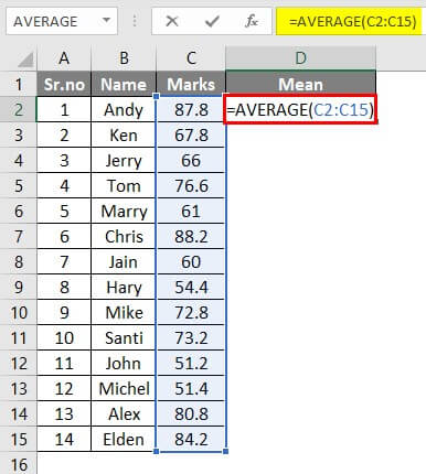
Step 2: Calculate the Mean
To calculate the mean, we will use the average function.
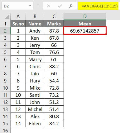
Add the formula “=AVERAGE (C2:C15)” in cell D2.
Press “Enter”, and Excel will calculate and display the mean value of the given marks.
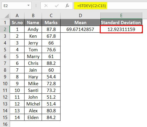
Step 3: Calculate the Standard Deviation
We will calculate the standard deviation in cell E2 using the standard deviation function.
Enter the formula “=STDEV(C2:C15)” in cell E2.
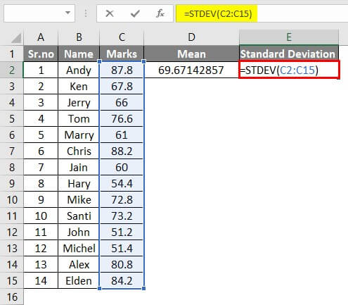
Once you press “Enter”, Excel will display the standard deviation value of the marks.
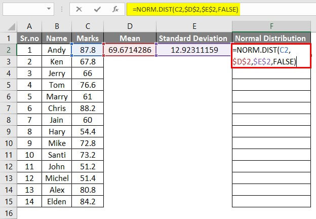
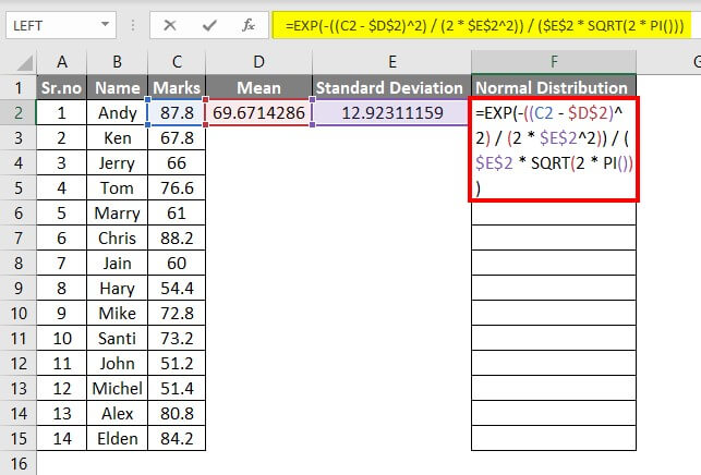
Step 4: Calculate the Normal Distribution
Now, we can find the normal distribution for each student’s mark using the above-calculated mean and standard deviation.
Enter the formula “=NORM.DIST(C2,$D$2,$E$2,FALSE)” in the cell F1.
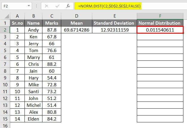
Press Enter, and Excel will show the normal distribution value (0.011540611) for Andy’s marks (87.8).
This normal distribution value shows that Andy got more marks (87.8) than the average class mark (69.67). So, this value will fall on the curve’s right side as it differs from the mean value.
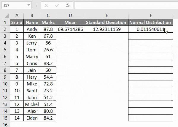
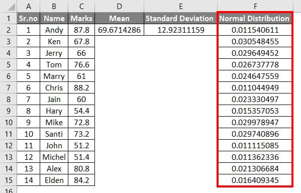
Step 5: Drag the Formula
Now, we will drag the formula from cell F2 to cell F15. We do this to apply the same formula for each student’s data.
You will get the values for normal distribution as below.
The figures in the F column show the chances of the student scoring the specific marks that they got. It also shows how different the marks are from the average expected marks (mean value of 69.67).
For instance, as Andy’s marks (87.8) are higher than the mean, the normal distribution value (0.011540611) will be on the curve’s right side. Similarly, as Ken’s marks (67.8) are less than the mean, his normal distribution value (0.030548455) will be on the left-hand side of the curve.
Less normal distribution signifies better performance, meaning there wasn’t much difference between the average requirement and the actual result.
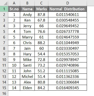
Example #2: Mathematical Formula in Excel
Let us calculate the normal distribution for the same data we used in Example #1, but now we will use the mathematical formula.
Step 1: Enter the below-mentioned formula in cell F2:
Step 2: Press Enter and drag the formula shown in the above example.
The data should look as below.
You can observe in the above image we have received the same result as example 1. This is the normal distribution using the mathematical formula.
How to Make a Normal Distribution Graph in Excel?
After calculating the normal distribution values, making a graph is very simple and easy. Let’s understand how to make a normal distribution Excel graph with an example.
We will see how to plot normal distribution in Excel for each person’s marks using the below table (from Example #1).
Step 1: Sort Smallest to Largest
To create a bell-shaped distribution curve, we must sort the values from lowest to highest.
So, select the Marks Column, including the heading cell (C1 to C15). Then go to the “Home tab” and click on “Sort & Filter” to select the “Sort Smallest to Largest” option.
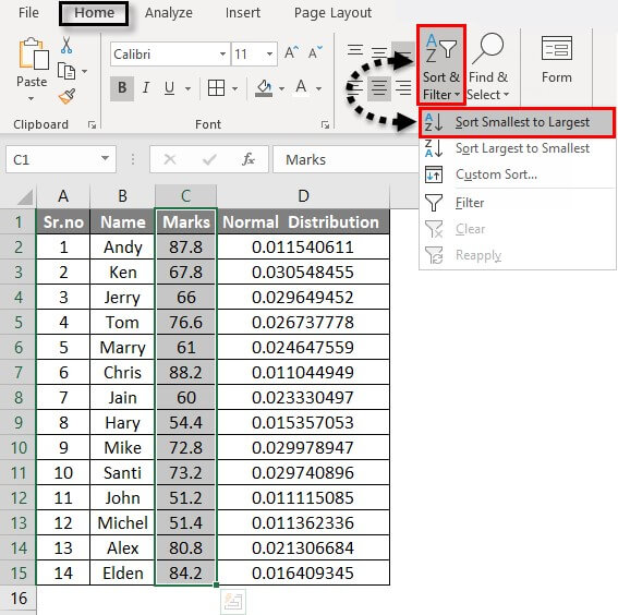
The marks column will get sorted from smallest to largest, and the data will look as in the image below.
Step 2: Go To Recommended Charts
We will select the columns that we want to create the graph.
So, select the Marks and Normal Distribution column →. Go to the “Insert tab” → Click “Recommended Charts”.
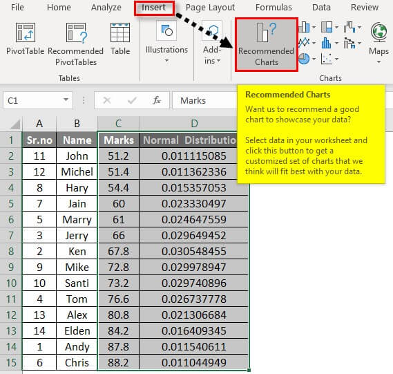
Select “All Charts” while inserting the chart.
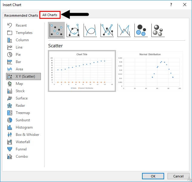
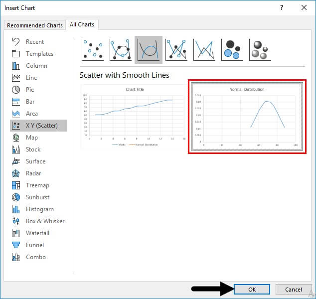
Step 3: Select Normal Distribution Chart
First, select the “X Y (Scatter)” to get to the normal distribution chart. You will see the built-in styles at the top of the dialog box. Click on the third style, “Scatter with Smooth Lines”.
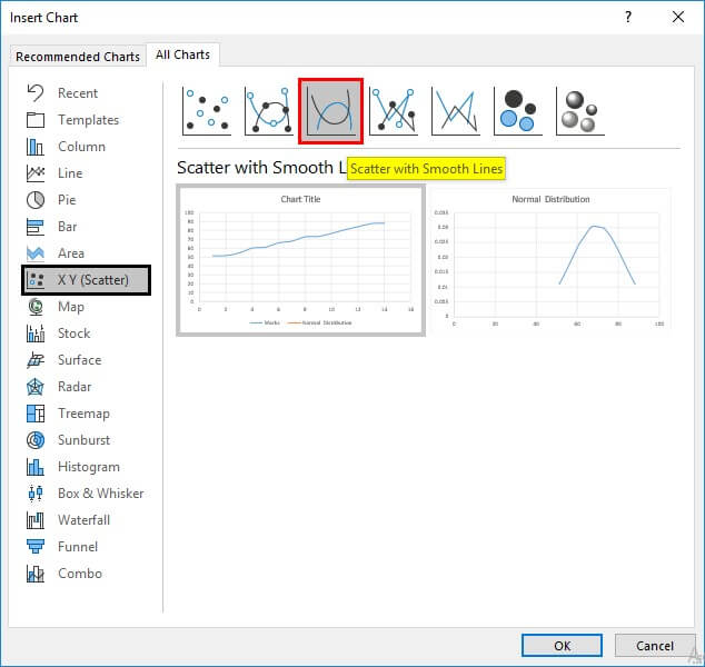
Finally, Select the second chart, “Normal Distribution”, and click “Ok”.
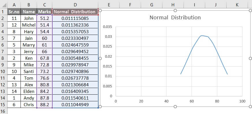
You will get the following chart where the data is scattered as bell-shaped, showing a variation in the distribution from lowest to highest.
Step 4: Axis Titles
Now, we can give a name to the X and Y-axis. Simply click on the “+” symbol for extra options and click on Axis Titles.
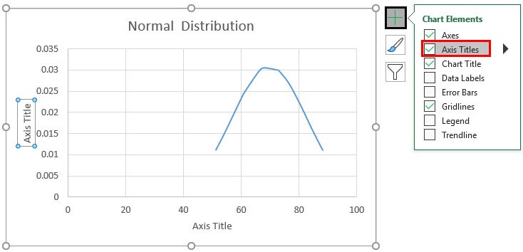
Now enter the names for both axes. The x-axis represents the marks, and the y-axis represents the value of the normal distribution.
Step 5: Edit the Curve
As the curve looks too far and small, it can be difficult to analyze. So let us maximize the curve size.
Double-click on the X-axis for that, and the Format Axis pane will appear.
Click on the “Axis Options”, the last symbol that looks like a green histogram.
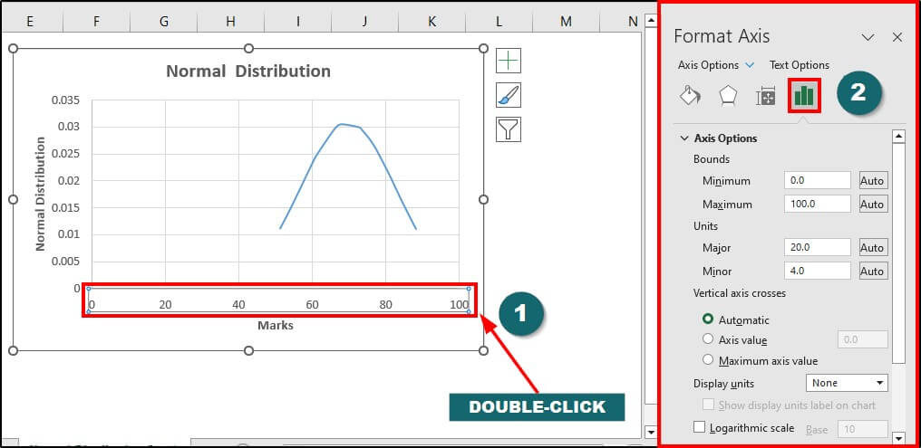
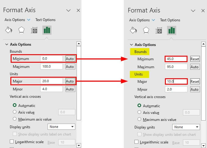
Change the starting point from “0.0” to “45.0” in the “Minimum” text box in the “Bounds” section.
Then to change the difference between each point on the x-axis, change the value “20” to “10” in the “Major” text box in the “Units” section.
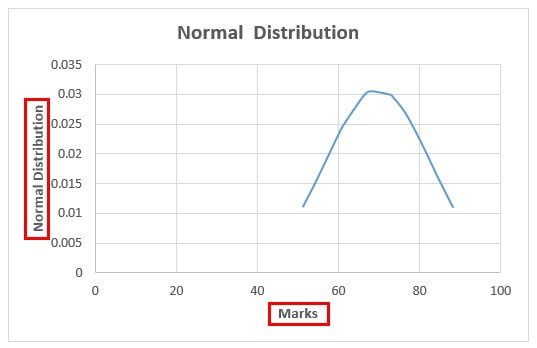
This is the normal distribution graph for the given data in Excel.
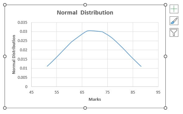
The above excel distribution graph looks like a bell-shaped curve, as discussed before. The top part represents the mean/average marks that are normal or expected from the students.
As the curve declines to the left, the student’s performance decreases, i.e., below the average of 69 marks (approximately). The right side of the curve shows the increased performance of the students.
Things to Remember
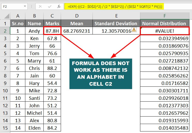
1. Excel returns “#VALUE!” as an error value when the x-value, mean, or standard deviation is not a number.
Example: If there is an alphabet or symbol in the data, the normal distribution formula will not work. It will show the error as per the below image.
Moreover, the mean and standard deviation formula will skip that one data, which can affect the accuracy.
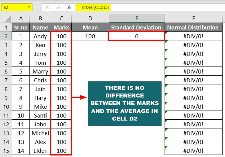
2. When the standard deviation ≤ 0, the DIST function will return a “#DIV/0!” Error.
Example: Imagine no difference between the x-value and the average. All the students scored the same marks, so the mean is the same too. In this situation, the standard deviation will be zero. Therefore, the normal distribution will be invalid as there is no uncertainty of the event happening.
Frequently Asked Questions (FAQs)
Q1. What is the difference between a normal probability density and a cumulative normal distribution function?
Answer: The normal probability density function (PDF) is a fancy term that tells us how likely something will happen within a certain range. It gives a smooth curve that tells us the chances of getting a specific value.
The CDF, cumulative normal distribution function, is related to the PDF. It tells us the probability of getting a value that will be less than or equal to a specific value. It’s like adding up the possibilities as we move along the curve.
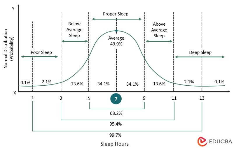
Q2. What is the range of the normal distribution?
Answer: The normal distribution is a mathematical pattern that describes how things are distributed in nature. Imagine a symmetrical bell-shaped curve. The normal distribution range is technically infinite, but we usually focus on a certain range that captures most of the data.
For example, in a typical normal distribution graph, the area under the curve shows how much data is present in a specific range. For instance, 68.2% of data usually fall within one standard deviation, i.e., from -1 to 1. Similarly, the area from -2 to 2 has 95.4% data, and the area from -3 to 3 shows 99.7% data.
Q3. Who discovered normal distribution?
Answer: The development of normal distribution involved contributions by more than one mathematician. One important figure was Carl Friedrich Gauss, who studied errors in astronomical observations and introduced the mathematical properties of the normal distribution. Another important contributor was Pierre-Simon Laplace, who introduced the idea that the sum of many random events tends to follow a normal distribution. The normal distribution is commonly used in statistics and probability to understand and analyze data, and its bell-shaped curve characterizes it.
Recommended Articles
This guide to Normal Distribution Graphs in Excel explains how to make a normal distribution graph using examples. We also provide a downloadable Excel template. You can also go through our other suggested articles –
