Updated August 24, 2023
Excel Control Charts (Table of Contents)
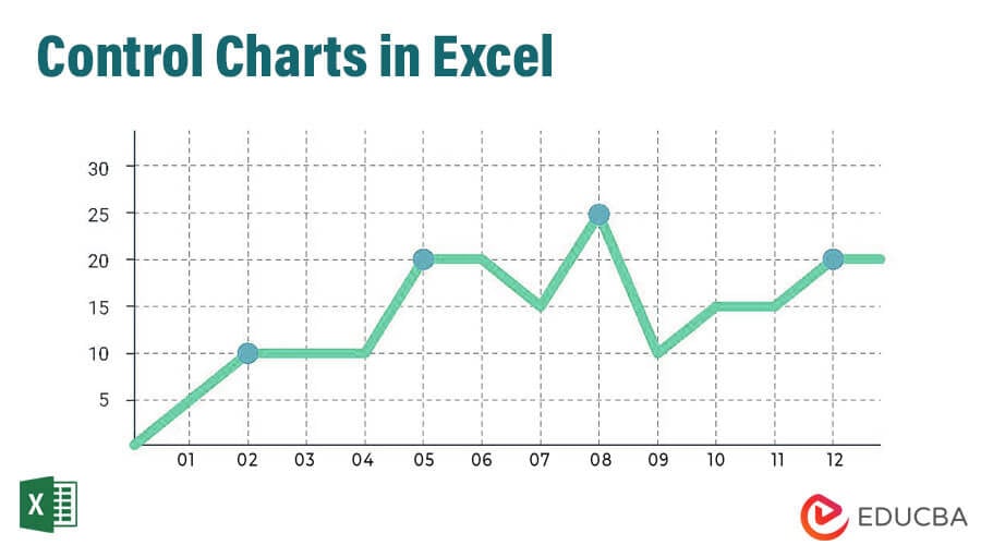
Introduction to Control Charts in Excel
Control charts are statistical visual measures to monitor how your process runs over a given period. Whether it is running as expected or there are some issues with it. There are important tool under Statistical Process Control (SPC) which measures the performance of any system/processes whether they are running smooth or not. If there are any disturbances, the processes can be reset. Control charts are most of the times used under manufacturing processes in order to check whether the manufacturing processes are under control or not.
Definition of Control Chart
A control chart is nothing but a line chart. It can be generated when we have upper and lower control limits present for the data, and we wanted to check whether the control points are lying between the actual upper and lower limits or going out of those. The process is controlled if the control points lie well within limits. If some of the points are lying outside of the control limits, the process is said to be not in control. Though there is different Statistical Process Control (SPC) software available to create control charts, Microsoft Excel does not lack in creating such charts and allows you to create those with more ease. This article will show how control charts can be created under Microsoft Excel.
Example of Control Chart in Excel
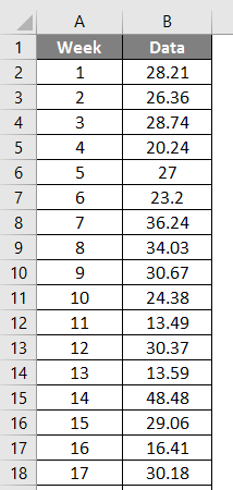
Suppose we have data from 30 observations from a manufacturing company as below. We want to see whether the process is well within the control limits. We will draw a Control chart to see whether the process is in control. See the screenshot of the partial data given below.
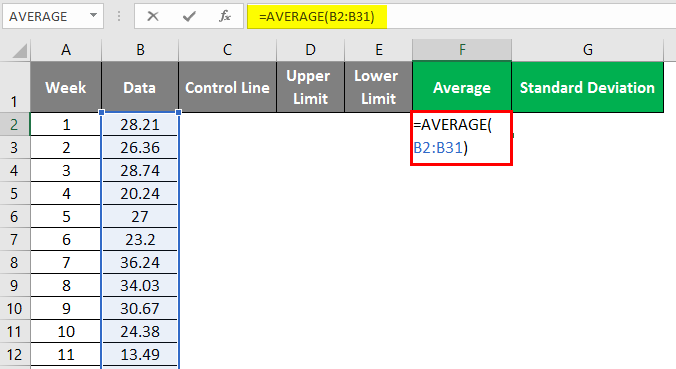
Step 1: In the cell, F1 applies the “AVERAGE(B2:B31)” formula, where the function computes the average of 30 weeks.
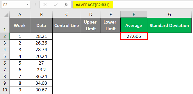
After applying the above formula, the answer is shown below.
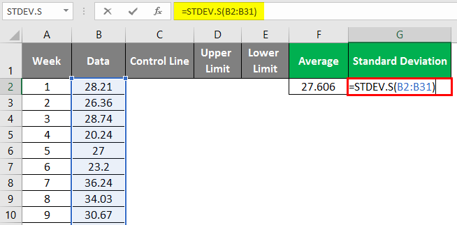
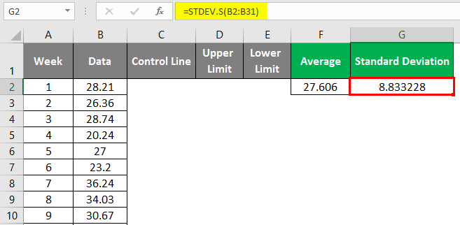
Step 2: In cell G2, apply the “STDEV.S(B2:B31)” formula to calculate the sample standard deviation for the given data. This formula calculates the sample standard deviation. We have a different formula to calculate the population standard deviation in Excel.
After applying the above formula, the answer is shown below.
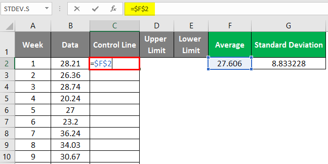
Step 3: In column C, called Control Line, go to cell C2 and input the formula as =$F$1. The $ sign used in this formula is to make the rows and columns constants. When you drag and fill the remaining rows for column C, all cells will have the same formula as the one imputed in cell C2. Drag and fill the remaining cells of column C. You’ll be able to see the output below.
After applying the above formula, the answer is shown below.
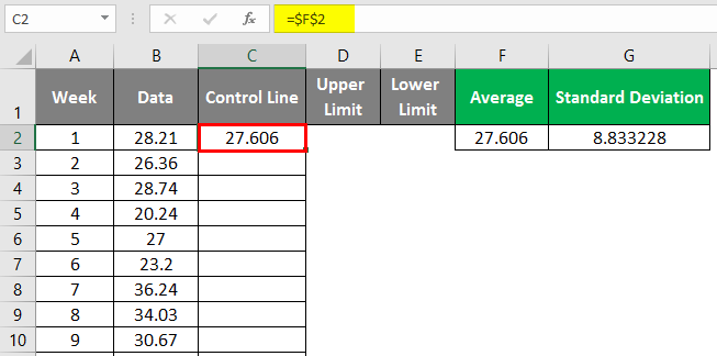
Drag and fill the remaining cell of column C.
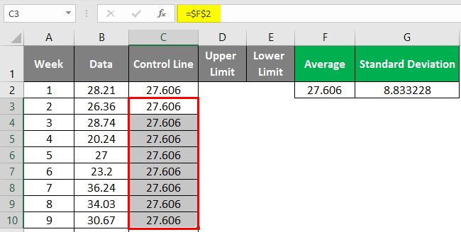
Because the Control Line is nothing but the line of the center for the control chart, which does not change over observations, we are taking the Average as a value for Control Line.
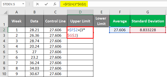
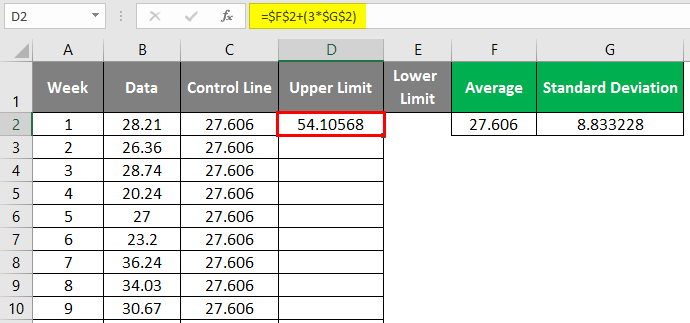
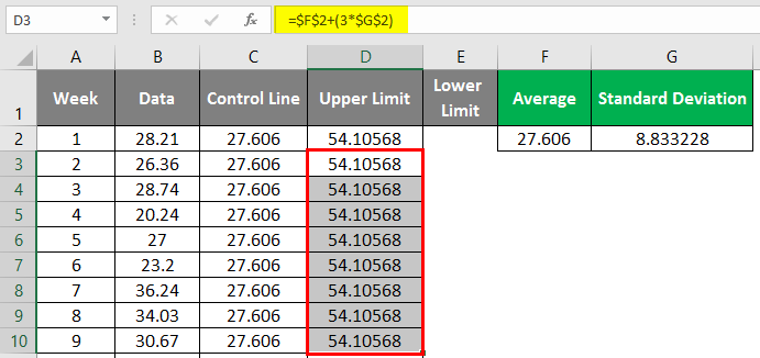
Step 4: For the Upper Limit, the formula is. Therefore, in cell D2, put the formula as =$F$2+(3*$G$2). Again, the upper limit is fixed for all the week’s observations. Therefore we have used the $ sign to make rows and columns constant. Drag and fill the remaining cell of column D, and you’ll be able to see the output below.
After applying the above formula, the answer is shown below.
Drag and fill the remaining cell of column D.
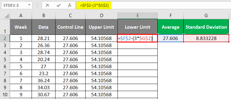
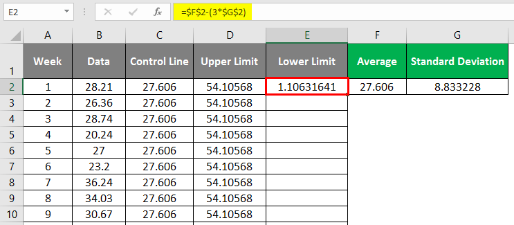
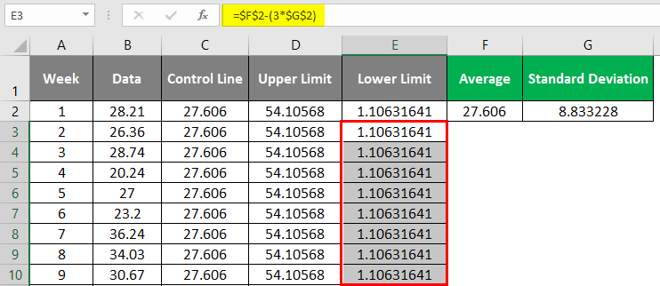
Step 5: Lower Limit for the control chart can be formulated as in cell E2. Put the formula as =$G$1-(3*$G$2). This formula calculates the lower limit, which is fixed for all weekly observations; the $ sign achieves that in this formula. Drag and fill the remaining cells with a formula, and you’ll be able to see the output below.
After applying the above formula, the answer is shown below.
Drag and fill the remaining cell of column E.
Explanation:
The Upper Limit, Lower Limit, and Central/Control Line are the control chart parameters. We calculate these terms because we have a theoretical base for that. In Statistical Process Control (SPC), we say that the processes are going normal if 99.73% of observations are scattered around the Central/Control Line within 3 standard deviations above and below the same (that’s why we calculate the upper limit as 3 standard deviations above from average which is a central line and lower limit as 3 standard deviations below of the average). If it happens, then and only then can we say that the process is following the normal pattern. Otherwise, the process is behaving abnormally, and we need to make adjustments to the machinery.
We are done with the required information, which is needed to plot the control chart in Excel. Now we will head towards adding one in Excel.
Step 6: Select the data from columns A and B (spread across A1:B31) from your Excel sheet and go to the Insert tab at the Excel ribbon. Under the Charts section, navigate towards Insert Line and Area Chart button.
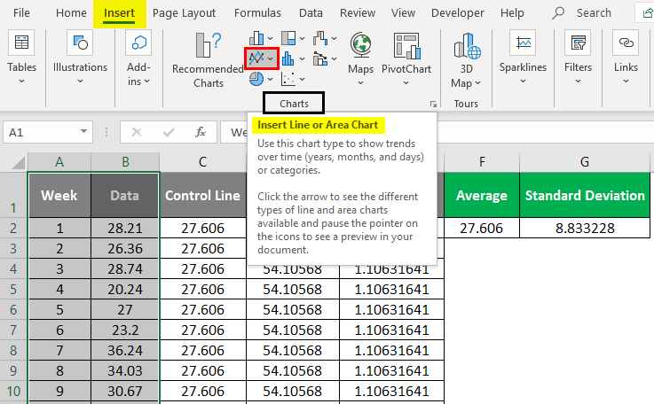
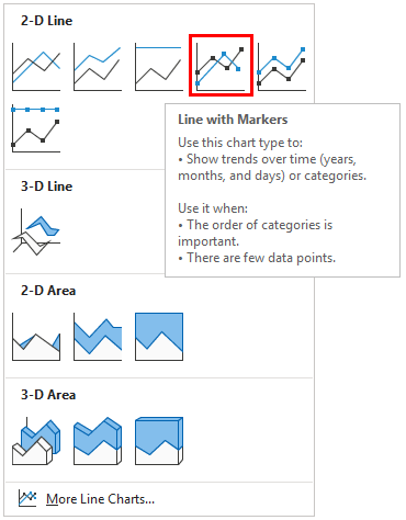
Step 7: Press the Insert Line or Area Chart dropdown button; you’ll be able to see a handful of line and area chart options available under Excel. Out of those all, under the 2 – D Line section, select Line with Markers and Press the Enter key.
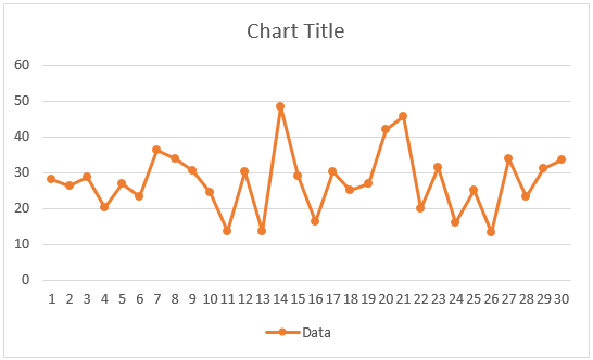
After removing the week’s data from the line chart, your graph will look like the one below.
We would like to add the central/control, lower, and upper limit lines to this chart to see how the weekly data is moving.
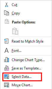
Step 8: Right-click on the Graph and click on the “Select Data” option.
A “Select Data Source” dialog box will open and click the “Add” button.
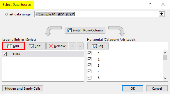
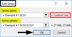
Step 9: Inside Legend Entries (Series), after clicking on the “Add” button and input Control Line as a “Series name” and corresponding control line values as “Series values” under the “Edit Series” dialog box. Click on the “OK” button once done.
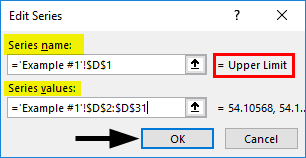
Step 10: After clicking on the “Add” button and inputting Upper Limit as a “Series name” and corresponding Upper Limit values as “Series values” under the “Edit Series” dialog box, click the “OK” button after done it.
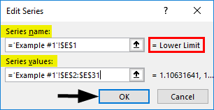
After clicking on the “Add” button and inputting Lower Limit as a “Series name” and corresponding Lower Limit values as “Series values” under the “Edit Series” dialog box, click the “OK” button after done with it.
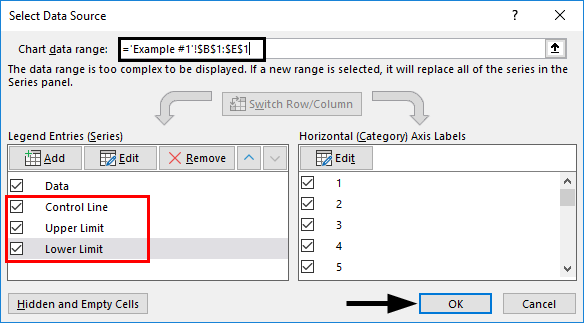
You’ll be able to see the control chart ready below.
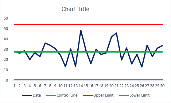
Step 11: Give the title “Control Chart” for this graph, and you are done with it.
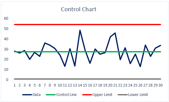
This is how we can create a control chart under Excel. This is from this article. Let’s wrap things up with some points to be remembered.
Things to Remember
- Control charts are plotted to see whether the process is within control.
- Calculating and plotting the Central/Control Limit, Upper Limit, and Lower Limit is mandatory to check whether the process lies between them.
Recommended Articles
This is a guide to Control Charts in Excel. Here we discuss How to create Control Charts in Excel, practical examples, and a downloadable Excel template. You can also go through our other suggested articles –
