Updated August 24, 2023
Excel Add Secondary Axis (Table of Contents)
Introduction to Excel Secondary Axis
The secondary Axis is an advanced visualization technique used in analytics. We know about basic charts, which implement a single axis. But what if we need two axes, i.e., adding a second data set on the existing chart. In that case, we’ll need a secondary axis. It is the first step in advanced analytics. We can add a secondary axis when we have two data sets in a single chart. This can be done in many tools and MS Excel as well. Excel has some basic and advanced graphical techniques which allow analysts to generate better insights from the graph. Adding a secondary axis is one of those advanced techniques in analytics.
Example of Secondary Axis in Excel
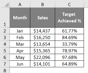
Below is an example that shows how the secondary axis works in Excel. For that, we need tabular data.
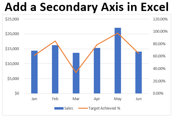
This data has two datasets,e Sales and Target Achieved %. As shown below, the graph will look like this when a secondary axis is added.
Sales amounts are shown in blue bars, whereas Targets are shown in the orange line represented in the vertical axis as shown above. Both the data sets are on Y-axis, but the second data set is added as a secondary axis to the same chart.
Explanation:
- While creating a secondary axis, both axes are vertically shown on the same graph. This is the most advanced technique used in analytics to show two data sets in the same graph. If both the data sets are important to show, we can use a secondary axis. This technique is often used in the financial model where we need a clear data picture.
- Representation of the two data sets in a single chart usually helps in better visualization from a reader’s and an analyst’s point of view. Below are the steps to add a secondary axis to an existing chart.
Steps to Add Secondary Axis in Excel
We’ll use the above table to demonstrate the addition of a secondary axis in the chart.
The data has “Month” in the first column and “Sales” and “Sales percentage” in the second and third columns, respectively. The secondary axis is based on a column chart. There are some steps to add a secondary axis.
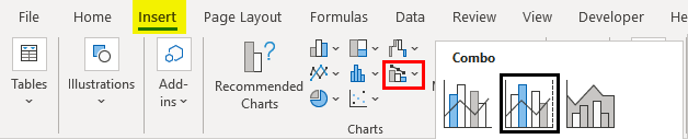
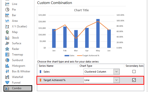
- The first step is to select the graph type directly from Insert > Combo and select the “Clustered column-Line on secondary axis,” as shown below.
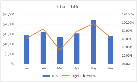
The chart can now be seen with two axes, as per the image below.

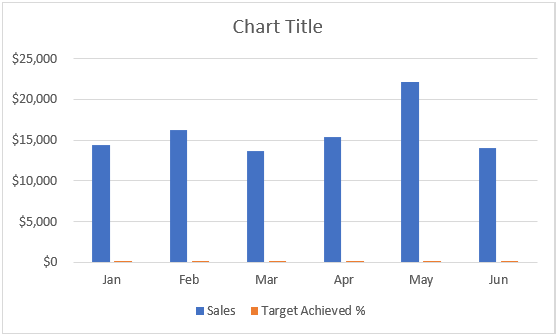
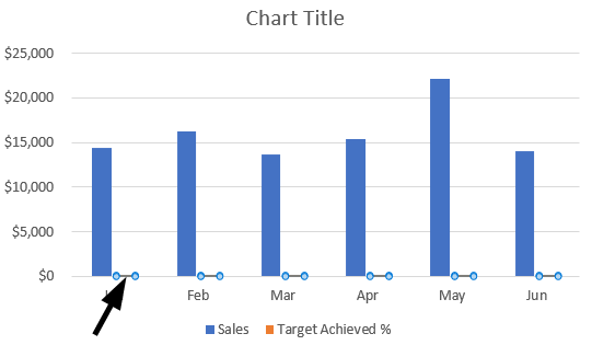
- The second method is using a column chart. We must plot a column chart first to show the sales in a graphical form.

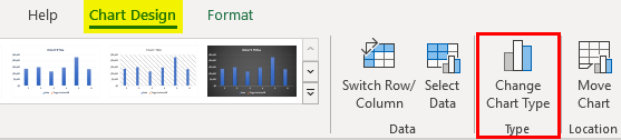
This chart is unclear as it does not show the sales percentage clearly. So to show it better, we can add another vertical axis. But this can be done by changing the chart type by going to Design > Change chart type, as shown below.
A dialog box will open like this where we have to go to “All charts”, as shown below.
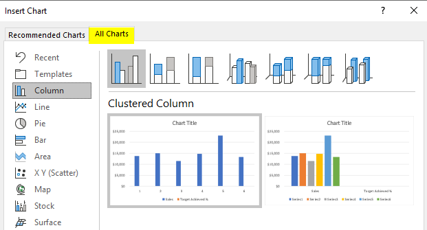
After the window opens, we must select the first clustered column chart.
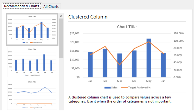
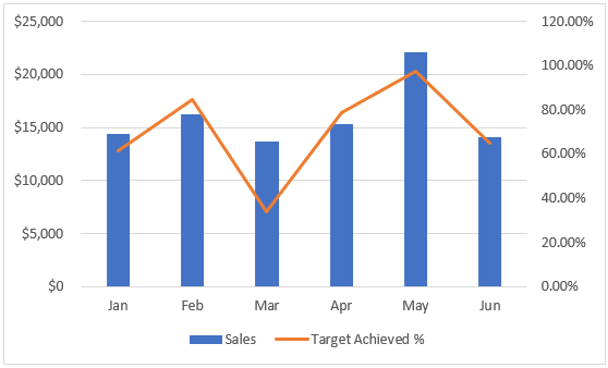
Now, the result is a secondary axis added to the chart.
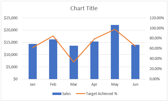
The target achieved in percentage can now be seen in a second vertical axis in orange. March has the lowest sales percentage whereas May has the highest, as shown in the chart.
- The second step is a manual method. Initially, the column chart needs to be created first.
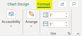
Next, we must select the chart and click on the Format Tab, as shown below.
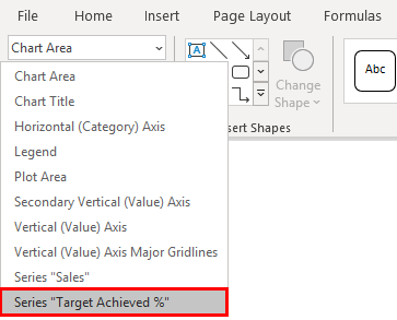
From the “Current selection” drop-down menu, we must select “Series Target Achieved %”.
The goal fixed can be identified in column bars as shown below.
Now, we’ll press Ctrl+1 to open the format data series options.
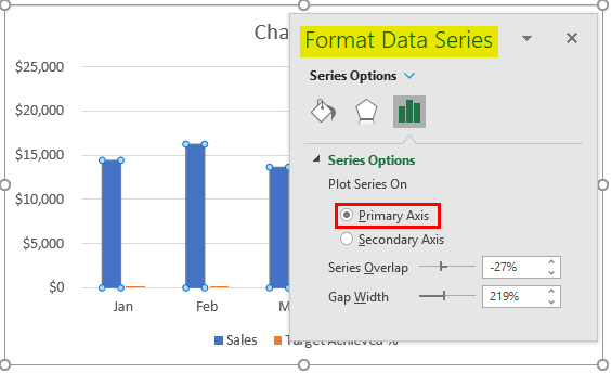
Now, we’ll have to select the “Secondary Axis” from the options, and the chart will look like this, as shown below. We are switching over from the Primary Y-Axis to Secondary Y-Axis here.
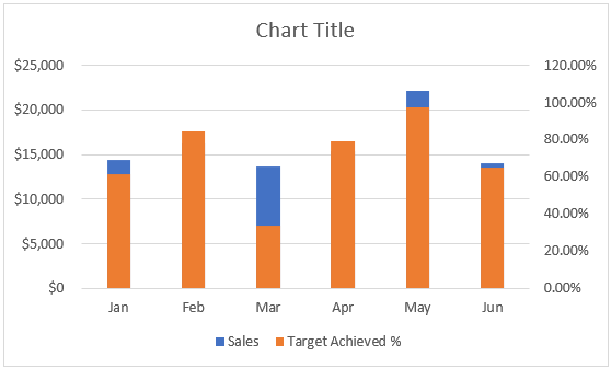
The chart shows Target achieved % in a column bar with a secondary axis. But it is a bit complicated to read enough. So, we can change the chart type by going to Design > Change chart type.
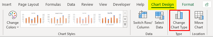
From the options, we have to go to “Combo” and change the “Target achieved %” to “Line” instead of “Clustered”.
Now the result is a chart with a dual-axis, as shown below.
This way, we can add a secondary axis to an existing chart. The above steps are a bit different, but the output remains the same in all the steps. It helps in analyzing multiple data sets in an easier way. Apart from Excel, the Secondary axis can be added to Google Sheets, Power BI, Tableau, etc. But plotting the same in Excel is comparatively easy than in other visualization tools. Comparing the “Sales” is easier in the column chart, but we can compare profit margins from different months with this technique.
Things to Remember
- The secondary axis requires a different chart from the primary axis chart.
- This chart type is a clustered combo chart.
- You can view secondary axis values from the right side vertical axis.
- You can view the primary axis value from the left side of the axis.
- Both the data sets need to have two-axis in a single chart.
- The chart is based on a column bar chart.
- Two data sets mean two columns from a single table.
Recommended Articles
This has been a guide to Adding a Secondary Axis in Excel. We discuss adding a secondary axis in Excel, a practical example, and a downloadable Excel template. You can also go through our other suggested articles –
