Updated August 24, 2023

Bubble Chart in Excel
It is categorized as a part of the Scatter or Bubble chart option in the Insert menu tab. Bubble chart in Excel, as the name suggests, in the chart, we represent the data points with the help of bubbles. The higher the data point value, the bigger the bubble will be, and it will eventually be seen at the top of the chart; similarly, a lower value will have a small bubble near the bottom Y-axis. This is useful for showing the population or regional capacity data.
Example: A typical XY Scatter chart might be used to display the relationship between birth rate and life expectancy at birth, with the county as the unit of analysis. If you also wished to express the country’s GDP, you could proportionally enlarge or shrink each plotted data point in the form of a Bubble– to simultaneously highlight the relationship between birth rate and life expectancy but also to highlight the GDP of the countries. Thus, the third value determines the size of the Bubble.
Bubble Charts are available in Excel 2010 and other versions of MS Excel. We can show the relationship between different datasets. They are mostly used in business, social, economic, and other fields to study the relationship of data.
How to Create a Bubble Chart in Excel?
It is very simple and easy to use. Let us now see how to create Bubble Chart in Excel with the help of some examples.
Example #1
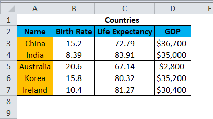
We used the example sample worksheet data for the Bubble chart in Excel.
Step 1: Select /create data to create the chart.
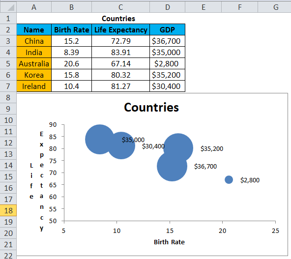
Below is sample data showing various countries’ birth rates, Life expectancy, and GDP.
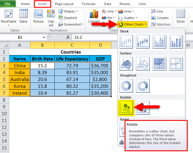
Select the data using CTRL+A. Then go to Insert Tab < Other Charts, click on it. You will see Bubble in the dropdown; select Bubble. Adjacent to that, you also have Bubble with a 3D effect option. I have selected the Bubble option for the below examples.
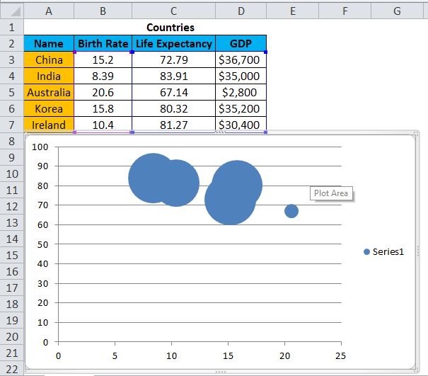
Step 2: Once you have clicked the “Bubble” option in the drop-down, you will see the Bubble chart created below.
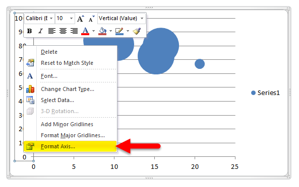
Now we need to format this Bubble chart for better understanding and clarity. First, we will select the Y-axis by clicking on it. Then we will press the right click to get the option and select the last one, “Format Axis”.
Once you click on the “Format Axis”, the following pop-up will open.
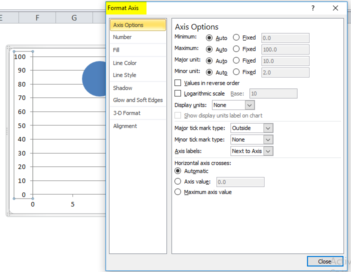
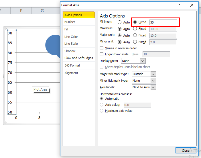
You must then change the “Axis Options” from Auto to Fixed, as shown below. I have taken a base figure 50 for Y-Axis (Life Expectancy).
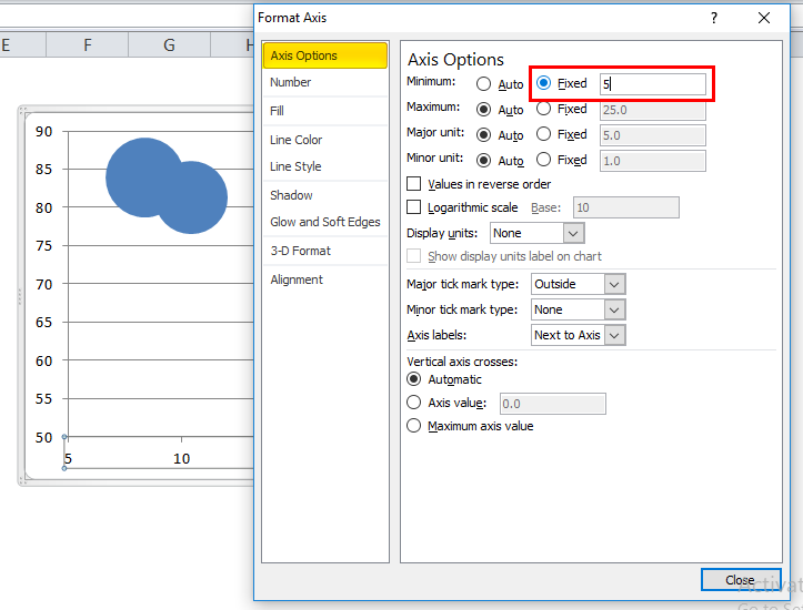
Step 3: We need to format the X-axis just like the Y-axis. Select the X-axis with a single click of the mouse. Then right-click and select “Format Axis”.
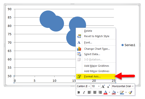
Once you click the “Format Axis”, you will get the below pop-up.
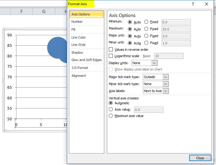
Here also, you must change the option from Auto to fixed in “Axis Options” and set the value to 5 as the base figure for X-axis (Birth Rate).
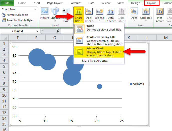
Step 4: We must add Chart Title and label to our Bubble Chart.
For that, we have to reach the Layout tab and click “Chart Title” and “Above Chart” to place the title above the chart.
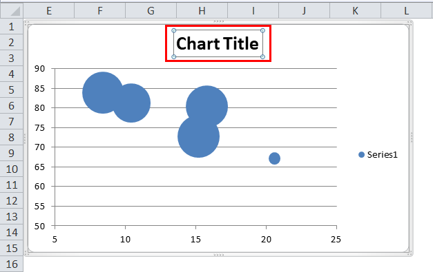
After Adding the Chart Title, our Chart looks like this.
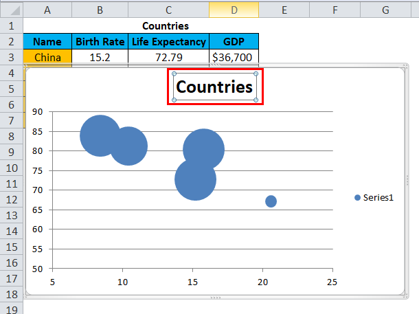
Now select the chart title on the chart, press =, then select “Countries” and press Enter. The chart title now becomes Countries.
Step 5: Now, we have to give titles to the X & Y-axis. We will start with the X-axis. For that, reach the Layout tab, select Axis Title, then selects “Primary Horizontal Axis Title.” After that, Select “Title Below Axis”.
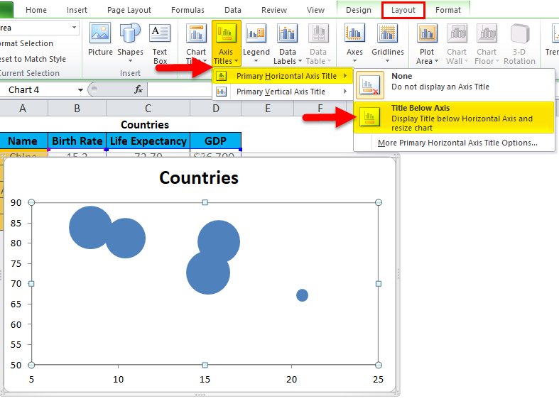
Once you have clicked the “Title Below Axis”, you will see “Axis title” below the horizontal axis.
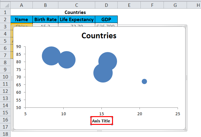
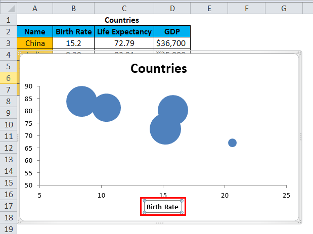
Now select the “Axis Title”, press =, and then select Birth Rate, press Enter. The X-axis is now labeled as Birth Rate.
Step 6: We will give the title Y-axis in the same manner.
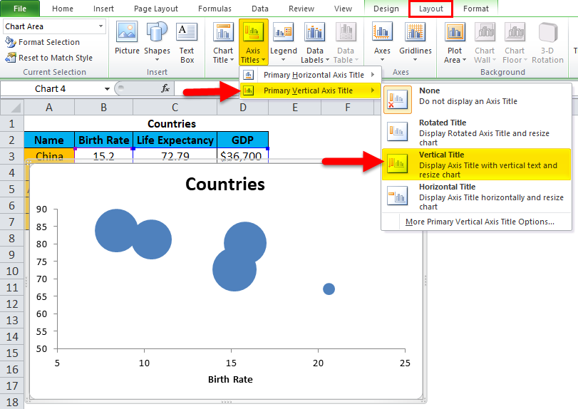
You will see “Axis title” on the Vertical axis.
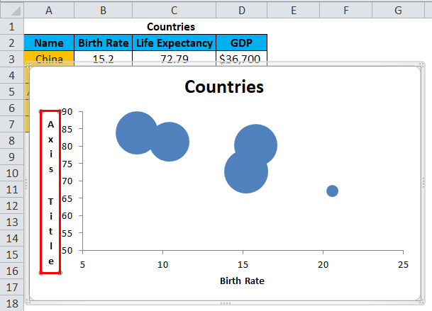
Now select the “Axis Title”, press =, and then select “Life Expectancy”, press Enter. The Y-axis is now labeled as Life Expectancy.

Step 7: Adding data labels to the chart. For that, we have to select all the Bubbles individually. Once you have selected the Bubbles, press right-click and select “Add Data Label”.
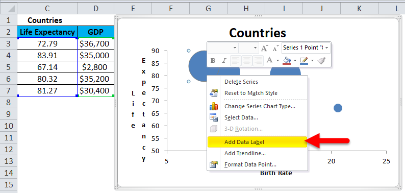
Excel has added the values from life expectancies to these Bubbles, but we need the GDP values for the countries.
For that, we need to press = and select the GDP relating to the country showing Life expectancy.
Example: Select the topmost Bubble, which shows 83.91(Life Expectancy) of India; we need to change it to the GDP of India. Press = and then select $35000, which is the GDP for India, and press Enter. The Bubble now represents the GDP of India.
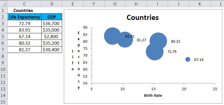
Now, change the Life expectancies to GDP of the respective countries as above one by one.
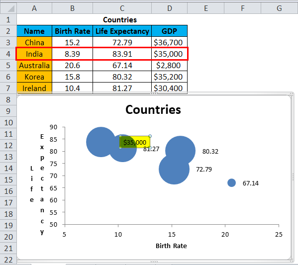
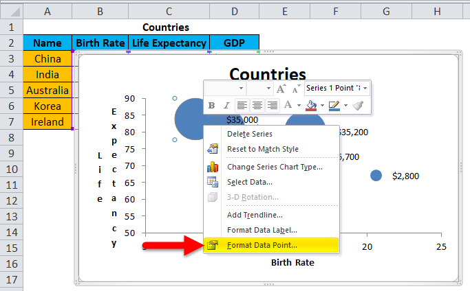
Step 8: To differentiate the Bubbles representing different countries, we need to give different colors to each Bubble. This will make the chart easier to understand.
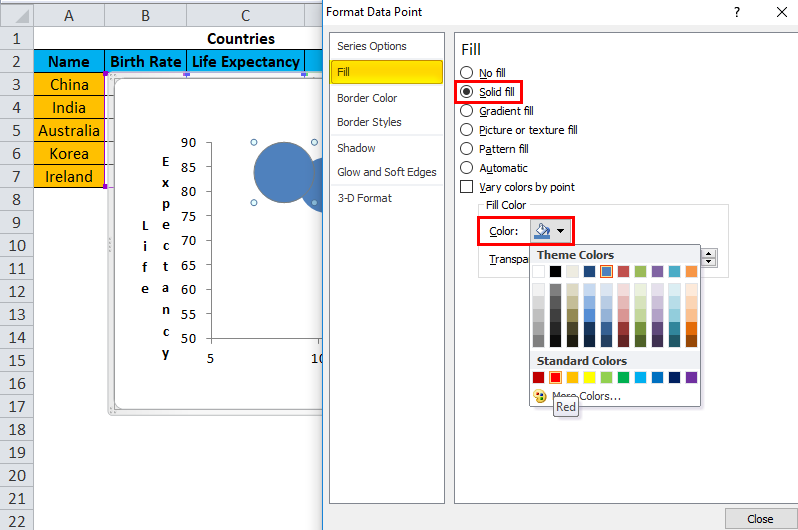
Select a Bubble, right-click, and click “Format Data Point”.
Then fill color in that bubble:
Select each bubble, and fill colors so they can be distinguished.
Finally, we have all the bubbles colored differently, representing different countries.
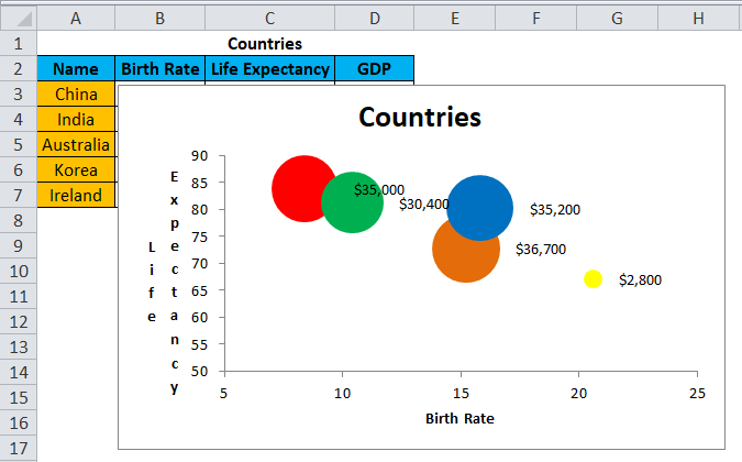
We now have a properly formatted Bubble chart in Excel showing, Birth Rate Life Expectancy, and GDP of different countries.
Example #2
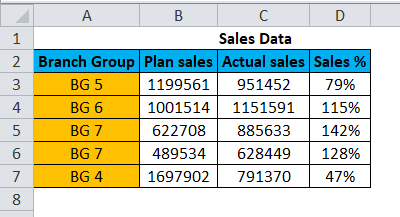
This is Sample data.
Select the data and now insert a bubble chart from the insert section.
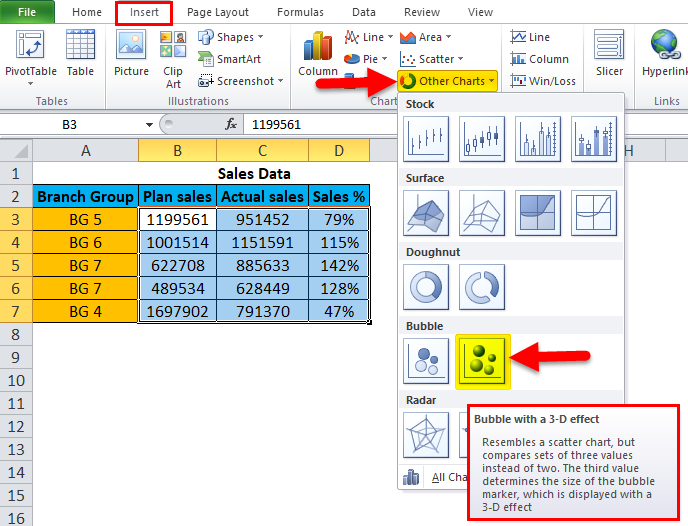
Once you have clicked the “Bubble with a 3-D effect” option in the drop-down, you will see the bubble chart created below.
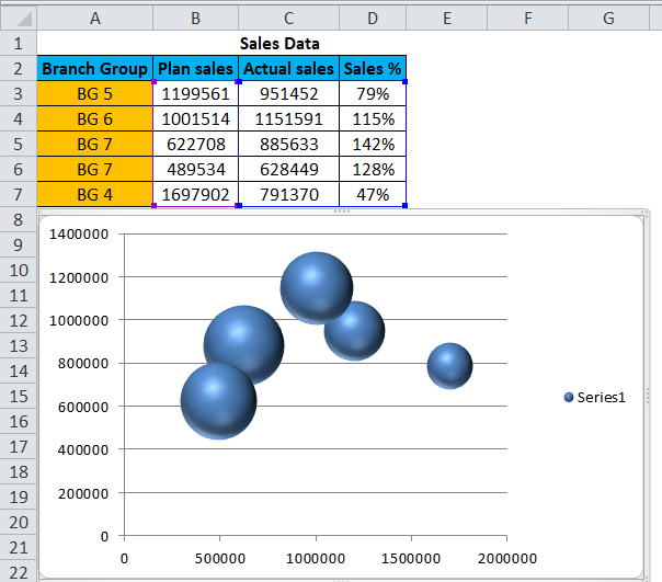
Follow all of the above steps, and the final Bubble chart will be as below:
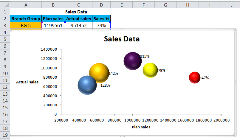
In the above example, each colored Bubble represents the name of different branch groups. The chart shows that Branch Group “BG 5” achieved actual sales for 951452 against planned sales of 1199561, and the sales percentage was 79%. Branch group “BG 6” achieved actual sales for 1151591, exceeding the planned sales for 1001514, and the sales percentage was 115%. Branch Group “BG 7” achieves the actual sales for 885633 against the planned sales for 622708 and a sales percentage of 142%, the highest, and so on.
Advantages of Bubble Chart in Excel
- A bubble chart in Excel can be applied for 3 dimension data sets.
- Attractive Bubbles of different sizes will catch the reader’s attention easily.
- The bubble chart in Excel is visually better than the table format.
Disadvantages of Bubble Chart in Excel
- A bubble chart in Excel might be difficult for a user to understand the visualization.
- The size of the Bubble is confusing at times.
- Formatting Bubble charts and adding data labels for large Bubble graphs was a tiring task in 2010 or earlier versions of Excel.
- The Bubble may overlap, or one may be hidden behind another if two or more data points have similar X & Y values. This is the biggest problem.
Things to Remember About Bubble Charts in Excel
- First, ensure which data set you want to show as a Bubble.
- Always format your X & Y axis to a minimum data value for ease.
- Choose colors for the Bubble as per the data. Choosing very bright or gaudy colors may spoil the complete look of the chart.
- Proper formatting of data labels, axis titles, and data points will make the chart easy to comprehend.
Recommended Articles
This is a guide to Bubble Chart article in Excel. Here, we discuss how to create Excel Bubble Chart along with Excel examples and a downloadable Excel template. You may also look at these suggested articles –
