Updated June 17, 2023
Overview of CSS Layout
CSS provides several layout options that allow us to control the position of HTML elements compared to their default position that would appear in a normal layout.
Various Layout Techniques
Given below are the various layout techniques:
- Normal layout
- CSS display property
- Flexbox
- Floats
- Grid layout
- Positioning elements
- Table Layout
- Multi-column layout
A single webpage may either contain only 1 layout from the above options or multiple layout options integrated and styled together to achieve the required structure of the webpage.
1. Normal flow in CSS
The default flow displays elements on a webpage according to their occurrence in the code without defining or applying layout control.
For example, let’s view the following code in the web browser:
Code:
<html>
<body>
<p>This is normal layout</p>
<ul>
<li>It uses default layout</li>
<li>No customizations applied</li>
<li>No layouts defined</li>
</ul>
<p>Everything is laid out as per it’s occurrence in the code</p>
</body>
</html>
Output:
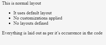
The output shows that the items on the webpage are laid out based on their definition in the code file. Specifically, the unordered list and the 2nd paragraph text follow the paragraph text. This flow, where HTML elements stack sequentially, is known as a blocked layout, in contrast to the inline layout, where elements render side by side.
2. CSS Display Property
By default, CSS has a display property set to block wherein all elements appear in a sequence. However, the display property provides several options like inline, flex, grid, inline-block, etc. Each value the block property can carry adds a different layout on the webpage.
Let’s see the above example with a display value of all <li> elements set to inline instead of the default block. With this change, the HTML code looks like this:
Code:
<html>
<body>
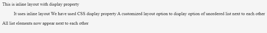
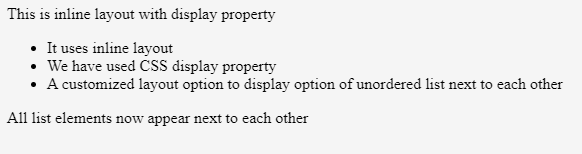
<p>This is inline layout with display property</p>
<ul>
<li style = "display:inline">It uses inline layout</li>
<li style = "display:inline">We have used CSS display property</li>
<li style = "display:inline">A customized layout option to display option of unordered list next to each other</li>
</ul>
<p>All list elements now appear next to each other</p>
</body>
</html>Output:
3. Flex-Layout in CSS
Web designers use the Flex or Flexbox layout to easily arrange HTML elements in a single direction, laying them out in a row or a column. We can use the flexbox layout to set the flex value for the display property. When applied to the parent element, all its direct children elements then become flex items.
Code:
<html>
<body>
<p>This is inline layout with display property</p>
<ul style="display:flex"> // setting display:flex here will align all li elements in row
<li >It uses inline layout</li>
<li >We have used CSS display property</li>
<li >A customized layout option to display option of unordered list next to each other</li>
</ul>
<p>All list elements now appear next to each other</p>
</body>
</html>
Output:
On setting display: Flex to the parent div, all its child elements were aligned in a row since the default flex-direction is set to row.
4. CSS Grid Layout
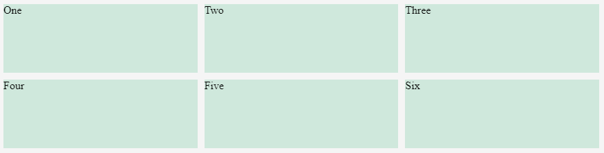
While web designers use the flexbox layout for single-dimensional layout, they use the CSS grid layout for two dimensions, aligning elements into rows and columns. We can use the Grid Layout with a value of display set to the grid. The example below uses a similar structure to the flex example but with a container as a parent element and some child elements. Also, in addition to using the grid, we are defining some row and column parameters on the parent element using the grid-template-rows and grid-template-columns CSS properties.
Example:
Code:
<!DOCTYPE html>
<html lang="en">
<head>
<meta charset="utf-8">
<meta name="viewport" content="width=device-width, initial-scale=1">
<style>
.wrapper {
display: grid;
grid-template-columns: 1fr 1fr 1fr;
grid-template-rows: 100px 100px;
grid-gap: 10px;
}
.wrapper > div
{
Background : rgb(207,232,220);
}
</style>
</head>
<body>
<div class="wrapper">
<div >One</div>
<div >Two</div>
<div >Three</div>
<div >Four</div>
<div >Five</div>
<div >Six</div>
</div>
</body>
</html>
Output:
CSS Float Options
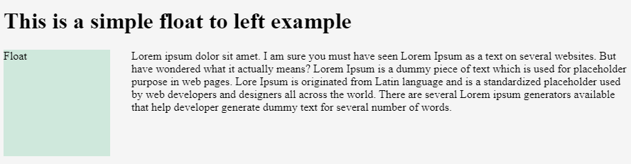
CSS Floating value modifies the behavior of an element that follows a normal flow. The element actively moves to the left or right and gets removed from the normal flow. Its surrounding content then floats around the floated element.
The CSS Float property has four possible values listed as follows:
- Float left — It is used to float the element to the left.
- Float right — It is used to float the element to the right.
- Float none — It specifies no floating and is the default value.
- Float inherit — It specifies that the value of the float property should be inherited from the parent elements.
Let’s explore the float option with the value left in the details below:
Code:
<!DOCTYPE html>
<html lang="en">
<head>
<meta charset="utf-8">
<meta name="viewport" content="width=device-width, initial-scale=1">
<style>
.box {
float: left;
width: 150px;
height: 150px;
margin-right: 30px;
Background : rgb(207,232,220);
}
</style>
</head>
<body>
<h1>This is a simple float to left example</h1>
<div class="box">Float</div>
<p> Lorem ipsum dolor sit amet. I am sure you must have seen Lorem Ipsum as a text on several websites. But have you wondered what it actually means? Lorem Ipsum is a dummy piece of text which is used for placeholder purpose in web pages. Lore Ipsum is originated from the Latin language and is a standardized placeholder used by web developers and designers all across the world. There are several Lorem ipsum generators available that help developer generate dummy text for several numbers of words.</p>
</body>
</html>
Output:
Conclusion – CSS Layout
In summary, we can conclude that CSS provides sufficient flexibility to combine various layout options and achieve the desired structure, especially with the help of CSS’s display, position, and float properties.
Recommended Articles
We hope that this EDUCBA information on “CSS Layout” was beneficial to you. You can view EDUCBA’s recommended articles for more information.

