Updated June 27, 2023
Introduction to CSS Button Border
In this article, we are discussing button borders in CSS. In general, a button serves as a clickable element that triggers an action, such as navigating to another page or performing a specific action. This article focuses on the application of borders to buttons. We explore how the border property is utilized to add borders to buttons. Additionally, we use the border-radius property to style the button borders and achieve rounded corners. We can also give a double stroke by adding another border property on the inner span element by reducing the border-radius property.
Working on CSS Button Border
Developers use borders in CSS to style buttons. In this article, we are discussing how to style the buttons using border-radius properties. In most cases, developers do not use borders for styling buttons.
First, we create buttons using a button tag, which can be done as follows. This button tag or property has different properties to style the buttons, like color, border, text alignment, font size, etc. Let us see the syntax and example.
Syntax:
<button type = "button" class = "button"> text or name of the button </button>Examples of CSS Button Border
Here are the following examples mention below:
Example #1
Code:
<!DOCTYPE html>
<html>
<head>
<title> Educba Training </title>
</head>
<body>
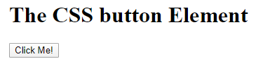
<h1>The CSS button Element</h1>
<button type="button" onclick="alert('Hello Educba!')">Click Me!</button>
</body>
</html>Output:
After clicking on the button
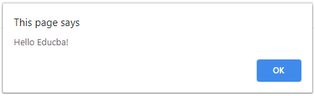
In the above program, we saw the simple creation of a button which will create a button named “click me” After clicking the button, it will pop up the message “Hello Educba”.
Let’s take a look at a general example of how you can declare borders when creating buttons.
Example #2
Code:
<!DOCTYPE html>
<html>
<head>
<title> Educba Training </title>
<style>
.button1 {
background-color: Blue;
border: none;
color: black;
padding: 15px 32px;
text-align: center;
font-size: 16px;
margin: 4px 2px;
}
.button2 {
background-color: Blue;
border: dotted;
color: black;
padding: 15px 32px;
text-align: center;
font-size: 16px;
margin: 4px 2px;
}
.button3 {
background-color: Blue;
border: double;
color: black;
padding: 15px 32px;
text-align: center;
font-size: 16px;
margin: 4px 2px;
}
</style>
</head>
<body>
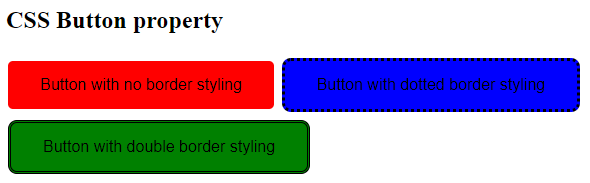
<h2>CSS Button property</h2>
<button class="button1">Button with no border styling </button>
<button class="button2">Button with dotted border styling</button>
<button class="button3">Button with double border styling</button>
</body>
</html>Output:
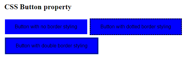
In the above program, we can see that we have designed three buttons with border properties. Like the first button, we have not applied any border property by specifying it as “none”; in the second button we have specified it as “dotted” and in the third button we have specified the border as “double”.
In a few examples, we also use the border-radius property for the buttons in CSS. The border-radius property applies rounded corners to the controller. Let us see an example of this, and it’s working.
Example #3
Code:
<!DOCTYPE html>
<html>
<head>
<title> Educba Training </title>
<style>
.button1 {
background-color: red;
border: none;
border-radius: 5px;
color: black;
padding: 15px 32px;
text-align: center;
font-size: 16px;
margin: 4px 2px;
}
.button2 {
background-color: Blue;
border: dotted;
border-radius: 9px;
color: black;
padding: 15px 32px;
text-align: center;
font-size: 16px;
margin: 4px 2px;
}
.button3 {
background-color: green;
border: double;
border-radius: 9px;
color: black;
padding: 15px 32px;
text-align: center;
font-size: 16px;
margin: 4px 2px;
}
</style>
</head>
<body>
<h2>CSS Button property</h2>
<button class="button1">Button with no border styling </button>
<button class="button2">Button with dotted border styling</button>
<button class="button3">Button with double border styling</button>
</body>
</html>
Output:
In the above program, we have specified all three buttons with button radius, the first button we specified with “5px”, and the second and third buttons with button radius as “9px”.
We will see about dislodged borders that have effects that have been detached from their border, and this can be done using the example below. Let us see the below example.
Example #4
Code:
<!DOCTYPE html>
<html>
<head>
<title> Educba Training </title>
<style>
.dislodged-border {
background: #FB3FDE;
border-radius: 30px;
color: #fff;
display: inline-block;
font-family: sans-serif;
padding: 15px 20px 14px;
position: relative;
text-decoration: none;
}
.dislodged-border,
.dislodged-border:before {
border-radius: 30px;
box-sizing: border-box;
}
.dislodged-border:before {
border: 2px solid #FB3FDE;
content: "";
display: block;
height: 100%;
position: absolute;
width: 100%;
top: 5px;
left: 3px;
z-index: -1;
}
</style>
</head>
<body>
<h1>The CSS button Element</h1>
<button class="dislodged-border">Button</button>
</body>
</html>
Output:
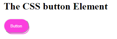
In the above program, we see that we have the output where first the button background color is pink, and it is like an inline-block button, and when we click on this button, we get a dislodged control where we get a blue outline. In the above code, we specify the white color as the font color, as we specify the display property as inline-block, which makes an inline element which gives the button a nice plum look; we specify padding, which is used for text spacing, we have also specified position with value as “relative” which makes the absolute positioning of the element.
The dislodged border: before is specified, which is used to apply to the button itself, and also consistent is defined and also we have specified border-radius, box-sizing with border-box value because when we declare dislodged border styles, we specify border-box as value to the box-sizing property.
Conclusion
In this article, we have concluded that the buttons are used for action events. Developers can declare these buttons by assigning a name to them and utilizing different types such as radio buttons, simple buttons, and more. Additionally, developers can design these buttons using various CSS styling properties such as border, color, background color, font-size, padding, and more. This article focuses on a property applied to buttons for styling: borders. Generally, designers and developers prefer simple buttons over bordered ones because they offer a clearer definition. The article examines various border styles such as solid, dotted, double, and others that developers can apply to buttons. We have also seen about dislodged borders applied to buttons.
Recommended Articles
We hope that this EDUCBA information on “CSS Button Border” was beneficial to you. You can view EDUCBA’s recommended articles for more information.

