Updated June 22, 2023
Introduction to Button in CSS
The following article provides an outline of the Button in CSS. Buttons are used to perform any action by clicking on it (like submitting a form in an application). A link is also like a button, but a link is used for navigating (changing) between pages and views.
Real-Time Example: If you consider any online exam, it has 4 or 5 options for each question. Once we choose any option, we must go to the next question. For this, it has a Save Next button. If we want to clear the chosen response, there is a Reset or Clear Response button. Suppose you want to revisit or recap the question by marking it with the Marked for Review button. At last, once we have finished our exam, Submit or Finish button for the end of the test.
In all these cases, every time each button has its own specific action to perform like “go to next question”,” clear response”, “marked for review”, and “finish the test”.
Why did CSS come into the Picture?
The below examples can illustrate it.
1. Without CSS
Let us see with the help of examples
Example #1: SaveNext.html
Code:
<!doctype html>
<html>
<head>
<style type="text/css">
input[type=button], input[type=submit], input[type=reset] {
border-width: 2px;
padding: 4px
font-size: 10pt;
color: yellow;
background-color: brown;
text-align: center;
}
#educba{
text-align: center;
}
</style>
<title>Save Next</title>
</head>
<body>
<div id="educba">
<input type="button" value="Save Next">
</div>
</body>
</html>
Output:

Example #2: Reset.html
Code:
<!doctype html>
<html>
<head>
<style type="text/css">
input[type=button], input[type=submit], input[type=reset] {
border-width: 2px;
padding: 4px;
font-size: 10pt;
color: yellow;
background-color: brown;
text-align: center;
}
#educba {
text-align: center;
}
</style>
<title>Reset</title>
</head>
<body>
<div id="educba">
<input type="reset" value="Reset">
</div>
</body>
</html>
Output:
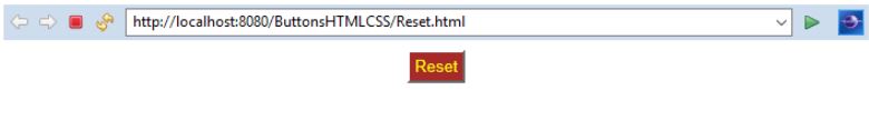
Example #3: MarkForReview.html
Code:
<!DOCTYPE html>
<html>
<head>
<style type="text/css">
input[type=button], input[type=submit], input[type=reset] {
border-width: 2px;
padding: 4px;
font-size: 10pt;
color: yellow;
background-color: brown;
text-align: center;
}
#educba {
text-align: center;
}
</style>
<title>MarkForReview</title>
</head>
<body>
<div id="educba">
<input type="button" value="Marked For Review">
</div>
</body>
</html>
Output:

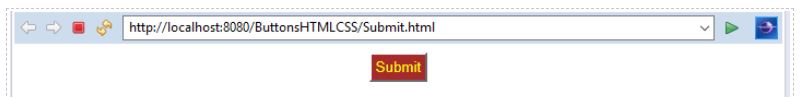
Example #4: Submit.html
Code:
<!DOCTYPE html>
<html>
<style type="text/css">
input[type=button], input[type=submit], input[type=reset] {
border-width: 2px;
padding: 4px;
font-size: 10pt;
color: yellow;
background-color: brown;
text-align: center;
}
#educba {
text-align: center;
}
</style>
<title>Submit</title>
</head>
<body>
<div id="educba">
<input type="submit" value="Submit">
</div>
</body>
</html>
Output:
Demonstration of the Above examples:
- In the above four examples, we have different buttons SaveNext, Reset, MarkForReview, and Submit. Each button has the same style, color, background, border, and padding.
- Even though we have written four times the same lines “style=” font-size: 10pt; color: yellow; background-color: brown; border: 2px; padding: 4px” in all 4 examples.
- There are only four html files, so we have written manually but considered more than 1000 such files. It is very time-consuming and difficult to write that many files, and also confusing while looking at the code.
- If we have the technology to write all common properties in one place, we have done our job very easily.
- Then Engineers came up with CSS abbreviated as Cascade Style Sheets; its name indicates the purpose is “styling the sheets”.
2. With CSS
Let us see with the help of examples
Example #1: SaveNext.html
Code:
<!doctype html>
<html>
<head>
<link rel="stylesheet" href="Styles.css">
<title>Save Next</title>
</head>
<body>
<div id="educba">
<input type="button" value="Save Next">
</div>
</body>
</html>
Example #2: Reset.html
Code:
<!doctype html>
<html>
<head>
<link rel="stylesheet" href="Styles.css">
<title>Reset</title>
</head>
<body>
<div id="educba">
<input type="reset" value="Reset">
</div>
</body>
</html>
Example #3: MarkForReview.html
Code:
<!DOCTYPE html>
<html>
<head>
<link rel="stylesheet" href="Styles.css">
<title>MarkForReview</title>
</head>
<body>
<div id="educba">
<input type="button" value="Marked For Review">
</div>
</body>
</html>
Example #4: Submit.html
Code:
<!DOCTYPE html>
<html>
<head>
<link rel="stylesheet" href="Styles.css">
<title>Submit</title>
</head>
<body>
<div id="educba">
<input type="submit" value="Submit">
</div>
</body>- CSS Code for Above Examples: Styles.css
input[type=button], input[type=submit], input[type=reset] {
border-width: 2px;
padding: 4px;
font-size: 10pt;
color: yellow;
background-color: brown;
text-align: center;
}
#educba{
text-align: center;
}- At last, we have achieved our requirement with the above css by common logic in place. Both with css and without css output are the same as in the above example.
How does CSS Button work?
- CSS will function by adding “<link rel= “stylesheet” href= “Styles.css”>” within html <head> tag.
- Button functionality action work as per written in the code. An internal javascript machine will run this code; it converts all HTML and CSS instructions into web instructions.
Syntax:
Selector{Property: Value;}Example:
h1{    //h1 is selector
padding: 2px 2px 2px 2px; //padding is property
// 2px 2px 2px 2px are values to property}
Different Property Declarations in CSS
Consider this below button example for all the upcoming property declarations.
<html>
<head>
<title>Button</title>
</head>
<body>
<button class="button">Button</button>
</body>
</html>
1. Colors to Buttons
background-color property: Set the background color of the button.
Color property: Set the text color.
Example:
.button
{
background-color: green;
color: yellow;
}
Note: class selector must be started with “.” followed by the selector. Upcoming all examples. The button is a selector, as we have taken in the above example class as a button. 2. Padding to Buttons
Padding property: Set the padding of the button means it will decide the button size from the top, right, bottom, and left. Example:
.button{
padding: 10px 20px 10px 20px; //top right, bottom, left respectively
}
3. Margin to Buttons
Margin property: Setting the margin of a button means it will decide where the button has to locate from the top, right, bottom, and left.
Example:
. button{
margin: 10px 20px 10px 20px; //top right, bottom, left respectively
}
4. Size to Buttons
Font-size property: Set the font size of the button.
Example:
.button
{
Font-size: 5px;
}
5. Radius to Buttons
Border-radius property: Set the radius to button (make a circle shape).
Example:
.button
{
border-radius: 5px;
}
6. Hovering to Buttons
Hover property: Move the cursor onto the button to perform the action.
Example:
.button: hover
{
background-color: green;//Move cursor on to button than appear green color
color: yellow;//Move away from button than appear yellow color
}
7. Shadowing Buttons
Box-shadow: Move the cursor onto the button, then its shadow will appear either top, right, bottom or left as specified in the values.
Example:
.button
{
box-shadow : 0 10px 20px 0 black; //shadow appears as black at right and bottom side of the button
}
8. Disabling Buttons
Disable property: Disable the button.
Example:
. disable .button{
opacity: 0.5; //Makes button half visible in color
cursor: not-allowed; //cursor is not allowed on this button
}
Examples with CSS Code
Given below are the examples:
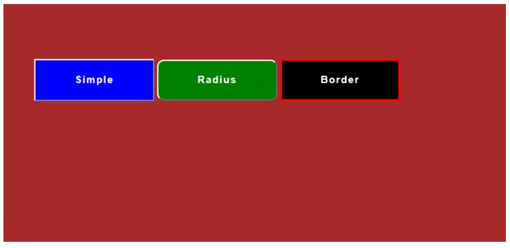
Example #1
Simple & Radius & Border Buttons.
Code:
<!DOCTYPE html>
<html>
<head>
<meta charset="ISO-8859-1">
<link rel="stylesheet" href="ButtonStyles.css">
<title>Simple & Radius & Border Buttons </title>
</head>
<body>
<div class="educba">
<button type="button" >Simple</button>
<button type="button" >Radius</button>
<button type="button" >Border</button>
</div>
</body>
</html>
CSS Logic:
.educba{
width:900px;
padding:10% 50px;
margin:0 auto;
}
body{
background:brown;
}
button{
width:180px;
display:inline-block;/*top and bottom padding done respectively*/
padding:20px 0px;
text-align: center;font-family: sans-serif;
font-size: 15px;
font-weight: bold;
color:#fff;
position: relative; /*normal default position of button*/
text-decoration: none;
letter-spacing: 1.5px;
}
button:NTH-CHILD(1) { /*NTH-CHILD represent which button affects from multiple*/
background: blue;
}
button:NTH-CHILD(2) {
background: green;
border-radius: 10px;
}
button:NTH-CHILD(3) {
background: black;
border:3px solid red;
}
Output:
Example #2
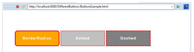
Border Radius-Dotted-Dashed Buttons.
Code:
<!DOCTYPE html>
<html>
<head>
<meta charset="ISO-8859-1">
<link rel="stylesheet" href="ButtonStyles.css">
<title>Border Radius-Dotted-Dashed Buttons</title>
</head>
<body>
<div class="educba">
<button type="button" >BorderRadius</button>
<button type="button" >Dotted</button>
<button type="button" >Dashed</button>
</div>
</body>
</html>
CSS Code:
.educba{
width:900px;
padding:10% 50px;
margin:0 auto;
}
body{
background:white;
}
button{
width:180px;
display:inline-block;
padding:20px 0px;
text-align: center;font-family: sans-serif;
font-size: 15px;
font-weight: bold;
color:#fff;
position: relative;
text-decoration: none;
letter-spacing: 1.5px;
}
button:NTH-CHILD(1) {
background: orange;
border:3px solid red;
border-radius: 10px;
}
button:NTH-CHILD(2) {
background: silver;
border:3px dotted red;/*border with dotted lines*/
}
button:NTH-CHILD(3) {
background: gray;
border:3px dashed red;/*border with dashed lines*/
}
Output:
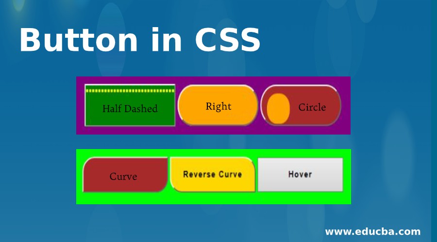
Example #3
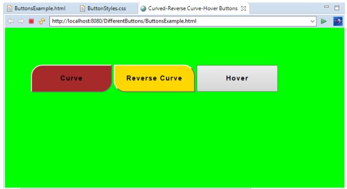
Curved-Reverse Curve-Hover Buttons.
Code:
<!DOCTYPE html>
<html>
<head>
<meta charset="ISO-8859-1">
<link rel="stylesheet" href="ButtonStyles.css">
<title>Curved-Reverse Curve-Hover Buttons</title>
</head>
<body>
<div class="educba">
<button type="button" >Curve</button>
<button type="button" >Reverse Curve</button>
<button type="button" >Hover</button>
</div>
</body>
</html>
CSS Code:
.educba{
width:900px;
padding:10% 50px;
margin:0 auto;
}
body{
background:lime;
}
button{
width:180px;
display:inline-block;
padding:20px 0px;
text-align: center;font-family: sans-serif;
font-size: 15px;
font-weight: bold;
color:black;
position: relative;
text-decoration: none;
letter-spacing: 1.5px;
}
button:NTH-CHILD(1) {
background: brown;
border-radius: 25px 0 25px 0;
}
button:NTH-CHILD(2) {
background: gold;
border-radius: 0 25px 0 25px;
}
button:NTH-CHILD(3):HOVER {
background: blue; /*hover than button becomes blue*/
}
Output:
Example #4
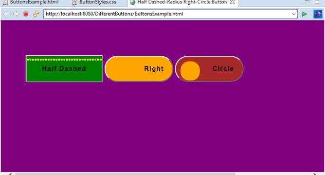
Half Dashed-Radius Right-Inside Circle Buttons.
Code:
<!DOCTYPE html>
<html>
<head>
<meta charset="ISO-8859-1">
<link rel="stylesheet" href="ButtonStyles.css">
<title>Half Dashed-Radius Right Circle Buttons</title>
</head>
<body>
<div class="educba">
<button type="button" >Half Dashed</button>
<button type="button" >Right</button>
<button type="button" >Circle</button>
</div>
</body>
</html>
CSS Code:
.educba{
width:900px;
padding:10% 50px;
margin:0 auto;
}
body{
background:purple;
}
button{
width:180px;
display:inline-block;
padding:20px 0px;
text-align: center;font-family: sans-serif;
font-size: 15px;
font-weight: bold;
color:black;
position: relative;
text-decoration: none;
letter-spacing: 1.5px;
}
button:NTH-CHILD(1){
background:green;
}
button:NTH-CHILD(1)::BEFORE {
content:"";
width:calc(100%); /*calc() function used for calculate width or height*/
height: calc(100%-14px);
position: absolute; /*not fixed moved along with a page if increase or decrease the page size*/
left: 0px;
top:5px;
border-bottom: 2px dashed yellow;
border-top: 2px dashed yellow;
}
button:NTH-CHILD(2) {
background: orange;
border-radius: 30px;
text-align: right;
width:160px;
padding-right: 20px;
}
button:NTH-CHILD(3)::BEFORE {
content:"";
width:calc(45px);
height: calc(45px);
position: absolute;
left: 11px;
top:11px;
border-radius:20px;
background: orange;
}
button:NTH-CHILD(3){
background: brown;
border-radius: 30px;
text-align: right;
width:160px;
padding-right: 20px;
}
Output:
Example #5
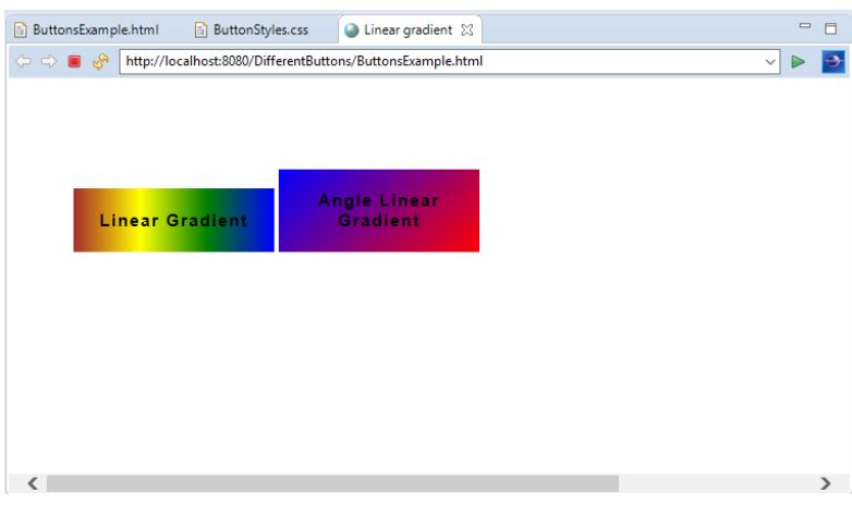
Linear Gradient Buttons.
Code:
<!DOCTYPE html>
<html>
<head>
<meta charset="ISO-8859-1">
<link rel="stylesheet" href="ButtonStyles.css">
<title>Linear gradient</title>
</head>
<body>
<div class="educba">
<button type="button" >Linear Gradient</button>
<button type="button" >Angle Linear Gradient</button>
</div>
</body>
</html>
CSS Code:
.educba{
width:900px;
padding:10% 50px;
margin:0 auto;
}
body{
background:white;
}
button{
width:180px;
display:inline-block;
padding:20px 0px;
text-align: center;font-family: sans-serif;
font-size: 15px;
font-weight: bold;
color:black;
position: relative;
text-decoration: none;
letter-spacing: 1.5px;
}
button:NTH-CHILD(1){
background: linear-gradient(to left,blue,green,yellow,brown); /*multiples colors at a time */border: 0px;
}
button:NTH-CHILD(2) {
background: linear-gradient(-45deg,red,blue);/* multiples colors at a time with angle*/
border: 0px;
}
Output:
Important Note: Apply CSS file within HTML file we must add below script in <head> tag.
<link rel="stylesheet" href="Styles.css">Recommended Articles
We hope that this EDUCBA information on “Button in CSS” was beneficial to you. You can view EDUCBA’s recommended articles for more information.

