Updated June 22, 2023
Introduction to CSS Border Generator
If you consider a box, the border always lies between the margin and the padding. The border is always on top of the HTML element, just like we have seen on top of the button. The border makes other element moves away if you use incorrect values, so you must use property; otherwise, the user interface is disturbed. In this topic, we are going to learn about CSS Border Generator.
Illustration with Example:
BorderGen.html:
<!DOCTYPE html>
<html>
<head>
<meta charset="ISO-8859-1">
<link rel="stylesheet" href="BorderStyles.css">
</head>
<body>
<div class="square">Hello How are you?</div>
</body>
</html>
BorderStyles.css:
div {
width: 200px;
height: 200px;
padding: 60px;
border: 60px solid transparent;
background-image: linear-gradient(0deg, brown, brown),
linear-gradient(0deg, pink, pink),
linear-gradient(0deg, red, red);
background-clip: content-box, padding-box, border-box;
/* background clip includes multiples areas like content,padding,border */
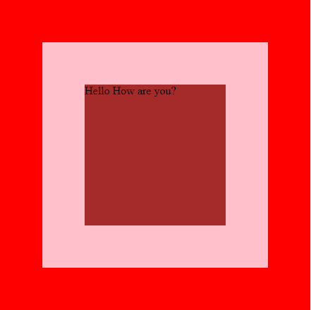
}Output:
Brief Explanation:
- Brown color space is content as shown in the above image.
- The above image has no padding, so the content “Hello, How are you” touched the top portion of the brown color.
- The pink color is the border, as we can see in the above picture, with a certain width.
- Last, Red is the margin with specific values, as in the above image.
How Does Border Generator Work?
It works on the border style, border color, and border width. Border width can be applied top, right, bottom, or left with any combination. Top, right, bottom, left, top-right, top-bottom, top-left-right, top-bottom-left, top-right-bottom-left, etc. combinations.
Syntax:
Selector{
property:value;
}
Example:
h1{
border-width:15px 20px 25px 30px; /* border width 15px(top) 20px(right) 25px(bottom) 30px(left) */
}
Examples of CSS Border Generator
Here are the following examples mentioned below
Example #1
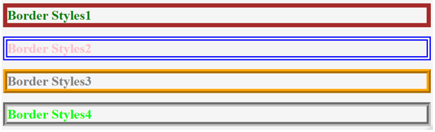
Solid-Double-Ridge and Groove Style Border:
Syntax:
h1{
border-style: double;
}
Example:
BorderStyles.html
<!DOCTYPE html>
<html>
<head>
<meta charset="ISO-8859-1">
<link rel="stylesheet" href="BStyles.css">
<title>BorderStyles</title>
</head>
<body>
<h1 class="a">Border Styles1</h1>
<h1 class="b">Border Styles2</h1>
<h1 class="c">Border Styles3</h1>
<h1 class="d">Border Styles4</h1>
</body>
</html>
BStyles.css
.a{
border-style: solid;
width: 1000px;
border-width: 10px;
color: green;
border-color: brown;
}
.b{
border-style: double;
width: 1000px;
border-width: 10px;
color: pink;
border-color: blue;
}
.c{
border-style: ridge;/* no curved edge border*/
width: 1000px;
border-width: 10px;
color: gray;
border-color: orange;
}
.d{
border-style: groove;/*curved edge border */
width: 1000px;
border-width:10px;
color: lime;
border-color: silver;
}
Output:
Example #2: Gradient Border
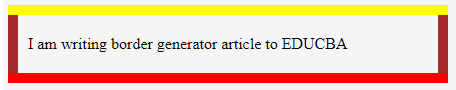
Allows multiple colors at a time in the border is known as Gradient Border.
Syntax:
h1{
background: linear-gradient(-45deg,blue,yellow,red,……);
}
Example:
BorderGradient.html
<!DOCTYPE html>
<html>
<head>
<meta charset="ISO-8859-1">
<title>Width-Style-Color</title>
<link rel="stylesheet" href="BorderGradient.css">
</head>
<body>
<div class="gen">
I am writing border generator article to EDUCBA
</div>
</body>
</html>
CSS Code:
.gen{
width: 400px;
padding: 20px;
border-top: 10px solid yellow;
border-bottom:10px solid red;
background-image:
linear-gradient(brown, brown),
linear-gradient(brown, brown);
background-size:10px 100%;
background-position:0 0, 100% 0;
background-repeat:no-repeat;
}
Output:
Example #3: Border Image
There are six types of border images
- Border-image-source
- Border-image-slice
- Border-image-width
- Border-image-outset
- Border-image-repeat
- Border-image
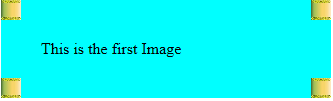
1. Border-image-source: We should provide the required image through url, which should be displayed on the border.
Syntax:
h1{
border-image-source:url("images.jpg");
}
Looks Like:
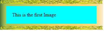
2. Border-image-slice: Cut the images into pieces and insert them into the border.
Syntax:
h1{
border-image-slice:50;
}
Looks Like:
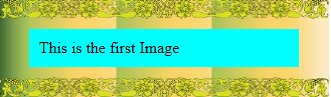
3. Border-image-width: Image displayed on the border with the specified width value.
Syntax:
h1{
border-image-width:30px;
}
Looks Like:
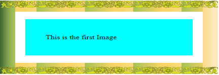
4. Border-image-outset: The image’s border will be set up beyond the specified width (as the name indicates outset).
Syntax:
h1{
border-image-outset:50px;
}
Looks Like:
5. Border-image-repeat: It has four types
a) Repeat: Image repeats on the border
Syntax:
h1{
border-image-repeat:30px;
}
Looks Like:
b) Stretch: Stretched image formed on the border
Syntax:
h1{
border-image-stretch:30px;
}
Looks Like:
c) Round: The image continued around the border without any disturbance at corners
Syntax:
h1{
border-image-round:30px;
}
Looks Like:
d) Space: Image formed with spaces on borders
Syntax:
h1{
border-image-space:30px;
}
Looks Like:
Example for Above All Border Images:
ImageBorder.html
<!DOCTYPE html>
<html>
<head>
<meta charset="ISO-8859-1">
<link rel="stylesheet" href="ImageBorder.css">
<title>Image Border</title>
</head>
<body>
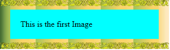
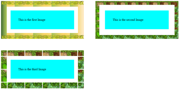
<p class="img1">This is the first Image</p>
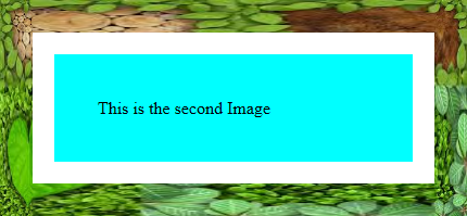
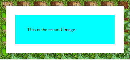
<p class="img2">This is the second Image</p>
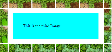
<p class="img3">This is the third Image</p>
</body>
</html>ImageBorder.css
p{
heigth:100px;
width:250px;
float:left;
margin:80px;
padding: 20px;
border:20px solid transparent;
background:aqua;
color: black;
}
.img1{
border-image-source:url("images.jpg");
border-image-slice:50;
border-image-repeat:repeat;/* image repeating on border*/
border-image-width:30px;/*border width image set as per value given and covered by image  */
border-image-outset:50px;/*border image covered beyond the specified width( as name indicates outset )  */
}
.img2{
border-image-source:url("images (1).jpg");
border-image-slice:50;
border-image-repeat:strench;/*it streches the image on border*/
border-image-width:30px;
border-image-outset:50px;
}
.img3{
border-image-source:url("images (1).jpg");
border-image-slice:50;
border-image-repeat:space;/*Given spaced image on border*/
border-image-width:30px;
border-image-outset:50px;
}
Output:
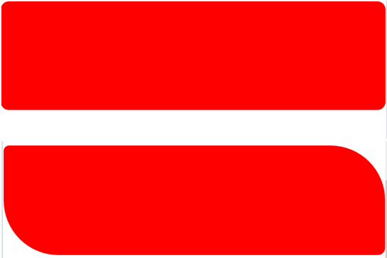
Example #4: Border Radius
Border comes with some radius.
Syntax:
h1{
border-radius: 15px 150px 20px 150px;
}
Example:
BorderRadius.html
<!DOCTYPE html>
<html>
<head>
<meta charset="ISO-8859-1">
<link rel="stylesheet" href="BorderRadius.css">
<title>Border Radius</title>
</head>
<body>
<div class="educba">
<div class="a"></div>
<div class="b"></div>
</div>
</body>
</html>
BorderRadius.css
body{
margin: 0px;
padding: 0px;
}
.educba{
max-width:1160;
margin:50px auto;
}
.a{
width: :200px;
height: 300px;
background: red;
margin:80px auto;
transition:1s; /*wait the cursor over 1 sec of time*/
border-radius: 20px;/* border with 20px radius*/
}
.a:HOVER {
border-radius: 50px;/*hover the cursor on the 1st red space border becomes circle*/
}
.b{
width: :200px;
height: 300px;
background: red;
margin:80px auto;
transition:1s;
border-radius: 15px 150px 20px 150px;
}
.b:HOVER {
border-radius: 150px 20px 150px 20px;/*hover the cursor on the 2nd red space you can see inverted image*/
}
Output:
Conclusion
Border can be used with any html element with gentle care. As we know, improper usage disturbs the entire alignment of the application.
Recommended Articles
We hope that this EDUCBA information on “CSS Border Generator” was beneficial to you. You can view EDUCBA’s recommended articles for more information.

