Updated June 15, 2023
Introduction to Menu Icon in CSS
The web pages we access have evolved at a skyrocketing pace and are continuing to do so. However, the basic structure of the pages continues to be similar to the earlier ones, with more dynamics added. There are certain things that a web page must mandatorily have. One such checkpoint for validating a web page is the triple bar menu icon, which upon clicking, opens like an accordion to give a visitor an overview of what they can explore on the website.
Examples of Menu Icon in CSS
In this article, we will explore various methods of creating a menu icon with the help of CSS and HTML. Let’s have a look at the example:
Example #1 – Creating a basic menu icon through CSS
We will write a simple CSS code to create a specific height and width bar and call for the tag on the HTML page three times to get the resultant triple bar icon.
a. Create a style sheet (namely MenuIcon.css), and write the definition for the <div> tag as specified below:
div {
width: 35px;
height: 5px;
background-color: black;
margin: 6px 0;
}
b. Now, create an HTML page, TestIcon.html. We will call the stylesheet and use it to create a menu.
<html>
<head>
<link rel = "stylesheet" href = "MenuIcon.css">
</head>
<body>
<div></div>
<div></div>
<div></div>
</body>
</html>
c. Save the page and open the HTML file through IE/Chrome/Firefox to see the result. A menu icon will be on the page’s top left corner.
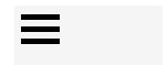
In this example, each horizontal bar’s height and width are specified. The margin adds some distance between each bar, and the background color of black highlights each bar to look like a menu bar together.
Example #2 – Animating the Menu Icon using CSS
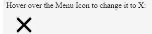
a. In this example, the bars created a CSS class menu within which we created specifications for div and its pseudo-elements of CSS, i.e., After and Before. The size of the menu is defined, which will encapsulate the bars of the menu icon; the size and margins for div are defined, which will be the middle bar, and the pseudo-elements after and before will be the upper and lower bar of the menu icon.
.menu{
margin: 1em;
width: 40px;
}
.menu:after,
.menu:before,
.menu div {
background-color:black;
border-radius: 3px;
content: '';
display: block;
height: 5px;
margin: 7px 0;
transition: all .2s ease-in-out;
}
b. Now, we will be working on the icon’s animation using the first and third bars, pseudo-elements of Before and After.
.menu:hover:before {
transform: translateY(12px) rotate(135deg);
}
.menu:hover:after {
transform: translateY(-12px) rotate(-135deg);
}
.menu:hover div {
transform: scale(0);
}
c. The logic for animation is that the upper bar (before) and the lower bar (after) rotate to the specified angle and direction when hovered upon. The middle bar (div) transforms to 0, i.e., vanishes upon hovering.
d. Here is the complete CSS code for this animation:(menuIcon.css)
.menu{
margin: 1em;
width: 40px;
}
.menu:after,
.menu:before,
.menu div {
background-color:black;
border-radius: 3px;
content: '';
display: block;
height: 5px;
margin: 7px 0;
transition: all .2s ease-in-out;
}
/* Move the upper bar */
.menu:hover:before {
transform: translateY(12px) rotate(135deg);
}
/* Move the lower bar */
.menu:hover:after {
transform: translateY(-12px) rotate(-135deg);
}
/* Make the mid bar fade out */
.menu:hover div {
transform: scale(0);
}
e. Now, we will use this CSS code through an HTML file to see the final output.
<html>
<head>
<link rel = "stylesheet" href = "MenuIcon.css">
</head>
<body>
<p>Hover over the Menu Icon to change it to X:</p>
<div class="menu">
<div></div>
</div>
</body>
</html>
The output for the same is:
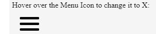
Example #3 – Writing CSS and JavaScript functions to animate the menu icon
a. Another method is to create a CSS icon with the transformation of each bar and call it on click-through a JavaScript function.
b. For writing the CSS code, we will define a menu class similar to the previous example. Instead of pseudo-elements, we will create three classes for each bar (before, mid, and after). We will apply to transform logic on each icon accordingly and make our CSS code ready (menuIcon2.css)
.menu{
margin: 1em;
width: 40px;
}
.before, .mid, .after {
background-color: #333;
width: 40px;
height: 5px;
margin: 6px 0;
transition: all .2s ease-in-out;
}
/* Animate bar#1 */
.change .before {
transform: rotate(-45deg) translate(-9px, 6px) ;
}
/* make bar#2 vanish post tranformation */
.change .mid {
transform: scale(0);
}
/* Animate bar#3 */
.change .after {
transform: rotate(45deg) translate(-8px, -8px) ;
}
c. Once this CSS code is ready, we will write a small function to trigger the transformation of the menu icon into a cross icon. We will call this function in the HTML file such that the icon transformation to X happens at the click of the mouse.
function menuIcon(x) {
x.classList.toggle("change");
}
d. We will call this function in an <script> in our HTML file and the CSS classes created. The final HTML file should look like this:
<html>
<head>
<link rel = "stylesheet" href = "MenuIcon2.css">
<script>
function menuIcon(x) {
x.classList.toggle("change");
}
</script>
</head>
<body>
<p>Click on the Menu Icon to change it to X:</p>
<div class="menu" onclick="menuIcon(this)">
<div class="before"></div>
<div class ="mid"></div>
<div class="after"></div>
</div>
</body>
</html>
e. When we check the HTML file, the output should look like this:
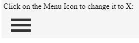
On clicking the menu icon, it will transform to X:
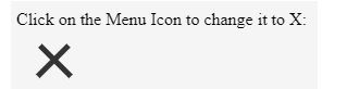
Conclusion
So, these were some examples of how we can create and animate menu icons using simple CSS and HTML. More options can be tried by modifying the transform logic. There are many other types of transformation on the menu icon we come across daily on different web pages. Some of them are very interesting to look at. But now that we know the basic logic to create the iconic menu icon, trying different transform logic will be fun.
Recommended Articles
We hope that this EDUCBA information on “Menu Icon CSS” was beneficial to you. You can view EDUCBA’s recommended articles for more information.

