Updated June 3, 2023
Introduction to CSS Inner Border
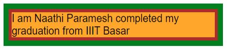
The inner border is nothing but space created between Border and outline property or element. We can apply the inner Border to the text of paragraphs, headers, table content, and images. There is no restriction that the inner Border always is in rectangular or square shape only; it can be any shape.
Rectangular border shape of the inner Border:
Rectangular border-radius shape of the inner Border:

The above two images conclude that the inner Border can be of any shape.
Working Principle of Inner Border
The inner Border is working on properties called outline and outline-offset. Outline property describes element border size, border type, and color of the Border, respectively.
Syntax:
div{
outline: 10px solid green;
}
Outline-offset describes the distance or space between the border and the outline element.
Syntax:
div{
outline-offset: 10px;
}
Examples with Syntax of CSS Inner Border
Given below are the examples of CSS Inner Border:
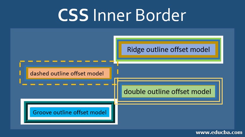
Outline Border has Multiple Types
- Solid: It provides the border with a solid, just like bold text.
- Dotted: It gives the border with dotted lines.
- Dashed: It provides the border with dashed lines.
- Double: It gives Border as double solid.
- Groove: It gives outside curved edges as a border.
- Ridge: It provides inside curved edges as a border (opposite functionality of groove).
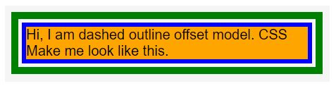
Example #1 – Outline and offset with Solid Border.
Syntax:
div{
outline: 10px solid green;
outline-offset: 10px;
}
Code:
<!DOCTYPE html>
<html>
<head>
<title>SolidOutline</title>
</head>
<style>
.solid {
width:400px;
length:100px;
margin: 40px 40px 40px 180px;
font-size:20px;
font-family:sans-serif;
border: 6px solid blue;
background-color: orange;
outline: 10px solid green;
outline-offset: 5px ;
}
</style>
<body>
<div class="solid">
Hi, I am dashed outline offset model. CSS Make me look like this.
</div>
</body>
</html>
Output:
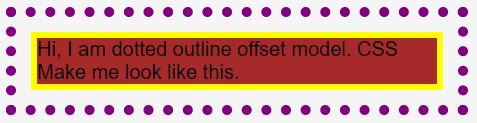
Example #2 – Outline and offset Dotted Border
Syntax:
div{
outline: 10px dotted blue;
outline-offset: 15px;
}
Code:
<!DOCTYPE html>
<html>
<head>
<title>DottedOutline</title>
</head>
<style>
.dotted {
width:400px;
length:100px;
margin: 40px 40px 40px 180px;
font-size:20px;
font-family:sans-serif;
border: 6px solid yellow;
background-color: brown;
outline: 10px dotted purple ;
outline-offset: 15px ;
}
</style>
<body>
<div class="dotted">
Hi, I am dotted outline offset model. CSS Make me look like this.
</div>
</body>
</html>
Output:
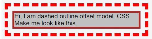
Example #3 – Outline and offset with Dashed Border
Syntax:
div{
outline: 10px dashed blue;
outline-offset: 12px;
}
Code:
<!DOCTYPE html>
<html>
<head>
<title>DashedOutline</title>
</head>
<style>
.dashed {
width:400px;
length:100px;
margin: 40px 40px 40px 180px;
font-size:20px;
font-family:sans-serif;
border: 6px solid brown;
background-color: silver;
outline: 10px dashed red ;
outline-offset: 15px ;
}
</style>
<body>
<div class="dashed">Hi, I am dashed outline offset model. CSS Make me look like this. </div>
</body>
</html>
Output:
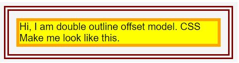
Example #4 – Outline and offset with Double Border
Syntax:
div{
outline: 10px double brown;
outline-offset: 13px;
}
Code:
<!DOCTYPE html>
<html>
<head>
<title>DoubleOutline</title>
</head>
<style>
.double {
width:400px;
length:100px;
margin: 40px 40px 40px 180px;
font-size:20px;
font-family:sans-serif;
border: 6px solid orange;
background-color: yellow;
outline: 10px double maroon ;
outline-offset: 15px ;
}
</style>
<body>
<div class="double">Hi, I am double outline offset model. CSS Make me look like this. </div>
</body>
</html>
Output:
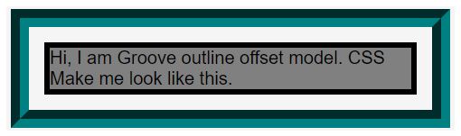
Example #5 – Outline and offset with Groove Border
Syntax:
div{
outline: 10px groove yellow;
outline-offset: 14px;
}
Code:
<!DOCTYPE html>
<html>
<head>
<title>GrooveOutline</title>
</head>
<style>
.groove {
width:400px;
length:100px;
margin: 40px 40px 40px 180px;
font-size:20px;
font-family:sans-serif;
border: 6px solid black;
background-color: gray;
outline: 20px groove teal ;
outline-offset: 17px ;
}
</style>
<body>
<div class="groove">Hi, I am Groove outline offset model. CSS Make me look like this. </div>
</body>
</html>
Output:
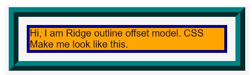
Example #6 – Outline and offset with Ridge Border
Syntax:
div{
outline: 10px ridge silver;
outline-offset: 10px;
}
Code:
<!DOCTYPE html>
<html>
<head>
<title>RidgeOutline</title>
</head>
<style>
.ridge {
width:400px;
length:100px;
margin: 40px 40px 40px 180px;
font-size:20px;
font-family:sans-serif;
border: 6px solid navy;
background-color: orange;
outline: 20px ridge teal ;
outline-offset: 17px ;
}
</style>
<body>
<div class="ridge">Hi, I am Ridge outline offset model. CSS Make me look like this.       </div>
</body>
</html>
Output:
Conclusion
The inner Border always creates space between the Border and the outer element; the Border creates space from the text to the top, whereas the outline border creates space between the borders to the outer element.
Conclusion Analogy:
The black color is border-created between the top and text, and the inner Border is green color created between the border outline.
Recommended Articles
This is a guide to the CSS Inner Border. Here we discuss the introduction, working principle, and different examples of Inner Border. You may also have a look at the following articles to learn more –

