Updated August 24, 2023
Excel Thermometer Chart (Table of Contents)
Description of Excel Thermometer Chart
A thermometer chart is based on a single data point; it is used to show the achievement percentage. It is based on a single cell of accomplishment and is the easiest way used in a dashboard to show the progress of all whether or not they have achieved their target.
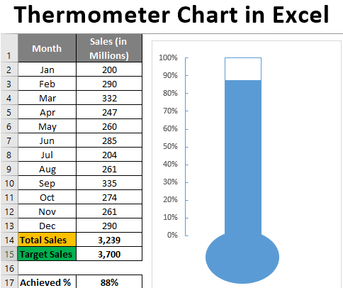
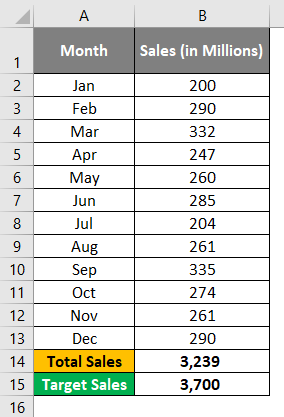
Suppose we have data for sales values captured month-wise in millions, as shown below:
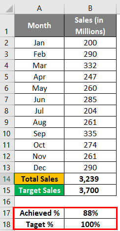
We have a Target of 3,700 Million for the year, and the one we have achieved is 3,239 Million, around 88% of the target we have achieved.
How to Create a Thermometer Chart in Excel?
Let’s understand how to create a thermometer chart with the below steps in Excel.
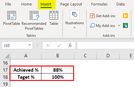
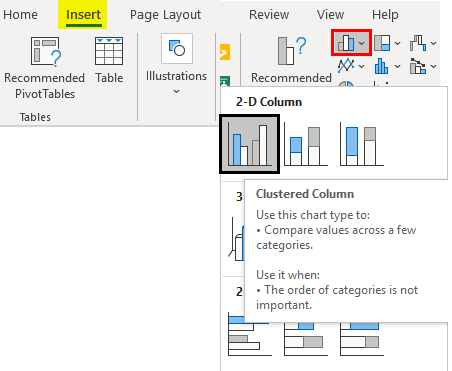
Step 1: Select Achieved and Target percentage values and navigate to the Insert menu tab on the Excel ribbon.
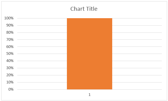
Step 2: Within Insert Menu, under the Graphs section, click on Insert Column or Bar Chart dropdown menu and then select the Clustered Column chart under the 2-D Column Chart section.
You can see a graph as shown below:
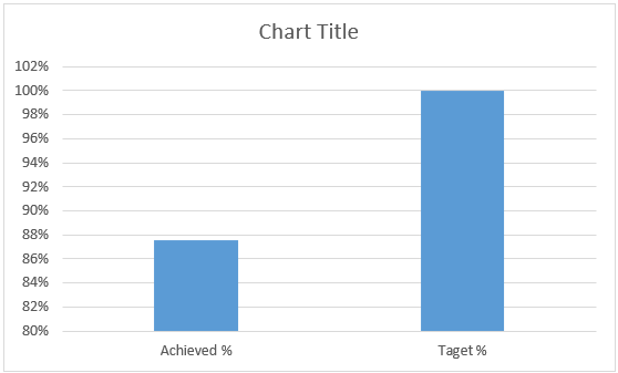
However, this is not something we expect as a Thermometer Chart. We need to make some amendments to the layout of this one to convert it into Thermometer Chart.
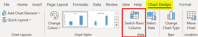
Step 3: With the chart selected, click on the Design tab, and under the Data group, click on the Switch Row/Columns option.
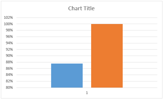
The Chart now will look as below:
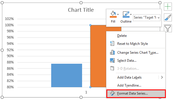
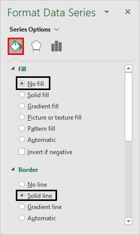
Step 4: Now, Select the orange column and right-click on it to access all the options available under it. Click on the Format Data Series option. It will open up a window at the extreme right in your Excel, where you can format the data series.
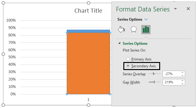
Step 5: Under the Format Data Series window at the extreme right of your Excel, click on the Secondary Axis radio button under Series Option. This will enable to overlap of the two series columns over one another, and it ideally becomes a stacked bar chart, as shown in the screenshot below:
Step 6: Select and right-click on the primary axis to format/modify the primary axis. The primary axis is the one that is on the left-hand side of the chart. Don’t select the one on the right-hand side of the graph.
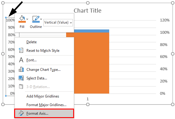
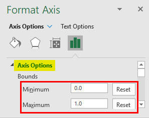
Step 7: Under the Format Axis panel that appears at the right, under Axis Options, change the Minimum and Maximum bound values to 0 and 1, respectively. It might appear as 0 and 1 by default, but you must manually change this to 0 and 1. You’ll see two Reset buttons beside Minimum and Maximum bound values as soon as you change these values.
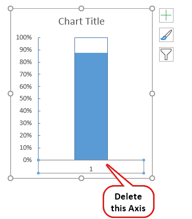
Step 8: Now, click on the secondary axis, which is placed at the rightmost corner of your chart, and press the Delete button through your keyboard to delete the same. The chart should look like the below now:
Step 9: Again, select the orange column and right-click towards the Format Data Series option. Inside the Format Data Series pane, change the following under Fill & Line section.
- Fill = No Fill
- Border = Solid Line (click on the radio button placed next to the Solid Line option)
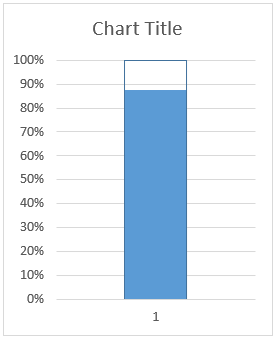
The graph now should look like the one below:
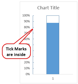
Step 10: Right-click on the axis again and select the Format Axis option. Under Axis Options, select the Major Type as Inside through the Tick Mark option.
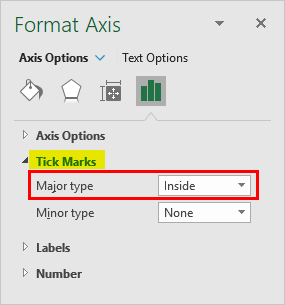
What this option will do is it will add the tick marks at the inner side of the axis so that after we remove all the gridlines and everything, we should see the axis values aligned properly. See the screenshot below:
Note that I have removed all the gridlines available under this chart. You can click on the horizontal lines and click the Delete keyboard button to delete the same.
Step 11: Delete the horizontal axis label as well.
We are almost done with our interesting Thermometer Chart. Follow the next few steps for quick final furnishes for this chart.
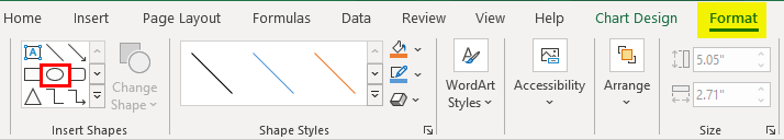
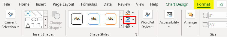
Step 12: Click on the Chart and navigate toward the Format tab at the Excel ribbon. You can see the Insert Shape group within it. Click on the Oval shape to add it at the bottom of this chart.
Align this oval shape at the bottom of our current chart.
You need to change the shape’s color to one of the charts and remove the shape outlines so that it could look like a part of the chart instead of a separate unit.
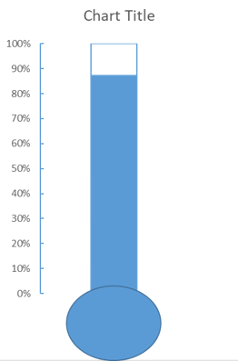
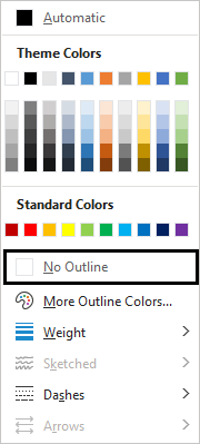
Step 13: Click on the shape to select it and navigate to the Format tab; from there, change the shape color to the one same as that of the chart (In our case, it is the same, so there is no need to worry) and under Shape Outline, click on No Outline option.
The final chart should look like the one below:
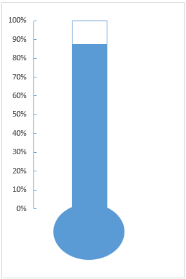
This is how we can configure Thermometer Chart inside Excel. This article ends here. Let’s wrap things up with some points to be remembered:
Things to Remember About Thermometer Chart in Excel
- A thermometer Chart is not a built-in option under the Charts section inside Excel Charts. Instead, we have to amend the 2-D Column Chart to convert it into a Thermometer Chart.
- This chart is well used when you have a target value, and the achieved value needs to be compared with the target value.
- Adding Shape at the bottom of the column chart is the key while creating the Thermometer Chart.
Recommended Articles
This is a guide to Thermometer Charts in Excel. Here we discuss How to Create a Thermometer Chart in Excel, practical examples, and a downloadable Excel template. You can also go through our other suggested articles –
