Updated June 14, 2023
Introduction to Border Images in CSS
We can set an image with the CSS border-image property and use it as the border around an element. The border-image property would be used to specify an image to be used as an additional background layer for the element instead of the border styles provided by the border-style properties.
There are three parts to the property:
- Create a border using an image.
- Where to split an image
- Describes whether center parts should be extended or repeated
This makes the image appear more prominent and vary from the other page items. In the upcoming examples, we will demonstrate how to add a border to an image.
CSS Border Images Properties
Following are the CSS border-image properties.
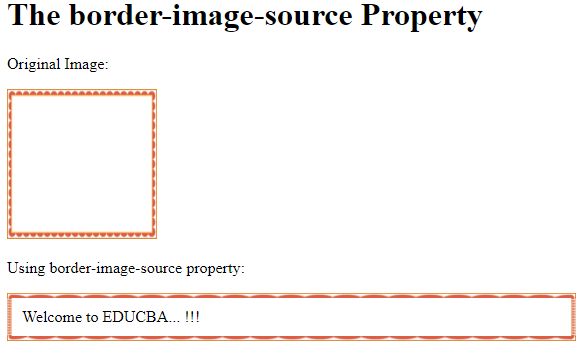
- border-image-source: This property defines the image path or source for the border-image.
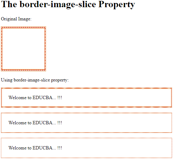
- border-image-slice: This property is used to slice the source image into regions.
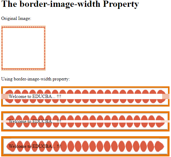
- border-image-width: This property specifies the width for border-image.
- border-image-repeat: Stipulates whether you should repeat, round, or stretch the border-image.
- border-image-outset: This property is used to determine the amount through which the region of the border image extends beyond the box.
Below are the properties for the CSS border image, written in syntax:
border-image: <'border-image-source'> || <'border-image-slice'> [ / <'border-image-width'> | / <'border-image-width'>? / <'border-image-outset'> ]? || <'border-image-repeat'>Examples to Implement CSS Border Image Properties
Here are the examples:
Example #1
Code:
<!DOCTYPE html>
<html>
<head>
<meta http-equiv="Content-Type" content="text/html; charset=windows-1252">
<title> CSS Border Image Property </title>
<style>
#border_img {
border: 5px solid transparent;
padding: 10px;
border-image-source: url(https://pluspng.com/img-png/png-certificate-borders-free-8-certificate-templates-free-itinerary-template-sample-intended-for-red-certificate-border-png-28044-1516.png);
border-image-slice: 50;
}
</style>
</head>
<body> <br>
<h1> The border-image-source Property </h1>
<p> Original Image: </p>
<img src="https://pluspng.com/img-png/png-certificate-borders-free-8-certificate-templates-free-itinerary-template-sample-intended-for-red-certificate-border-png-28044-1516.png" height="150" width="150">
<p> Using border-image-source property: </p>
<p id="border_img"> Welcome to EDUCBA... !!! </p>
</body>
</html>
Output:
Example #2
Code:
<!DOCTYPE html>
<html>
<head>
<meta http-equiv="Content-Type" content="text/html; charset=windows-1252">
<title> CSS Border Image Property </title>
<style>
#border_img_slice1 {
border: 5px solid transparent;
padding: 20px;
border-image-source: url(https://pluspng.com/img-png/png-certificate-borders-free-8-certificate-templates-free-itinerary-template-sample-intended-for-red-certificate-border-png-28044-1516.png);
border-image-slice: 5%;
}
#border_img_slice2 {
border: 5px solid transparent;
padding: 20px;
border-image-source: url(https://pluspng.com/img-png/png-certificate-borders-free-8-certificate-templates-free-itinerary-template-sample-intended-for-red-certificate-border-png-28044-1516.png);
border-image-slice: 10%;
}
#border_img_slice3 {
border: 5px solid transparent;
padding: 20px;
border-image-source: url(https://pluspng.com/img-png/png-certificate-borders-free-8-certificate-templates-free-itinerary-template-sample-intended-for-red-certificate-border-png-28044-1516.png);
border-image-slice: 15%;
}
</style>
</head>
<body><br>
<h1> The border-image-slice Property </h1>
<p> Original Image: </p>
<img src="https://pluspng.com/img-png/png-certificate-borders-free-8-certificate-templates-free-itinerary-template-sample-intended-for-red-certificate-border-png-28044-1516.png" height="150" width="150">
<p>Using border-image-slice property:</p>
<p id="border_img_slice1"> Welcome to EDUCBA... !!! </p>
<p id="border_img_slice2"> Welcome to EDUCBA... !!! </p>
<p id="border_img_slice3"> Welcome to EDUCBA... !!! </p>
</body>
</html>
Output:
Example #3
Code:
<!DOCTYPE html>
<html>
<head>
<meta http-equiv="Content-Type" content="text/html; charset=windows-1252">
<title> CSS Border Image Property </title>
<style>
#border_img_slice1 {
border: 5px solid transparent;
padding: 20px;
border-image-source: url(https://pluspng.com/img-png/png-certificate-borders-free-8-certificate-templates-free-itinerary-template-sample-intended-for-red-certificate-border-png-28044-1516.png);
border-image-slice: 40;
border-image-width: 25px;
}
#border_img_slice2 {
border: 5px solid transparent;
padding: 20px;
border-image-source: url(https://pluspng.com/img-png/png-certificate-borders-free-8-certificate-templates-free-itinerary-template-sample-intended-for-red-certificate-border-png-28044-1516.png);
border-image-slice: 40;
border-image-width: 30px;
}
#border_img_slice3 {
border: 5px solid transparent;
padding: 20px;
border-image-source: url(https://pluspng.com/img-png/png-certificate-borders-free-8-certificate-templates-free-itinerary-template-sample-intended-for-red-certificate-border-png-28044-1516.png);
border-image-slice: 40;
border-image-width: 35px;
}
</style>
</head>
<body> <br>
<h1> The border-image-width Property </h1>
<p> Original Image: </p>
<img src="https://pluspng.com/img-png/png-certificate-borders-free-8-certificate-templates-free-itinerary-template-sample-intended-for-red-certificate-border-png-28044-1516.png" height="150" width="150">
<p>Using border-image-width property:</p>
<p id="border_img_slice1"> Welcome to EDUCBA... !!! </p>
<p id="border_img_slice2"> Welcome to EDUCBA... !!! </p>
<p id="border_img_slice3"> Welcome to EDUCBA... !!! </p>
</body>
</html>
Output:
Example #4
Code:
<!DOCTYPE html>
<html>
<head>
<meta http-equiv="Content-Type" content="text/html; charset=windows-1252">
<title> CSS Border Image Property </title>
<style>
#border_img_slice1 {
border: 5px solid transparent;
padding: 20px;
border-image-source: url(https://pluspng.com/img-png/png-certificate-borders-free-8-certificate-templates-free-itinerary-template-sample-intended-for-red-certificate-border-png-28044-1516.png);
border-image-slice: 40;
border-image-outset: 10px;
}
#border_img_slice2 {
border: 5px solid transparent;
padding: 20px;
border-image-source: url(https://pluspng.com/img-png/png-certificate-borders-free-8-certificate-templates-free-itinerary-template-sample-intended-for-red-certificate-border-png-28044-1516.png);
border-image-slice: 40;
border-image-outset: 15px;
}
#border_img_slice3 {
border: 5px solid transparent;
padding: 20px;
border-image-source: url(https://pluspng.com/img-png/png-certificate-borders-free-8-certificate-templates-free-itinerary-template-sample-intended-for-red-certificate-border-png-28044-1516.png);
border-image-slice: 40;
border-image-outset: 15px 2px;
}
</style>
</head>
<body> <br>
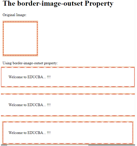
<h1> The border-image-outset Property </h1>
<p> Original Image: </p>
<img src="https://pluspng.com/img-png/png-certificate-borders-free-8-certificate-templates-free-itinerary-template-sample-intended-for-red-certificate-border-png-28044-1516.png" height="150" width="150">
<p>Using border-image-outset property:</p>
<p id="border_img_slice1"> Welcome to EDUCBA... !!! </p> <br>
<p id="border_img_slice2"> Welcome to EDUCBA... !!! </p> <br>
<p id="border_img_slice3"> Welcome to EDUCBA... !!! </p>
</body>
</html>Output:
Example #5
Code:
<!DOCTYPE html>
<html>
<head>
<meta http-equiv="Content-Type" content="text/html; charset=windows-1252">
<title> CSS Border Image Property </title>
<style>
#border_img_slice1 {
border: 5px solid transparent;
padding: 20px;
border-image-source: url(https://pluspng.com/img-png/png-certificate-borders-free-8-certificate-templates-free-itinerary-template-sample-intended-for-red-certificate-border-png-28044-1516.png);
border-image-slice: 40;
border-image-repeat: repeat;
}
#border_img_slice2 {
border: 5px solid transparent;
padding: 20px;
border-image-source: url(https://pluspng.com/img-png/png-certificate-borders-free-8-certificate-templates-free-itinerary-template-sample-intended-for-red-certificate-border-png-28044-1516.png);
border-image-slice: 40;
border-image-repeat: round;
}
#border_img_slice3 {
border: 5px solid transparent;
padding: 20px;
border-image-source: url(https://pluspng.com/img-png/png-certificate-borders-free-8-certificate-templates-free-itinerary-template-sample-intended-for-red-certificate-border-png-28044-1516.png);
border-image-slice: 40;
border-image-repeat: round stretch;
}
</style>
</head>
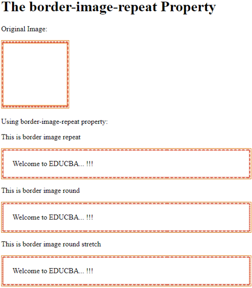
<body> <br>
<h1> The border-image-repeat Property </h1>
<p> Original Image: </p>
<img src="https://pluspng.com/img-png/png-certificate-borders-free-8-certificate-templates-free-itinerary-template-sample-intended-for-red-certificate-border-png-28044-1516.png" height="150" width="150">
<p>Using border-image-repeat property:</p>
<p> This is border image repeat </p>
<p id="border_img_slice1"> Welcome to EDUCBA... !!! </p>
<p> This is border image round </p>
<p id="border_img_slice2"> Welcome to EDUCBA... !!! </p>
<p> This is border image round stretch </p>
<p id="border_img_slice3"> Welcome to EDUCBA... !!! </p>
</body>
</html>Output:
Conclusion
So far, we have seen how border-image property can be used in place of border styles. However, the support for border image has improved, supporting all modern browser versions. This border-image property provides custom borders to images on their websites, making them look better. The border-image property is very useful, adding a unique dimension to your layout.
Recommended Articles
We hope this EDUCBA information on “Border Images in CSS” benefited you. You can view EDUCBA’s recommended articles for more information.

