
Scatter Plot Chart in Excel ( Table of Contents )
Scatter Plot Chart in Excel
Scatter Plot Chart in Excel is the most unique and useful chart where we can plot the different points with values on the chart scattered randomly, showing the relationship between the two variables placed nearer to each other.
Scatter Plot Chart is available in the Insert menu tab under the Charts section, which has different types, such as Scatter Scatter with Smooth Lines and Dotes, Scatter with Smooth Lines, and Straight Line with Straight Lines under both 2D and 3D types.
Where to find the Scatter Plot Chart in Excel?
Scatter Plot Chart in Excel is available under the chart section.
Go to Insert > Chart > Scatter Chart
How to Make the Scatter Plot Chart in Excel?
Scatter Plot Chart is very simple to use. Let us now see how to make the Scatter Plot Chart in Excel with the help of some examples. If Excel charting tools are not enough, you can try other scatter plot makers tools.
Example #1
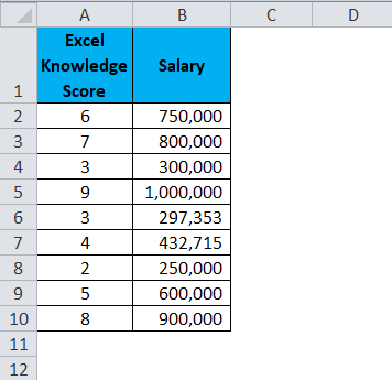
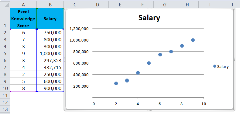
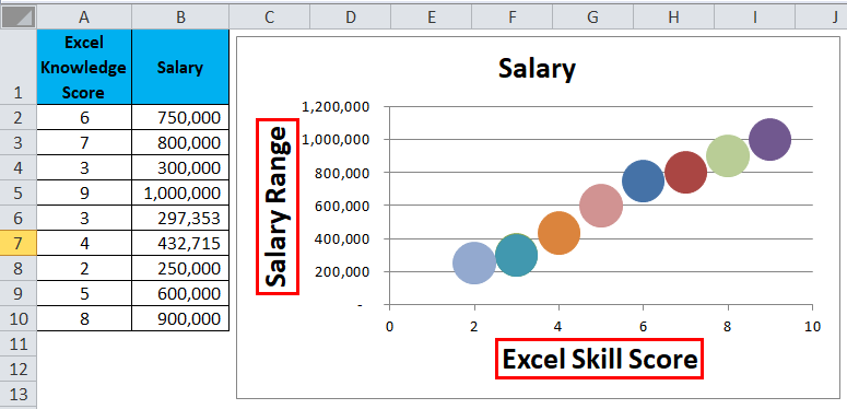
In this example, I am using one of the survey data. This survey is all about Excel knowledge score out of 10 and the salary range for each Excel score.
Using the X-Y chart, we can identify the relationship between two variables.
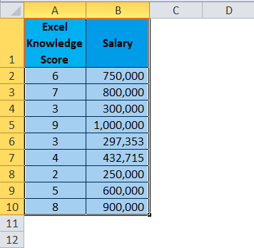
Step 1: Select the data.
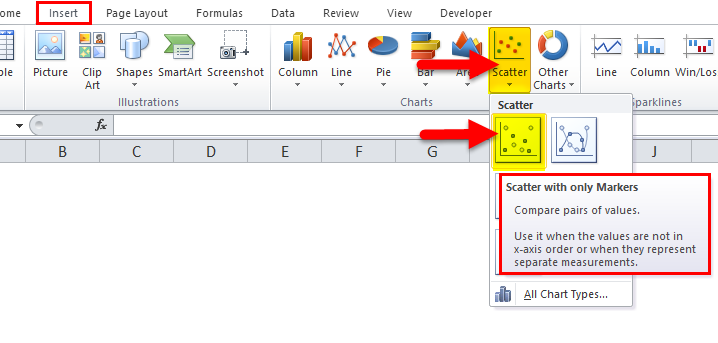
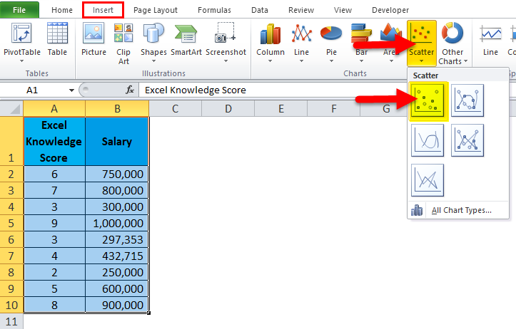
Step 2: Go to Insert > Charts > Scatter Chart > Click on the first chart.
Step 3: It will insert the chart for you.
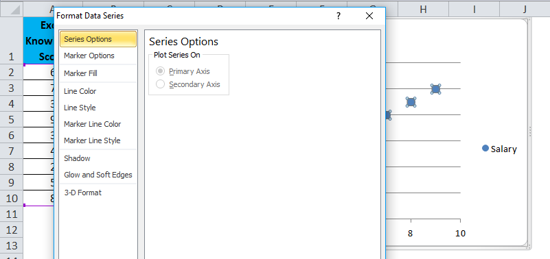
Step 4: Select the bubble. It will show you the options below, and press Ctrl + 1 (the shortcut key to formatting). On the right-hand side, an option box will open in Excel 2013 & 2016. In Excel 2010 and earlier versions, a separate box will open.
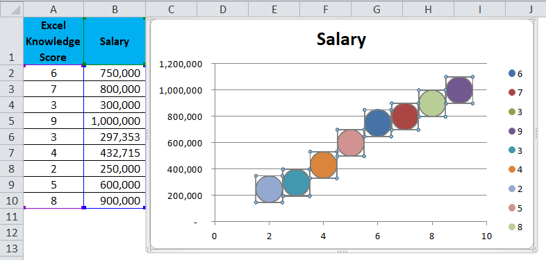
Step 5: Click the Marker Fill option and select Vary Colours by Point.
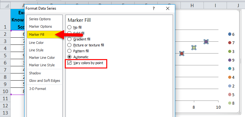
It will add different colors to each marker.
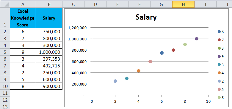
Step 6: Go to Marker Options > Select Built-in > Change Size = 25.
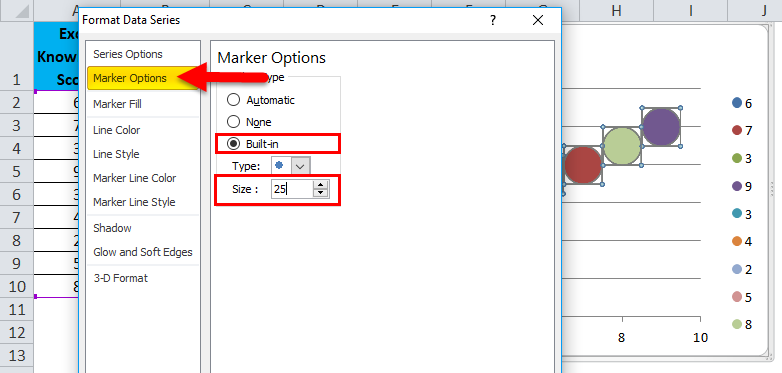
Step 7: Now, each marker looks bigger and looks a different color.
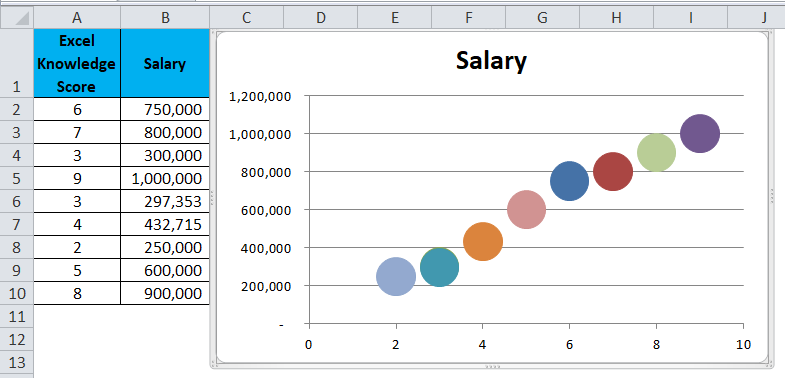
Step 8: Select Legend and press the delete option.
It will be deleted from the chart.
Step 9: Once you click on that chart, it will show all the options.
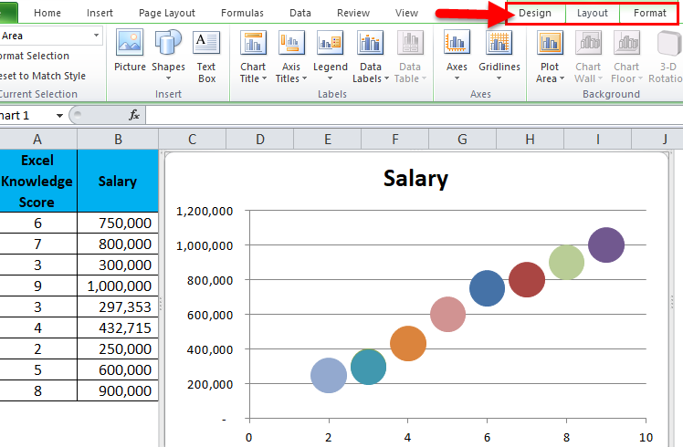
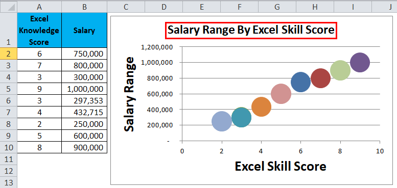
Select Axis Titles and enter axis titles manually.

The axis titles will be added.
Step 10: Similarly, Select The Chart title and enter the chart title manually.
Interpretation of the Data
Now each marker represents the salary range against the Excel skill score. The relationship between these two variables is “as the excel skill score increases the salary range is also increases”.
The salary Range is a dependent variable here. The salary range is increased only if the Excel skill score increases.
Example #2
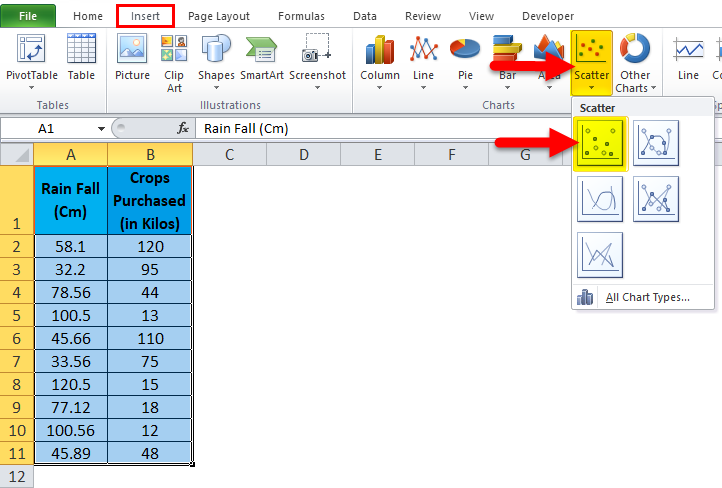
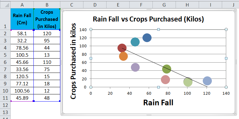
In this example, I will use the agriculture data to show the relationship between the Rainfall data and crops purchased by farmers.
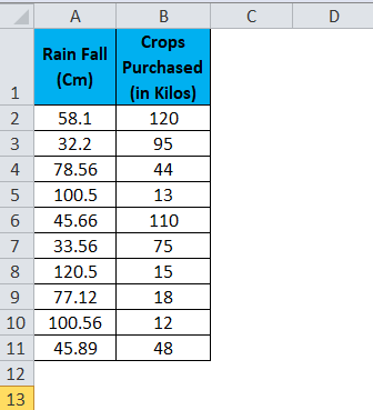
We need to show the relationship between these two variables using an X-Y scatter chart.
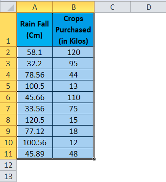
Step 1: Select the data.
Step 2: Go to Insert > Chart > Scatter Chart > Click on the first chart.
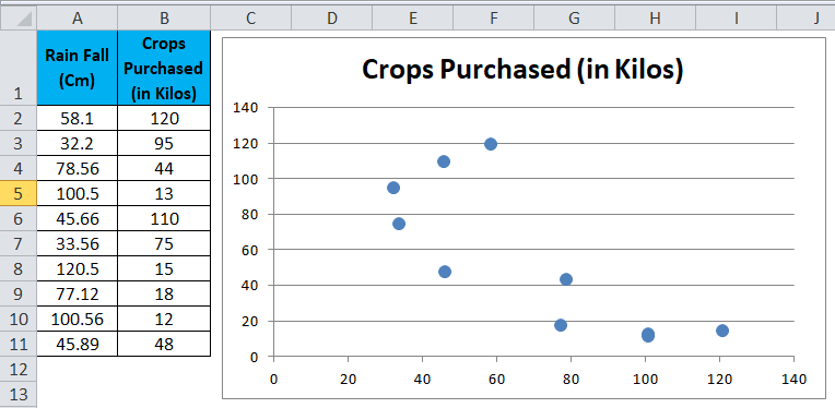
Step 3: This will create the scatter diagram.
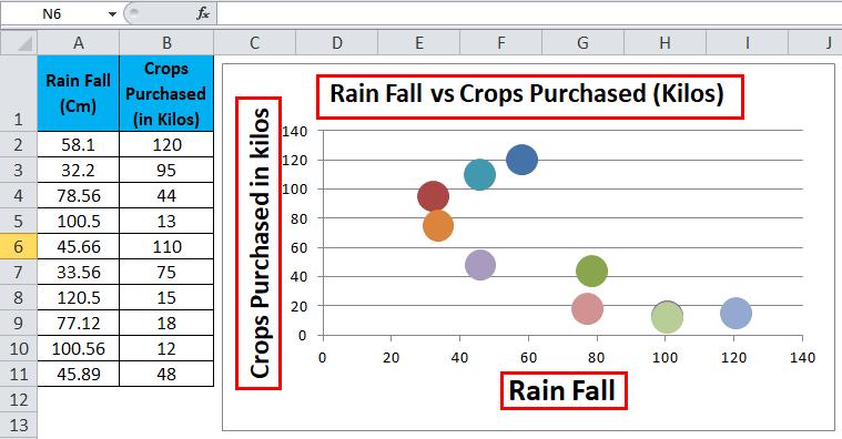
Step 4: Add the axis titles, increase the size of the bubble, and Change the chart title as we have discussed in the above example.
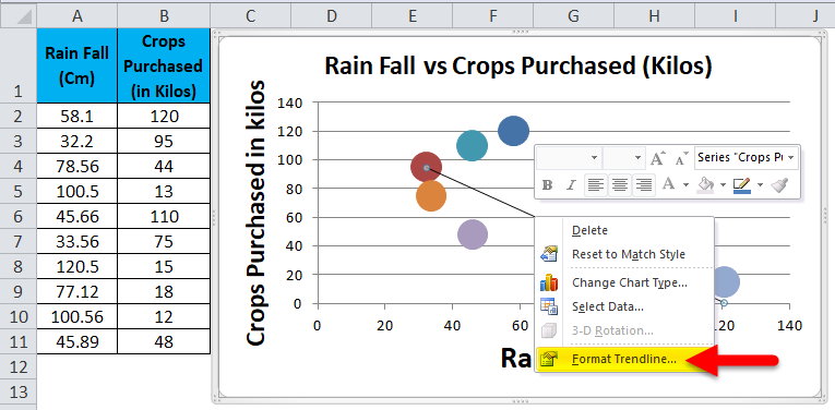
Step 5: We can add a trend line to it. Select the chart > Layout > Select trendline option > Select linear trendline.
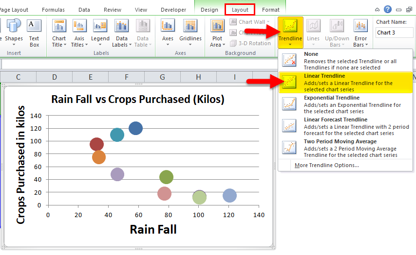
The Trendline will be added.
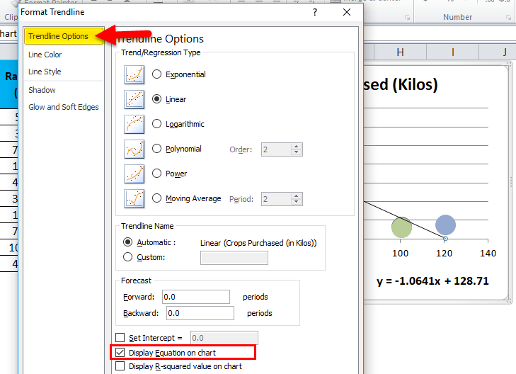
Step 6: This chart represents the LINEAR EQUATION. We show this equation. Select the trend line, and right-click select the option Format trendline.
It will open the box next to the chart. Select the Trendline option under that. Select the “Display Equation on Chart” option
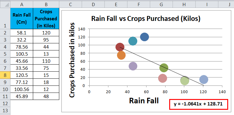
LINEAR EQUATION will be added, and a final chart will look like this.
Interpretation of the Chart
- We have created a chart showing the relationship between Rainfall and Crops purchased by farmers.
- The highest crops purchased is when the rainfall is above 40 cm and below 60 cm. In this rainfall range, farmers purchased 120 kilos of crops.
- However, as the rainfall increase beyond 62 cm, the crop purchased by farmers is going down and down. At 100 cm rainfall, the crops purchased is declined to 12 kilos.
- At the same time, even if the rainfall is not that great, crops sale is very less.
- It is very clear that crop sales are completely dependent on rainfall.
- Rainfall should be in between 40 to 60 cm to expect a good amount of crop sales.
- If the rainfall exceeds that range, the crop sale decreases considerably.
- As a crop seller, assessing the rainfall percentage and investing accordingly is very important. Otherwise, you have to deal with the stock of crops for a long time.
- If you are analyzing the rainfall carefully, you can increase the prices of the crops if the rainfall is ranging between 40 to 60 cm. Because in this range of rainfall, farmers are very much interested in buying crops and does not matter about the price level.
Things to Remember
- You need to arrange your data to apply to a scatter plot chart in Excel.
- First, find if there is any relationship between two variable data sets; otherwise, there is no point in creating a scatter diagram.
- Always mention the Axis Title to make the chart readable. Because as a viewer, it is very difficult to understand the chart without Axis Titles.
- Axis Titles are nothing but Horizontal Axis (X-Axis) and Vertical Axis (Y-Axis)
Recommended Articles
This has been a guide to Excel Scatter Plot Chart. Here we discuss how to create Scatter Plot Chart in Excel, practical examples, and a downloadable Excel template. You can also go through our other suggested articles –
