Updated March 21, 2023
Introduction to Adding Filters in Tableau Dashboard
Adding filters in the Tableau dashboard is steps involved to apply various filter conditions to the dashboard. Tableau starts the processing by connecting to the data source and importing the data to the workbook. After the data available on the workbook, the Tableau developer needs to select the appropriate measures, dimensions and the relevant chart types for the dashboard visualizations. To add the Filters Tableau provides options on the top right corner followed by “More options” that include “Use as Filter” option. Next, the relevant field needs to be selected for the filter configuration from the dataset that will reflect on the dashboard.
Adding Step-by-Step Filters to a Dashboard
Let’s proceed to add the filter to a dashboard. For this demonstration, we are considering the Distribution Unit Volume data. The data contains details pertaining to volume distributed across different distribution units lying in different regions. Important dimensions here are Distribution Unit, Region and Mode while Distribution Volume is a measure. Using this data, we will create sheets, build a dashboard and finally add the filter to the dashboard.
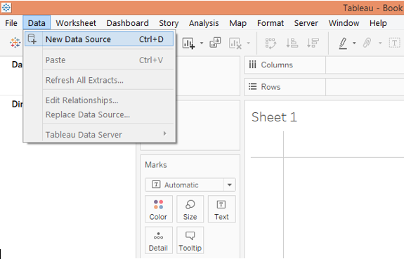
1. In the first place, load the data. For that click on “New Data Source” in the Data menu. Alternatively, click on “Connect to data”.
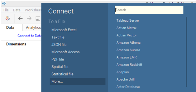
2. In “Connect”, select the requisite data source type. In this case, it is Microsoft Excel, so click on Microsoft Excel and load the data.
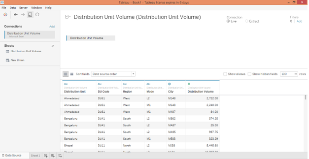
3. The data that gets loaded as can be seen in the below screenshot.
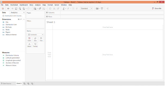
4. Moving to the sheet tab we can see the dimensions and measures present in the respective sections as shown by the below screenshot.
5. Let’s create the first analysis. The select Pie chart in Marks card then drags dimension Mode into the Columns region. Further, drag dimension Region and measure Distribution Volume over Color and Angle respectively in Marks card. We get two pie charts separate for each mode that shows Region-wise distribution volume contribution.
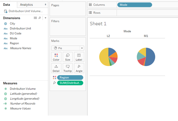
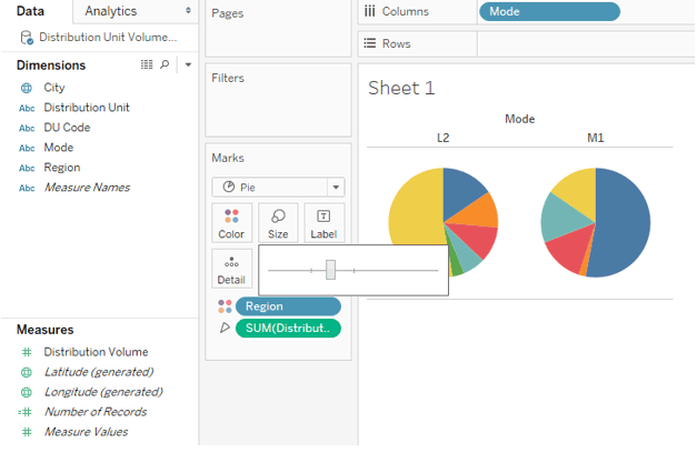
6. Adjust the size of the pie charts from Size in Marks card as shown below.
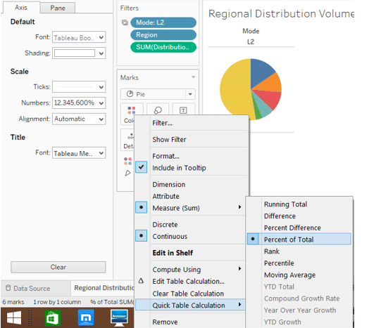
7. To get contribution as percentages go to the drop-down menu of Distribution Volume in Marks card, select “Percent of Total” in “Quick Table Calculation”. Rename this sheet “Regional Distribution Volume By Mode”.
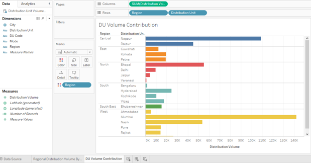
8. Next, in another sheet, we’ll create an analysis that gives us distribution unit wise distribution volume with the regional break-up. To generate it, drag measure Distribution Volume into Columns region and dimensions Region and Distribution Unit into Rows region. To distinguish each region, drag dimension Region over Color in Marks card. Once done, we get the following a horizontal bar chart. Rename the sheet as “DU Volume Contribution”.
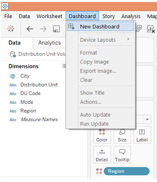
9. Now we will incorporate the above two analyses in a dashboard. To create a new dashboard, click on the “New Dashboard” option in the Dashboard menu as shown in the below screenshot. Alternatively, we can also click on the “New Dashboard” symbol in the sheet bar.
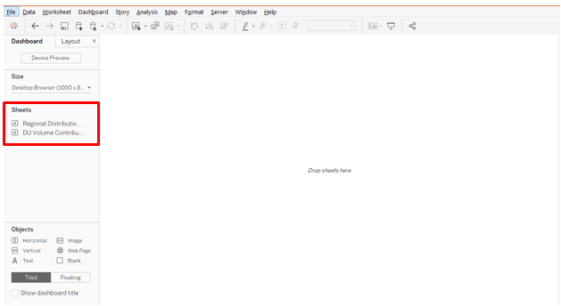
10. Following the above step creates a blank dashboard. The sheets appear on the left side as shown below.
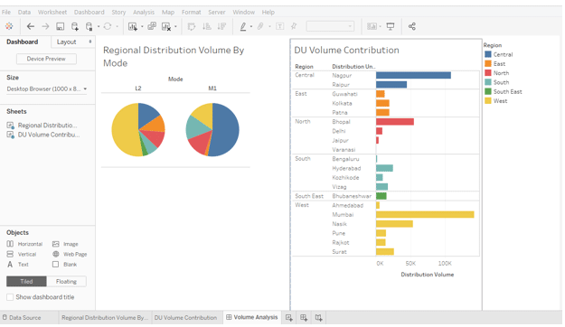
11. To get the analysis from a sheet, just double click over it, or drag that sheet into the “Drop sheets here” section. As illustrated below, we brought analysis from both the sheets into the dashboard.
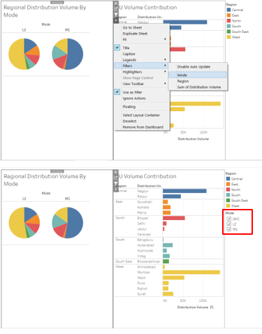
12. Now, we come to the most important part: adding filters to the dashboard. Click over any visualization, and on the right top corner, we find certain symbolic options. The lowermost is “More Options”, click over it.
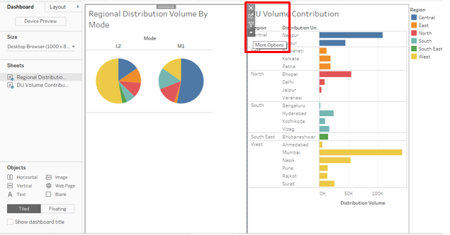
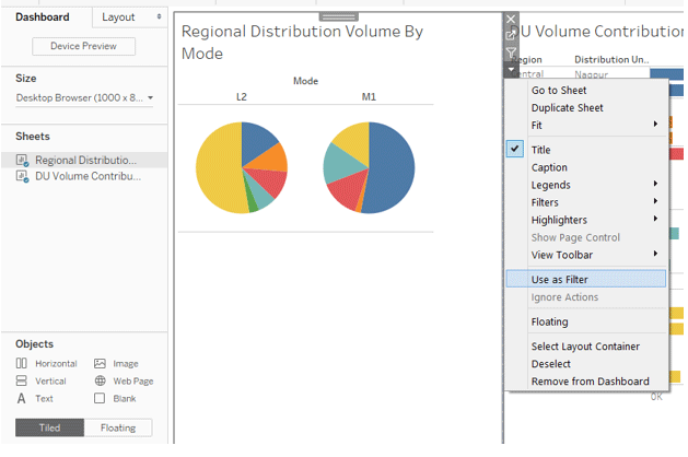
13. In More Options, click on “Use as Filter”. This is an easy and quick way to filter data using visualizations.
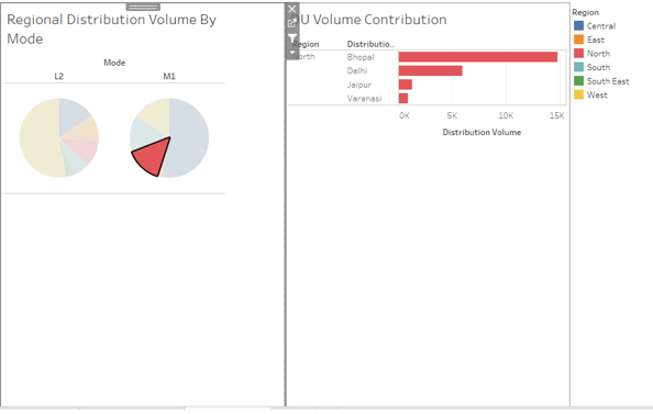
14. As can be seen in the below screenshot, just selecting a portion of the pie chart for Mode M1 gives details pertaining to it in the other analysis also.
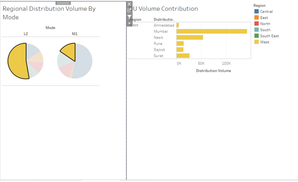
15. As illustrated below, selecting the West region in the pie charts gives total volume distribution for West in the DU Volume Contribution analysis also.
16. Now, we want the filter to appear over the dashboard. For that go to More Options, and in Filters select the field over which we want to create a filter. Like in this case, we created a filter for Mode as shown below. The filter appears on the right side of the dashboard as can be seen in the screenshot subsequent to the below screenshot.
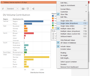
17. We can change the way we want to display the filter by right-clicking over it and selecting the suitable option. Like, in this case, we preferred to have a filter as a dropdown menu.
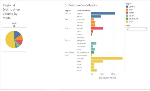
18. From the Mode filter dropdown, we selected L2 and as we can see below, data got filtered for the Pie “Regional Distribution Volume By Mode” analysis but not for “DU Volume Contribution”. This is because the filter is applied over the former analysis, and to have it work over the latter also, we need to apply it over all the sheets. We must remember that if two or more analyses have common fields over which the filter is generated, then only that filter will work for those analyses.
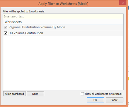
19. To apply a filter over all the sheets, right-click over it, and in “Apply to Worksheets”, click on “Selected Worksheets” post which “Apply Filter to Worksheets [Mode]” dialogue box appears as shown in the screenshot subsequent to the below screenshot.
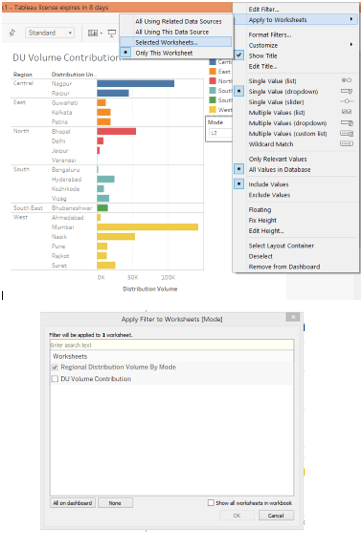
20. In the “Apply Filter to Worksheets [Mode]” dialogue box, check the DU Volume Contribution. This ensures that the filter now gets applied to analysis from all the sheets.
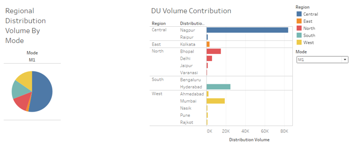
21. Let’s check if the filter got applied across all the sheets or not. In the Mode filter, select M1, and we can see, in the below screenshot, the analysis on the left side shows the contribution of different regions in distribution volume for mode M1. Similarly, we can see that the filter has affected the “DU Volume Contribution” analysis too. So, the filter has got applied across the sheets successfully.
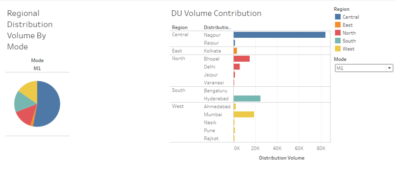
22. In the below screenshot, we selected mode L2 in the Mode filter giving us visual insights through both the analyses pertaining to that model only.
Conclusion
The significance of having filters over a dashboard lies in the fact that they shouldn’t help extract the contents and provide insights just for a particular analysis. Rather, filters are added over the dashboard to equally affect all the analysis in order to obtain context-specific insights from all the analyses.
Recommended Articles
This is a guide to Adding Filters in Tableau Dashboard. Here we have discussed the basic concept and stepwise process of Adding Filters in Tableau Dashboard. You can also go through our other suggested articles to learn more –
