Excel Data Visualization (Table of Contents)
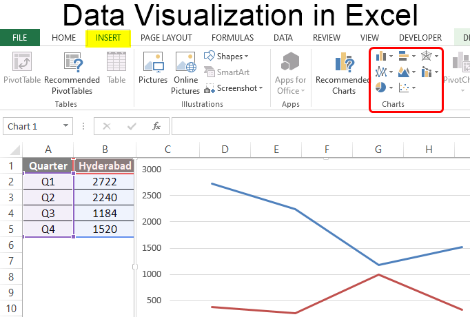
Introduction to Excel Data Visualization
Excel is widely used for data analysis owing to its excellent data visualization features. The data visualization capability of Excel allows for building insightful visualizations. Every chart in Excel has its own significance. Excel provides many built-in charts, which can be beautifully leveraged to use data correctly.
Various Types of Visualizations in Excel
To understand the data visualization capability of Excel, we will demonstrate the applications of various charts. This will familiarize us with the procedure to build these visualizations in Excel and use them for deriving insights from data.
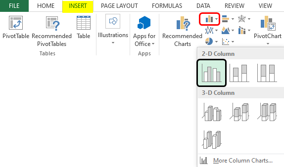
1. Column Chart
It is a very simple chart type that presents data as vertical bars. First, to build a column chart, select the data, then select the required option from the Column chart option, as seen below. As we can see, various options are in the Column chart, and the requisite one should be selected.
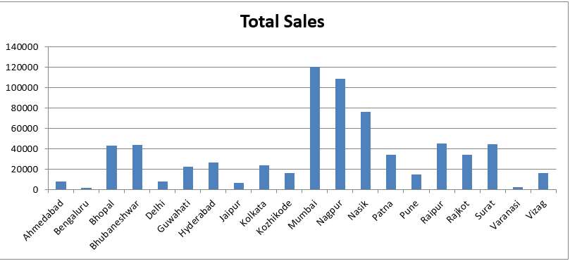
When we follow the above procedure, a column chart is created, as shown in the below screenshot. It is a very simple column chart that gives us region-wise total sales. The chart can be formatted as needed.
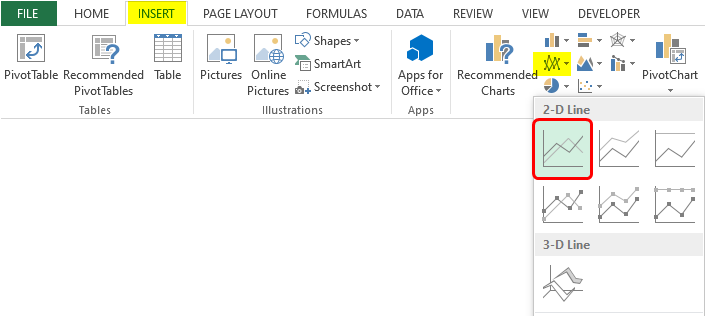
2. Line Chart
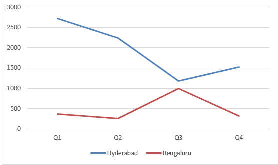
This chart is useful for observing trends. E.g., in this case, we have quarter-wise data for two cities, and we shall compare the sales trend over the quarters for these two cities. First, to build a line chart, select the data, and then select the requisite line chart option, as shown below.
Following the above procedure leads to creating a line chart, as shown in the screenshot below.
3. Pie Chart
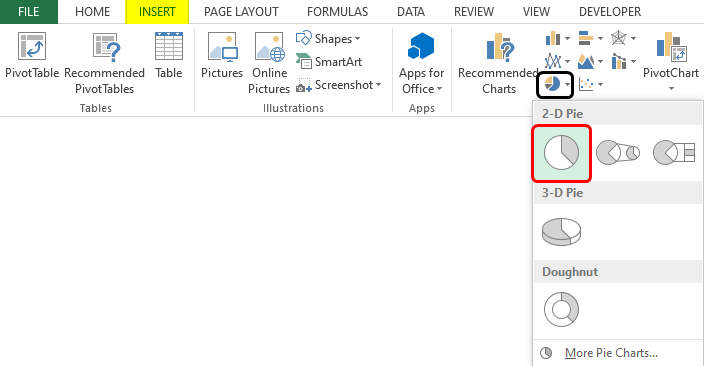
The pie Chart gives the contribution of a category. E.g., we shall build a pie chart to determine each quarter’s percentage contribution to total sales. To create a pie chart, select the requisite columns, and click on the required pie chart option from the Pie option as shown below.
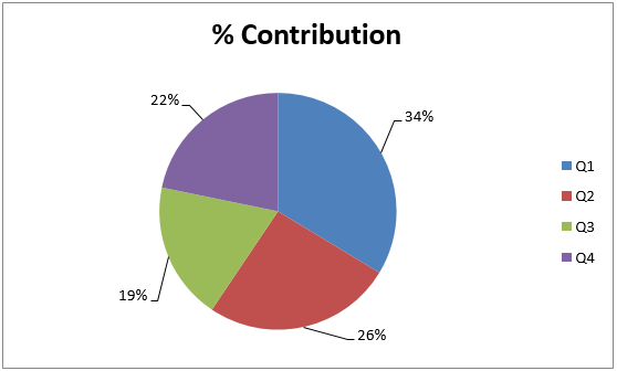
As a result of following the above procedure, a pie chart is created, which can be seen below. The pie chart gives us a quick insight into the percentage contribution.
4. Bar Chart
This chart type is no different than a column chart, only that we have horizontal bars here. To build a horizontal bar, select the bar chart option from the Bar option, as shown in the following screenshot.
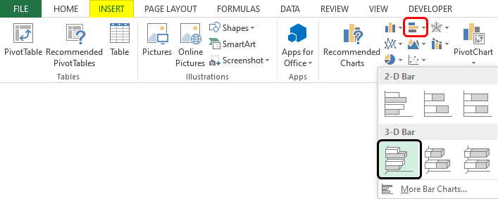
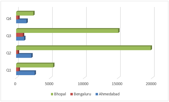
As we can see in the above screenshot, we selected clustered bar in 3-D, which gave us a clustered 3-D bar graph, as shown in the following screenshot. We can use this visualization to compare sales for three cities for four quarters.
5. Area Chart
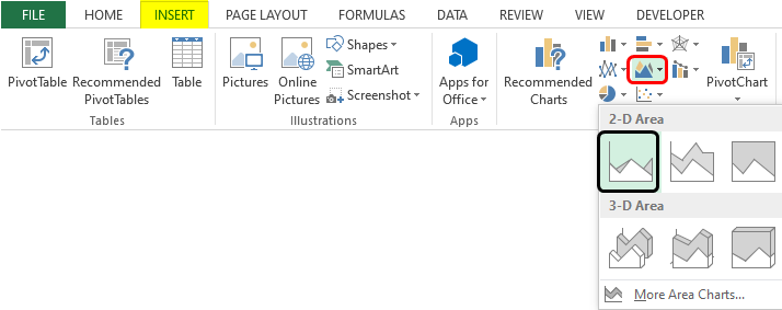
This chart represents the trend of a measure for various categories over time. The chart makes use of areas to present the data. To generate an area chart, we shall follow the steps in the screenshot below.
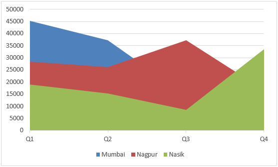
As we can see above, we selected the requisite range, and then we selected the requisite Area chart option from the Area option. As a result, we got the following chart, as shown in the screenshot. The area chart gives us a quick insight into the sales trend over the quarters for the three cities.
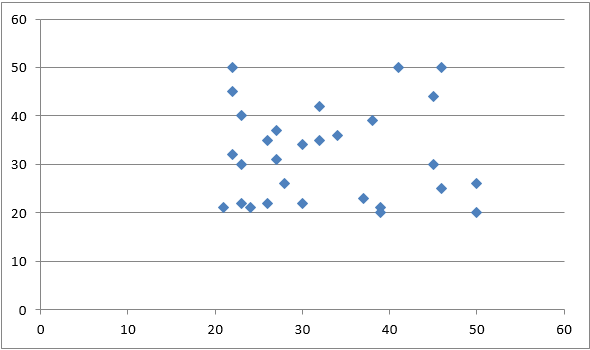
6. Scatter Chart
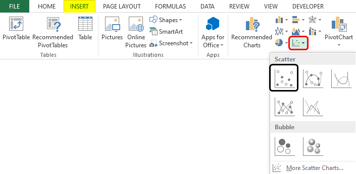
This chart helps in determining the relation between two variables. It is also referred to as the X-Y chart. The chart requires two series and takes corresponding individual values as x and y coordinates. To build a scatter plot, select the data and then the requisite scatter plot option, as seen in the following screenshot.
Following the above procedure leads to the creation of a scatter plot. As we can see, the pattern formed by the scatter plot allows us to derive insights based on the context.
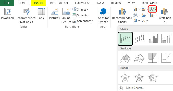
7. Stock Chart
These are special types of charts that are used for stock price analysis. To build a stock chart, select the data and the requisite stock chart option, as shown in the following screenshot.
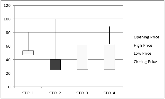
As can be seen in the above screenshot, the Open-High-Low-Close stock chart. This chart requires that stocks’ Opening, High, low, and Closing Prices be defined in the order. Each chart option in the Stock chart requires a different set of inputs. When the chart is built, it looks like as shown below.
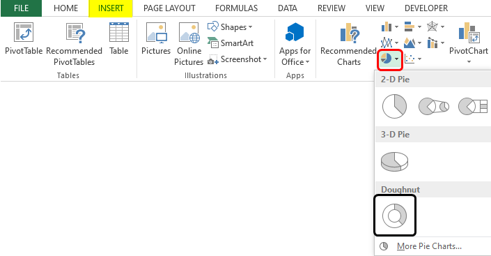
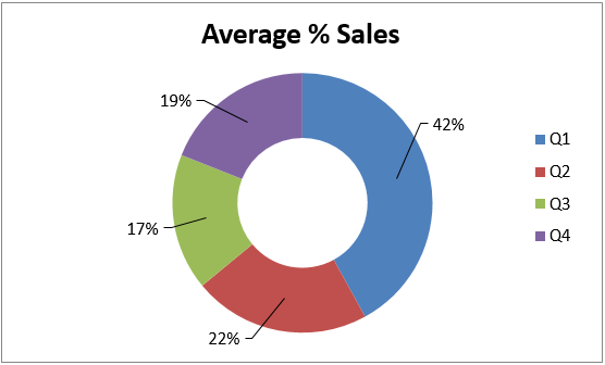
8. Doughnut Chart
This chart is a type of pie chart, only that it is represented in the shape of a doughnut. Building this chart is quite simple. Select the data over which the chart needs to be built, and then from the other chart option, select the required option from the two doughnut options. This is as shown in the below screenshot.
The above procedure leads to the creation of the doughnut chart, as shown below. The doughnut chart gives us an idea of the average % contribution in total sales. The middle space in the doughnut chart can be used to write a meaningful text that conveys some insight.
9. Bubble Chart
Bubble charts, though complex, can be beautifully used to derive insights from data. This chart takes into consideration three values. Two of the three dimensions represent X-axis and Y-axis, respectively, and the third value determines the size of the bubble. We shall build a bubble chart using the method illustrated below.
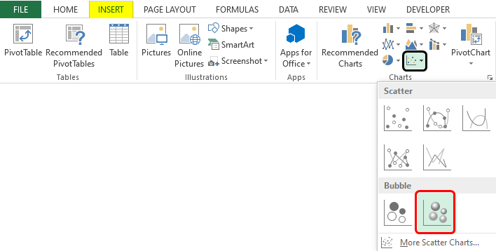
As seen in the above screenshot, we selected a bubble chart with a 3-D effect. Note that we selected numeric data only from the table for building the bubble chart, as seen in the screenshot. Following the above method, we get a bubble chart, as shown below.

Things to Remember About Excel Data Visualization
- When selecting a visualization in Excel for a particular problem, you should choose one before applying it.
- Visualization and its features must be studied in detail before using it. An incomplete understanding of the visualization might give incorrect results.
Recommended Articles
This is a guide to Excel Data Visualization. Here we discuss various types of Excel Data Visualization, practical examples, and a downloadable Excel template. You can also go through our other suggested articles –
