Updated August 24, 2023
Excel Pareto Analysis ( Table of Contents)
Introduction to Pareto Analysis in Excel
Pareto Analysis has based on the Pareto principle, which says 80% of the effect for a particular event (or many events in that case) has its roots in 20% of the causes/reasons. Vilfredo Pareto, an Italian economist, first developed the 80/20 principle. This principle is often remembered as an 80/20 pattern; hence, it is called the Pareto Principle. The analysis done using this principle is also known as Pareto Analysis. Some real-life examples of the Pareto Principle can formulate as follows:
- 20% of the stakeholders own 80% of the shares of one particular company.
- 20% of the people in this world acquire 80% of the wealth.
- 20% of the bugs cause 80% of the software issues.
How to Create a Pareto Chart in Excel?
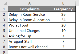
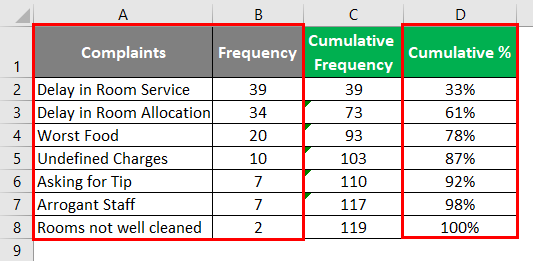
Suppose we have data as shown in the screenshot below. The hotel tracks the frequency of complaints for each category associated with it and increases the count by one unit whenever a client raises a complaint under a category. For instance, if a particular category receives one complaint, the frequency for that category will be one. Therefore, when someone says the frequency of complaints under a category is 40, it means 40 times a complaint has been raised. See the screenshot below for your reference.
Step 1: Under column C, capture the cumulative percentage. The cumulative percentage can be captured using the formula as shown below:
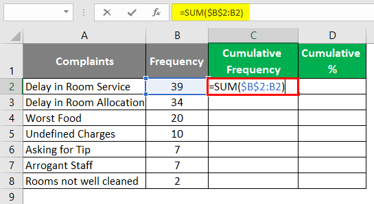
Well, this formula seems somewhat weird to the naked eye. However, this is the best suitable formula for capturing the running totals or cumulative sums.
Step 2: Drag this formula Across the cells C3:C8 to get the running total of the frequencies in column B. You can see it as shown below:
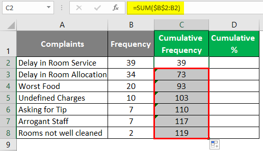
Every time, the system captures the sum of frequencies starting from cell B2 and up-to-the corresponding cell. For Ex. in cell C4, the sum value starts from B2 to B4.
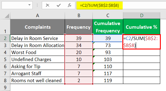
Step 3: In column D, find the cumulative percentage with the help of the formula =C2/SUM($B$2:$B$8).
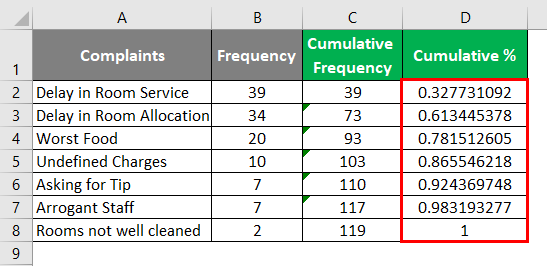
Step 4: Drag this formula down across the cells D3:D8 so that we can get the cumulative percentage of frequency to proceed with our Pareto chart. This can also be achieved using a keyboard shortcut Ctrl + D.
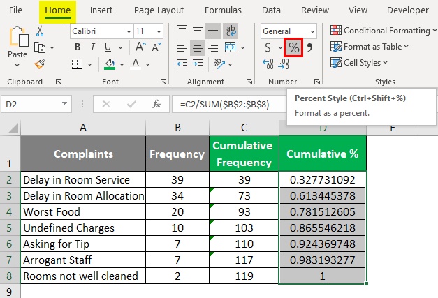
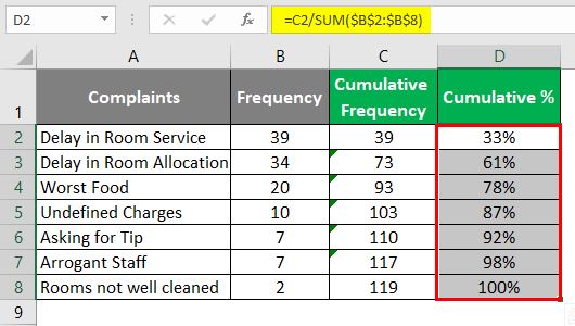
Step 5: Select the cells D2:D8 and navigate to the Number Formatting group under the Home tab, where you can see the Percentage Style button. Click on that button to change the style of cells as a percentage. Or else, you can press Ctrl + Shift + % button on your keyboard as a shortcut to achieve the result.
You should see the cells under column D are formatted as percentage values.
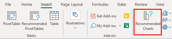
Step 6: Select columns A, B, and column D in your Excel data and navigate to the Insert tab through the Excel ribbon.
Step 7: Under the Charts group, click the Recommended Charts option. And you will see all the charts which can be used to represent this data visually.
As soon as you click on Recommended Charts option under the Charts section, a new window named Insert Charts will open up, as shown below:
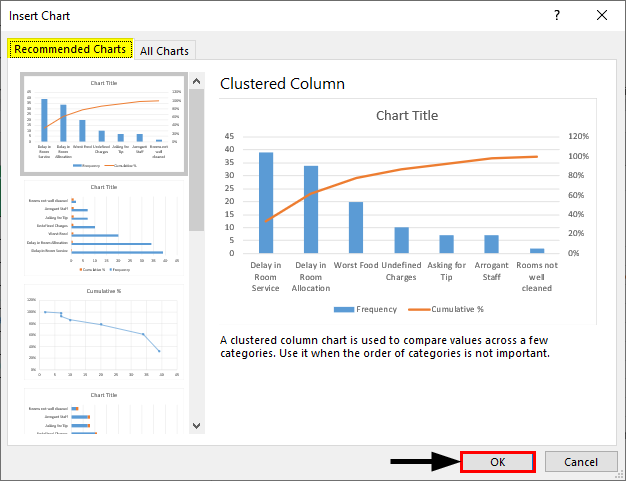
Step 8: Click on the All Charts tab in the Insert Chart window. Where you can see a list of charts available to insert under Excel.
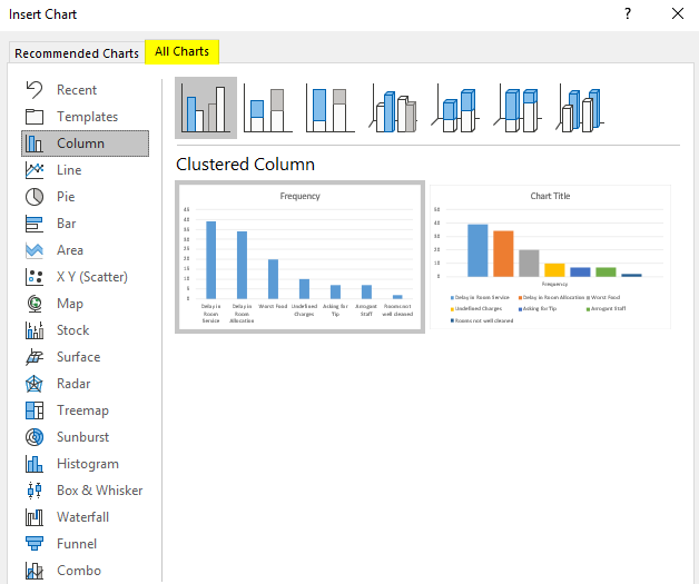
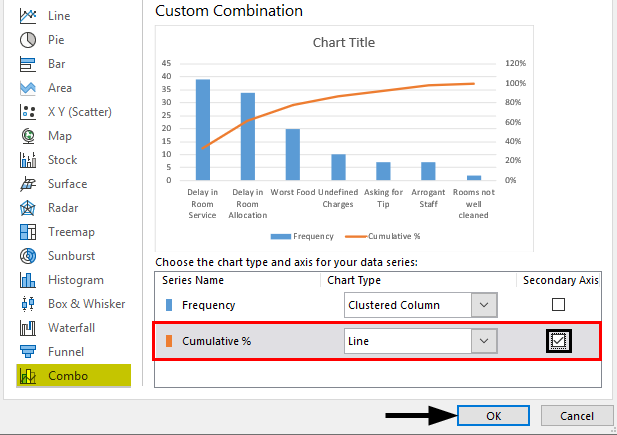
Step 9: Move towards the Combo option on the left-hand side and select Custom Combination under it to customize the chart.
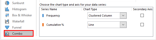
Step 10: Now, under Custom Combination, select and tick the Secondary Axis option for the Cumulative % series. The Cumulative % values will be plotted on the Secondary Axis. Click on the OK button once done. See the screenshot below:
The final chart should look at the one below:
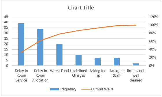
We would like to modify this chart to look like a Pareto chart. Follow the steps below for the same.
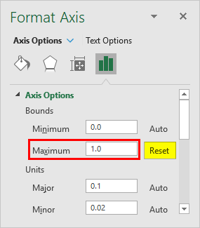
Step 11: Right-click on the Secondary Axis values on the graph and choose Format Axis… option. A new Format Axis pane will open up at the rightmost side of the Excel sheet. Under Axis Options, change the Maximum value for Bounds to 1.0. It is automatically set to 1.2, which means 120%.
If you see any Pareto Chart, you’ll observe that the gap between bars is very small. Bars are close to each other. We will try to reduce the gap between the bars of our Pareto chart.
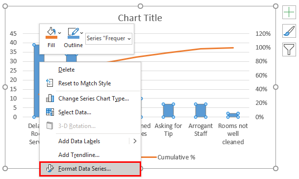
Step 12: Right-click on any of the bars and choose the Format Data Series… option at the end of the list of options.
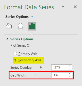
Step 13: You can see on the right-hand side; the Format Data Series window will open in Excel. Under Series Options, You will have the Gap Width option, which can be managed custom. Change the Gap Width to, say, 3% so that the bars get close to each other.
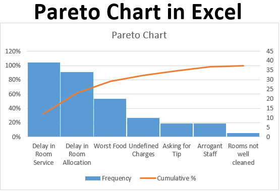
It looks like a Pareto Chart.
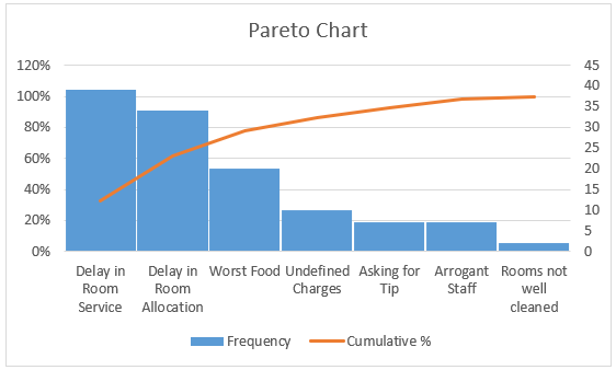
Here I have changed the color of the Cumulative % line series. Also, I have added a chart title for this chart.
Based on our Pareto Chart, we can say that Almost 90% of the complaints are raised for Delays in Room Service and Allocation. Therefore, these are the major areas we should keep improving for better customer feedback and reviews.
This is it from this article. Let’s wrap things up with some points to be remembered:
Things to Remember About Pareto Analysis in Excel
- In layman’s terms, Pareto Analysis is also called as 80/20 principle.
- It is always good to capture the cumulative percentage of the frequencies or data values and sort them in descending order.
- Cumulative values should not be a part of the chart. Only Frequency values and Cumulative Percentages should be a part of the chart.
Recommended Articles
This is a guide to Pareto Analysis in Excel. Here we discuss How to use Pareto Analysis in Excel, practical examples, and a downloadable Excel template. You can also go through our other suggested articles –
