Updated August 24, 2023
3D Plot in Excel
3D Plot in Excel plots the graph for those data sets, which may not give much visibility, compares feasibility with other data sets and plots the area when we have large data points. It is a creative way of changing a simple 2D graph into 3D.
How to Plot 3D Graphs in Excel?
Plotting 3D graphs in Excel is very easy and useful when converting data, pie charts, and graphs into a 3D format. Let’s understand how to plot 3D Graphs in Excel with some examples.
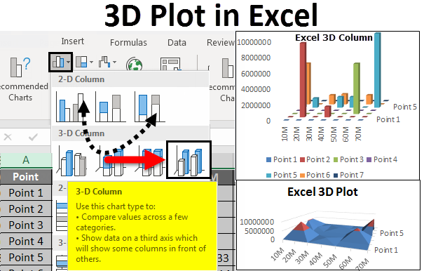
3D Plot can be accessed from the Insert menu under the Charts section.
3D Plot in Excel – Example #1
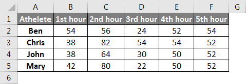
We have data where we have measured the distance climbed by some athletes in Meters. The distance is covered with an instance of an hourly basis. For consecutive 5 hours, each athlete has climbed some distance, and at the end, most distance covered, that athlete wins the game. By seeing the data, we might not come across a conclusion, or we cannot compare. Plotting this data in 3D graphs will make it easy to validate the case situation.
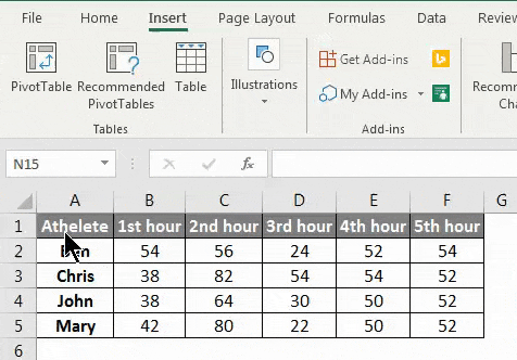
Now creating a 3D Plot for the above data set. First, select the data.
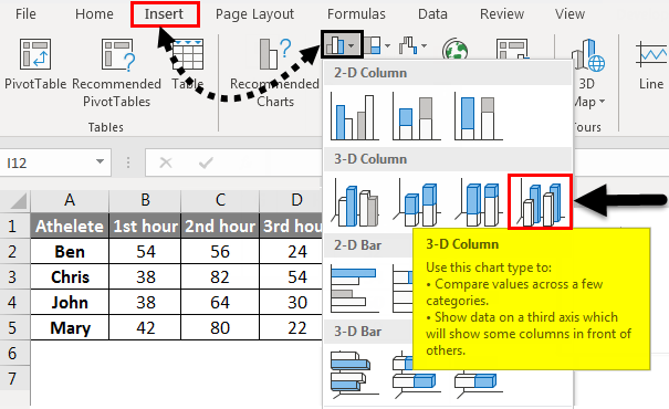
Then go to the Insert menu tab, and under the chart, select column chart. Once we click on it, we will get a drop-down menu. From there, select a 3D Column as shown below.
After selecting the 3D Column option, we will get a 3D plot with Columns as shown below. Here we can add Data labels, Axis Titles, and Headings and even change the design of 3D columns.
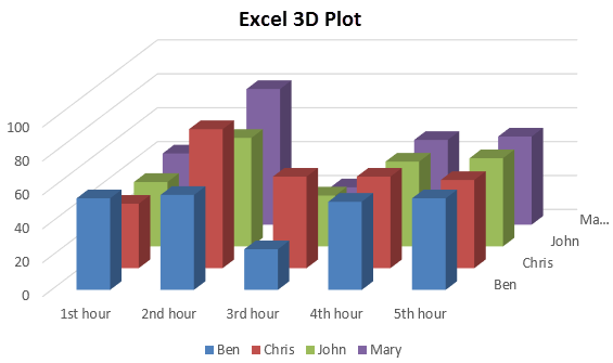
As we can see in the above graph, the whole data is mapped in Columns, and these columns are parallel framed with data. The height of columns have mapped, and height parameters are shown above on each column.
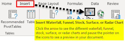
Let’s map this data again in a different 3D plot. We will now plot a 3D graph. First, select the data and then go to the Insert menu tab; under the Charts section, select Waterfall, Stock, Surface, or Radar chart, as shown below. (And for other Excel versions, select the Other Charts option)
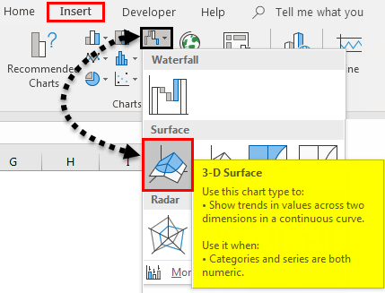
Once we do that, we will get a drop-down menu of Stok, Surface, and Radar charts. From there, select 3D Surface.
Once we do that, we will get the 3D Surface Plot, as shown below.
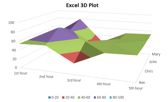
The above data shows the distance climbed by athletes by crest and trough, and different color region represents the distance range. By this, we can try some more 3D Plots available in Excel for our use.
3D Plot in Excel – Example #2
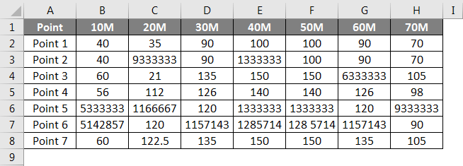
Let’s consider that surface height data from some defined points and the height is measured in each 10 Meter gap. Somewhere there is a huge spike in surface height; in others, there is a huge drop. The data is shown below.
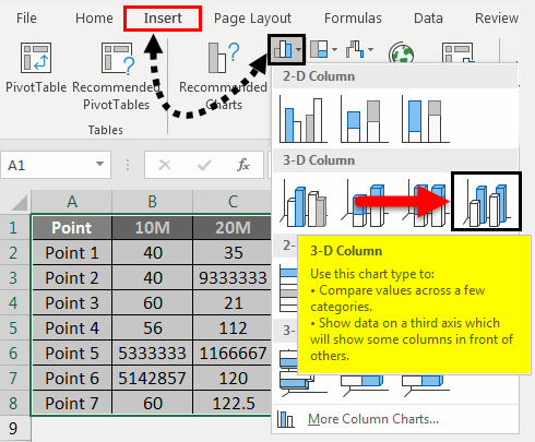
First, select the complete data for plotting the 3D graph for the above example. Then go to the Insert menu, and under the Charts section, select column chart as shown below. Once we click on it, we will get a drop-down menu. From there, select a 3D Column as shown below.
After selecting the 3D Column option, we will get a 3D plot with Columns as shown below.
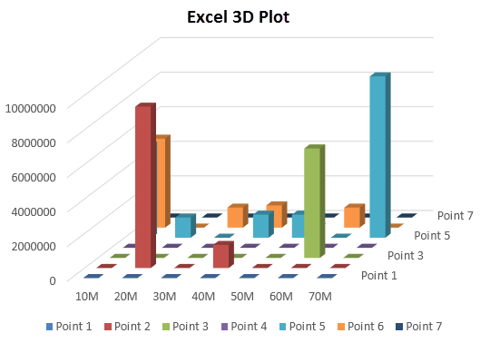
As we can see, there are a few huge towers and some flat blocks. Plotting this kind of data in 3D charts gives visibility where there are peaks and downs in the process. We can add data labels here.
Let’s plot another 3D graph with the same data. For that, select the data and go to the Insert menu; under the Charts section, select Line or Area Chart, as shown below.
After that, we will get the drop-down list of Line graphs, as shown below. From there, select the 3D Line chart.
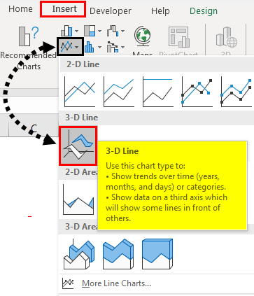
After clicking on it, we will get the 3D Line graph plot below.
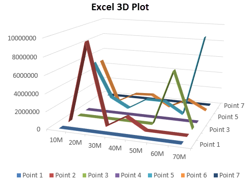
This is the most feasible, simple 3D plot. And it is very easy to understand, and the data in this plot are quite separated. And the variation in data is also clearly visible. Using a 3D Line plot is good when we have the data where we can easily see the separation.
The above-shown example is of them from the 3D plot category. We can create a 3D plot for Pie Chart, Area Chart, Bar Chart, and Combo Charts if our data allows us to represent different and required views.
If we create a Pie chart for the data we considered for the above-shown examples, we might not be able to get the desired view on a 3D plot. So it is better to understand first what we want to see; later, we can map it with the desired 3D plot.
Pros of 3D Plot in Excel
- Even if the data is presentable, the visibility becomes wider using a 3D Plot when data has dimensions.
- These 3D or simple graphs make updating modifications done in the backend easily.
- When we have the surface height data, we can also plot contour graphs.
Things to Remember
- Plotting a 3D graph in Excel is not always necessary when we have a simple data structure.
- While pasting the graph in different files, always paste it with the image to avoid any changes in the final graph.
- Ensure the data is in the proper format to facilitate easy graph modifications.
- Do not add data labels in 3D Graphs because the plot gets congested often. Use data labels when it is visible.
Recommended Articles
This has been a guide to 3D Plot in Excel. Here we discussed How to plot 3D Graphs in Excel, practical examples, and a downloadable Excel template. You can also go through our other suggested articles –
