Updated August 24, 2023
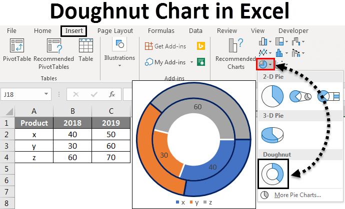
Doughnut Chart in Excel
A doughnut chart is a built-in feature in Excel. It represents the proportion of data where the total should be 100%. It looks a little similar to a pie chart with a hole.
How to Create Doughnut Charts in Excel?
Now we will see How to Create Doughnut Charts in Excel. We will see How to create different types of Doughnut Charts in Excel, like Doughnut charts with Single data series, Double Doughnut Charts, and Doughnut Charts with Multiple data series, and how to modify them with some examples.
Doughnut Charts in Excel – Example #1
Following is an example of a single doughnut in Excel:
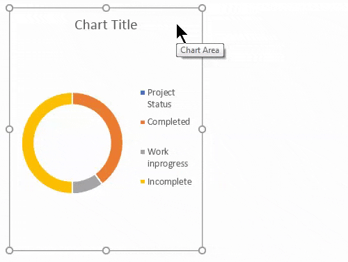
Single Doughnut Charts in Excel
Consider a project with three stages: completed, work, InProgress, and Incomplete. We will create a doughnut chart to represent the project status percentage-wise.
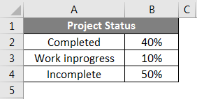
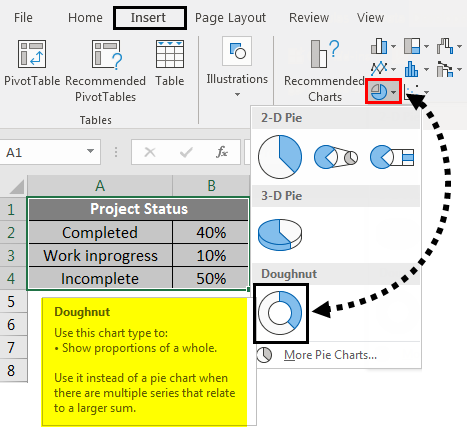
Consider the example of the above status of the project and will create a doughnut chart for that. Select the data table and click on the Insert menu. Under charts, select the Doughnut chart.
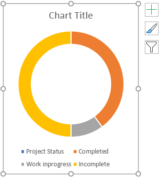
The chart will look like the one below.
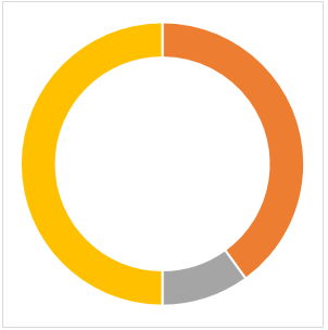
Now click on the + symbol that appears top right of the chart, which will open the popup. Untick the Chart Title and Legend to remove the text in the chart.
Once you do that, the chart will look like below.
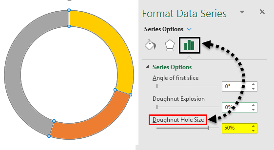
Now we will format the chart. Select the chart and right-click a pop-up menu that will appear. From that, select the Format Data Series.

A formatted menu appears on the right when clicking the Format Data series.
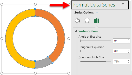
The “Format Data Series” menu reduces the Doughnut Hole Size. Currently, it is 75% now, reduced to 50%.
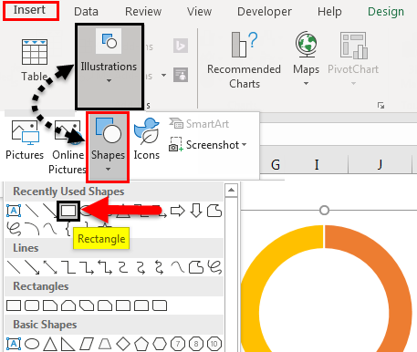
To input the percentage text, select Doughnut. Then click on Shapes under the Illustrations option from the Insert menu and select the Rectangle box.
Now click on the inserted rectangle shape and select the Text box in the picture below.
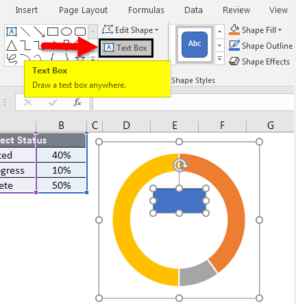
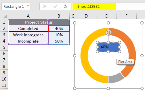
Now give the formula to represent the status of the project. For that input = (equal sign) in the text box, select the cell showing the value of completed status that is B2.
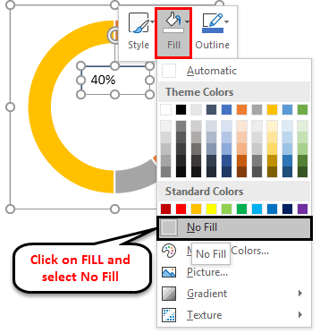
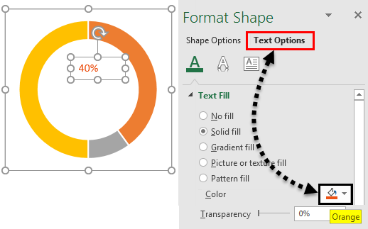
Now we should format that text. Right-click on the text and select the format. Select the Fill and No Fill, then the blue color disappears.
Now apply a format to the text per your doughnut color for that particular field. Now it is showing in Orange color; hence we will set the text color also in “Orange”.
Select the text, right-click from the pop-up, and select the formatting data series, and a menu will appear on the right side. Select “Text options” from the right-side menu and change the color to “Orange”.
Similarly, input the text for incomplete and work in progress.

Now change the percentages and see how the chart changes.
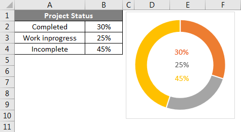
We can observe the changes in the chart and text if we input the formula in “Incomplete,” like 100%-completed-Work InProgress. So that Incomplete will pick automatically.
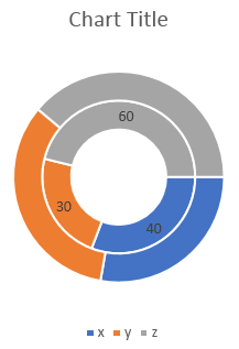
Doughnut Charts in Excel – Example #2
Following is an example of a doughnut chart in Excel:
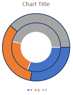
Double Doughnut Chart in Excel
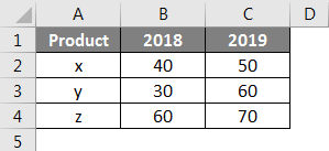
With the help of a double doughnut chart, we can show the two matrices in our chart. Let’s take an example of the sales of a company.
Here we are considering two years of sales, as shown below for the products X, Y, and Z.
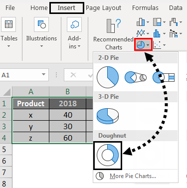
Now we will create a doughnut chart similar to the previous single doughnut chart. Select the data alone without headers, as shown in the below image. Click on the Insert menu. Go to charts and select the PIE chart drop-down menu. From the Dropdown, select the doughnut symbol.
Then the below chart will appear on the screen with two doughnut rings.
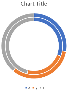
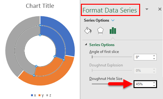
To reduce the doughnut hole size, select the doughnuts, right-click, and then select Format data series. Now we can find the option Doughnut Hole Size at the bottom, where you drag the percentage to reduce.
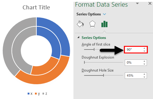
If we want to change the angle of the doughnut, change the settings of “Angle of the first slice”. We can observe the difference between 0 degrees and 90 degrees.
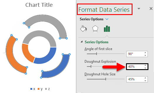
If we want to increase the gap between the rings, adjust the Doughnut Explosion. Observe the below image for reference.
If we want to add the shadow, select the middle option, which is highlighted. Select the required Shadow option.
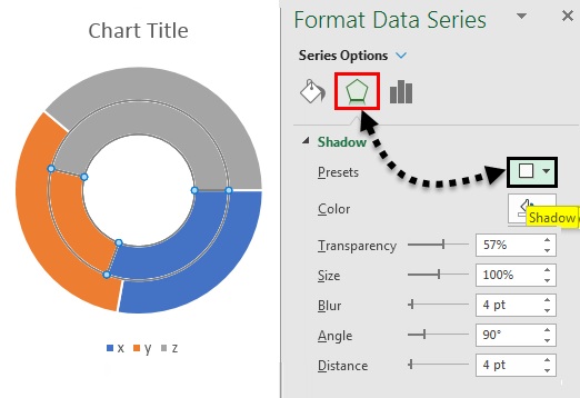
After applying the shadow, we can adjust the shadow related options like Color, Transparency, size, etc.
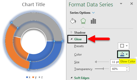
If we want to apply the color shadow, use Glow at the bottom of the “shadow” menu. As per the selected color, the shadow will appear.
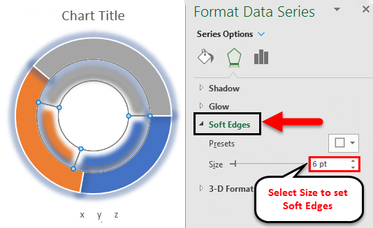
If we want to increase the edges’ softness, change the softness settings by selecting Soft Edges at the bottom of the Glow menu.
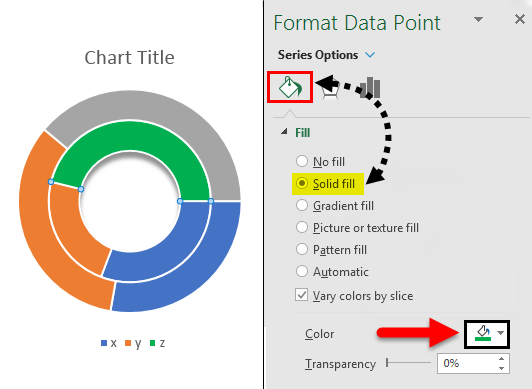
If we want a different color, select the particular ring we want to change the color. Observe the data to identify which ring you selected (Data will highlight as per your ring selection). Observe the below image; only the year 2018 is highlighted.
Select the particular part of the selected ring and change the color per your requirement. Please find the color box which is highlighted.
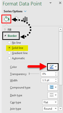
If we want to add the border to the ring, select the ring or part of the ring in which you want to add a border. Go to option Fill and line. Select the solid line and then change the required color for the border.
After applying the border to the selected rings, the results will look as shown below.
We can adjust the Width, Transparency, Dash type, etc., as per your requirements.
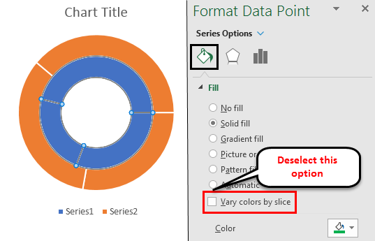
If we want to fill a single color for the entire ring, then deselect the highlighted option.
If we want the data figures on the ring, select the ring and right-click the option Add Data Labels.
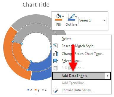
Then the data labels will appear on the ring, as shown below.
Doughnut Charts in Excel – Example #3
Following is an example of multiple doughnuts in Excel:
Multiple Doughnut Charts in Excel
Multiple doughnut charts are also created in a similar way; the only thing required to create multiple doughnuts is multiple matrices. For example, in the double doughnut, we have two years of data; if we have 3 or 4 years of data, we can create multiple doughnut charts.
Things to Remember
- Doughnut charts are similar to Pie charts with a hole in the center.
- Doughnut charts help create a visualization with single, double, and multiple matrices.
- It mostly helps to create a chart for 100 percent matrices.
- It is possible to create single doughnut, double doughnut, and multiple-doughnut charts.
Recommended Articles
This has been a guide to Doughnut Chart in Excel. Here we discussed How to Create Doughnut Chart in Excel and Types of Doughnut Charts in Excel, along with practical examples and a downloadable Excel template. You can also go through our other suggested articles –
