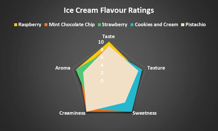
What is a Radar Chart in Excel?
A radar chart in Excel is a graph that has several axes (lines) starting from a single point in the middle. Each line shows data from a separate data column, and the data points connect in a circular manner. Because of its appearance, it is also called a spider, polar, star, or web chart.
It’s useful for comparing multiple variables and their values in a single chart, making it easy to identify patterns and variations among the data points.
Table of Contents
- What is a Radar Chart in Excel?
- How to Read & Interpret It?
- Types
- How to Make a Radar Chart in Excel?
- How to Edit the Chart?
- How to Change the Chart Design?
How to Read a Radar Chart?
Let’s say you want to compare the top 5 products your electronics company sells. In this example, we use the sales data from the second quarter of 2023 to create a radar chart in Excel, where:
- Each line will represent one of the products
- The dot on each line is the sales amount for that particular product.

#1: Interpreting Radar Chart with a Single Data Point
Since we only have one data point for sales, we can read the radar chart in Excel as follows:
- If the dot is closer to the center (origin), the lesser the sales.
- If the dot is farther from the center, the higher the sales.
So, the data point that is farthest from the center will be your best-selling product. In this case, the smartphone is your highest-selling product. This way, you can see the products that are already doing good and the products that you need to focus on.
#2: Interpreting Radar Chart with Multiple Data Points
In the earlier example, we only had one data point (sales), but we can also use it to study multiple data points.
Imagine you are choosing a top-rated tourist spot for a trip. You create a spider chart where each axis represents a specific tourist place. The points on the lines show ratings for Sightseeing, Food, History, and Transportation at each place.

We can interpret each data point individually, as follows:
- Switzerland stands out in Sightseeing, followed by Italy
- Italy stands out in History, followed by Paris
- Paris excels in Food, while Italy comes second
- Dubai and New York have higher ratings in Transportation.
We can also compare all the metrics together to know which tourist spot has the highest rating in all aspects. We can see that the best place to visit will be Paris, as it has the overall highest rating (all its data points are equal to or above 4).
Types of Radar Charts in Excel
Excel has 3 types of radar charts, depending on how we present the data. We can use lines only, lines with markers, or even filled areas to present the information.
1. Simple Radar Chart
It is the simplest radar chart in Excel, where only lines connect the data points.

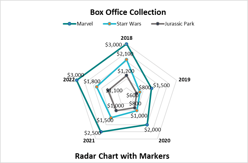
2. Radar Chart with Markers
In addition to lines, this spider chart uses dots (markers) to show the data points on the axes.

3. Radar Chart with Fills
This type of web chart doesn’t use lines or dots; instead, it fills the space between the data points completely.
How to Make a Radar Chart in Excel?
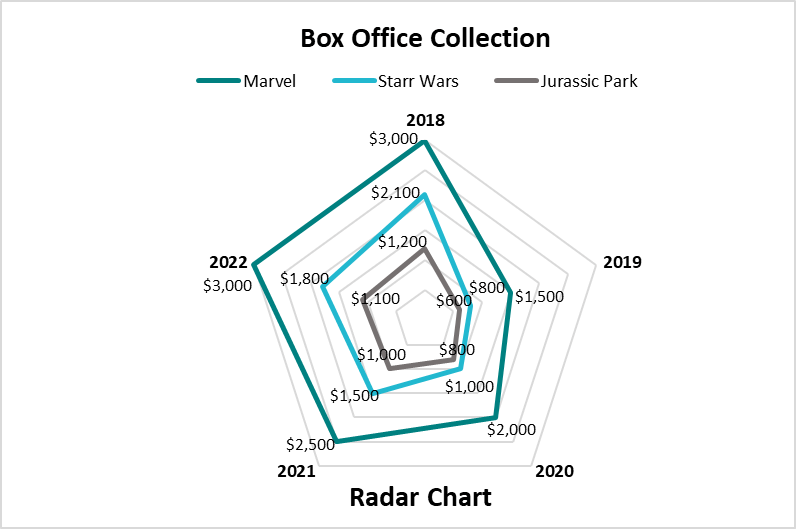
Let’s assume the box office earnings of three movie franchises (Marvel, Star Wars, and Jurassic Park) over five years. To visualize their performance, we will create three types of Radar Charts: Simple, with Markers, and with Fills.
Given:
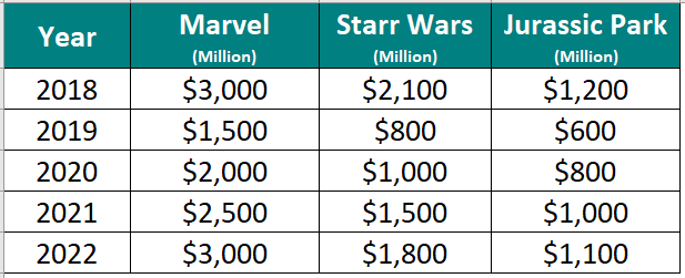
Solution:
A) Simple Radar Chart
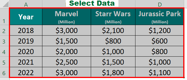
Step 1: Select the data, including the years and earnings for each franchise.
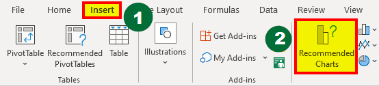
Step 2: After that,
- Go to the Insert tab in the Excel ribbon
- Click on Recommended Charts.
Step 3: Then,
- Select Radar from the All Charts list
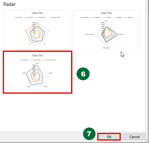
- Choose the first chart type to create a basic radar chart in Excel.
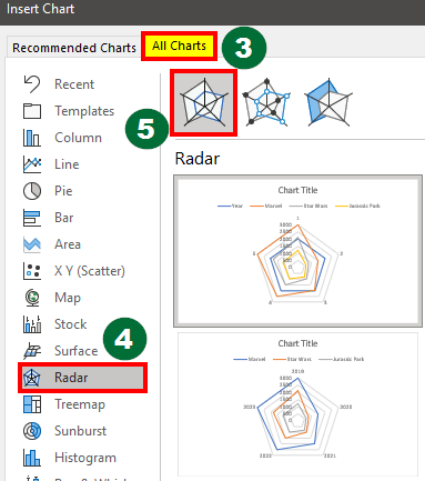
Step 4: Select any Chart Pattern from the options and click OK
The resulting web chart is given below, named Radar Chart.
B) Radar Chart with Markers
Step 1: Follow the first 2 steps from the above example of Basic Radar Chart.
Step 2: Select the second chart type to create a Radar Chart with Markers.
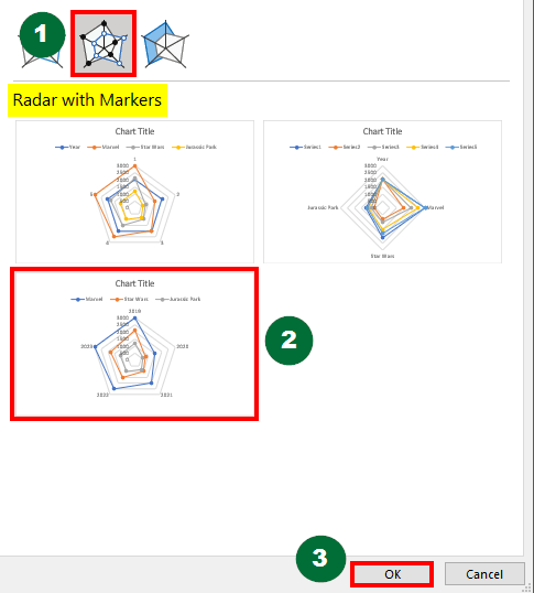
The result is displayed below, named Radar Chart with Markers.
C) Radar Chart with Fills
Step 1: Follow the first 2 steps from the above example of Basic Radar Chart.
Step 2: Select the third chart type to create a Radar Chart with Fills.
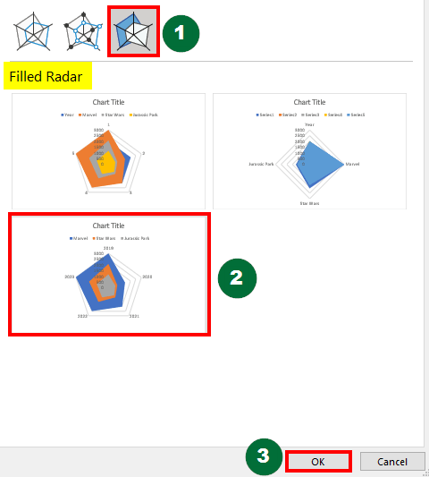
Below is the resulting spider chart, named Radar Chart with Fills.
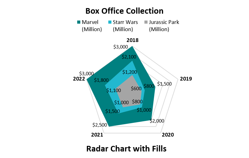
The above spider charts compare the box office earnings of different movie franchises over five years, with the option to add markers and fill for easy understanding.
How to Edit a Radar Chart in Excel?
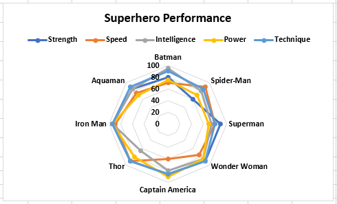
Suppose you made a radar chart in Excel but accidentally forgot to select some data points from the source. In such cases, you can easily edit the chart using the following methods.
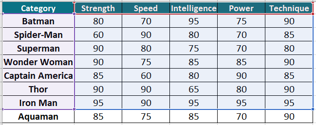
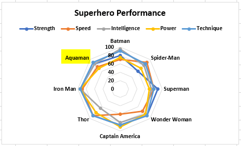
Let’s say we have the following data and we create the given chart:
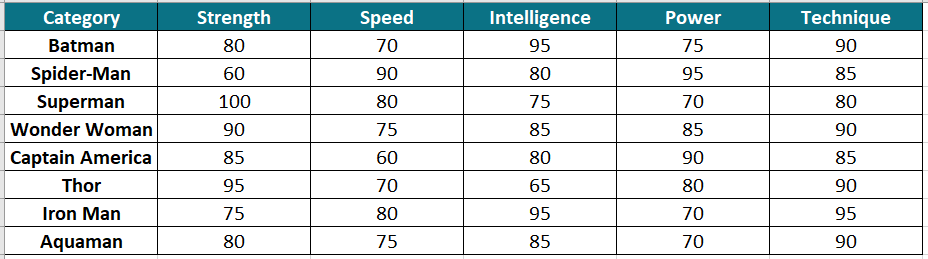
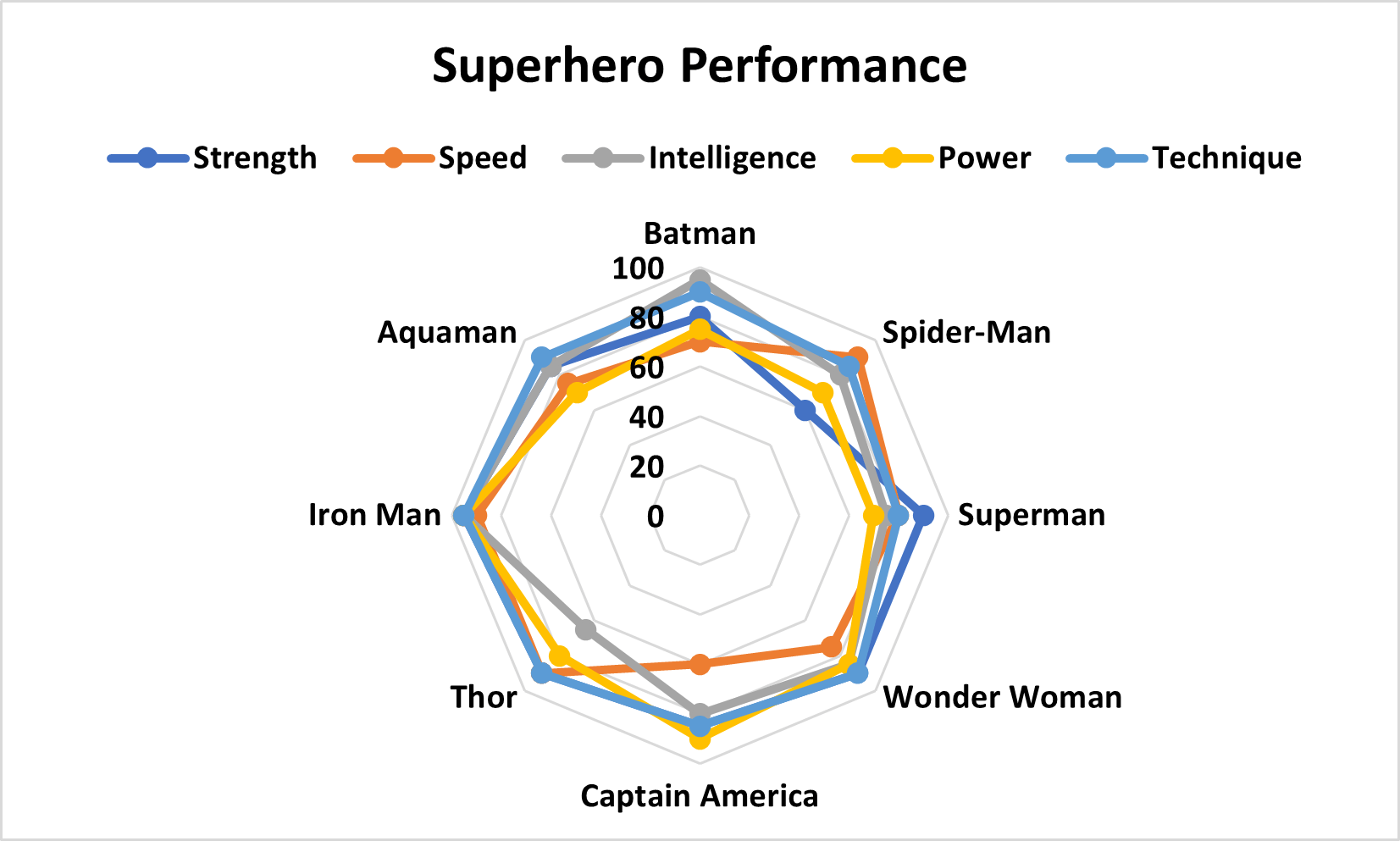
However, if you pay attention, you will see that the chart does not have data about Aquaman, meaning that we did not select the complete data.
Solution:
To add data for Aquaman, we can edit the chart as follows,
- Select the created chart
- Click on Select Data present in the Chart Design tab.
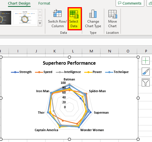
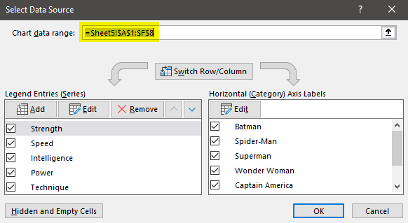
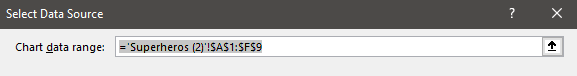
- The Select Data Source dialog box will appear, as shown below.
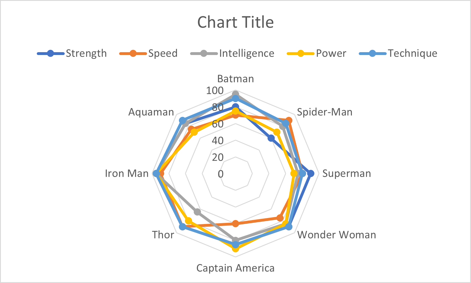
A) Method 1 to Add Data
Change the data range in the Chart Data Range text box. Here we will change =Sheet5!$B$2:$B$8 to =Sheet5!$B$2:$B$9 to select the whole data.
Once you click Ok, you can see the new complete chart.
B) Method 2 to Add Data
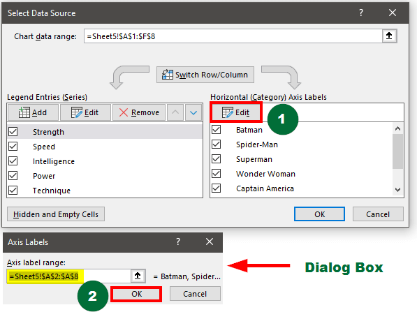
Step 1: Do the following when the Select Data Source dialog box appears:
- Select Edit from Horizontal (Category) Axis Labels
- Enter the Axis label range as =Sheet5!$B$2:$B$9 instead of =Sheet5!$B$2:$B$8
- Click on Ok in the Axis Labels dialog box.
Step 2: After that,
- Select Strength from Legend Entries (Series)
- Select Edit in the Legend Entries (Series)
- A new dialog box will appear, where you can enter the Series values as =Sheet5!$B$2:$B$9 instead of =Sheet5!$B$2:$B$8.
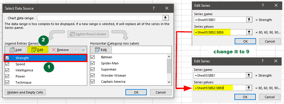
Step 3: Repeat the second step for all the other attributes (Speed, Intelligence, Power, and Technique).
Result:
This method will add Aquaman’s strength, speed, intelligence, and all other performance aspects to the chart, as shown below.
How to Change the Chart Design?
To make the chart more presentable, you can change the chart design, the background colors, and the markers (dots) color.
For instance, let us start with the chart below and make its appearance changes.
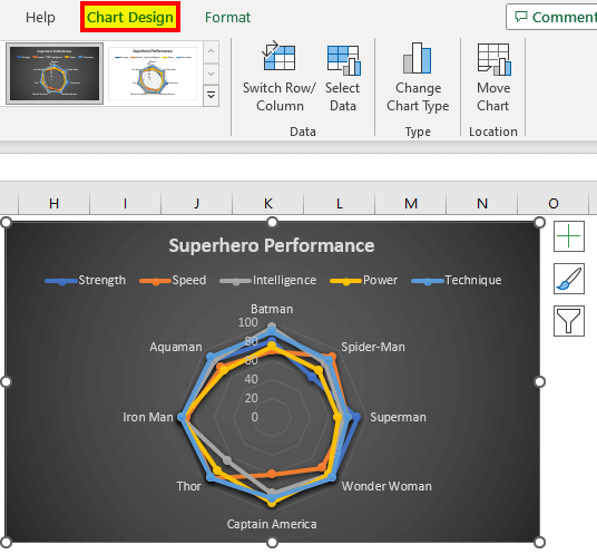
1. Chart Design
To use a different design style,
- Select the chart
- Go to the Chart Design tab
- Select any design from the Chart Styles group
Result:
The selected design will automatically apply to the chart.
2. Line Color
To color the lines,
- Click on the chart and then click on the Chart Element

- Select Axes → Select More Options.
- Select the line from the chart that you want to change the color. The Format Data Series dialog box opens
- Select the Fill icon and then click on the Line option
- Choose the desired color from the option named “Color.”
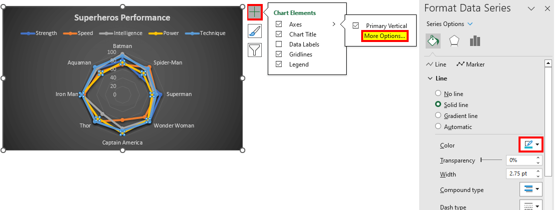
Result:
You can see the changes in the color of the line “Power” from yellow to blue.
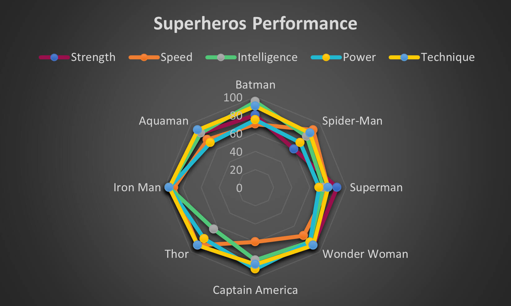
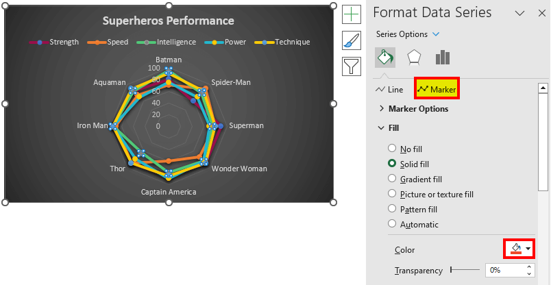
3. Marker Color
To add new colors to your markers, do the following,
- Double-click on the chart and the Format Data Series box will appear
- Select the marker you want to change the color for
- Choose the Marker option from the dialog box
- Choose a new color as per your needs from the Color
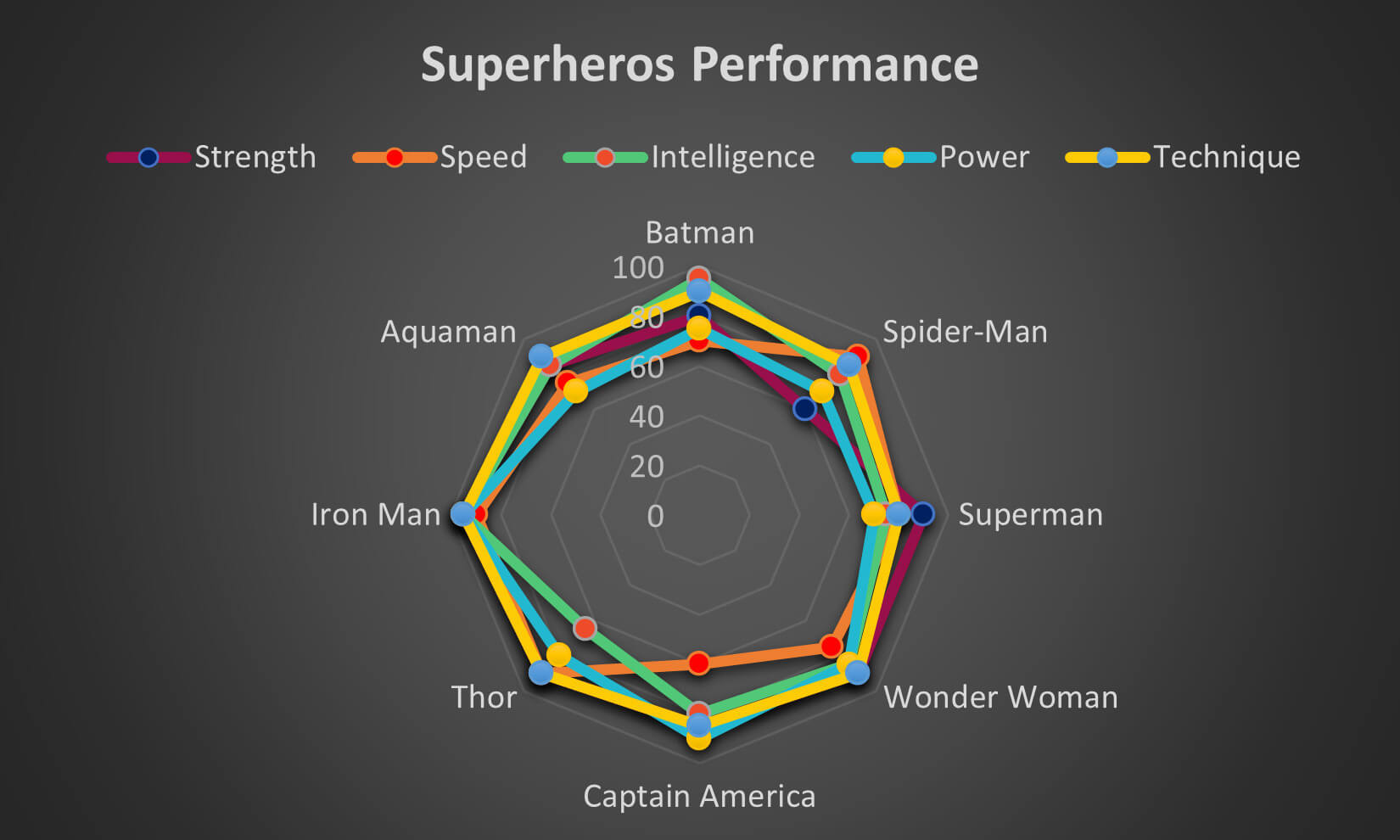
Result:
The marker color for the Intelligence aspect turns from Grey to Orange.
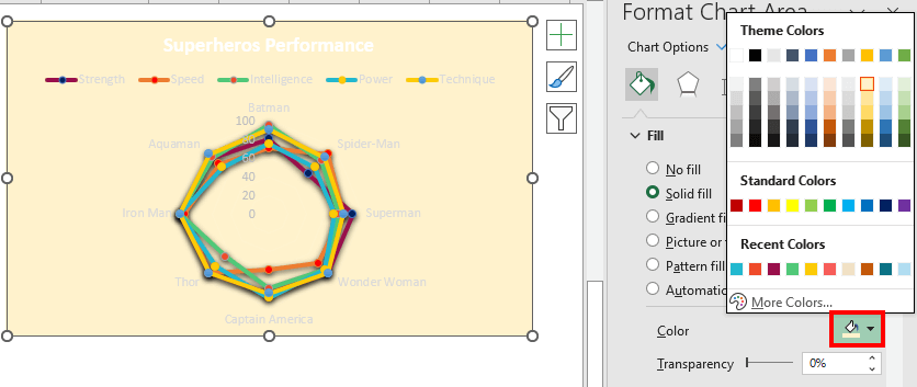
4. Chart Color
To fill in the chart,
- Double-click on the chart, and the Format Chart Area dialog box will appear
- Open the Fill dropdown list
- Select the color as per your requirement from the Color option in the list.
Result:
The color of the overall chart changes from black to sandal (light yellow).
5. Font Color
Follow the below-given steps to change the font color in the chart design,
- Click on the Chart
- Go to the Format tab
- Select the required section on the chart, such as Chart Title, Legend, Category Labels, etc.
- Choose a style from the WordArt Styles
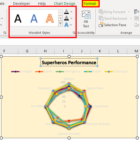
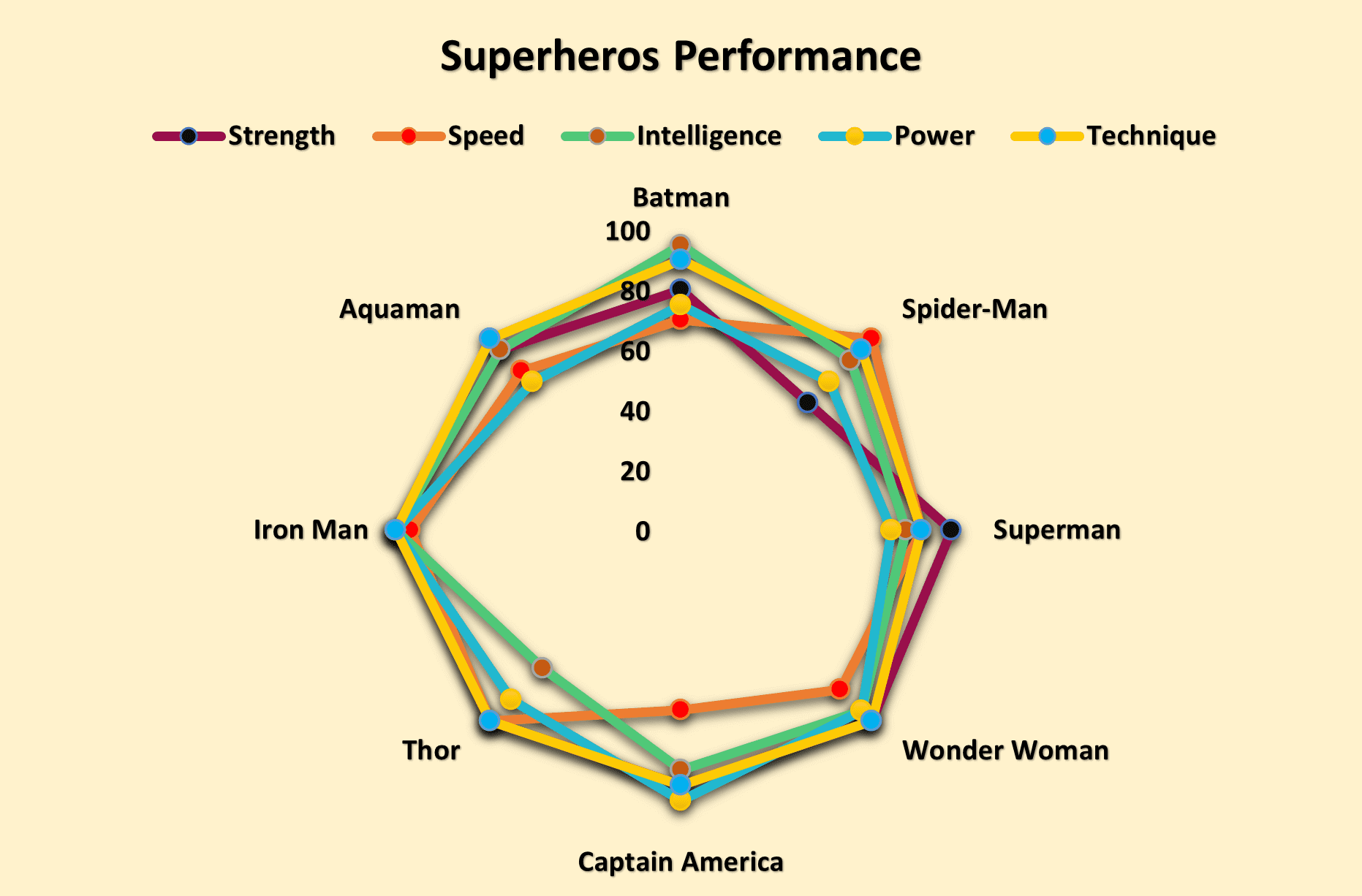
Overall Result:
After applying all the formatting, including the font color, your chart will finally look like this.
Frequently Asked Questions (FAQs)
Q1. When to use radar charts?
Answer: Radar charts offer several benefits that make them useful for visualizing and comparing data:
- Comparing Multiple Data Sets: You can easily compare multiple data at the same time.
- Better Visual Appeal & Easy Pattern Recognition: The chart design makes it simple to find any patterns and makes the chart more engaging and easier to understand.
- Identifying Outliers & Inconsistencies: These web charts make it easy to see which data points are very different from others as well as find any areas that need attention or improvement.
- Helps in Decision-Making: It simplifies complex data, making it easier to make informed decisions and communicate insights to others.
Q2. Name some radar chart alternatives.
Answer: We can use several charts and graphs instead of spider charts in Excel. Some of the most appropriate are pie charts, line charts, bar graphs, and histograms. However, if you need more advanced charts, you can use conditional formatting data bars, sparklines, heatmaps, and area charts.
Q3. What alternative tool can we use besides Excel to create a radar chart?
Answer: Excel is the best tool you can use to create radar charts. As an equally simpler alternative, you can use google sheets. However, there are several other tools like Tableau and Power BI that can help you create radar charts.
Recommended Articles
This article explains the meaning of radar chart in Excel. We have added steps on how to create as well as edit a spider chart. We have added several easy examples for your understanding. You can refer to the following articles to learn about more Excel-related topics.
