Updated June 27, 2023

Introduction to Sticky Footer CSS
In CSS, when we create websites or web pages, it has both a header and a footer. The header and footer are the top and bottom parts of the page or any documents. In CSS, there are two types of headers and footers. They can be either fixed or sticky to position the header and footer. This sticky footer is used for the footer to stick to the bottom of the pages irrespective of the amount of content on the page. This sticky footer works only when the page’s content is short, so there is enough space to push the footer down to the page.
Working on Sticky Footer in CSS
Developers use a sticky footer in CSS to style the footer in a way that it sticks to the bottom of the page.
Example
<!doctype html>
<html lang="en">
<head>
<title>CSS Cookbook: sticky footer</title>
<style>
body {
background-color: #fff;
color: #333;
font: 6.2em /   Arial;
padding: 0;
margin: 0;
}
* {
box-sizing: border-box;
}
section {
height: 400px;
width: 600px;
}
.wrapper {
min-height: 120%;
display: grid;
grid-template-rows: auto 1fr auto;
}
.page-header,
.page-footer {
background-color: cyan;
color: red;
padding: 30px;
}
.page-body {
padding: 40px;
}
.preview {
height: 500px;
overflow: auto;
}
</style>
</head>
<body>
<section>
<div class="wrapper">
<header class="page-header">This is the header section </header>
<main class="page-body">
<p> In this section you will have main section of the content and if it has more content then the footer will be pushed down. </p>
</main>
<footer class="page-footer">Sticky footer section</footer>
</div>
</section>
</body>
</html>
Output:
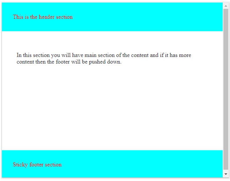
In the above example, we have a .wrapper in which we have specified a minimum height of 120% which takes the container height as tall as a container. The above screenshot shows three different sections with a header, middle main content section, and footer sections.
How to Create Sticky Footer in CSS?
Given below are the methods to create a sticky footer:
1. Using calc()
Developers use this method to create a sticky footer even when they desire to remove all the extra elements, and they can adjust the height within the wrapper.
Example:
<!DOCTYPE html>
<html>
<head>
<title>Educba Training </title>
</head>
<style>
body {
margin: 0;
height: 100%;
text-align: center;
font-family: sans-serif;
}
.wrapper {
min-height: calc(100vh - 70px);
}
footer {
height: 50px;
background: linear-gradient(70deg, #ae63e4, #47cf73);
}
</style><body>
<div class="wrapper">
<h1>CSS Sticky Footer with Calc()</h1>
</div>
<footer></footer>
</body>
</html>
Output:
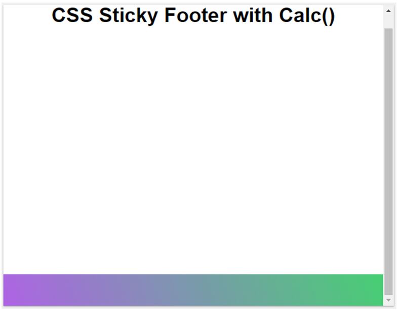
In the above example, we can see that this sticky footer works until the content is short, else the footer is pushed downwards.
2. Using Flexbox
As we know that maintaining the height of the content is the biggest task, and having the footer that must be at the bottom is much more difficult. So this can be done using flexbox in CSS, making it easy to spread the content horizontally. If the properties of flexbox are familiar and we need to wrap the vertical portions in a flex container which must be specified,d. It automatically expands the container’s space if we are spreading it horizontally.
Example:
<!DOCTYPE html>
<html>
<head>
<title>Educba Training</title>
</head>
<style>
body {
margin: 0;
height: 100%;
display: flex;
min-height: 100vh;
text-align: center;
flex-direction: column;
font-family:  sans-serif;
}
.main-content {
flex: 1;
}
footer {
padding: 30px;
background: linear-gradient(70deg, blue, green, red, yellow);
}
</style>
<body>
<header>
<h1>CSS Sticky footer using flexbox </h1>
</header>
<main class="main-content">
<p>The main content can be written here.... </p>
</main>
<footer></footer>
</body>
</html>
Output:
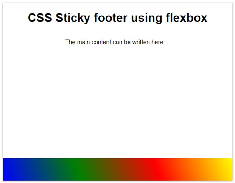
In the above example, we can see that we are using flex as the value for the display property. And if we know all the CSS properties for Flexbox, then it’s easy to use this Flexbox for creating a sticky footer.
3. Using grid value for the display property
Developers mainly use this for implementing the sticky footer. However, it is not advisable as it is not supported.
Example:
Code:
<!DOCTYPE html>
<html>
<head>
<title>Educba Training </title>
</head>
<style>
body {
margin: 0;
height: 100%;
text-align: center;
font-family: sans-serif;
}
body {
min-height: 100%;
display: grid;
grid-template-rows: 1fr auto;
}
footer {
grid-row-start: 2;
grid-row-end: 3;
padding: 30px;
background: linear-gradient(70deg, yellow, green, yellow, green);
}
</style>
<body>
<div class="main-wrapper">
<h1>CSS3 Grid to Create Sticky Footer</h1>
</div>
<footer></footer>
</body>
</html>
Output:

In the above example, we can see that we have declared the display property with grid value, which will have other different grid properties like grid-row-start, grid-row-end, color, etc.
Here we have seen a sticky footer which is a CSS property and is not much supported by all the browsers. Some of them are Firefox, Google Chrome, Opera, etc.
Conclusion
This article concludes that the sticky footer is one of the CSS footer types. This footer property uses a fixed or sticky footer in CSS. We observed that we can create a sticky footer using different methods. These methods include utilizing the calc() method attribute, creating a sticky footer using flexbox, which enables the content of the layout to spread horizontally and vertically, and creating a sticky footer using the grid value as the display property. Here we saw each method with examples.
Recommended Articles
We hope that this EDUCBA information on “Sticky Footer CSS” was beneficial to you. You can view EDUCBA’s recommended articles for more information.

