Overview of Simple Linear Regression in R
A statistical concept that involves in establishing the relationship between two variables in such a manner that one variable is used to determine the value of another variable is known as simple linear regression in R.
The relationship is established in the form of a mathematical equation obtained through various values of the two variables through complex calculations. Just establishing a relationship is not enough, but data must also meet certain assumptions. R programming offers an effective and robust mechanism to implement the concept.
Advantages of Simple Linear Regression in R
Advantages of using Linear Regression Model:
- Robust statistical model.
- Helps us to make forecast and prediction.
- It helps us to make better business decisions.
- It helps us to take a rational call on the logical front.
- We can take corrective actions for the errors left out in this model.
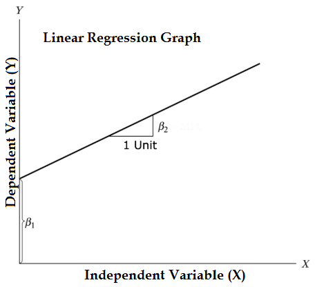
Equation of Linear regression model
The Equation of Linear regression model is given below:
Y = β1 + β2X + ϵ- Independent Variable is X
- Dependent Variable is Y
- β1 is an intercept of the regression model
- β2 is a slope of the regression model
- ϵ is the error term
We will work on the “cars” dataset which comes inbuilt with Rstudio.
Let see how the structure of the cars dataset looks like.
For this, we will use the Str() code.
str(cars)
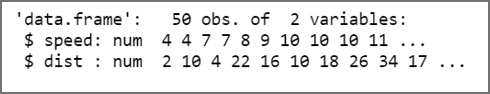
Here we can see that our dataset contains two variables Speed and Distance.
Speed is an independent variable and Distance is a dependent variable.
Let’s take the statistical view of the cars dataset.
For this, we will use the Summary() code.
summary(cars)
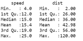
In speed variable we have maximum observation is 25 whereas in distance variable the maximum observation is 120. Similarly, minimum observation in speed is 4 and distance is 2.
The Plot Visualization
To understand more about data we will use some visualization:
- A scatter plot: Helps to identify whether there is any type of correlation is present between the two variables.
- Box plot: Helps us to display the distribution of data. Distribution of data based on minimum, first quartile, median, third quartile and maximum.
- The density plot: Helps us to show the probability density function graphically.
1. Scatter plot
It will help to visualize any relationships between the X variable and the Y variable.
#Scatterplotscatter.smooth(x=cars$speed, y=cars$dist, main="Dist ~ Speed", xlab = "Speed", ylab = "Distance" )
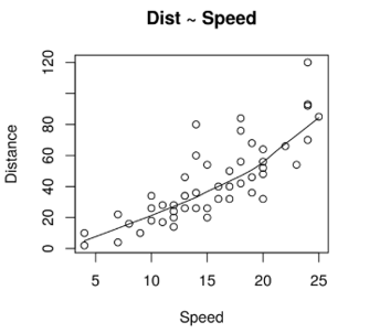
A Scatter Plot here signifies that there is a linearly increasing relationship between the dependent variable (Distance) and the independent variable (Speed).
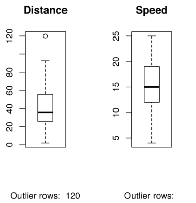
2. Box Plot
Box plot helps us to identify the outliers in both X and Y variables if any.
Code for box plot looks like this:
#Scatterplot

scatter.smooth(x=cars$speed, y=cars$dist, main="Dist ~ Speed", xlab = "Speed", ylab = "Distance" )

#Divide graph area in 2 columns

par(mfrow=c(1, 2))

#Boxplot of Distance

boxplot(cars$dist, main="Distance", sub=paste("Outlier rows: ", boxplot.stats(cars$dist)$out))

#Boxplot for Speed

boxplot(cars$speed, main="Speed", sub=paste("Outlier rows: ",

boxplot.stats(cars$speed)$out))
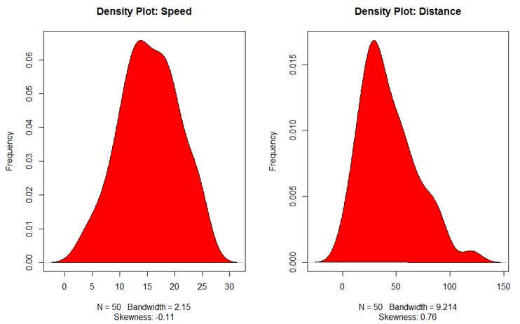
3. Density Plot
This plot helps to see the normality of the distribution
#Divide graph area in 2 columns

par(mfrow=c(1, 2))

#Density plot for Speed variable

plot(density(cars$speed), main="Density Plot: Speed", ylab="Frequency", sub=paste("Skewness:",

+     +round(e1071::skewness(cars$speed), 2)))

polygon(density(cars$speed), col="red")

#Density plot for Distance

plot(density(cars$dist), main="Density Plot: Distance", ylab="Frequency", sub=paste("Skewness:",

+     +round(e1071::skewness(cars$dist), 2)))

polygon(density(cars$dist), col="red")
Types of Correlation Analysis
This analysis helps us to find the relationship between the variables.
Types of correlation analysis:
- Weak Correlation (a value closer to 0)
- Strong Correlation (a value closer to ± 0.99)
- Perfect Correlation
- No Correlation
- Negative Correlation (-0.99 to -0.01)
- Positive Correlation (0.01 to 0.99)
#Correlation between speed and distance

cor(cars$speed, cars$dist)
![]()
0.8068949 signifies that there is a strong positive correlation between the two variables (Speed and Distance).
Linear Regression model
Now we will start the most important part of the model.
The formula used for linear regression is lm(Dependent Variable ~ Independent Variable)
#linear regression model

linear_regression <- lm(dist ~ speed, data=cars)

print(linear_regression)
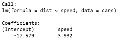
We will fit these output in our regression analysis equation
dist = −17.579 + 3.932∗speed
To get a summary of the linear regression model, we will use code Summary()
linear_regression <- lm(dist ~ speed, data=cars)

summary(linear_regression)
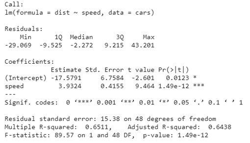
Now we will understand what these outcomes mean.
- R squared (R2) also known as the coefficient of determination. It will tell us what proportion of change in the dependent variable caused by the independent variable. It is always between 0 and 1. The higher the value of the R squared the better the model is.
- Adjusted R Squared, it is a better statistic to consider if we want to see the credibility of our model. Adjusted R2 helps us to check the goodness of the model also and it will also penalize the model if we add a variable that does not improve our existing model.
- As per our model summary, Adjusted R squared is 0.6438 or we can say that 64% of the variance in the data is being explained by the model.
- Further, there are many statistics to check the credibility of our model like t-statistic, F-statistic, etc.
Recommended Articles
This is a guide to Simple Linear Regression in R. Here we discuss the introduction, advantages of Simple Linear Regression in R, Some of the Plot visualization, and types with respective examples. You may also look at the following articles to learn more –
