Updated March 22, 2023

Introduction to Boxplot labels in R
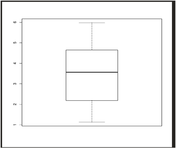
Labels are used in box plot which are help to represent the data distribution based upon the mean, median and variance of the data set. R boxplot labels are generally assigned to the x-axis and y-axis of the boxplot diagram to add more meaning to the boxplot. The boxplot displays the minimum and the maximum value at the start and end of the boxplot. The mean label represented in the center of the boxplot and it also shows the first and third quartile labels associating with the mean position.
Plotting the boxplot graph
- We need five valued input like mean, variance, median, first and third quartile.
- Identifying if there are any outliers in the data.
- Design the model to plot the data.
Parameters under boxplot() function
- formula: This parameter allows to spilt numeric values into several groups.
- Data:: Input data that contains either a data frame or a list.
- Subset: Optional vector parameter to specify a subset for plotting.
- xlab: x-axis annotation
- ylab: y-axis annotation.
- range: range specifies the plot extensions.
- action: specify what happens when there is a null value. Either ignore the response or the value.
Creating Random Data
We can create random sample data through the rnorm() function.
Let’s now use rnorm() to create random sample data of 10 values.
data<-data.frame(Stat1=rnorm(10,mean=3,sd=2))
Above command generates 10 random values with mean 3 and standard deviation=2 and stores it in the data frame.
When we print the data we get the below output.
Stat1
1 2.662022
2 2.184315
3 5.974787
4 4.536203
5 4.808296
6 3.817232
7 1.135339
8 1.583991
9 3.308994
10 4.649170
We can convert the same input(data) to the boxplot function that generates the plot.
We add more values to the data and see how the plot changes.
data<-data.frame(Stat1=rnorm(10,mean=3,sd=2),

Stat2=rnorm(10,mean=4,sd=1),

Stat3=rnorm(10,mean=6,sd=0.5),

Stat4=rnorm(10,mean=3,sd=0.5))

boxplot(data)
Adding more random values and using it to represent a graph.
Below are values that are stored in the data variable.
| STAT 1 | STAT 2 | STAT 3 | STAT 4 |
| 3.795465 | 4.21864 | 5.827585 | 2.157315 |
| 0.911726 | 4.09119 | 6.260811 | 2.26594 |
| 3.707828 | 3.35987 | 5.88945 | 3.714557 |
| 0.115772 | 4.5123 | 5.934858 | 2.40645 |
| 0.697556 | 2.15945 | 6.81147 | 2.571304 |
| 5.129231 | 3.2698 | 6.250068 | 3.025175 |
| 5.404101 | 4.38939 | 5.670061 | 2.9901 |
| 1.455066 | 3.13059 | 5.692323 | 2.69693 |
| 0.868636 | 5.42311 | 5.415435 | 2.674768 |
| 2.14113 | 3.90728 | 6.206059 | 2.806656 |
Below is the boxplot graph with 40 values. We have 1-7 numbers on y-axis and stat1 to stat4 on the x-axis.

We can change the text alignment on the x-axis by using another parameter called las=2.
Analyzing the Graph of R Boxplot labels
We have given the input in the data frame and we see the above plot.
To understand the data let us look at the stat1 values.
The plot represents all the 5 values. Starting with the minimum value from the bottom and then the third quartile, mean, first quartile and minimum value.

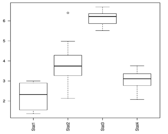
The above plot has text alignment horizontal on the x-axis.
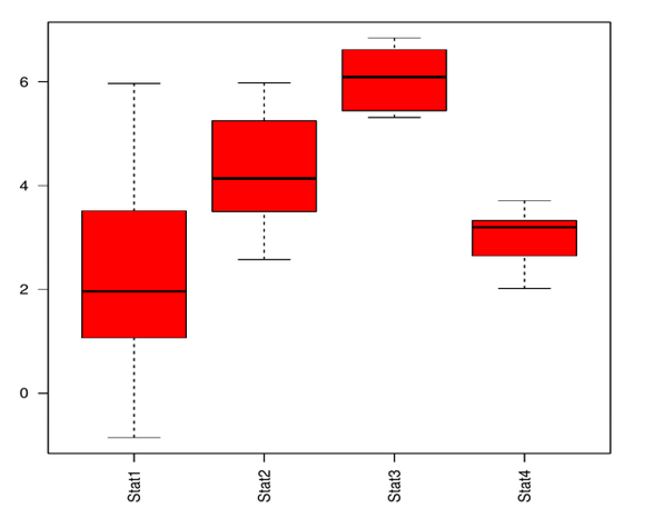
Changing the Colour
In all of the above examples, We have seen the plot in black and white. Let us see how to change the colour in the plot.
We can add the parameter col = color in the boxplot() function.
data<-data.frame(Stat1=rnorm(10,mean=3,sd=2),

Stat2=rnorm(10,mean=4,sd=1),

Stat3=rnorm(10,mean=6,sd=0.5),

Stat4=rnorm(10,mean=3,sd=0.5))

boxplot(data,las=2,col="red")

data
Below we can see the plot output in red.
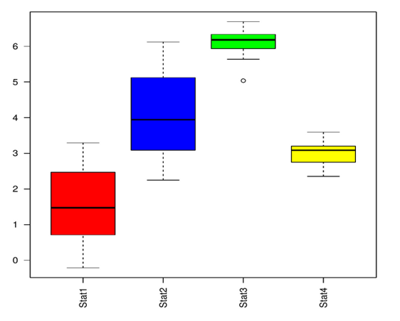
Using the same above code, We can add multiple colours to the plot.
data<-data.frame(Stat1=rnorm(10,mean=3,sd=2),

Stat2=rnorm(10,mean=4,sd=1),

Stat3=rnorm(10,mean=6,sd=0.5),

Stat4=rnorm(10,mean=3,sd=0.5))

boxplot(data,las=2,col=c("red","blue","green","yellow")

data
Adding Labels
We can add labels using the xlab,ylab parameters in the boxplot() function.
data<-data.frame(Stat1=rnorm(10,mean=3,sd=2),

Stat2=rnorm(10,mean=4,sd=1),

Stat3=rnorm(10,mean=6,sd=0.5),

Stat4=rnorm(10,mean=3,sd=0.5))

boxplot(data,las=2,xlab="statistics",ylab="random numbers",col=c("red","blue","green","yellow"))

data

By using the main parameter, we can add heading to the plot.
data<-data.frame(Stat1=rnorm(10,mean=3,sd=2),

Stat2=rnorm(10,mean=4,sd=1),

Stat3=rnorm(10,mean=6,sd=0.5),

Stat4=rnorm(10,mean=3,sd=0.5))

boxplot(data,las=2,xlab="statistics",ylab="random numbers",main="Random relation",notch=TRUE,col=c("red","blue","green","yellow"))

data
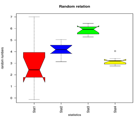
Notch parameter is used to make the plot more understandable. As medians of stat1 to stat4 don’t match in the above plot.
Advantages & Disadvantages of Box Plot
Below are the different Advantages and Disadvantages of the Box Plot:
Advantages
- Summarizing large amounts of data is easy with boxplot labels.
- Displays range and data distribution on the axis.
- It indicates symmetry and skewness
- Helps to identify outliers in the data.
Disadvantages
- Can be used only for numerical data.
- If there are discrepancies in the data then the box plot cannot be accurate.
Notes:
- Graphs must be labelled properly.
- Scales are important; changing scales can give data a different view.
- Comparing data with correct scales should be consistent
Conclusion – R Boxplot labels
The data grouping is made easy with the help of boxplots. Box plot supports multiple variables as well as various optimizations. We can also vary the scales according to data.
Boxplots can be used to compare various data variables or sets.
The usability of the boxplot is easy and convenient. We need consistent data and proper labels. Boxplots are often used in data science and even by sales teams to group and compare data. Boxplot gives insights on the potential of the data and optimizations that can be done to increase sales.
Boxplot is an interesting way to test the data which gives insights on the impact and potential of the data.
Recommended Articles
This is a guide to R Boxplot labels. Here we discuss the Parameters under boxplot() function, how to create random data, changing the colour and graph analysis along with the Advantages and Disadvantages. You may also look at the following article to learn more –
