Updated March 17, 2023
Introduction to Seaborn Violin Plot
Seaborn violin plot plays a similar activity pursued through the box or whisker. It shows quantitative data across single or multiple categorical variables. A Violin plot is an attractive and effective way of showing data in various units. The broad form data frame helps to maintain the numeric column, which was plotted in a graph. It is beneficial and essential. Seaborn is an excellent graphical interface of python used for visualizing the graphics, which was statistical. It will include the standard layouts, which were terrific, and also have the color schemes enabling the numerical visualizations. It performs an identical function for the box graph. The violin plot displays the set of numerical points among one or more variables. Apart from the box plot contains the kernel density estimation for the function of density. A Violin plot is an efficient technique for displaying the spatial dimensions of data points.
Below syntax shows the seaborn violin plot:
Syntax:
seaborn.violinplot (parameters)In a broad form, every statistical element is depicted on the chart and will contain the data set. The other different modules of a numpy package are employed. We recommend the panda’s library, which corresponds to the labels defined in the axis. Seaborn violin plots require increased recognition when we compare them with the box plot, which is relevant to the data. It is possible to use python packages or numpy, but we prefer the object of pandas.

Key Takeaways
- It shows showing the distribution of quantitative data on several levels. The categorical variables distribution is compared by using a violin plot.
- It is an attractive and effective way of showing multiple distributions simultaneously, but the estimation procedure is influenced by sample size.
How to Create Seaborn Violin Plot?
The function of violin plots is to create graphs and depict kernel density distribution and a box plot. The violin plot is used in statistics and analytics to understand categorical data. The main advantage of the violin plot is that this plot is used in distribution and multiple peaks.
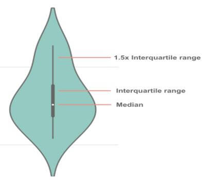
Below figure shows the violin plot, which offers the range:
Along with the data frame, the violin plot function works with the object of single series. In the below example, we are plotting the single variable distribution.
Code:
import seaborn as sns
import random
import numpy as np
import matplotlib.pyplot as plt
plot = random.sample (range(0,50),30)
violin = np.array(plot)
sns.violinplot (plot)
plt.show ()
Output:
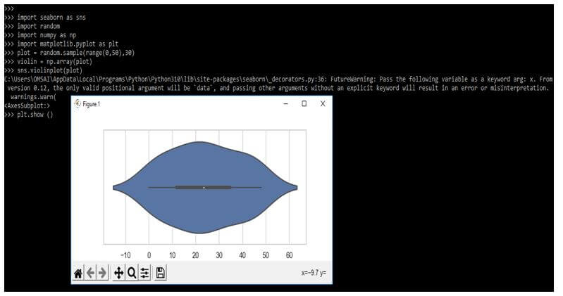
The sample size is significant in the violin plot. The plot is misleading by using a small sample size.
Code:
import seaborn as sns
import random
import numpy as np
import matplotlib.pyplot as plt
plot = random.sample(range(0,50),30)
violin = np.array(plot)
sns.violinplot(plot)
sns.stripplot (plot, color = 'black')
plt.show ()
Output:
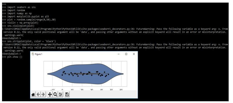
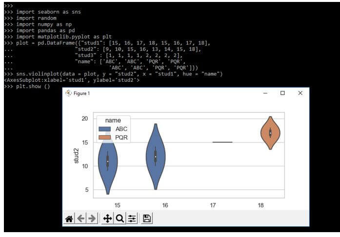
The violin plot will lie with the datasets and show the data distributions of multiple categories.
Code:
import seaborn as sns
import random
import numpy as np
import pandas as pd
import matplotlib.pyplot as plt
plot = pd.DataFrame({"stud1": [15, 16, 17, 18, 15, 16, 17, 18],
  "stud2": [9, 10, 15, 16, 13, 14, 15, 18],
  "stud3" : [1, 1, 1, 1, 2, 2, 2, 2],
  "name": ['ABC', 'ABC', 'PQR', 'PQR',
  'ABC', 'ABC', 'PQR', 'PQR']})
sns.violinplot(data = plot, y = "stud2", x = "stud1", hue = "name")
plt.show ()
Output:
Seaborn Violin Plot Data
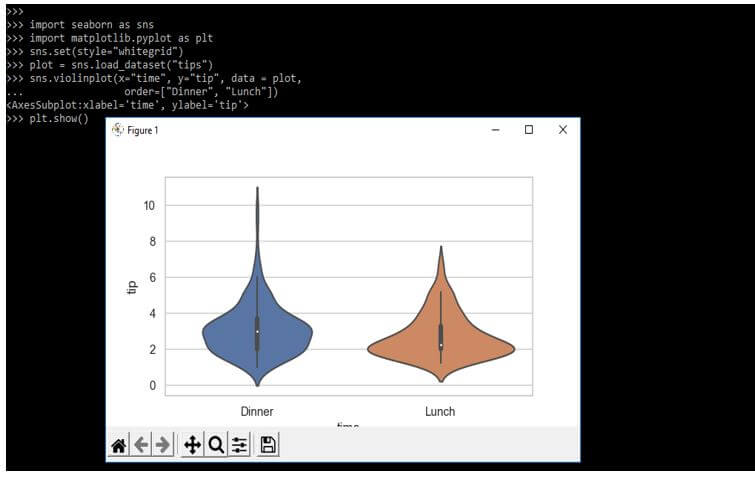
While using the seaborn violin plot, we must import the seaborn library at the beginning of a code. We can also use the set method with function, this function will contain the style parameter, and we can use this type of parameter to customize the design of our plot. We also need to load the dataset method to acquire the data frame. We are using the violin plot data function to create the violin graphs; we can find this method in a seaborn package. We also need to specify the order of the x-axis and y-axis; in the below example, we have labeled the x-axis as time and the y-axis as a tip.
Below example shows how we can plot the data by using the seaborn violin as follows:
Code:
import seaborn as sns
import matplotlib.pyplot as plt
sns.set(style="whitegrid")
plot = sns.load_dataset ("tips")
sns.violinplot(x = "time", y = "tip", data = plot,
  order=["Dinner", "Lunch"])
plt.show()
Output:
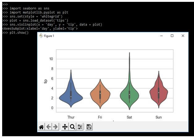
The violin plot in python plays similar to the whisker and box plot. In the below example, we are loading the tips dataset.
Code:
import seaborn as sns
import matplotlib.pyplot as plt
sns.set (style = 'whitegrid')
plot = sns.load_dataset('tips')
sns.violinplot (x = 'day', y = 'tip', data = plot)
plt.show()
Output:
Examples of Seaborn Violin Plot Code
Different examples are mentioned below:
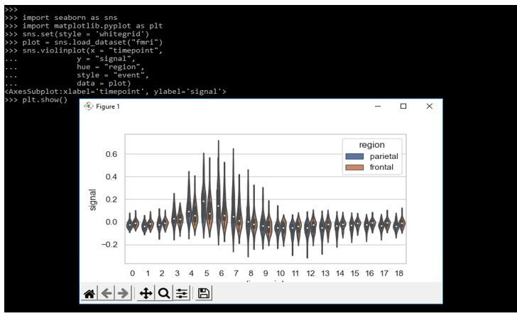
Example #1
The below example shows the violin plot as follows. In the below example, we are adding the dataset name as fmri.
Code:
import seaborn as sns
import matplotlib.pyplot as plt
sns.set(style = 'whitegrid')
plot = sns.load_dataset("fmri")
sns.violinplot(x = "timepoint",
  y = "signal",
  hue = "region",
  style = "event",
  data = plot)
plt.show()
Output:
Example #2
In the example below, we are using the palette parameter and creating the points using different shades using the palette argument. In the below example, we are loading the tips data set.
Code:
import seaborn as sns
import matplotlib.pyplot as plt
sns.set(style="whitegrid")
tips = sns.load_dataset("tips")
sns.violinplot()
plt.show()
Output:
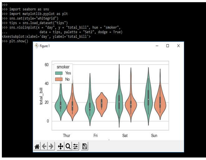
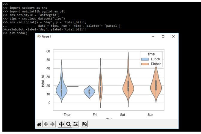
Example #3
In the example below, we are creating every dimension of the color attribute from the axes of a particular category. In the below example, we are adding the tips data set.
Code:
import seaborn as sns
import matplotlib.pyplot as plt
sns.set (style = "whitegrid")
tips = sns.load_dataset("tips")
sns.violinplot(x = 'day', y = 'total_bill',
plt.show()
Output:
FAQ
Other FAQs are mentioned below:
Q1. What is the use of the seaborn violin plot in python?
Answer:
A violin plot in python allows the visual distribution of numeric variables for single or multiple groups.
Q2. Which libraries do we need to use when using the seaborn violin plot in python?
Answer:
We need to use the seaborn, matplotlib and pandas, and numpy library when using the violin plot in python.
Q3. Which method do we need to use when using the seaborn violin plot?
Answer:
We are using the violin plot () method to use it in python. This method is used to plot the graph.
Conclusion
It shows quantitative data across single or multiple categorical variables. A Violin plot is an attractive and effective way of showing data in various units. It will include the standard layouts, which were terrific, and also have the color schemes enabling the numerical visualizations.
Recommended Articles
This is a guide to Seaborn Violin Plot. Here we discuss the introduction, examples, and how to create a seaborn violin plot with FAQ. You may also have a look at the following articles to learn more –
