Updated March 15, 2023

Introduction to Seaborn Time Series
Seaborn time series is a special data type where we observe the set of operations per time. We are recording the timestamp of every observation. This data type is dealt with when discussing application monitor data and stock prices. For plotting the time series graph using seaborn, we need to set the figure size and adjust the padding between multiple subplots.
Key Takeaways
- The seaborn ts plot is a new addition to a recent module version. It is used when we have timestamp data available for it.
- This function plots the time series data, either in a data frame or an N-dimensional array.
Overview of Seaborn Time Series
It is nothing but the type of data in which we can set the measurement; every observation contains its timestamp. The time plot shows values changing as per time, like the x and y graphs. The time plot is only representing the time of an x-axis. The x and y graphs only plot the x variables such as age, weight, and height.
This plot is not including categories like bar or pie charts. Time series plots are helpful to display the progression of the data as per time. This chart type is proper if we analyze the data as per odd intervals. Suppose we plot the time plots using the panda module; pandas are nothing but the open source library based on numpy. The python module provides multiple data structures and methods for processing the statistical data. It is well known for making the analysis and data import more easily.
How to Use Seaborn Time Series?
While using it, we need to follow the below steps as follows. Also, we need to install and import the seaborn module in our code.
- First, we must download and install the seaborn and matplotlib module in our system.
- After installing the module, we must import the same using the import keyword.
- After importing the module, we need to set the figure size and add the padding between multiple plots.
- After setting the figure size, we create the panda’s data frame for holding the date time series.
- After creating the panda’s data frame, we are making the seaborn line plot using the data.
- In the last step, we rotate the params by 45, and then we display the graph figure using the show method.
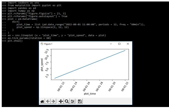
The below example shows how we can use the seaborn time series in the plot as follows. We are importing the seaborn, pandas, matplotlib, and numpy modules in the example below.
Code:
import seaborn as sns
from matplotlib import pyplot as plt
import pandas as pd
import numpy as np
plt.rcParams["figure.figsize"] = [5, 3]
plt.rcParams["figure.autolayout"] = True
plot = pd.DataFrame(
dict (
plot_time = list (pd.date_range ("2022-08-01 11:00:00", periods = 12, freq = "60min")),
plot_speed = np.linspace (1, 12, 12) ) )
ax = sns.lineplot (x = "plot_time", y = "plot_speed", data = plot)
ax.tick_params (rotation = 60)
plt.show()
Output:
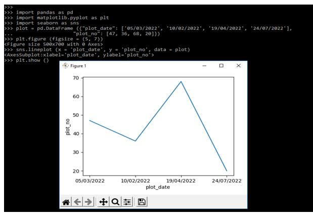
In below example we are using multiple data with plot data as follows. We are importing the seaborn library.
Code:
import pandas as pd
import matplotlib.pyplot as plt
import seaborn as sns
plot = pd.DataFrame ({"plot_date": ['05/03/2022', '10/02/2022', '19/04/2022', '24/07/2022'],
"plot_no": [47, 36, 68, 20]})
plt.figure (figsize = (5, 7))
sns.lineplot (x = 'plot_date', y = 'plot_no', data = plot)
plt.show ()
Output:
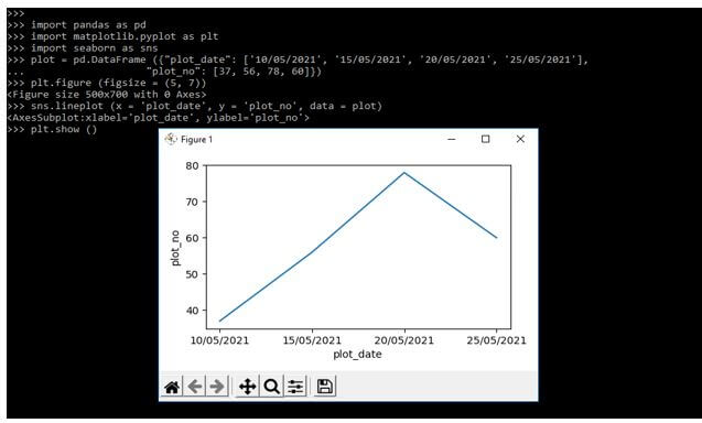
Seaborn Time Series Plots
The plot is used to visualize the data values which was changing as per time. Below example shows plot single time series as follows:
Code:
import pandas as pd
import matplotlib.pyplot as plt
import seaborn as sns
plot = pd.DataFrame ({"plot_date": ['10/05/2021', '15/05/2021', '20/05/2021', '25/05/2021'],
"plot_no": [37, 56, 78, 60]})
plt.figure (figsize = (5, 7))
sns.lineplot (x = 'plot_date', y = 'plot_no', data = plot)
plt.show()
Output:
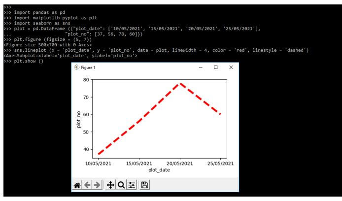
In below example we are customizing the color of a graph, we are adding color as red and defining the linewidths and line styles as follows.
Code:
import pandas as pd
import matplotlib.pyplot as plt
import seaborn as sns
plot = pd.DataFrame ({"plot_date": ['10/05/2021', '15/05/2021', '20/05/2021', '25/05/2021'],
"plot_no": [37, 56, 78, 60]})
plt.figure (figsize = (5, 7))
sns.lineplot (x = 'plot_date', y = 'plot_no', data = plot, linewidth = 4, color = 'red', linestyle = 'dashed')
plt.show ()
Output:
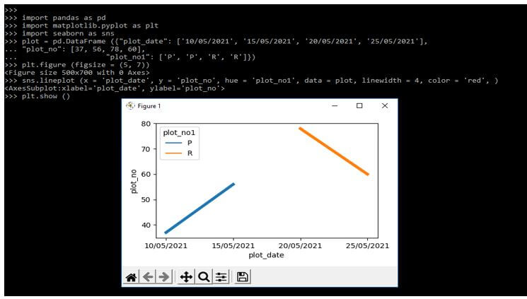
In the following plot, we are plotting the multiple time series as follows. We are using hue parameter for the same.
Code:
import pandas as pd
import matplotlib.pyplot as plt
import seaborn as sns
plot = pd.DataFrame ({"plot_date": ['10/05/2021', '15/05/2021', '20/05/2021', '25/05/2021'],
  "plot_no": [37, 56, 78, 60], "plot_no1": ['P', 'P', 'R', 'R']})
plt.figure (figsize = (5, 7))
sns.lineplot (x = 'plot_date', y = 'plot_no', hue = 'plot_no1', data = plot, linewidth = 4, color = 'red', )
plt.show ()
Output:
Examples of Seaborn Time Series
Given below are the examples mentioned:
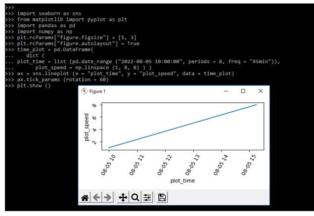
Example #1
In the below example, we are plotting single time series as follows.
Code:
import seaborn as sns
from matplotlib import pyplot as plt
import pandas as pd
import numpy as np
plt.rcParams ["figure.figsize"] = [5, 3]
plt.rcParams ["figure.autolayout"] = True
time_plot = pd.DataFrame (
dict (
plot_time = list (pd.date_range ("2022-08-05 10:00:00", periods = 8, freq = "45min")),
plot_speed = np.linspace (1, 8, 8) ) )
ax = sns.lineplot (x = "plot_time", y = "plot_speed", data = time_plot)
ax.tick_params (rotation = 60)
plt.show ()
Output:
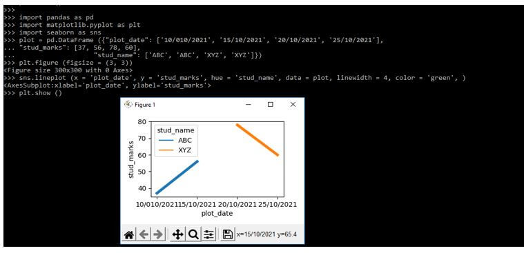
Example #2
In the below example, we are plotting two-time series on a single plot as follows. We are using two series.
Code:
import pandas as pd
import matplotlib.pyplot as plt
import seaborn as sns
plot = pd.DataFrame ({"plot_date": ['10/010/2021', '15/10/2021', '20/10/2021', '25/10/2021'],
  "stud_marks": [37, 56, 78, 60],
  "stud_name": ['ABC', 'PQR', 'XYZ', 'MNP']})
plt.figure (figsize = (3, 3))
sns.lineplot (x = 'plot_date', y = 'stud_marks', hue = 'stud_name', data = plot, linewidth = 4, color = 'green', )
plt.show ()
Output:
FAQ
Given below are the FAQs mentioned:
Q1. What is the use of seaborn time series in python?
Answer:
The data type is used to plot the time series graph by using seaborn and matplotlib libraries.
Q2. Which libraries do we need to use at the time of plotting the graph?
Answer:
We need to use the seaborn, matplotlib, numpy, and pandas library at the time of plotting the graph.
Q3. What is the time plot in seaborn time series?
Answer:
The time plot in seaborn will display the values which were against the clock. It is like x and y graphs but it will displays x axis.
Conclusion
It is nothing but the type of data in which we can set the measurement, every observation contains its timestamp. It is a special data type where we are observing the set of operations as per time. We are recording the timestamp of every observation.
Recommended Articles
This is a guide to Seaborn Time Series. Here we discuss the introduction, how to use seaborn time series? examples and FAQ respectively. You may also have a look at the following articles to learn more –
