Updated March 17, 2023
Introduction to Seaborn Stacked Bar Plot
A Seaborn stacked bar plot is the visual representation of the data set in a category highlighted in shape, such as a rectangle. The data provided in the data set is represented by using the height and length of the bar chart. In it, one axis includes the count’s proportion, which is associated with the classification of the dataset column.

Key Takeaways
- We are using the seaborn barplot method to create the stacked bar plot, showing a bar’s confidence intervals and point estimates.
- It is similar to the bar graph, where each graph will have divided into sub-bars to represent the data.
What is Seaborn Stacked Bar?
In seaborn data, exploration is nothing but something that we are doing. Exploratory data analysis is the process used to extract, understand or explore the data as we know that data is displayed differently. It is a helpful graph that was used in multiple applications and presentations.
The stacked bar plot axis will represent the count values connected with it. We can describe the seaborn stacked bar plot vertically as well as horizontally. The seaborn vertical bar chart is known as the column chart. The stacked bar plot is the type of graph where each graph is divided into multiple bars to show numerous column data simultaneously. In a stacked bar plot, the subgroups are displayed as bars on the top of each bar. The seaborn barplot function does not contain the parameter to draw the stacker bar plot; we are drawing the stacked bar plot while putting the bar charts on top of each other plot.
The bar plot in seaborn will represent the estimated central tendency of a numeric variable by using the height of every rectangle, providing an indication of uncertainty estimation using bars. Bar plots include the zero in a quantitative range of the axis; it is a good choice when we put zero as a meaningful value. In the dataset, zero is not a significant value.
How to Create Seaborn Stacked Bar?
It is a kind of graph divided into multiple bars representing column data. For plotting the stacked bar plot, we need to specify the stacked value as true in a plot method.
Below is the syntax which was used to create the seaborn stacked bar as follows:
Syntax:
DataFrame.plot(parameters)The below example shows how we can create the seaborn stacked bar plot as follows. For creating the stacked bar plot, we need to install the seaborn library in our system. Also, we need to import the seaborn, matplotlib, and pandas library.
In the below example, we are creating the data frame as follows:
Code:
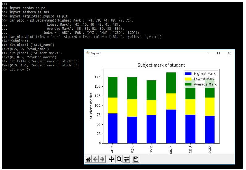
import pandas as pd
import seaborn as sns
import matplotlib.pyplot as plt
bar_plot = pd.DataFrame({'Highest Mark': [78, 70, 74, 88, 75, 72],
  'Lowest Mark': [42, 46, 40, 43, 41, 48],
  'Average Mark': [55, 58, 52, 56, 53, 50]},
  index = ['ABC', 'PQR', 'XYZ', 'MNP', 'CBD', 'BCD'])
bar_plot.plot (kind = 'bar', stacked = True, color = ['Blue', 'yellow', 'green'])
plt.xlabel ('Stud_name')
plt.ylabel ('Student marks')
plt.title ('Subject mark of student')
plt.show ()
Output:
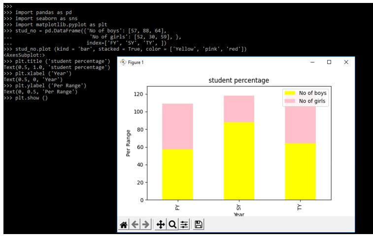
In the below example, we differentiate the boy’s and girls as per year wise. We are creating it as per year wise as follows.
Code:
import pandas as pd
import seaborn as sns
import matplotlib.pyplot as plt
stud_no = pd.DataFrame({'No of boys': [57, 88, 64],
  'No of girls': [52, 30, 59], },
  index = ['FY', 'SY', 'TY', ])
stud_no.plot (kind = 'bar', stacked = True, color = ['Yellow', 'pink', 'red'])
plt.title ('student percentage')
plt.xlabel ('Year')
plt.ylabel ('Per Range')
plt.show ()
Output:
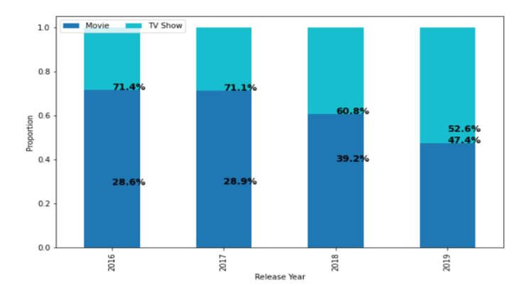
Seaborn Stacked Bar Percent Charts
The seaborn stacked bar percent charts are used to observe the values in a rectangular bar. The seaborn module in python uses the function of the seaborn barplot for creating the bar plots. The stacked bar gives the overall graph a look using the observations set in the second set. We have no function to create stacked bar percent charts. A bar chart is the most frequently used and easy to design; also, it is straightforward to understand.
Below example shows seaborn stacked bar percent charts as follows:
Code:
import pandas as pd
import matplotlib.pyplot as bar_plot
import numpy as np
plot = pd.read_csv('bar.csv')
plot = data.loc [].copy()
plot.dropna (inplace = True)
plot['release_year'] = plot['release_year'].astype('int')
tab.plot (kind = 'bar',
stacked = True,
colormap = 'tab10',
figsize = (10, 6))
bar_plot.legend (loc = "upper left", ncol = 2)
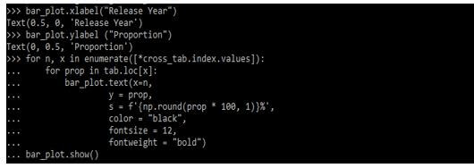
bar_plot.xlabel ("Release Year")
bar_plot.ylabel ("Proportion")
for n, x in enumerate([*cross_tab.index.values]):
for prop in tab.loc [x]:
bar_plot.text (x=n,
y = prop,
s = f'{np.round (prop * 100, 1)} %',
color = "blue",
fontsize = 12,
fontweight = "bold")
bar_plot.show ()Output:
Examples of Seaborn Stacked Bar Plot
Different examples are mentioned below:
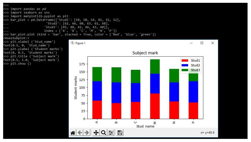
Example #1
In the below example, we are defining stud marks as follows.
Code:
import pandas as pd
import seaborn as sns
import matplotlib.pyplot as plt
bar_plot = pd.DataFrame({'Stud1': [58, 50, 54, 81, 55, 52],
  'Stud2': [62, 66, 60, 63, 61, 68],
  'Stud3': [45, 48, 42, 46, 43, 40]},
  index = ['A', 'B', 'C', 'M', 'N', 'P'])
bar_plot.plot (kind = 'bar', stacked = True, color = ['Red', 'blue', 'green'])
plt.xlabel ('Stud_name')
plt.ylabel ('Student marks')
plt.title ('Subject mark')
plt.show ()
Output:
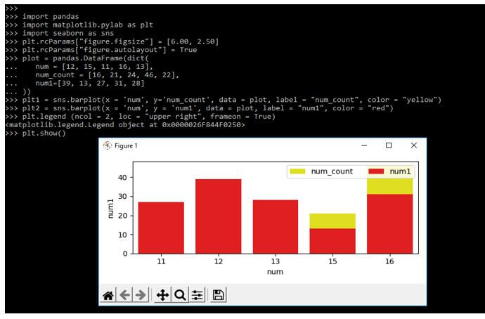
Example #2
The example below defines two plots in separate lines, i.e., plt1 and plt2.
Code:
import pandas
import matplotlib.pylab as plt
import seaborn as sns
plt.rcParams["figure.figsize"] = [6.00, 2.50]
plt.rcParams["figure.autolayout"] = True
plot = pandas.DataFrame(dict(
num = [12, 15, 11, 16, 13],
num_count = [16, 21, 24, 46, 22],
num1=[39, 13, 27, 31, 28]))
plt1 = sns.barplot(x = 'num', y='num_count', data = plot, label = "num_count", color = "yellow")
plt2 = sns.barplot(x = 'num', y = 'num1', data = plot, label = "num1", color = "red")
plt.legend (ncol = 2, loc = "upper right", frameon = True)
plt.show ()
Output:
FAQ
Other FAQs are mentioned below:
Q1. What is the use of a seaborn stacked bar plot in python?
Answer:
We are using it to represent the multiple-bar plot in a single bar. One plot is divided into subplots.
Q2. Which libraries do we need to use when defining stacked bar plots in python?
Answer:
When using a stacked bar plot, we need to use the seaborn, numpy, pandas, and seaborn library.
Q3. How many ways can we plot the seaborn stacked bar plot?
Answer:
We can plot the seaborn stacked plot vertically and horizontally as per request.
Conclusion
The stacked bar plot axis will represent the count values connected with it. We can describe it vertically as well as horizontally. It is the visual representation of the data set in a category highlighted in shape, such as a rectangle.
Recommended Articles
This is a guide to Seaborn Stacked Bar Plot. Here we discuss the introduction, percent charts, examples, and how to create a seaborn stacked bar with FAQ. You may also have a look at the following articles to learn more –
