Updated March 16, 2023
Introduction to Seaborn Palette
Seaborn palette makes easy-to-use colors suited to the data characteristics and the goals of visualization. It is used to color the plot; by using the palette, we can generate different colors. Color plays an essential role in an aspect of visualizations at the time we are using the same efficiently. The seaborn color palette adds more value to the specified plot.

Key Takeaways
- The color palette provides the interface in many possible ways; we can generate colors by using seaborn and the same by using function.
- By using the color palette, we are accepting the seaborn palette. It will also be taking the list of colors in matplotlib format.
Overview of Seaborn Palette
At the time of creating the visualization of data, our main aim is to communicate the insights for finding the data. While visualizing the necessary information, styling will influence the audience. After formatting the data for visualization, the next step in data visualization is styling. In seaborn, styling is the process used to customize the visualization look. The decision of details visualization increases the impact of our work. We can build a color palette by using the function name color_palette. The color palette function takes any built-in palette; we can create our palette.
Create Colors Seaborn Palette
Seaborn contains 170 different types of palettes available. We can access the palette list by importing the seaborn package.
In the below example, we are importing the seaborn package by using the import keyword as follows:
Code:
import pandas as pd
import matplotlib.pyplot as plt
import seaborn as sns
Output:
In the example below, we are using a palette value as “d,” which will show an error because d is not a palette value.
Code:
sns.pairplot(df, hue='total_bill', palette='d')Output:
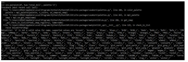
Below image shows the list of palette values which was supported in python as follows:
Below example shows the palette as follows:
We are defining one by one palette examples as follows:
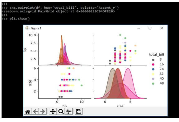
1. Accent_r
Code:
sns.pairplot(df, hue='total_bill', palette='Accent_r')
plt.show()
Output:
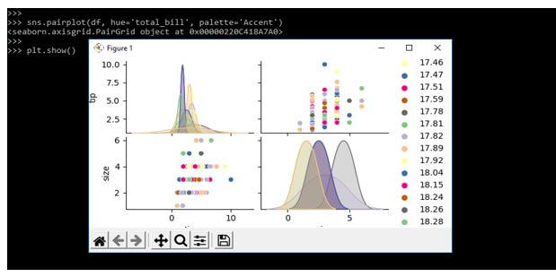
2. Accent
Code:
sns.pairplot(df, hue='total_bill', palette='Accent')
plt.show()
Output:
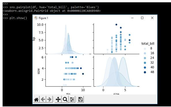
3. Blues
Code:
sns.pairplot(df, hue='total_bill', palette='Blues')
plt.show()
Output:
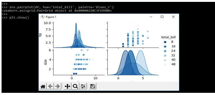
4. Blues_r
Code:
sns.pairplot(df, hue='total_bill', palette='Blues_r')
plt.show()
Output:
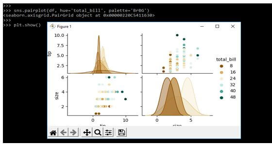
5. BrBG
Code:
sns.pairplot(df, hue='total_bill', palette='BrBG')
plt.show()
Output:
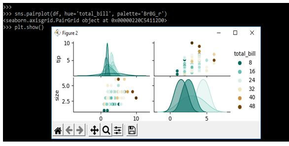
6 BrBG_r
Code:
sns.pairplot(df, hue='total_bill', palette='BrBG_r')
plt.show()
Output:
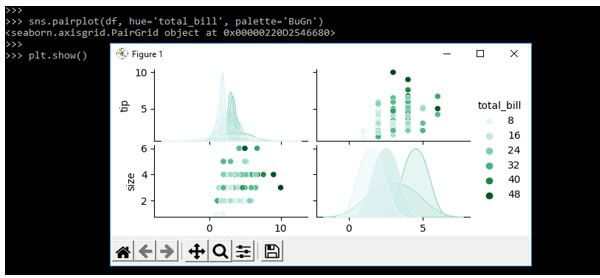
7. BuGn
Code:
sns.pairplot(df, hue='total_bill', palette='BuGn')
plt.show ()
Output:
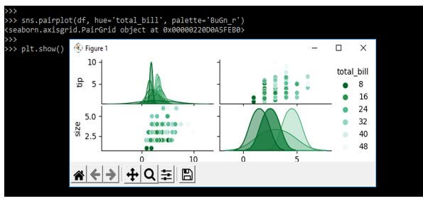
8. BuGn_r
Code:
sns.pairplot(df, hue='total_bill', palette='BuGn_r')
plt.show()
Output:
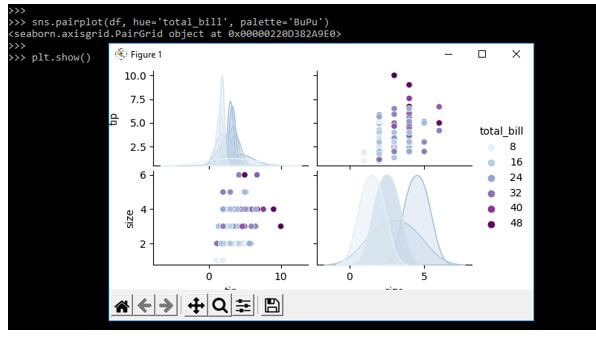
9. BuPu
Code:
sns.pairplot(df, hue='total_bill', palette='BuPu')
plt.show()
Output:
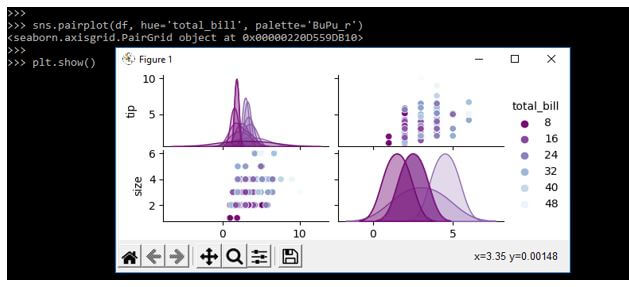
10. BuPu_r
Code:
sns.pairplot(df, hue='total_bill', palette='BuPu_r')
plt.show()
Output:
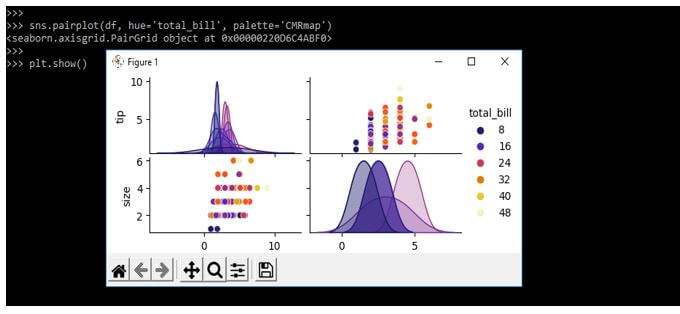
11. CMRmap
Code:
sns.pairplot(df, hue='total_bill', palette='CMRmap')
plt.show()
Output:
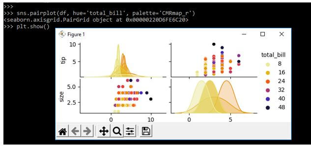
12. CMRmap_r
Code:
sns.pairplot(df, hue='total_bill', palette='CMRmap_r')
plt.show()
Output:
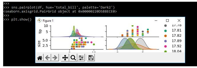
13. Dark2
Code:
sns.pairplot(df, hue='total_bill', palette='Dark2')
plt.show()
Output:
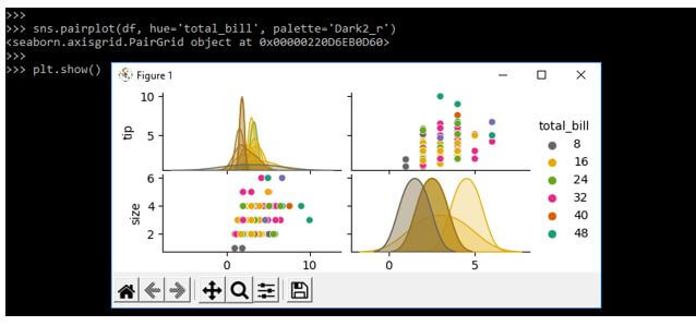
14. Dark2_r
Code:
sns.pairplot(df, hue='total_bill', palette='Dark2_r')
plt.show()
Output:
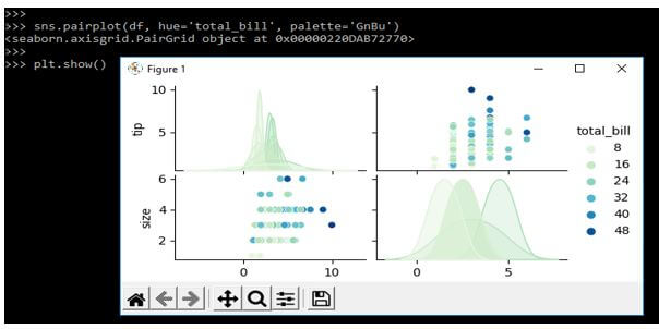
15. GnBu
Code:
sns.pairplot(df, hue='total_bill', palette='GnBu')
plt.show()
Output:
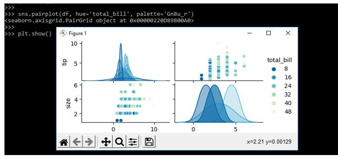
16. GnBu_r
Code:
sns.pairplot(df, hue='total_bill', palette='GnBu_r')
plt.show()
Output:
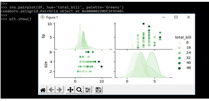
17. Greens
Code:
sns.pairplot(df, hue='total_bill', palette='Greens')
plt.show()
Output:
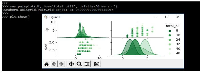
18. Greens_r
Code:
sns.pairplot(df, hue='total_bill', palette='Greens_r')
plt.show()
Output:
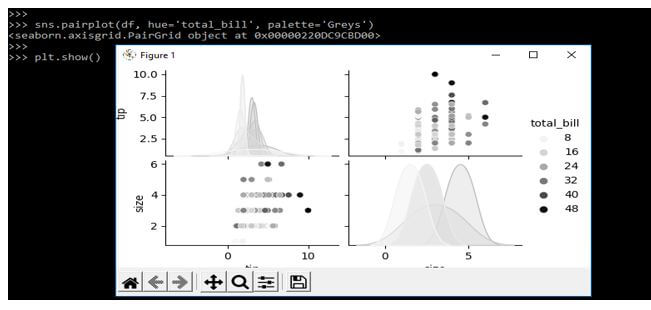
19. Greys
Code:
sns.pairplot(df, hue='total_bill', palette='Greys')
plt.show()
Output:
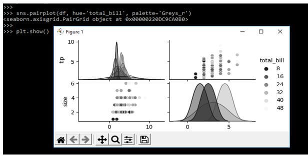
20. Greys_r
Code:
sns.pairplot(df, hue='total_bill', palette='Greys_r')
plt.show ()
Output:
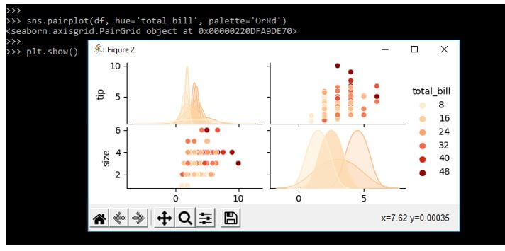
21. OrRd
Code:
sns.pairplot(df, hue='total_bill', palette='OrRd')
plt.show()
Output:
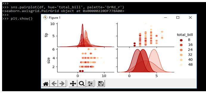
22. OrRd_r
Code:
sns.pairplot(df, hue='total_bill', palette='OrRd_r')
plt.show()
Output:
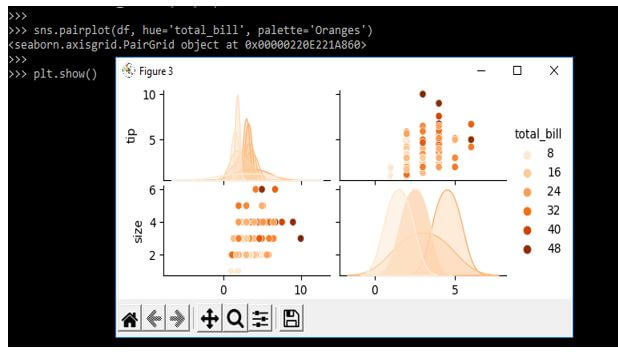
23. Oranges
Code:
sns.pairplot(df, hue='total_bill', palette='Oranges')
plt.show()
Output:
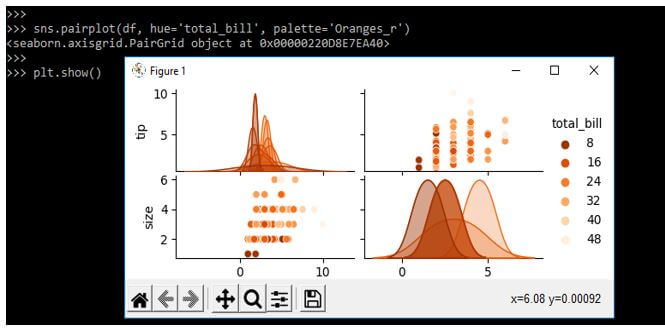
24. Oranges_r
Code:
sns.pairplot(df, hue='total_bill', palette='Oranges_r')
plt.show()
Output:
Seaborn Palette Categorical
Seaborn is the more critical visualization package in python. The seaborn package contains robust controls and beautiful colors for a wide plot array parameter. In python data visualization, colors are essential and necessarily involved; color influences the observer.
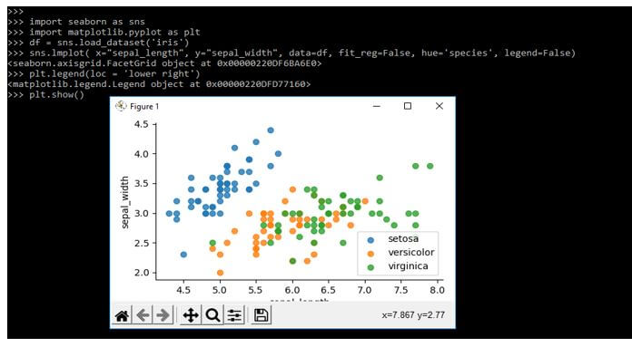
Using the scatterplot, we use color encoding for the different data sets.
In the following example, we are using the iris dataset for the seaborn repository as follows:
Code:
import seaborn as sns
import matplotlib.pyplot as plt
df = sns.load_dataset('iris')
sns.lmplot ( x="sepal_length", legend=False)
plt.legend(loc = 'lower right')
plt.show()
Output:
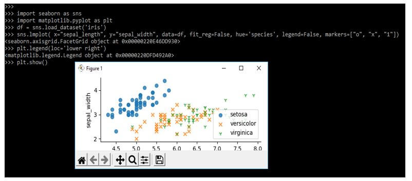
In seaborn, it is also possible to define the maker shapes in a different category; we can use the argument function of markers.
Code:
import seaborn as sns
import matplotlib.pyplot as plt
df = sns.load_dataset('iris')
sns.lmplot( x="sepal_length", markers=["o", "x", "1"])
plt.legend(loc='lower right')
plt.show()
Output:
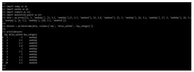
Seaborn Palette Custom Colors
We know that seaborn is the library based on a matplotlib. We need to create our custom data to use the palette’s custom colors.
Below example shows to create custom data as follows:
Code:
import numpy as np
import pandas as pd
import seaborn as sns
import matplotlib.pyplot as plt
data = np.array (…)
dataset = pd.DataFrame( … )
print (dataset)
Output:
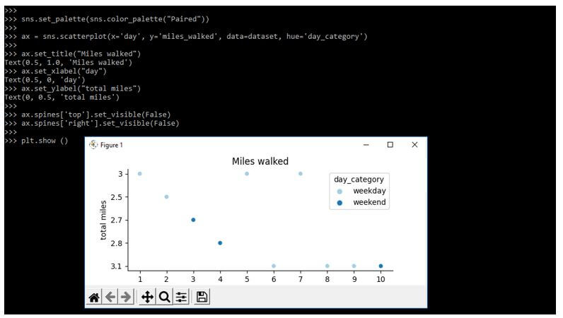
The below example shows to use of the existing palette. Seaborn and matplotlib contain multiple color palettes.
In the below example, we are using the paired palette as follows:
Code:
sns.set_palette(sns.color_palette ("Paired"))
plt.show()
Output:
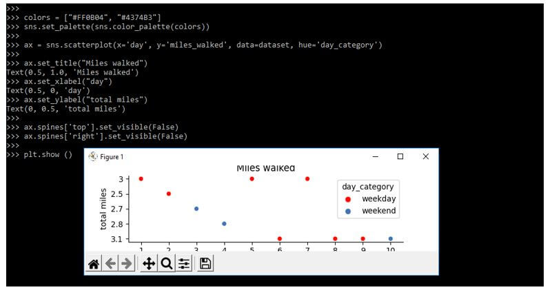
In the below example, we are using our color palette as follows. We are using a particular set of colors to define a custom color palette in seaborn.
Code:
sns.set_palette(sns.color_palette(colors))
plt.show()
Output:
FAQ
Other FAQs are mentioned below:
Q1. What is the use of the seaborn palette in python?
Answer:
By using it, we can color the plot. By using the palette, we can generate different types of colors.
Q2. What is a custom seaborn palette in python?
Answer:
It is nothing, but we are creating our custom color palette and using the same in our code.
Q3. What are circular color systems in the seaborn palette?
Answer:
At the time, we used categories of arbitrary numbers without distinguishing the others; it was the easiest way to draw circular color systems.
Conclusion
The decision of details visualization increased the impact of our work. We can build a color palette by using the function name color_palette. Color plays an essential role in an aspect of visualizations at the time we are using the same efficiently. Seaborn’s color palette adds more value to the specified plot.
Recommended Articles
This is a guide to Seaborn Palette. Here we discuss the introduction, create colors, seaborn palette, categorical, custom colors, and FAQ. You may also have a look at the following articles to learn more –