Updated March 17, 2023
Introduction to Seaborn Multiple Plots
Seaborn multiple plots are used to plot multiple graphs in a single window. We can plot the multiple graphs using two ways, first with the help of function, facetgrid, and other with the help of a matplotlib. The facet grid function is a general way of plotting the grids based on a function. It will help visualize the variable and its relationship with multiple variables.

Key Takeaways
- The class of facetgrid is used to visualize the relationship between subsets of data distributions and was used for creating the grid in multiple plots.
- We can also use the pair grid function, which is similar to the facet grid function; it takes the data frame.
What are Seaborn Multiple Plots?
The seaborn multiple plots use the input as a data frame and the name of variables that shapes the column or dimensions of color from the grid. We will utilize the facet grid method in a seaborn to draw the representation of multiple graphics using a single interface. The facet grid is a method that was used to create matrices-dependent methods. It will depict the specific factor dispersion correlating with the various parameters. The object of the facet grid method will be taking an argument to set the values and data of the parameters.
How to Work Seaborn Multiple Plots?
We are using the data provided by the integrated data frame from a seaborn package for configuring the dimensions and plots. The functionality is virtually identical to the facetgrid. We are creating the grid and providing functionality for displaying the method.
Code:
import pandas as pd
import matplotlib.pyplot as plt
import seaborn as sns
import numpy as np
plot = sns.load_dataset ("tips")
graph = sns.FacetGrid (plot, col = "time")
plt.show ()
Output:
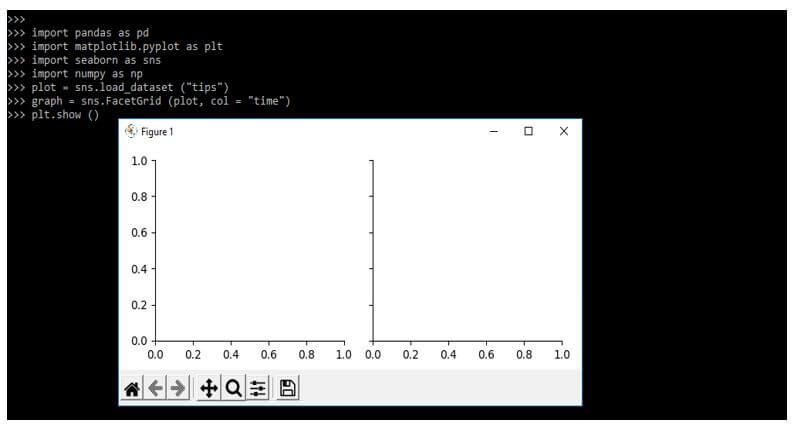
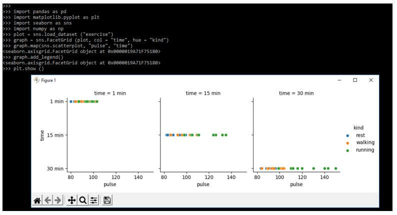
We can draw the scatter plot by using the method of scatter plot. We are also using the facet grid module to create numerous graphs. It will display every dataset field from the number of matrix values. For the ordinal attribute, we can utilize the hue attribute as follows.
Code:
import pandas as pd
import matplotlib.pyplot as plt
import seaborn as sns
import numpy as np
plot = sns.load_dataset ("exercise")
graph = sns.FacetGrid (plot, col = "time", hue = "kind")
graph.map (sns.scatterplot, "pulse", "time")
graph.add_legend()
plt.show ()
Output:
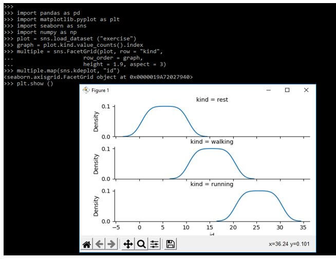
We can draw the kdeplot by using the method of kdeplot. The dataset values are used for determining the standard arrangements of the elements. The categories sequence is deployed if the parameter is applied for creating the sort which was categorized. The aspects will be displayed when an attribute exists.
Code:
import pandas as pd
import matplotlib.pyplot as plt
import seaborn as sns
import numpy as np
plot = sns.load_dataset ("exercise")
graph = plot.kind.value_counts ().index
multiple = sns.FacetGrid(plot, row = "kind",
  row_order = graph,
  height = 1.9, aspect = 3)
multiple.map (sns.kdeplot, "id")
plt.show ()
Output:
Seaborn Multiple Plots Python Functions
The library of seaborn provides multiple functions, making data analysis and visualizations easier.
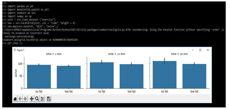
1. Bar Plot
It will give the estimation of the central tendency of the plot as follows.
Code:
import pandas as pd
import matplotlib.pyplot as plt
import seaborn as sns
import numpy as np
plot = sns.load_dataset ("exercise")
sea = sns.FacetGrid(plot, col = "time", height = 4)
sea.map(sns.barplot, "diet", "pulse",)
plt.show ()
Output:
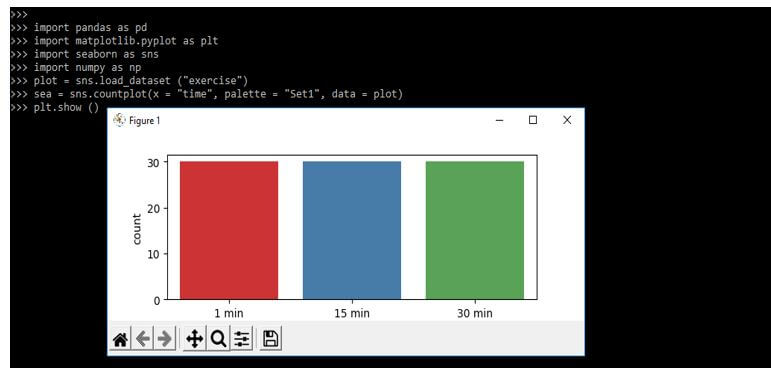
2. Countplot
The countplot function will return the count of all values for every category.
Code:
import pandas as pd
import matplotlib.pyplot as plt
import seaborn as sns
import numpy as np
plot = sns.load_dataset ("exercise")
sea = sns.countplot(x = "time", palette = "Set1", data = plot)
plt.show ()
Output:
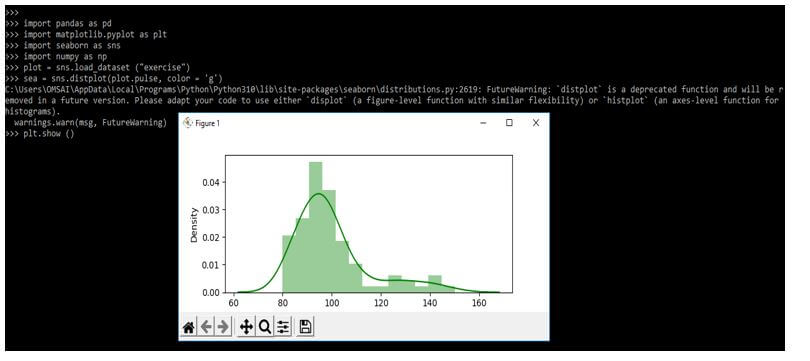
3. Distribution Plot
The seaborn library supports the function of distplot, which was used to create data distribution.
Code:
import pandas as pd
import matplotlib.pyplot as plt
import seaborn as sns
import numpy as np
plot = sns.load_dataset ("exercise")
sea = sns.distplot(plot.pulse, color = 'g')
plt.show ()
Output:
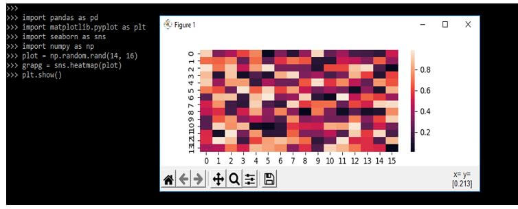
4. Heatmap
Heatmap is the seaborn library that was used to visualize the matrix data.
Code:
import pandas as pd
import matplotlib.pyplot as plt
import seaborn as sns
import numpy as np
plot = np.random.rand(14, 16)
grapg = sns.heatmap(plot)
plt.show()
Output:
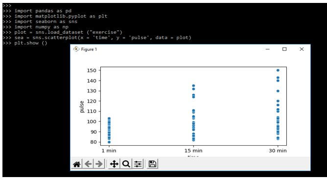
5. Scatterplot
This function helps us create a plot drawing relationships between variables.
Code:
import pandas as pd
import matplotlib.pyplot as plt
import seaborn as sns
import numpy as np
plot = sns.load_dataset ("exercise")
sea = sns.scatterplot(x = 'time', y = 'pulse', data = plot)
plt.show ()
Output:
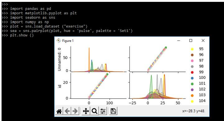
6. Pairplot
The seaborn library of python visualizes the data by using pairplot.
Code:
import pandas as pd
import matplotlib.pyplot as plt
import seaborn as sns
import numpy as np
plot = sns.load_dataset ("exercise")
sea = sns.pairplot(plot, hue = 'pulse', palette = 'Set1')
plt.show ()
Output:
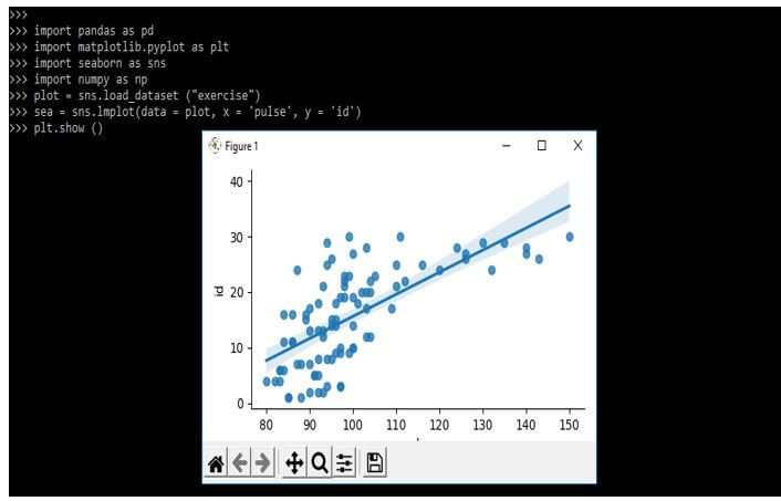
7. Linear Regression Plot
The lmplot function draws the linear relationship.
Code:
import pandas as pd
import matplotlib.pyplot as plt
import seaborn as sns
import numpy as np
plot = sns.load_dataset ("exercise")
sea = sns.lmplot(data = plot, x = 'pulse', y = 'id')
plt.show ()
Output:
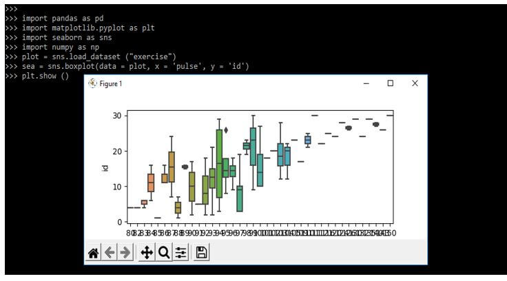
8. Boxplot
This plot will represent the data set quartiles.
Code:
import pandas as pd
import matplotlib.pyplot as plt
import seaborn as sns
import numpy as np
plot = sns.load_dataset ("exercise")
sea = sns.boxplot(data = plot, x = 'pulse', y = 'id')
plt.show ()
Output:
Examples of Seaborn Multiple Plots
Different examples are mentioned below:
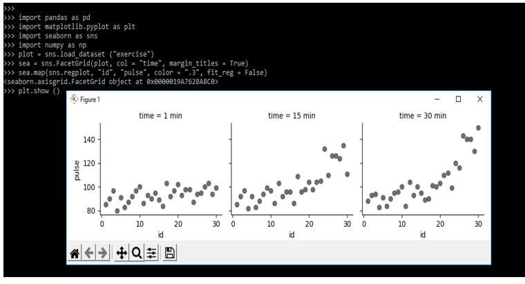
Example #1
In the example below, we are drawing several plots using the function name as FacetGrid. We are depicting the regression plot, so we are using the function name as regplot. The constructor accepts the multiple parameters by utilizing the layout of the grid.
Code:
import pandas as pd
import matplotlib.pyplot as plt
import seaborn as sns
import numpy as np
plot = sns.load_dataset ("exercise")
sea = sns.FacetGrid(plot, col = "time", margin_titles = True)
sea.map (sns.regplot, "id", "pulse", color = ".3", fit_reg = False)
plt.show ()
Output:
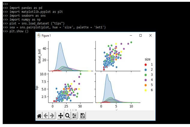
Example #2
The below example shows to plot the pairplot as follows. In the below example, we are using datasets as tips.
Code:
import pandas as pd
import matplotlib.pyplot as plt
import seaborn as sns
import numpy as np
plot = sns.load_dataset ("tips")
sea = sns.pairplot(plot, hue = 'size', palette = 'Set1')
plt.show ()
Output:
FAQ
Other FAQs are mentioned below:
Q1. What is the use of seaborn multiple plots in python?
Answer:
Using the seaborn multiple graphs, we plot multiple plots into a single graph. We are using multiple methods to plot the seaborn multiple plots.
Q2. Which libraries are we using when plotting seaborn multiple plot graphs?
Answer:
We use seaborn, matplotlib, numpy, and pandas library when plotting the graph with seaborn multiple plots.
Q3. Which function are we using when plotting the graph with seaborn multiple plots?
Answer:
We use barplot, countplot, distplot, heatmap, scatterplot, pairplot, implot, and boxplot functions.
Conclusion
We can plot the multiple graphs using two ways, first with the help of function, facetgrid, and other with the help of a matplotlib. We will utilize the method of facet grid in a seaborn to draw the representation of multiple graphics using a single interface.
Recommended Articles
This is a guide to Seaborn Multiple Plots. Here we discuss the introduction, seaborn multiple plots python functions, examples, and FAQ. You may also have a look at the following articles to learn more –
