Updated March 17, 2023
Introduction to Seaborn Distribution Plot
Seaborn distribution plot is a matplotlib function used with regplot and kdeplot functions. It will fit the statistical distributions and PDF estimated over to the data. Seaborn is the most widely used python library, an extension of a matplotlib. It is the distplot which was depicting the variation of the data distribution. It is beneficial and essential in python.

Key Takeaways
- The seaborn distribution plot function will accept the data variable as an argument and return the density of a plot.
- We can plot the distribution plot using the seaborn; also, we can change the distribution of plot bin sizes and the estimation of plots.
What is Seaborn Distribution Plot?
It represents the overall distribution of data variables which was continuous. The matplotlib module and the seaborn module are used to depict the distplot by using different variations. It depicts the data from the histogram and lines a combination into it.
Below is the syntax:
Syntax:
seaborn.distplot()
seaborn.jointplot()
seaborn.pairplot()
seaborn.rugplot()
The Seaborn module of python contains various functions for plotting the data and depicting the data variations. The Seaborn distplot function is used to plot the distplot. The distplot represents the univariate data distribution, i.e., variable data distribution against the density distribution. The function of the seaborn distplot will accept the variable of data.
How to Use Seaborn Distribution Plot?
We need to install the seaborn library in our system; we can install the same using the pop command.
Below steps shows how we can use the seaborn distribution plot as follows:
1. While using the seaborn distribution plot, first, we need to install the seaborn package as follows.
Code:
pip install seabornOutput:
2. To check the installation of the seaborn library in this step, we are importing the seaborn package also; with the seaborn package, we are importing the matplotlib package for drawing the graph. We are importing all the packages by using the import keyword as follows.
Code:
import seaborn as sns
import matplotlib.pyplot as plt
Output:
3. We must also import the data set in our code to use it. We are importing the data set by using the function name load_dataset. In the below example, we are loading the mpg data set as follows.
Code:
df = sns.load_dataset ('mpg')Output:
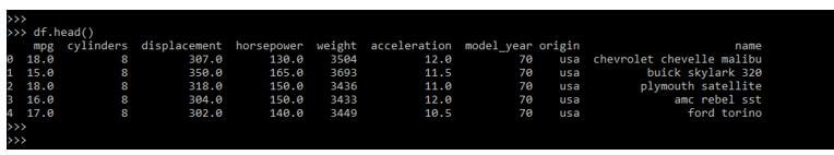
4. In this step, we are checking the data of the loaded data set. We are studying the data by using the following command as follows.
Code:
df.head()Output:
5. In the below example, we are plotting it as follows. We are using the kde, color, and bins parameters as follows.
Code:
sns.distplot(df['mpg'], kde = False, color ='Yellow', bins = 30)
plt.show ()
Output:

Seaborn Distribution Plot Types
Below are the types used to examine the univariate and bivariate distribution.
The four types are mentioned below:
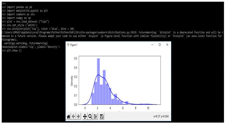
1. Distplot
This plot uses a universal set of observations and is visualized using the histogram. Below is an example of the distplot as follows. In the example below, we are using bins to set the numbers, and the color is used to specify the color.
Code:
import pandas as pd
import matplotlib.pyplot as plt
import seaborn as sns
import numpy as np
plot = sns.load_dataset ("tips")
sns.set_style ('white')
sns.distplot (plot['tip'], color = 'blue', bins = 20)
plt.show ()
Output:
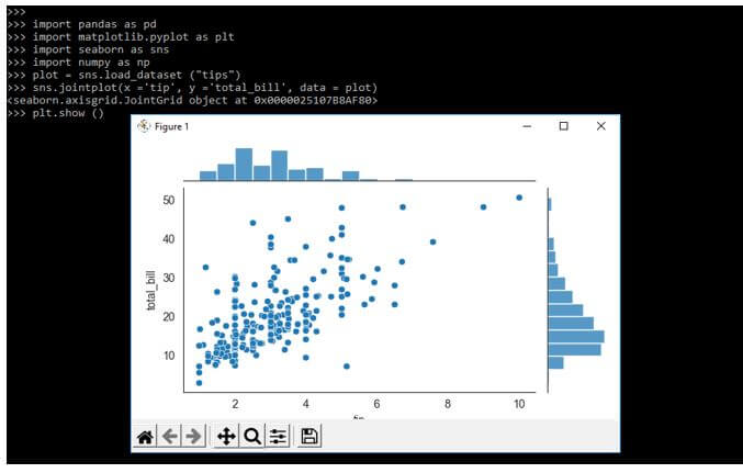
2. Jointplot
This plot is used to draw the two variables using univariate and bivariate graphs. It combines the two different plots. In the below example, we are using the x and y variable to plot the x and y-axis of the graph. Also, we are using data to define the data set as follows.
Code:
import pandas as pd
import matplotlib.pyplot as plt
import seaborn as sns
import numpy as np
plot = sns.load_dataset ("tips")
sns.jointplot(x ='tip', y ='total_bill', data = plot)
plt.show ()
Output:
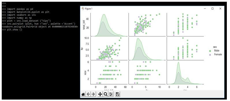
3. Pairplot
This plot represents the pairwise relationship in the entire data frame and supports the additional parameter called a hue for categorical separation. Below is an example of the seaborn pairplot as follows.
Code:
import pandas as pd
import matplotlib.pyplot as plt
import seaborn as sns
import numpy as np
plot = sns.load_dataset ("tips")
sns.pairplot (plot, hue ="sex", palette ='Accent')
plt.show ()
Output:
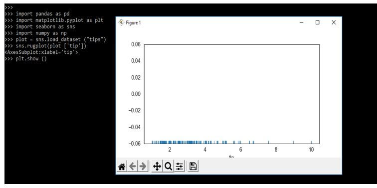
4. Rugplot
This plot plots the data points from an array stuck on an axis. Like a distplot, it will take a single column. This plot will create the dashes instead of drawing the histogram. The below example shows the rugplot as follows.
Code:
import pandas as pd
import matplotlib.pyplot as plt
import seaborn as sns
import numpy as np
plot = sns.load_dataset ("tips")
sns.rugplot (plot ['tip'])
plt.show ()
Output:
Examples
Different examples are mentioned below:
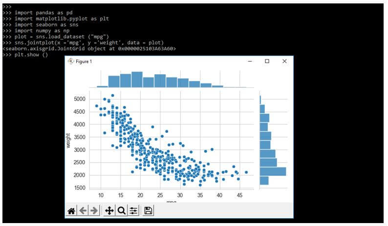
Example #1
The below example shows seaborn distribution plots as follows. In the below example, we are loading the dataset name as mpg.
Code:
import pandas as pd
import matplotlib.pyplot as plt
import seaborn as sns
import numpy as np
plot = sns.load_dataset ("mpg")
sns.set_style ('whitegrid')
sns.distplot (plot['mpg'], color = 'red', bins = 25)
plt.show ()
Output:
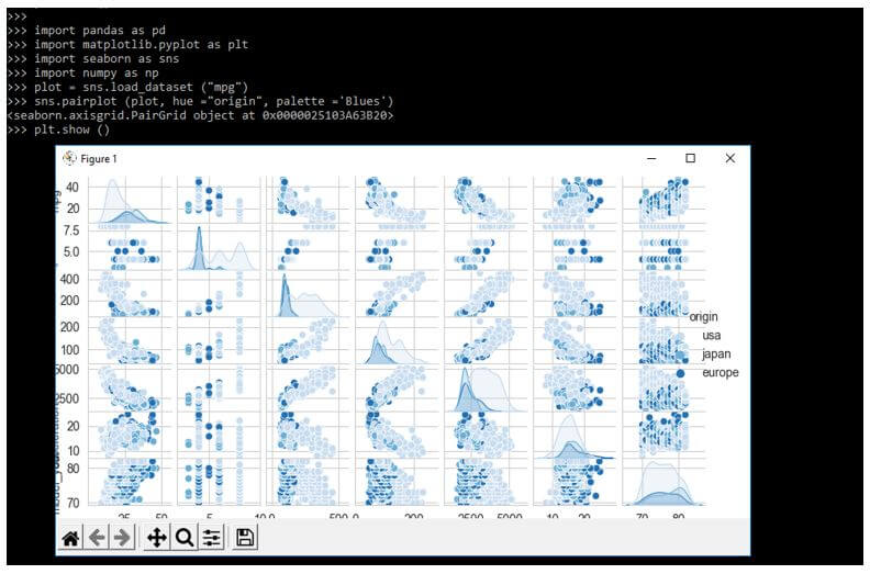
Example #2
The below example shows seaborn distribution pairplot as follows. In the below example, we are loading the mpg data set as follows.
Code:
import pandas as pd
import matplotlib.pyplot as plt
import seaborn as sns
import numpy as np
plot = sns.load_dataset ("mpg")
sns.pairplot (plot, hue ="origin", palette ='Blues')
plt.show ()
Output:
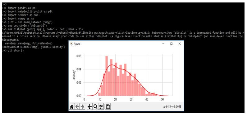
Example #3
The below example shows seaborn distribution joint plot as follows. In the below example, we are loading the mpg data set as follows.
Code:
import pandas as pd
import matplotlib.pyplot as plt
import seaborn as sns
import numpy as np
plot = sns.load_dataset ("mpg")
sns.jointplot(x ='mpg', y ='weight', data = plot)
plt.show ()
Output:
FAQ
Other FAQs are mentioned below:
Q1. What is the use of the seaborn distribution plot in python?
Answer:
It is used to depict the distribution of a plot; it is also used to represent the distribution.
Q2. Which libraries are we using while drawing the seaborn distribution plot?
Answer:
When drawing the plot, we must import the numpy, pandas, seaborn, and matplotlib library.
Q3. How many types of seaborn distribution plots are available in python?
Answer:
There are four types available in python, i.e., pair plot, joint plot, rug plot, and distribution plot.
Conclusion
The matplotlib module and the seaborn module are used to depict the distplot by using different variations. It is a matplotlib function that was used with regplot and kdeplot functions. It will fit the statistical distributions and PDF estimated over to the data.
Recommended Articles
This is a guide to Seaborn Distribution Plot. Here we discuss the introduction, examples, types, and how to use the seaborn distribution plot with FAQ. You may also have a look at the following articles to learn more –
