Updated March 15, 2023

Introduction to Seaborn Countplot
Seaborn countplot is used to show the count of each observation as per category by the graph. Its function is to create the bar charts as per the number of category options at a high level. When using sns.countplot, the seaborn function of countplot is counting the observation number as per category; after counting the result, it will display the result as a bar chart or a graph.
Key Takeaways
- The count plot function is similar to the bar plot function; both functions do not contain much difference in working.
- The countplot function in python can go through across the flat histogram instead of using the quantitative variable. The API of the the seaborn count plot is identical.
What is Seaborn Countplot?
Countplot in seaborn is the best way to create a bar chart in python. Using the library of countplot and parameters, we are finding the results from the dataset. Data analysts widely use the library of seaborn. However, the galaxy plot is the best way to provide the data representation. To use the seaborn count plot, we need to import the seaborn library in our project; without it, we cannot use the countplot function in the project; it will show the error message. The count plot represents the occurrence and observation present in the variable.
How to Create Seaborn Countplot?
The seaborn countplot is the graphical display showing the frequency of occurrence. To create the graph first, we install the seaborn in our system.
1. While creating the seaborn countplot, in the first step, we install the the library package of seaborn by using the pip command. The below example shows the installation of the package of seaborn as follows.
Code:
pip install seabornOutput:
2. After installing the library package of seaborn, we are now importing the seaborn package into our project. We are importing the packages by using the import keyword as follows. Also, we are importing the pyplot library with seaborn.
Code:
import seaborn as sns
import matplotlib.pyplot as plt
Output:
3. While importing the library package of seaborn, we now need to load the data set in this step. In the below example, we are loading the data set name as tips as follows. We are loading the dataset by using the load_dataset function.
Code:
df = seaborn.load_dataset ('tips')Output:
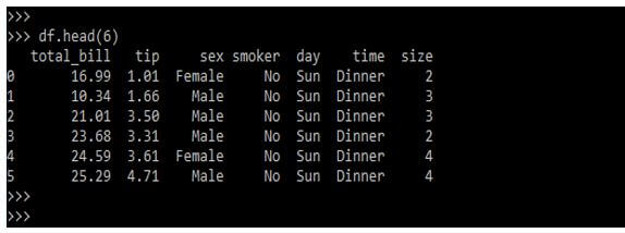
4. While loading the dataset in this step, we are checking the data which was present in the data set by using the following command as follows.
Code:
df.head (6)Output:
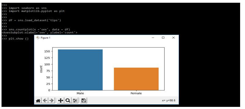
5. After checking the data of the dataset, now, in this step, we are plotting the seaborn countplot by using the dataset we have loaded.
Code:
sns.countplot(x ='sex', data = df)
plt.show ()
Output:
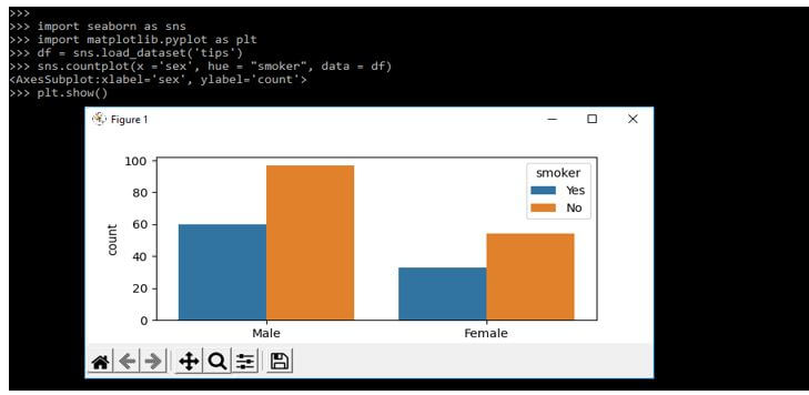
6. At the time, the points s plotted by using two dimensions then another dimension was added to the graph by coloring as per the third variable. So in the below example, we are providing a count as follows.
Code:
import seaborn as sns
import matplotlib.pyplot as plt
df = sns.load_dataset('tips')
plt.show()
Output:
Seaborn Countplot Dataset and Chart
The countplot function in seaborn is returning the axes object which was plot displayed in it. The countplot method of seaborn displays the number of events classified using bars.
Syntax:
Seaborn.countplot(parameters);In the above syntax x, y parameter is taking the name of variables into the data. This is an optional parameter. Hue is the parameter in the countplot function taking the column name for color encoding. Data is the optional parameter while using it. The data parameter is taking a list of arrays and data frames. Order and hue_order parameter takes the list of string orders to plot the categorical levels.
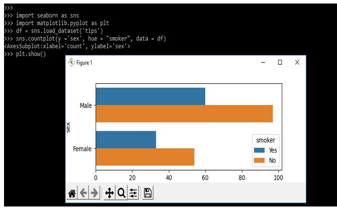
In the below example, we plot the horizontal chart and perform the multiple count plots by using the exchange of data variable by using another axis as follows.
Code:
import seaborn as sns
import matplotlib.pyplot as plt
df = sns.load_dataset('tips')
plt.show()
Output:
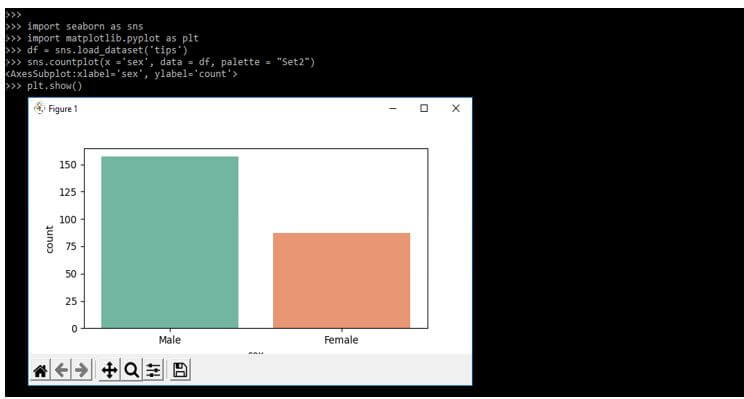
We can also generate the different colors by using palette. The below example shows palette is responsible for generating the countplot as follows.
Code:
import seaborn as sns
import matplotlib.pyplot as plt
df = sns.load_dataset('tips')
plt.show()
Output:
Examples of Seaborn Countplot
Given below are the examples mentioned:
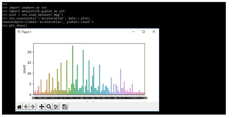
Example #1
In the below example, we are passing the x variable parameter as follows.
Code:
import seaborn as sns
import matplotlib.pyplot as plt
plot = sns.load_dataset('mpg')
sns.countplot(x ='acceleration', data = plot)
plt.show()
Output:
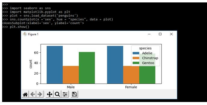
Example #2
In the below example, we are adding the three dimensions; in a third variable, we are coloring the points as follows.
Code:
import seaborn as sns
import matplotlib.pyplot as plt
plot = sns.load_dataset('penguins')
sns.countplot(x ='sex', hue = "species", data = plot)
plt.show()
Output:
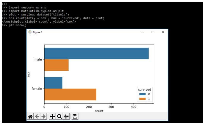
Example #3
In the below example, we are rendering the plot horizontally. We are substituting the y as x for orientation adjusting as follows.
Code:
import seaborn as sns
import matplotlib.pyplot as plt
plot = sns.load_dataset('titanic')
sns.countplot(y ='sex', hue = "survived", data = plot)
plt.show()
Output:
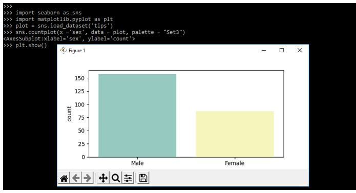
Example #4
By using the palette, we can develop the point with colors. The below example shows how we can use the palette with countplot as follows.
Code:
import seaborn as sns
import matplotlib.pyplot as plt
plot = sns.load_dataset('tips')
sns.countplot(x ='sex', data = plot, palette = "Set3")
plt.show()
Output:
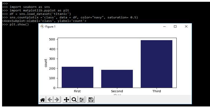
Example #5
In the below example, we are using the color and saturation parameters.
Code:
import seaborn as sns
import matplotlib.pyplot as plt
df = sns.load_dataset('titanic')
sns.countplot(x ='class', data = df, color="navy", saturation= 0.5)
plt.show()
Output:
FAQ
Given below is the FAQ mentioned:
Q1. What is the use of seaborn countplot in python?
Answer:
The function is used to visualize the data in the statistical investigation of deep learning. The countplot is primarily used to display the count of observation.
Q2. How to group the variables in a seaborn countplot?
Answer:
Suppose we have only one data variable instead of two variables, then the axis will denote them in each data variables axis.
Q3. What is the use of a color palette in the seaborn countplot?
Answer:
We are using a color palette in a seaborn countplot to color the specified graph, which we are designing using the function of the seaborn countplot.
Conclusion
Using the library of countplot and parameters, we are finding the results from the dataset. Data analysts widely use the library of seaborn. Its function is to create the bar charts as per the number of category options at a high level.
Recommended Articles
This is a guide to Seaborn Countplot. Here we discuss the introduction and how to create seaborn countplot? dataset and chart, examples, and FAQ. You may also have a look at the following articles to learn more –
