Introduction to Seaborn Color Palette
Seaborn color palette plays a vital role in the aspect of visualizations. When using color effectively, the color will add additional value to the plot. The palette means the flat surface on which we can mix and arrange the color. In seaborn, we are using color_palette(), which was used to give colors to the plot and will add more value to the plot.

Key Takeaways
- We are using the function of the color palette to build the color palette in python. This function takes any seaborn color palette.
- In python, we can also build our color palette by passing the colors list in a format of matplotlib; it will include tuples of RGB.
Overview
To use it, we need to import the seaborn package; without it, we cannot use the color palette. Seaborn in python contains robust controls and beautiful colors for our plots. Seaborn is using color, which is well suited for the characteristics of our data and the goals of our visualization. When creating the data visualization, our primary goal is to communicate insights we have found in our data. It is beneficial and essential for drawing plots.
Using Seaborn Color Palette
We need to import the seaborn, NumPy, and pyplot modules in our code when using it. Seaborn is making it accessible for us to select the color palette.
Below example shows how we can import the packages:
Code:
import numpy as np
import seaborn as sns
import matplotlib.pyplot as plt
sns.set()
Output:
The critical function at the time of working with it is the color_palette. This function will provide multiple ways to create colors in a seaborn. The function of the color palette is accepting the name of the colormap of matplotlib and the seaborn palette. Using the process of color_palette using multiple arguments returns the color style, which was the default. The function of set_palette is taking the same views taken by color_palette and setting the default cycle of color. The color palette generator, a powerful tool for designers and data visualization enthusiasts, can greatly enhance your creative process. The Color palette accepts the name of the Matplotlib colormap and the seaborn palette.
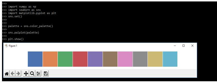
The quantitative palette is good when we need to distinguish the chunks of data.
Below example shows the quantitative palette as follows:
Code:
palette = sns.color_palette()
sns.palplot(palette)
plt.show()
Output:
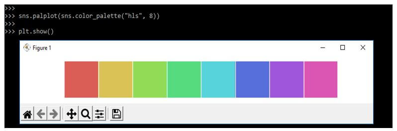
We can also use the circular color system by using it. The widespread way to do the circular color systems is to use the hls color space, which transformed the RCB values.
Code:
sns.palplot (sns.color_palette ("hls", 8))
plt.show()
Output:
In the below example, we are using the hls_palette function by using the seaborn color systems as follows.
Code:
sns.palplot (sns.hls_palette (8, l=.3, s=.8))
plt.show()
Output:

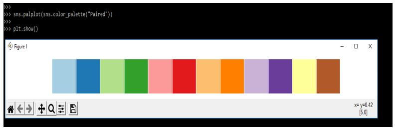
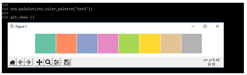
The categorical color brewer is a nice feature. In the below example, we are using the color palette function as follows.
Code:
sns.palplot(sns.color_palette("Paired"))
plt.show()
Output:
Code:
sns.palplot(sns.color_palette("set2"))
plt.show()
Output:
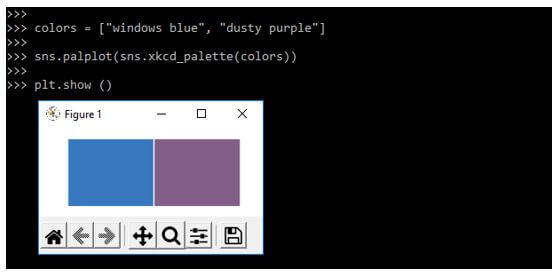
The below example shows the named color from the survey of xkcd. In the example below, we are using the color we have defined.
Code:
colors = ["windows blue", "dusty purple"]
sns.palplot(sns.xkcd_palette(colors))
plt.show()
Output:
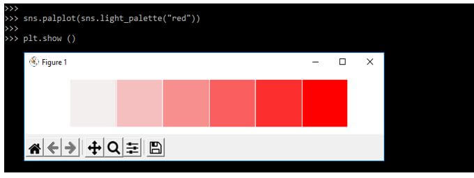
The below example shows a sequential color palette. We are using red color to define the palette as follows.
Code:
sns.palplot(sns.light_palette("red"))
plt.show()
Output:
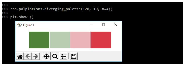
The below example shows the custom diverging palette. We are using numbers to define the color as follows.
Code:
sns.palplot(sns.diverging_palette (120, 10, n=4))
plt.show()
Output:
Different Seaborn Color Palette Categorical
It is used to color the plot. By using the palette, we can generate different colors.
Below are the color palette types as follows:
- Qualitative
- Sequential
- Diverging
Below is the syntax of the color palette as follows. It contains the three input parameters as follows.
Syntax:
Seaborn.color_palette(parameter);1. Qualitative
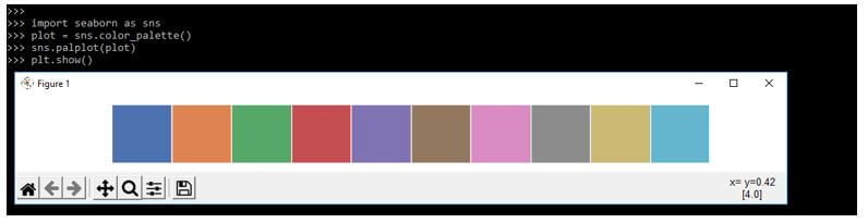
The qualitative palette is used at the time when the variable is categorical. The color which was assigned for each group is distinct.
Code:
import seaborn as sns
plot = sns.color_palette()
sns.palplot (plot)
plt.show()
Output:
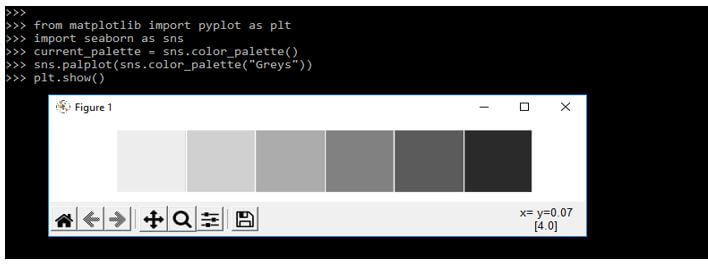
2. Sequential
In this palette, color moves sequentially from light to dark.
Code:
from matplotlib import pyplot as plt
import seaborn as sns
current_palette = sns.color_palette()
sns.palplot(sns.color_palette("Greys"))
plt.show()
Output:
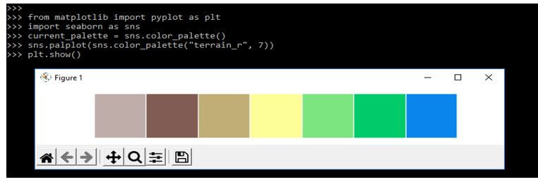
3. Diverging
We use a diverging palette when we work on values mixed like negative and positive.
Code:
from matplotlib import pyplot as plt
import seaborn as sns
current_palette = sns.color_palette()
sns.palplot(sns.color_palette("terrain_r", 7))
plt.show()
Output:
Examples of Seaborn Color Palette
Different examples are mentioned below:
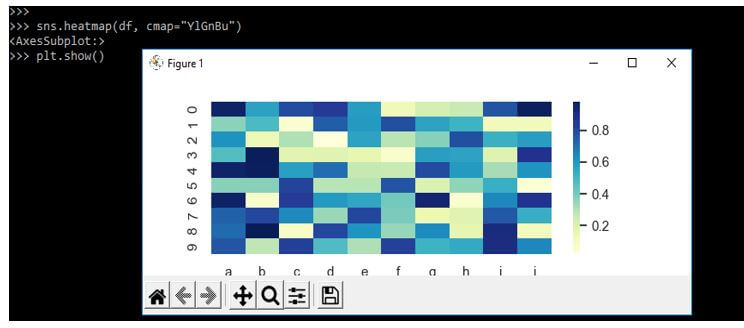
Example #1
In the below example, we are using single color with the sequential palette as follows.
Code:
import seaborn as sns
import matplotlib.pyplot as plt
import pandas as pd
import numpy as np
sns.heatmap(df, cmap="YlGnBu")
plt.show()
Output:
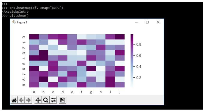
Code:
sns.heatmap(df, cmap="BuPu")
plt.show()
Output:
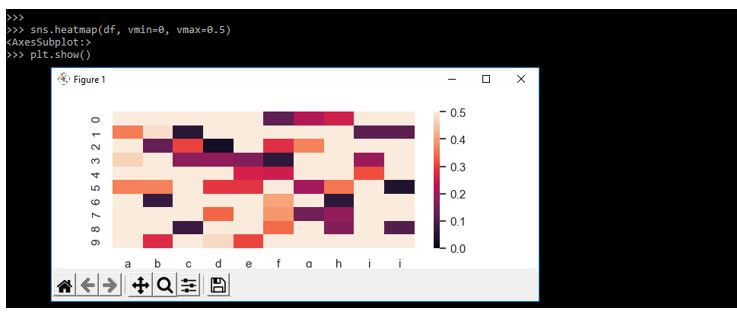
Code:
sns.heatmap(df, vmin=0, vmax=0.5)
plt.show()
Output:
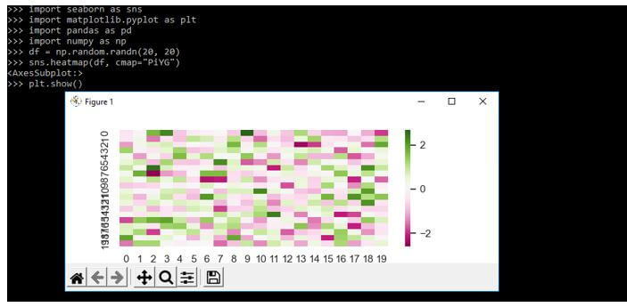
Example #2
The below example shows diverging color palette. In the below example, we are using two colors as follows.
Code:
import seaborn as sns
import matplotlib.pyplot as plt
import pandas as pd
import numpy as np
df = np.random.randn(20, 20)
sns.heatmap(df, cmap="PiYG")
plt.show()
Output:
We are specifying the value at the time of plotting data. We are using the center parameter as follows.
Code:
sns.heatmap(df, center=1)
plt.show()
Output:

FAQ
Other FAQs are mentioned below:
Q1. What is the use of the seaborn color palette in python?
Answer:
It is used to color the plot. Also, by using a palette, we generate several colors.
Q2. What is the seaborn default color palette?
Answer:
If suppose we are not passing any color to the palette, then seaborn is using its default colors. This default color depends on the library of matplotlib.
Q3. What is the color brewer palette in python?
Answer:
Seaborn is using the color brewer palette. The color brewer is setting the color palette. The color palette is chosen by using interpretation.
Conclusion
Seaborn in python contains robust controls and beautiful colors for our plots. When using color effectively, the color will add additional value to the plot. The palette means the flat surface on which we can mix and arrange the color.
Recommended Articles
This is a guide to Seaborn Color Palette. Here we discuss the introduction, using a seaborn color palette, examples, and FAQ, respectively. You may also have a look at the following articles to learn more –
