Updated March 17, 2023
Introduction to Seaborn Boxplot
Seaborn boxplot is the visual representation of groups depicted from numerical data using the quartiles. It is used for detecting the data set outlier. It captures the summary data effectively and efficiently by using the simple box, allowing us to compare all the groups easily. For example, it will summarize a data sample by using the percentile as 50th, 75th, and 25th.
The seaborn boxplot percentile is the median, upper and lower quartile. Boxplot in a seaborn helps to maintain the quantitative distribution of data in a way that facilitates the difference between levels or across the categorical variables. The seaborn boxplot main body will show the median confidence interval and the quartiles. The median contains the horizontal line, and each box of medians contains the horizontal lines at the median, which extends the vertical lines to the data points of non-outlier, and the horizontal lines caps which end on whiskers.

Key Takeaways
- Using the seaborn boxplot technique, we can use the statistics of visualizing summary to check our data. We can say that a boxplot will plot something.
- The advantage of using seaborn boxplots is that they will work with the data frames and contain several functions.
How to Use Seaborn Boxplot?
In the seaborn boxplot, suppose we are using only a single data variable instead of using two data variables; then, it will mean that the axis will denote each of the data variable’s axes. To use it, we need to install the seaborn in our system.
Below is the syntax of the seaborn boxplot as follows:
Syntax:
Seaborn.boxplot()It consists of five things that we need to define in our code while using it as follows:
- First quartile, or 25%
- Second quartile (median), or 50%
- Minimum
- Maximum
- The third quartile, or 75%
Below steps shows how we can use the seaborn boxplot as follows:
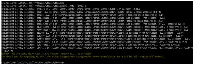
In the below step, first, we are installing the seaborn in our system as follows.
1. While using the seaborn boxplot, first, we need to install the library package of seaborn by using the pip command. The below example shows to install the package of seaborn as follows.
Code:
pip install seabornOutput:
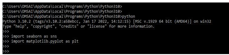
2. After installing the library package of seaborn, we are now importing the seaborn package. In this step, we import the matplotlib and seaborn packages using the import keyword.
Code:
import seaborn as sns
import matplotlib.pyplot as plt
Output:
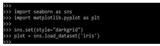
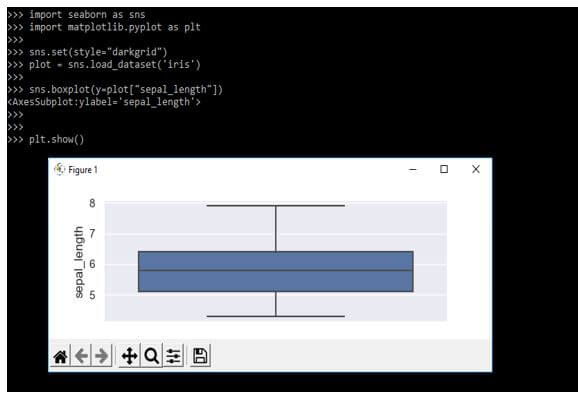
3. After importing the library in this step, we need to load the data set. Below we are loading the data set name as iris as follows.
Code:
sns.set(style="darkgrid")
plot = sns.load_dataset('iris')
Output:
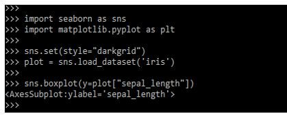
4. After loading the data set in this step, we plot the graph using the boxplot function.
Code:
sns.boxplot (y=plot ["sepal_length"])Output:
5. After plotting the graph in this step, we display the graph by using the boxplot function as follows.
Code:
plt.show()Output:
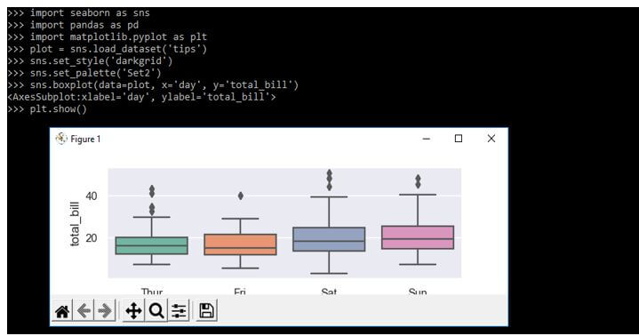
How to Create Seaborn Boxplot Data?
We must select the dataset with continuous features for creating the box plot. The box plot will display the statistics summary for the dataset’s variables, range, and median.
The below example shows the load of the default data set data using the load dataset function as follows.
Code:
plot = sns.load_dataset('tips')
sns.set_style ('darkgrid')
sns.set_palette ('Set2')
sns.boxplot (data=plot, x='day', y='total_bill')
plt.show()
Output:
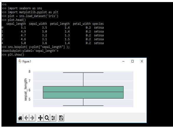
The boxplot is related to the method of the boxplot. In the below example, we are loading the data of the iris as follows.
Code:
import seaborn as sns
import matplotlib.pyplot as plt
plot = sns.load_dataset('iris')
plot.head()
sns.boxplot( y=plot["sepal_length"] );
plt.show()
Output:
Examples of Seaborn Boxplot
Different examples are mentioned below:
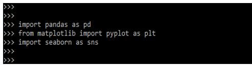
For creating the data, we need to import the panda’s library; also, we need to import the seaborn pyplot library as follows:
Code:
import pandas as pd
from matplotlib import pyplot as plt
import seaborn as sns
Output:
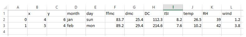
After importing the library, we need to create the sample data file to use the same in our code. We have created a sample csv file name as a plot. Below is the sample file data which we are displaying. Below is a sample file we are loading into our code.
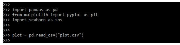
Now we are loading the csv data files into our code using the method of read_csv as follows.
Code:
plot = pd.read_csv("plot.csv")Output:
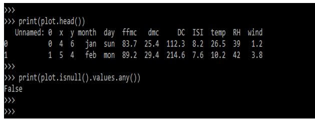
We can also check the data of files by using the print function. We can also check whether the data contains any null values or not.
Code:
print(plot.head())
print(plot.isnull().values.any())
Output:
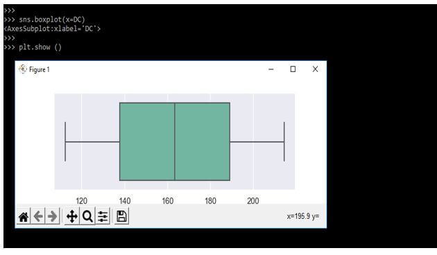
After creating the csv file, we assign the value to each column using the plot variable. For example, we are making the boxplot of the above details below.
Code:
FFMC = plot ["FFMC"]
DC = plot ["DC"]
RH = plot ["RH"]
ISI = plot ["ISI"]
temp = plot ["temp"]
sns.boxplot(x=DC)
plt.show ()
Output:
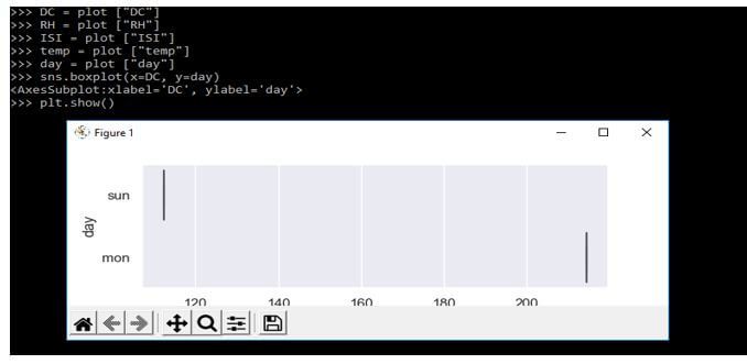
In the below example, we are positioning the boxplot in a seaborn as follows. In addition, we are plotting the boxplot per day.
Code:
day = plot ["day"]
sns.boxplot(x=DC, y=day)
plt.show()
Output:
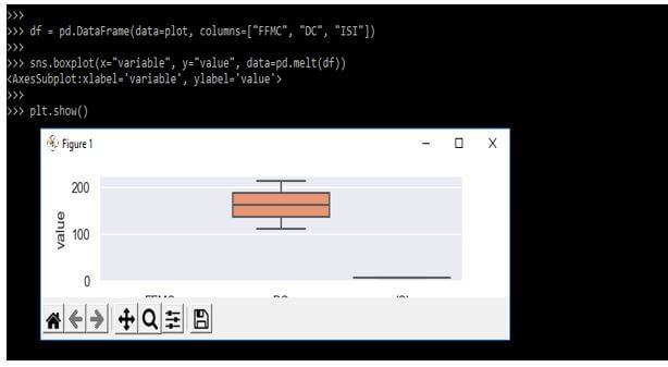
In the below example, we are creating a new data frame in which we are only visualizing the data as follows.
Code:
df = pd.DataFrame(data = plot, columns = ["FFMC", "DC", "ISI"])
plt.show()
Output:
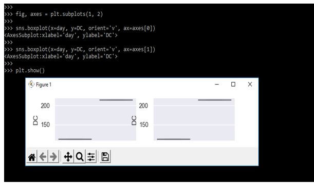
Below we are creating the subplots by using the seaborn boxplot as follows. In the below example, we are making the two plots.
Code:
fig, axes = plt.subplots(1, 2)
sns.boxplot(x=day, y=DC, orient='v', ax=axes[0])
sns.boxplot(x=day, y=DC, orient='v', ax=axes[1])
plt.show()
Output:
FAQ
Other FAQs are mentioned below:
Q1. What is the primary purpose of using a seaborn boxplot?
Answer:
Seaborn boxplots are used to visualize the statistics of the dataset summary and display the distribution-like range.
Q2. How can we set styling in the seaborn boxplot?
Answer:
Applying styling in seaborn boxplots is very easy. We can do the same by using the set_palette and the set_style functions.
Q3. How can we change the order of seaborn boxplots?
Answer:
The function of seaborn is to give control over how we can order the items. We use the order parameter to change the order of seaborn boxplot items.
Conclusion
Boxplot in a seaborn helps to maintain the quantitative distribution of data in a way that facilitates the difference between levels or across the categorical variables. It is the visual representation of groups depicted from numerical data using the quartiles.
Recommended Articles
This is a guide to Seaborn Boxplot. Here we discuss the introduction, Examples, and how to use a seaborn boxplot along with FAQ. You may also have a look at the following articles to learn more –
