Updated March 17, 2023
Introduction to Seaborn Bar Chart
A Seaborn bar chart was used to aggregate the data, which was categorical as per the methods. It is also understood as per visualization of group action. For using this plot, we are choosing the column, which was categorical for the x-axis, and the numerical column for the y-axis. Seaborn bar chart will be creating a plot which was taking the mean of a column that is categorical.
Key Takeaways
- Seaborn supports many types of bar charts. We can combine the seaborn with the matplotlib to demonstrate the plots.
- Several data sets are included with the seaborn. We can also pass any data to the plots. We are creating the barplot with the method of barplot.
What is Seaborn Bar Chart?
It shows the confidence and point estimates of rectangular bars. The bar plot represents the estimate by using error bars. The Seaborn bar plot includes the zero in the axis range; there is an excellent choice to put zero, which is a meaningful value for the variable. For the datasets, zero is not a significant value; the plot will allow us to focus on the single and multiple categorical variables. It is essential to keep in mind to plot the bar showing only mean value, but in numerous cases, it is more informative for showing the distribution.
How to Use Seaborn Bar Chart Graphs?
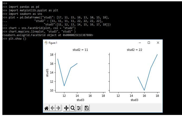
The class of facet grid is used for visualizing the relationship between a subset of data and data distribution which was used to create grids into multiple plots. The below example shows how to use graphs as follows. In the below example, we are plotting the line plot between customizing the data grid as multiple plots. The different seaborn plots use regplot, catplot, and implot to use the object by default.
Code:
import pandas as pd
import matplotlib.pyplot as plt
import seaborn as sns
plot = pd.DataFrame({"stud1": [17, 11, 15, 16, 13, 10, 15, 18],
  "stud2" : [11, 11, 11, 11, 22, 22, 22, 22],
  "stud3": [11, 12, 13, 14, 15, 16, 17, 18 ]})
chart = sns.FacetGrid(plot, col = "stud2")
chart.map(sns.lineplot, "stud3", "stud1")
plt.show ()
Output:
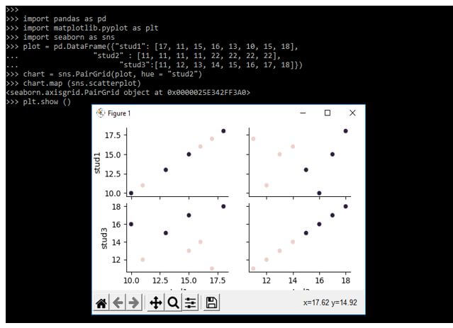
The seaborn pair grid is similar to the class of facet grid. It will take the plots and data frame of every column to column and the grid row. We use the hue parameter for the categorical data, with each color representing the different categories.
Below example shows the use of the seaborn pair grid to plot the graphs as follows:
Code:
import pandas as pd
import matplotlib.pyplot as plt
import seaborn as sns
plot = pd.DataFrame({"stud1": [17, 11, 15, 16, 13, 10, 15, 18],
  "stud2" : [11, 11, 11, 11, 22, 22, 22, 22],
  "stud3": [11, 12, 13, 14, 15, 16, 17, 18]})
chart = sns.PairGrid (plot, hue = "stud2")
chart.map (sns.scatterplot)
plt.show ()
Output:
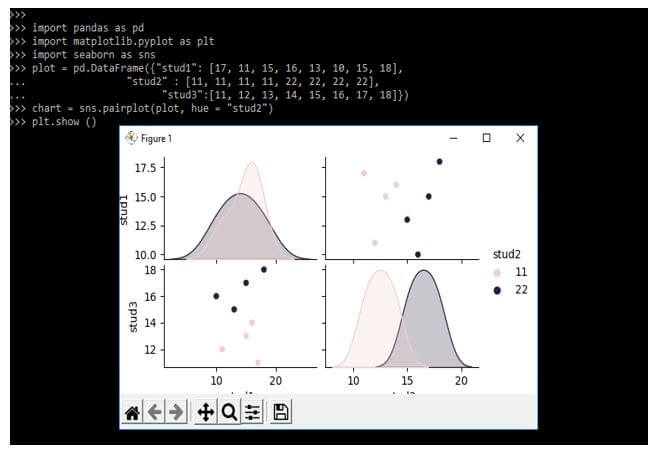
The example below shows the pair plot to plot the multiple seaborn bar chart. It is used to plot the distribution between the dataset columns. It also plots the column from the data frame axes, displaying the matrix plots showing different graphs similar to the pair grid class. Below are the different types of plot charts as follows.
Code:
import pandas as pd
import matplotlib.pyplot as plt
import seaborn as sns
plot = pd.DataFrame({"stud1": [17, 11, 15, 16, 13, 10, 15, 18],
  "stud2" : [11, 11, 11, 11, 22, 22, 22, 22],
  "stud3": [11, 12, 13, 14, 15, 16, 17, 18]})
chart = sns.pairplot(plot, hue = "stud2")
plt.show ()
Output:
Examples of Seaborn Bar Chart Code
Different examples are mentioned below:
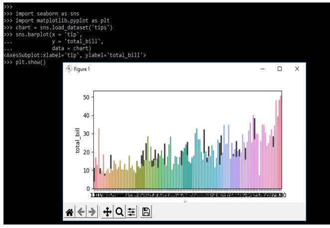
Example #1
The example below loads the data set name as tips and the seaborn and matplotlib library.
Code:
import seaborn as sns
import matplotlib.pyplot as plt
chart = sns.load_dataset('tips')
sns.barplot(x = 'tip',
  y = 'total_bill',
  data = chart)
plt.show ()
Output:
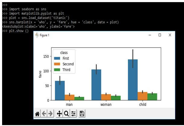
Example #2
In the below example, we are importing the seaborn and matplotlib library. We are loading the titanic dataset as follows.
Code:
import seaborn as sns
import matplotlib.pyplot as plt
plot = sns.load_dataset('titanic')
sns.barplot(x = 'who', y = 'fare', hue = 'class', data = plot)
plt.show ()
Output:
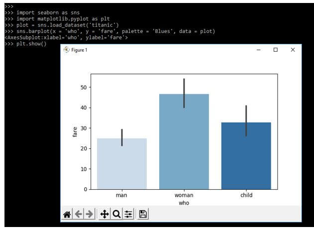
Example #3
In the below example, we are adding the palette parameter with a bar chart as follows. Also, we are importing the seaborn and matplotlib library. In the below example, we are loading the data set name as titanic.
Code:
import seaborn as sns
import matplotlib.pyplot as plt
plot = sns.load_dataset('titanic')
sns.barplot(x = 'who', y = 'fare', palette = 'Blues', data = plot)
plt.show ()
Output:
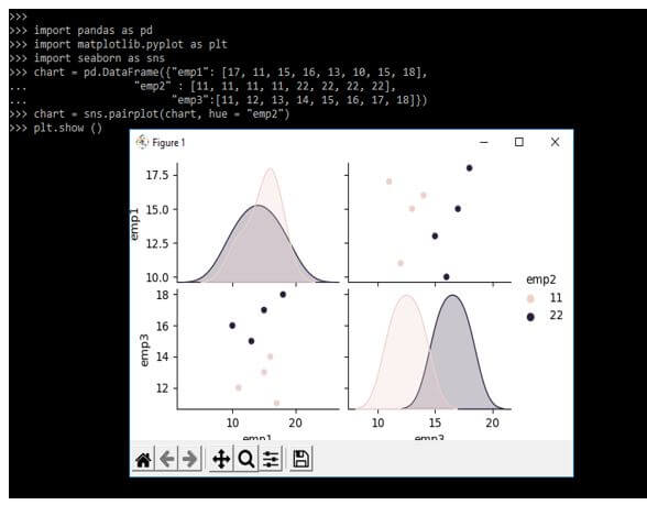
Example #4
In the example below, we plot the graph using a pairplot. In the below example, we are importing the seaborn and matplotlib libraries as follows.
Code:
import pandas as pd
import matplotlib.pyplot as plt
import seaborn as sns
chart = pd.DataFrame({"emp1": [17, 11, 15, 16, 13, 10, 15, 18],
  "emp2" : [11, 11, 11, 11, 22, 22, 22, 22],
  "emp3":[11, 12, 13, 14, 15, 16, 17, 18]})
chart = sns.pairplot(chart, hue = "emp2")
plt.show ()
Output:
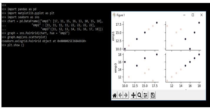
Example #5
In the below example, we are plotting the scatterplot as follows. In the below example, we are importing the seaborn, pandas, and matplotlib library.
Code:
import pandas as pd
import matplotlib.pyplot as plt
import seaborn as sns
chart = pd.DataFrame({"emp1": [17, 11, 15, 16, 13, 10, 15, 18],
  "emp2" : [11, 11, 11, 11, 22, 22, 22, 22],
  "emp3": [11, 12, 13, 14, 15, 16, 17, 18]})
graph = sns.PairGrid(chart, hue = "emp2")
graph.map (sns.scatterplot)
plt.show ()
Output:
FAQ
Other FAQs are mentioned below:
Q1. What is the use of the seaborn bar chart in python?
Answer:
It is used to aggregate the categorical data. We can plot the graph using it.
Q2. Which libraries are we using in the seaborn bar chart?
Answer:
We need to use the matplotlib, pandas, numpy, and seaborn library.
Q3. Which function do we need to use when creating the seaborn bar chart?
Answer:
We use the pairplot, barchart, and scatterplot functions in python to use the seaborn bar chart.
Conclusion
It shows the confidence and point estimates of rectangular bars. The bar plot represents the estimate by using error bars. It is used to aggregate the categorical data as per the methods. It is also understood as per visualization of group action.
Recommended Articles
This is a guide to Seaborn Bar Chart. Here we discuss the introduction, examples, and how to use seaborn bar chart graphs with FAQ. You may also have a look at the following articles to learn more –
