Updated March 24, 2023
Introduction to Scatterplots in R
A very important tool in an exploratory analysis, which is used to represent and analyze the relation between two variables in a dataset as a visual representation, in the form of an X-Y chart, with one variable acting as X-coordinate and another variable acting as Y-coordinate is termed as a scatterplot in R. R programming provides very effective and robust mechanism being facilitated but not limited to function such as plot(), with various functionalities in R providing options to improve visual aesthetics.
How to Create Scatterplots in R?
To create scatter plots in R programming, the First step is to identify the numerical variables from the input data set which are supposed to be correlated. Next, the step would be importing the dataset to the R environment. Once the data is imported into R, the data can be checked using the head function.
Next, apply the plot function with the selected variables as parameters to create Scatter plots in the R language. The Scatter plots in R programming can be improvised by adding more specific parameters for colors, levels, point shape and size, and graph titles.
Syntax
Let’s assume x and y are the two numeric variables in the data set, and by viewing the data through the head() and through the data dictionary these two variables are having a correlation.
The scatter plots in R for the bi-variate analysis can be created using the following syntax
plot(x,y)
This is the basic syntax in R which will generate the scatter plot graphics.
Scatterplots Matrices in R
When we have more than two variables in a dataset and we want to find a correlation of each variable with all other variables, then the scatterplot matrix is used. The most basic and simple command for scatterplot matrix is:
- pairs(~Sepal.Length+Sepal.Width+Petal.Length+Petal.Width, data= iris, main =”Scatterplot Matrix”)
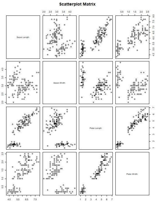
The above graph shows the correlation between weight, mpg, dsp, and cyl.
Scatterplot 3D in R
Sometimes a 3-dimensional graph gives a better understanding of data. For this R provides multiple packages, one of them is “scatterplot3d”. Below are the commands to install “scatterplot3d” into the R workspace and load it in the current session
- install.packages(“scatterplot3d”)
- library(scatterplot3d)
- After loading the library, the execution of the below commands will create a 3-D scatterplot.
- attach(iris)
- scatterplot3d(Sepal.Length, Sepal.Width, Petal.Length, main = “3D Scatterplot”)
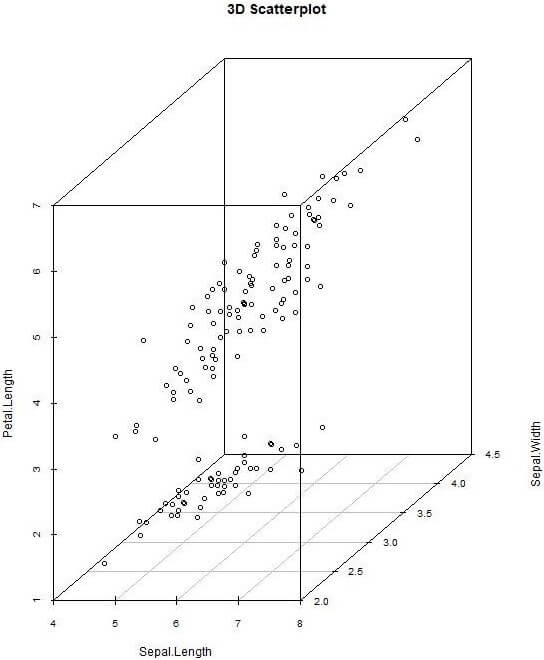
Apart from this, there are many other ways to create a 3-Dimensional. Users can also add details like color, titles to make the graph better. Users can also create interactive 3D scatterplot by using the “plot3D(x,y,z)” function provided by “rgl” package. This function creates a spinning 3D scatterplot that can be rotated using a mouse. Thus, giving a full view of the correlation between the variables.
Examples of Scatter plots in R Language
In the example of scatter plots in R, we will be using R Studio IDE and the output will be shown in the R Console and plot section of R Studio.
The dataset we will be using is the iris dataset, which is a popular built-in data set in the R language.
The iris data set data dictionary would be the dataset having flowers properties information
- The measurements values of the sepal.
- The measurement values of the petal.
- The specific type of information.
Example #1
Let’s view the variables available in the iris dataset by using the colnames function in R programming
R code:
colnames(iris)
R Console Output:
![]()
Let’s discuss the detailed variables available and their types in the iris dataset:
Length: It stores the sepal length measurement data. It is a numeric type variable.
Width: It stores the sepal width measurement data. It is a numeric type variable.
Length: It stores the petal length measurement data. It is a numeric type variable.
Width: It stores the petal width measurement data. It is a numeric type variable.
Species: It stores the species name information. It is a categorical variable. The species category names are setosa, Versicolor, and virginica.
Example #2
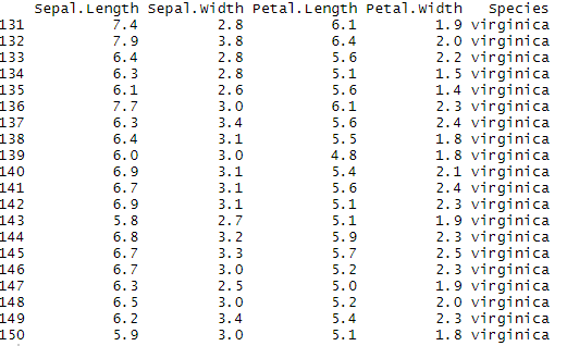
Next, we will review the first 20 rows of the iris dataset by using a head function in R.
R Code:
head(iris,20)
R Console Output:
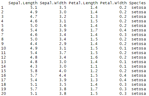
The above R console Output data view of the iris dataset shows sepal. Length and sepal. Width variables are correlated.
Similarly, the above dataset shows the petal, Length, and petal. Width variables are correlated.
Example #3
Let’s now create a scatterplot with sepal. Length and sepal.Width variables using plot() function in R programming.
- The sepal. The length will be provided to the x-axis of the graph.
- The sepal. The width will be provided to the y-axis of the graph.
R Code:
plot(iris$Sepal.Length,iris$Sepal.Width)
R Plots output visualization:
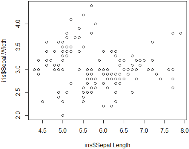
The points in the scatter plot shows the data distribution patterns of all the observations of the iris dataset.
- Heare its 150 observations are plotted in the scatter plot.
- We can know the total observation value by viewing the tail rows
R Code:
tail(iris,20)
R Console Output showing the last 20 rows of iris dataset with row number as the first column:
Example #4
Next, we will apply more parameters to the plot function to improve the scatter plot representation.
- We will add the x-axis label as Sepal Length and the y-axis as Sepal Width.
- Also will add the title of the scatter plot as Sepal Properties of Iris Flowers
The R code for the label would be as follows:
plot(iris$Sepal.Length,iris$Sepal.Width,xlab='Sepal Length',ylab='Sepal Width',main='Sepal Properties of Iris Flowers')
R Plots output visualization:
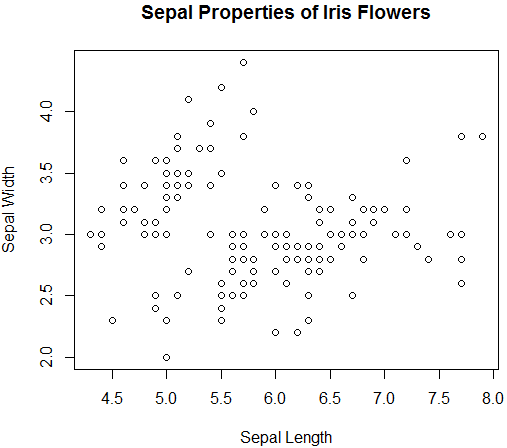
The above scatterplot diagram shows meaningful labels for representation.
Example #5
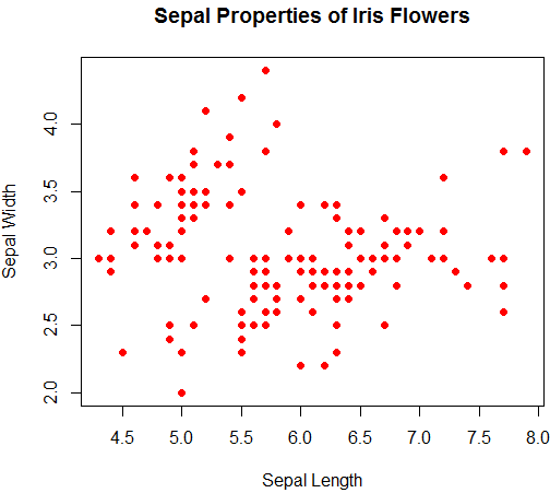
Next, we will apply further enhancements to the scatter plot by adding color and shapes to the scatter points.
In the next R function, we will change the aesthetic of the points represented by using pch parameter value 19 which is the solid circle.
Further, we will be adding color with the specific condition to each Species category by using the point function in the R language:
- Setosa as blue
- Versicolor as green
- virginica as red
R code to improve the Scatter plot for an aesthetic change with red color:
plot(iris$Sepal.Length,iris$Sepal.Width,xlab='Sepal Length',ylab='Sepal Width',main='Sepal Properties of Iris Flowers',pch=19,col='red')
R Plots output visualization:
Example #6
Applying points() function to segregate the color for setosa category of iris species and changing the color to blue.
R code:
plot(iris$Sepal.Length,iris$Sepal.Width,xlab='Sepal Length',ylab='Sepal Width',main='Sepal Properties of Iris Flowers',pch=19,col='red')

points(iris$Sepal.Length[iris$Species=='setosa'],iris$Sepal.Width[iris$Species=='setosa'],pch=19,col='blue')
R Plots output visualization:
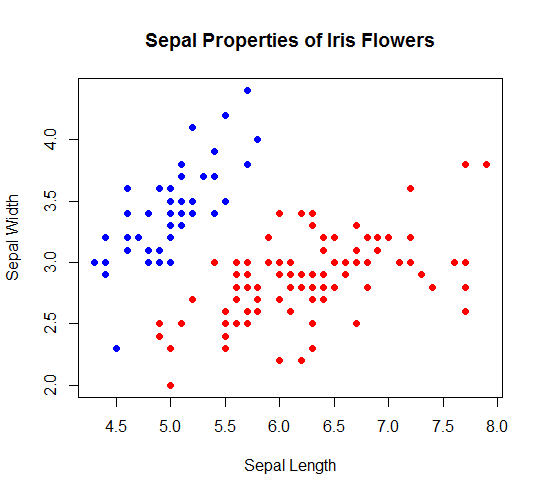
The above scatterplot shows setosa category floors are in blue and others are in red-colored points.
Example #7
Next, we will apply green color to the Versicolor species category using another point () function
R code:
plot(iris$Sepal.Length,iris$Sepal.Width,xlab='Sepal Length',ylab='Sepal Width',main='Sepal Properties of Iris Flowers',pch=19,col='red')

points(iris$Sepal.Length[iris$Species=='versicolor'],iris$Sepal.Width[iris$Species=='setosa'],pch=19,col='green')
R Plots output visualization:
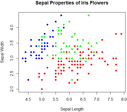
The above scatter plot shows red for virginica, blue for setosa, and green for Versicolor. It will help in the linear regression model building for predictive analytics.
It completes the example of Scatter plots in R.
Conclusion
The scatter plot using plot() function provides basic features of representation, however, implementation of the ggplot2 package provides additional representation features like advance color grouping and various symbols type to the scatter plot. The scatter plot in R can be added with more meaningful levels and colors for better presentation.
Recommended Articles
This is a guide to Scatterplots in R. Here we discuss how to create Scatter plots in R? with respective examples with appropriate syntax and sample codes.t. You may also look at the following articles to learn more-
