Updated March 23, 2023
Overview of Plot Function in R
Plot function in R language is a basic function that is useful for creating graphs and charts for visualizations. It is implemented as plot() in R programing language. The plot function supports a wide variety of function parameters for different scenarios and types of objects to be passed to it. Plot function in the R graphics package mostly used to develop the two-dimensional graphs to analyze the data set distribution or to visualize correlation among data variables. Several graphs like scatter plot and line graphs are some of the commonly used charts for exploratory data analysis which are created using plot function in R.
Syntax of the Plot Function in R
The generic syntax for a plot in Rstudio is:
Plot(x,y,…)
And its complete syntax is:
plot(x, y, type, main, sub, xlab, ylab)
“x” provides us the data points and we will plot that data by using the above syntax. Sometimes data in X is self-sufficient for the plot that it doesn’t require any other variable.
“y” also provides us data and we plot it with X variable data.
Plots are of different kinds.
Type command is used to pass on the code like which type of plot we want.
Different Types of Plot Functions
Types of the plot are:
- “p”: is used for points plot
- “l”: is used for lines plot
- “b”: is used for both point plot and lines plot in a single place
- “c”: is used to join empty point by the lines
- “o”: is used for both lines and over-plotted point
- “h”: is used for ‘histogram plot’
- “s”: is used for stair steps
- “n”: is used for no plotting
For the title of the plot, we have to pass the “main” syntax. Similarly, for the subtitle of the plot, we have to pass “sub” syntax.
The plot is of no use if the x-axis and y-axis are not labeled. For labeling, we will use syntax “xlab” for x-axis legends and “ylab” for y-axis legends.
Examples of a Plot Functions with datasets
The basic examples of the plots have been given below:
Case 1
We have marks of 20 students of two different sections of Class 10th. X is class 10 section A and Y is class 10 section B.
X = 40, 15, 50, 12, 22, 29, 21, 35, 14, 15,49, 25, 41, 43, 30, 20, 48, 25, 18, 23
Y = 41, 42, 32, 14, 42, 27, 13, 50, 33, 22, 31, 30, 49, 25, 40, 39, 14, 37, 15, 50
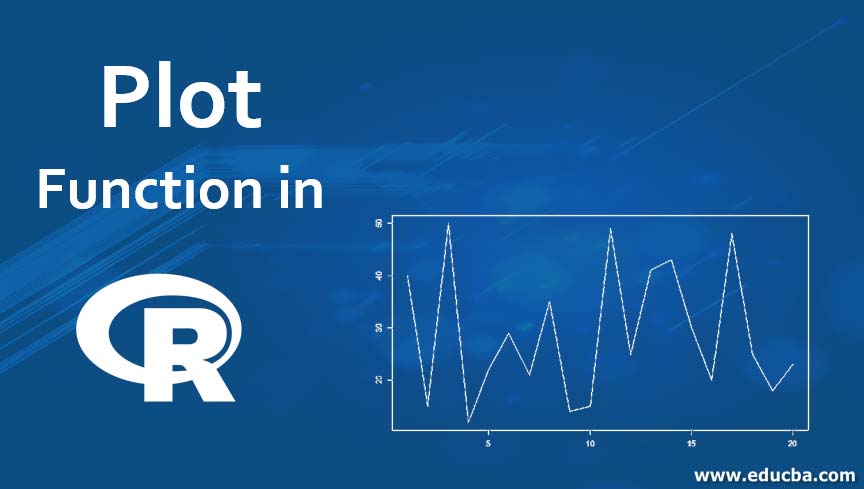
- Let’s see the line plot of class 10 section A.
X = c(40, 15, 50, 12, 22, 29, 21, 35, 14, 15, 49, 25, 41, 43, 30, 20, 48, 25, 18, 23)

plot(X ,type = "l")
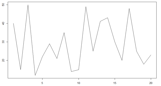
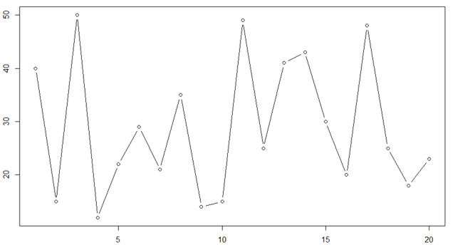
- Let’s see the line plot of class 10 section B.
Y = c(41, 42, 32, 14, 42, 27, 13, 50, 33, 22, 31, 30, 49, 25, 40, 39, 14, 37, 15, 50)

plot(Y, type = "l")
- Let’s see the point plot of Class 10 section A.
X = c(40, 15, 50, 12, 22, 29, 21, 35, 14, 15, 49, 25, 41, 43, 30, 20, 48, 25, 18, 23)> plot(X ,type = "p")
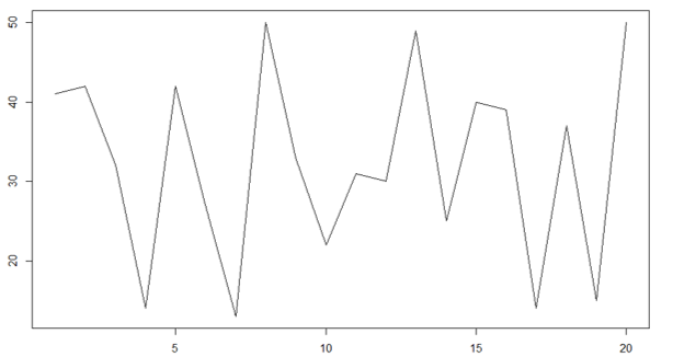
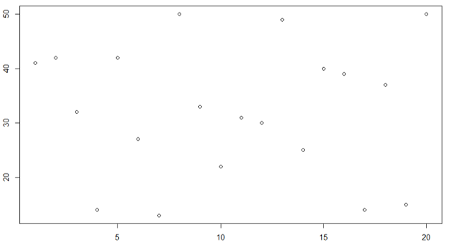
- Let’s see the point plot of Class 10 section B.
Y = c(41, 42, 32, 14, 42, 27, 13, 50, 33, 22, 31, 30, 49, 25, 40, 39, 14, 37, 15, 50)> plot(Y, type = "p")
Lastly, we can see a mixture of both points and lines for both the section.
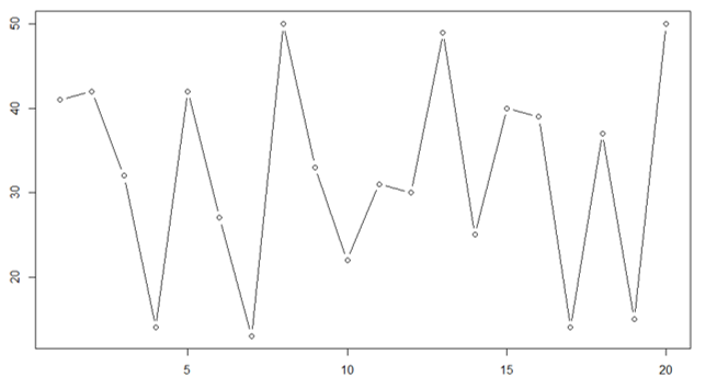
Class 10 section A
X = c(40, 15, 50, 12, 22, 29, 21, 35, 14, 15, 49, 25, 41, 43, 30, 20, 48, 25, 18, 23)> plot(X ,type = "b")
Class 10 section B
Y = c(41, 42, 32, 14, 42, 27, 13, 50, 33, 22, 31, 30, 49, 25, 40, 39, 14, 37, 15, 50)> plot(Y, type = "b")
Case 2
Let’s consider a situation where we have to plot data that provides the marks of a class. In class, there are 50 students. In this case, we will see how to add the name of the axis, title and all.
| Roll number | Marks |
| 1 | 43 |
| 2 | 55 |
| 3 | 62 |
| 4 | 86 |
| 5 | 99 |
| 6 | 43 |
| 7 | 76 |
| 8 | 29 |
| 9 | 84 |
| 10 | 58 |
| 11 | 68 |
| 12 | 56 |
| 13 | 89 |
| 14 | 31 |
| 15 | 20 |
| 16 | 77 |
| 17 | 75 |
| 18 | 94 |
| 19 | 61 |
| 20 | 35 |
| 21 | 54 |
| 22 | 41 |
| 23 | 63 |
| 24 | 32 |
| 25 | 73 |
| 26 | 58 |
| 27 | 26 |
| 28 | 45 |
| 29 | 60 |
| 30 | 81 |
| 31 | 52 |
| 32 | 29 |
| 33 | 48 |
| 34 | 36 |
| 35 | 51 |
| 36 | 53 |
| 37 | 99 |
| 38 | 20 |
| 39 | 57 |
| 40 | 28 |
| 41 | 64 |
| 42 | 39 |
| 43 | 59 |
| 44 | 31 |
| 45 | 84 |
| 46 | 76 |
| 47 | 28 |
| 48 | 74 |
| 49 | 68 |
| 50 | 64 |
Now we have to present this data in the plot.
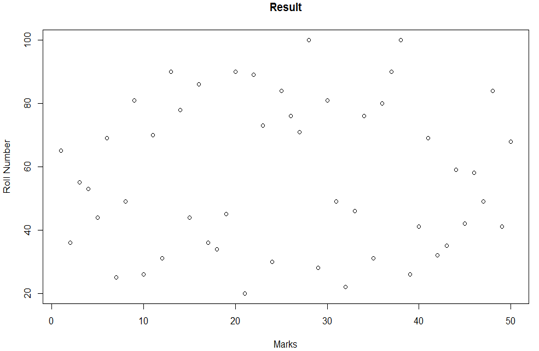
plot_data = read.csv("Plots in R.csv",header = TRUE) > plot(plot_data$Roll.number, plot_data$Marks, type = "p", xlab = 'Marks', ylab = 'Roll Number')
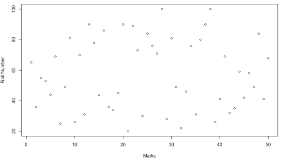
In this plot, we can see the name of the titles. On the x-axis, we have marks, on the y-axis we have roll number. Like on the same lines we can add the title of the plot also which we will see in the below code.
plot(plot_data$Roll.number, plot_data$Marks, type = "p", xlab = 'Marks', ylab = 'Roll Number', main = 'Result')
Advantages of Plot in R Function
Advantages of the plot:
- Pass on the findings in constructive ways to the stakeholders.
- Easy to understand
- The human brain can process visual information more easily than written information.
- Quick access to relevant information
- Easy Identification of latest trends
- Simple comprehension of data
Conclusion
Data is available in an enormous amount. It is not easy to convert the data into that structure which provides some meaningful insights. One of the best structure which converts data into precise and meaningful format is the plot (if we say in large “visualization”). Researchers, data scientists, economists always prefer plots if they want to showcase any data. Plots are easy to understand, the learnings derived from plots can last long in the mind.
If you think that there is too much data and you want to pass on the learnings of that data to your audience, the best way is to use the plot. The only precaution you have to take is to find which type of plot is the best fit for your data points. Once you find the right type, writing code or syntax is not tough.
Recommended Articles
This is a guide to Plot Function in R. Here we discuss the introduction, Syntax of the Plot Function in R, Examples of a plot and their Types along with the Advantages. You can also go through our other suggested articles to learn more–
